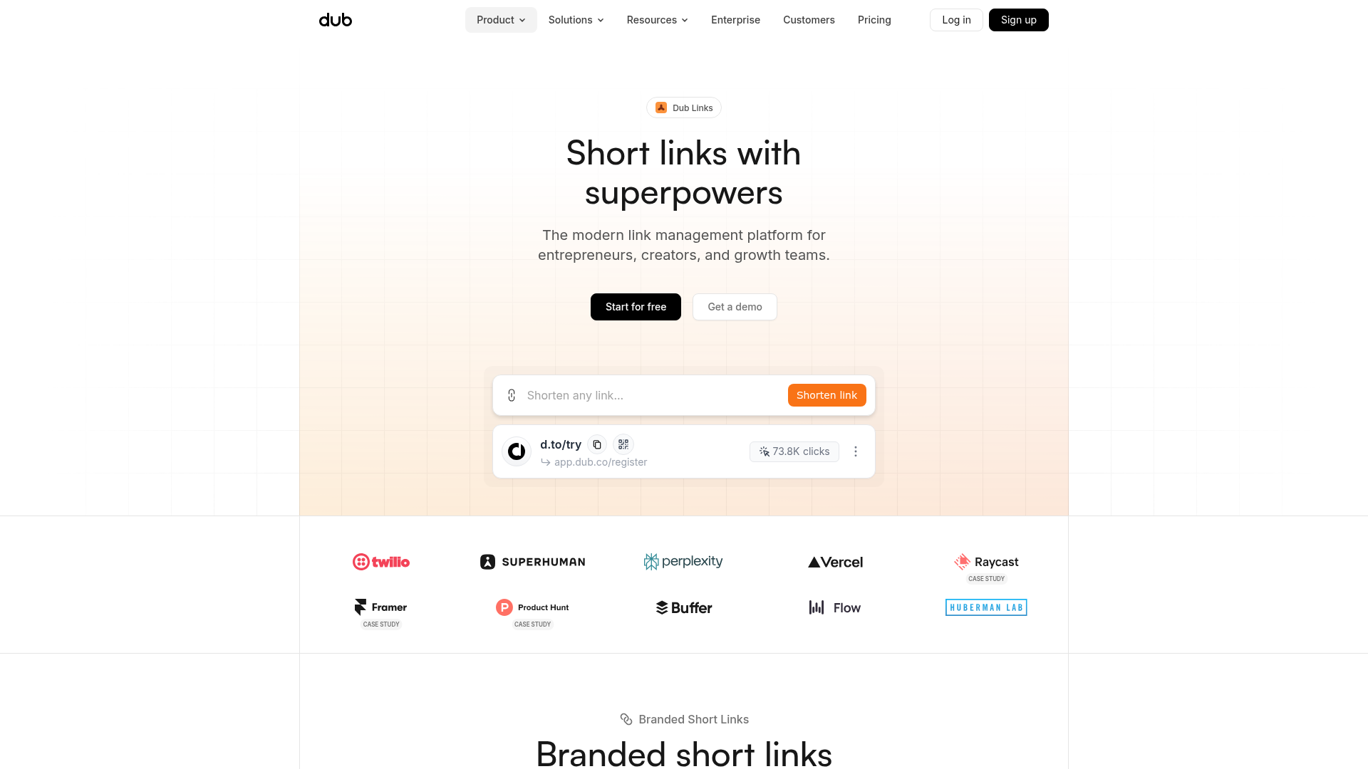
Dub.sh Link Management Landing Page
A clean SaaS landing page featuring a centralized link shortener input, bento-style product features, and a logo marquee for high-profile integrations.
Overview
Dub.sh is a modern link management platform designed for marketing teams and developers. It serves as an excellent clone reference because it masterfully balances a minimalist layout with high-impact interactive elements like a functional URL input demo and a sophisticated grid-based visual architecture.
Design System
- Color Palette & Visual Hierarchy: The design uses a clean white background contrasted against a subtle beige/amber radial gradient that anchors the hero section. Primary actions use high-contrast black (
bg-black) or vibrant brand orange (bg-orange-500), creating a clear hierarchy that directs users toward the link shortener and sign-up buttons. - Typography: The typography uses a modern sans-serif stack (system fonts/Inter-like) with tight tracking and a clear scale—large, bold headlines in the hero and structured subheads for features. Subtle gray text (
text-gray-500) is used for secondary metadata and descriptions. - Page Structure: The layout follows a classic SaaS lead-gen funnel: (1) A hero with a live-action demo of the product, (2) a high-density logo cloud for social proof, and (3) a grid-based feature section introduced by lowercase utility labels like "Branded Short Links."
- Reusable Components:
- The Shortener Bar: A rounded input field containing a secondary action button, often paired with a floating "Result Card" that previews a shortened link and click analytics.
- Navigation: A sticky header with dropdown menus and distinctive rounded CTA buttons.
- Interactive Badges: The "Dub Links" pill at the top serves as a perfect reusable UI piece for announcements or category labels.
- Implementation Clues: Based on the class naming conventions (e.g.,
flex,mx-auto,rounded-full), the site is built using Tailwind CSS. It uses a structured grid system evidenced by the faint background lines that align perfectly with component edges.
Use Cases
- Who should clone this: Developers building utility-first SaaS tools, developer experience (DevEx) products, or marketing analytics platforms that need to showcase a single core function immediately.
- Remix Directions:
- Functional Demo: Adapt the central URL input field to demonstrate other single-input logic, like domain searching, code generating, or prompt engineering.
- Visual Style: Swap the amber hero gradient and grid lines for a dark mode variant with neon accents to fit a cybersecurity or crypto brand.
- Information Architecture: The logo marquee and feature grid can be detached and reused as a standalone "Social Proof & Specs" block for any landing page.
- Suggested Scope: Beginners should focus on cloning the hero section and the interactive input bar. Advanced users can clone the full page to leverage the responsive navigation and integrated case study badges (like those seen for Framer and Raycast).
Related Inspirations

Koa Health Mental Care Landing Page
A clean healthcare landing page featuring a centered hero section, scroll-based fade-in animations, overlapping mobile mockups, and a multi-column feature grid with accent borders.
Visual AI Landing Page Templates
A high-end SaaS layout featuring a serif-heavy typography system, bento-style product showcase grids, accordion-style feature blocks, and minimalist wireframe UI components.
Slingshot Event Swag Hero and Logos
A clean SaaS landing page featuring a split hero layout with promotional product imagery, a call-to-action button, and a monochrome brand logo trust bar.

Slite SaaS Knowledge Base Landing Page
A clean SaaS hero section with a conversational headline, secondary call-to-action buttons, and a structured software interface preview featuring user testimonials.
Attio AI CRM Landing Page
A clean SaaS landing page featuring a tiered navigation bar, a centered hero section with twin CTAs, and a detailed interactive dashboard preview.
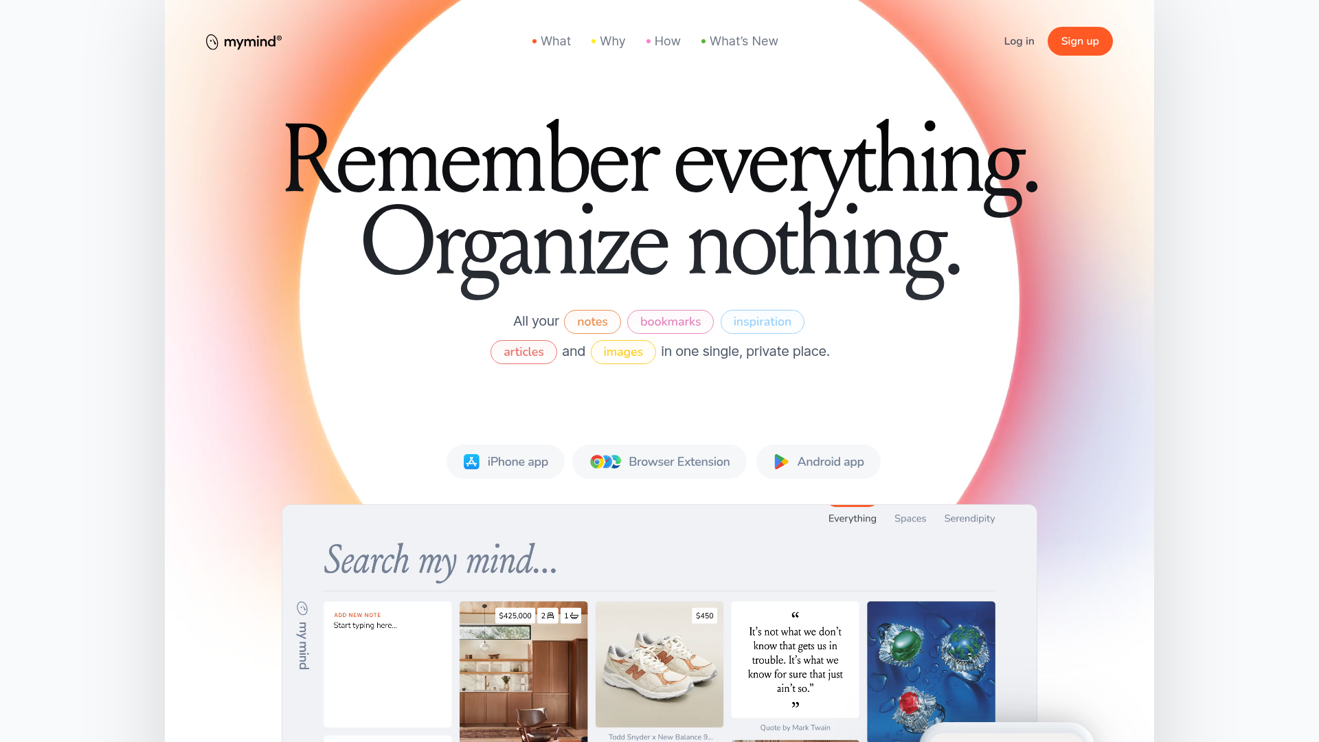
Mymind AI Tool Landing Page
A minimalist SaaS landing page featuring a soft-gradient hero section, custom pill-shaped text badges, and a dynamic bento-style search result preview grid.
