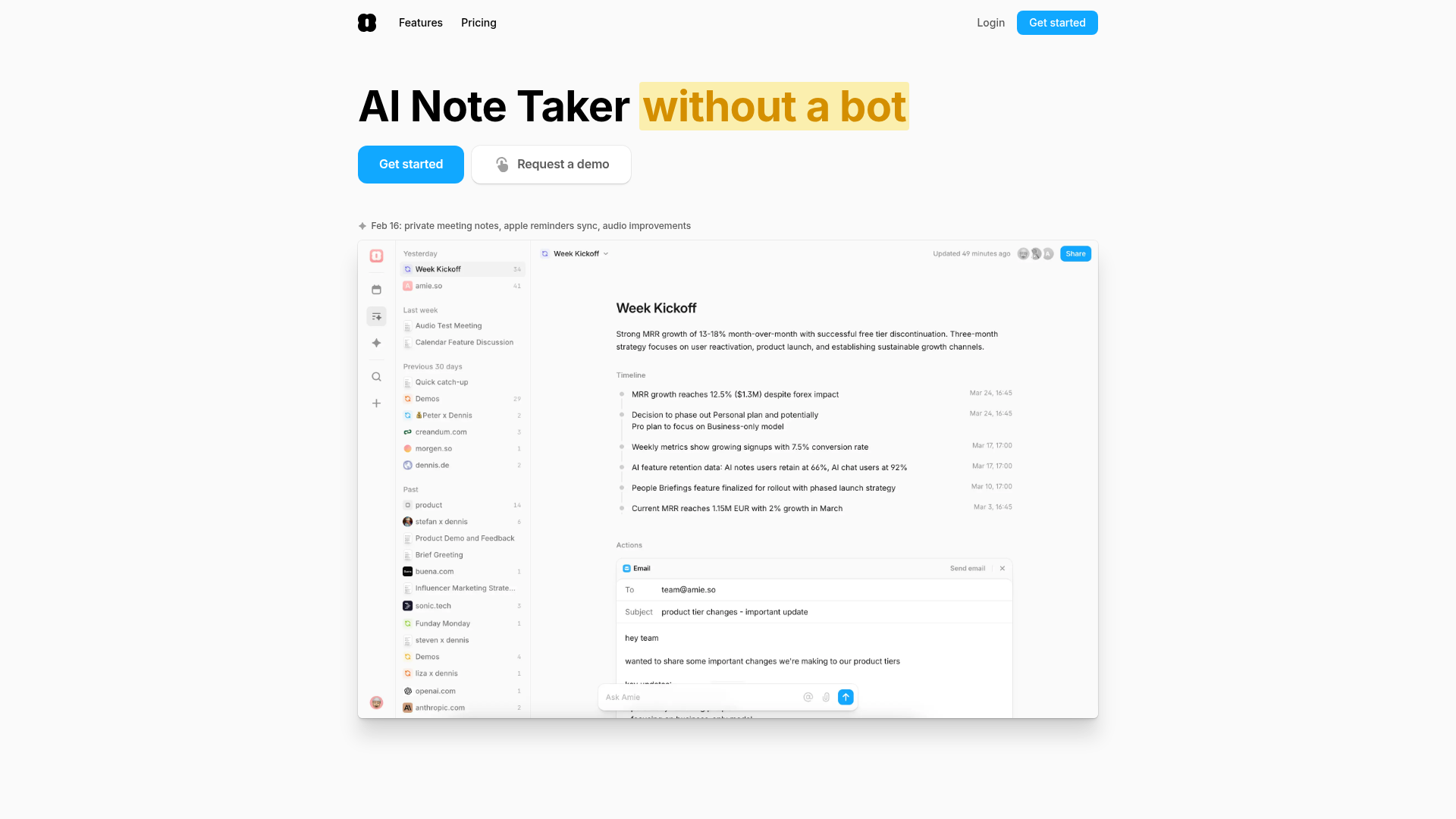
Amie AI Note Taker Landing Page
A clean SaaS landing page featuring a glassmorphism dashboard UI, high-contrast action buttons, and a minimalist left-aligned sidebar navigation.
Overview
This is a high-conversion landing page for Amie, an AI-powered note-taking and calendar application. It is an exceptional reference for builders because of its sophisticated "glassmorphism" dashboard UI, high-contrast typography, and a unique scrolling feature deck that effectively bridges the gap between marketing copy and product reality.
Design System
- Color Palette & Visual Hierarchy: The base is a clean
#FFFFFFwith secondary sections using soft off-whites (#F9FAFB) and subtle gradients. High-contrast accent colors define specific feature blocks: Azure Blue (#3B82F6) for primary actions and AI Chat, Emerald Green for Meeting Notes, and Soft Orange for Scheduling. Visual hierarchy is achieved through oversized, bold headers contrasted against mutedtext-secondarydescriptions. - Typography: The system relies on a bold, sans-serif font family (Inter or similar) with tight letter-spacing (
tracking-tight). Display text uses a 2.5xl to 6xl scale. Highlighting is a core brand element, specifically the "without a bot" secondary-colored background span (rgba(255,215,0,0.3)). - Page Structure:
- Hero: Left-aligned copy with dual CTA buttons and a centered glass-effect product screenshot.
- Social Proof: A grayscale, infinitely scrolling logo marquee.
- Themed Feature Blocks: Vertical sections defined by a specific accent color and icon type (e.g., Meeting Notes, AI Chat).
- Dynamic Steps: A "7-day achievement" grid that visualizes user success over time.
- FAQ: A clean, border-separated accordion list.
- Reusable Components:
- Buttons: Rounded-xl corners with subtle shadows; the primary blue button features a slight gradient and sharp white text.
- Notch UI: A unique floating container designed to mimic the macOS notch, adding a "native app" feel to the web experience.
- Contextual Cards: Integration blocks (Slack, HubSpot) that use small-scale logos and clear labels.
- Interaction & Motion: The HTML indicates the use of
framer-motionor similar foranimate-scroll-xmarquees. Most images are lazy-loaded with blur-up placeholders to maintain a premium feel during scroll. - Implementation Clues: Built with Next.js and Tailwind CSS. It utilizes a sticky header with
backdrop-blur-lgandbg-background/80to maintain navigation visibility without cluttering the UI.
Use Cases
- Who should clone this: B2B SaaS founders, productivity tool developers, and AI startups who want to look established and "pro-level" with minimal custom illustration.
- What products can remix it: Calendar apps, CRM dashboard extensions, and automated transcription services. The "Replaces: [Logo List]" component is a particularly strong pattern for any disruptive tool.
- Practical remix directions:
- Style Swap: Change the heavy rounded corners (
rounded-xl) to sharp 2px corners for a more technical/developer-focused aesthetic. - Information Architecture: Adapt the 7-day "Today / Day 3 / Day 7" roadmap for onboarding documentation or pricing tier comparisons.
- Style Swap: Change the heavy rounded corners (
- Suggested clone scope: The Hero Section and Sticky Backdrop-blur Header are the highest value for quick clones. The Feature Grid with integrated Slack-style testimonials is excellent for building trust on secondary pages.
Related Inspirations

Slite SaaS Knowledge Base Landing Page
A clean SaaS hero section with a conversational headline, secondary call-to-action buttons, and a structured software interface preview featuring user testimonials.
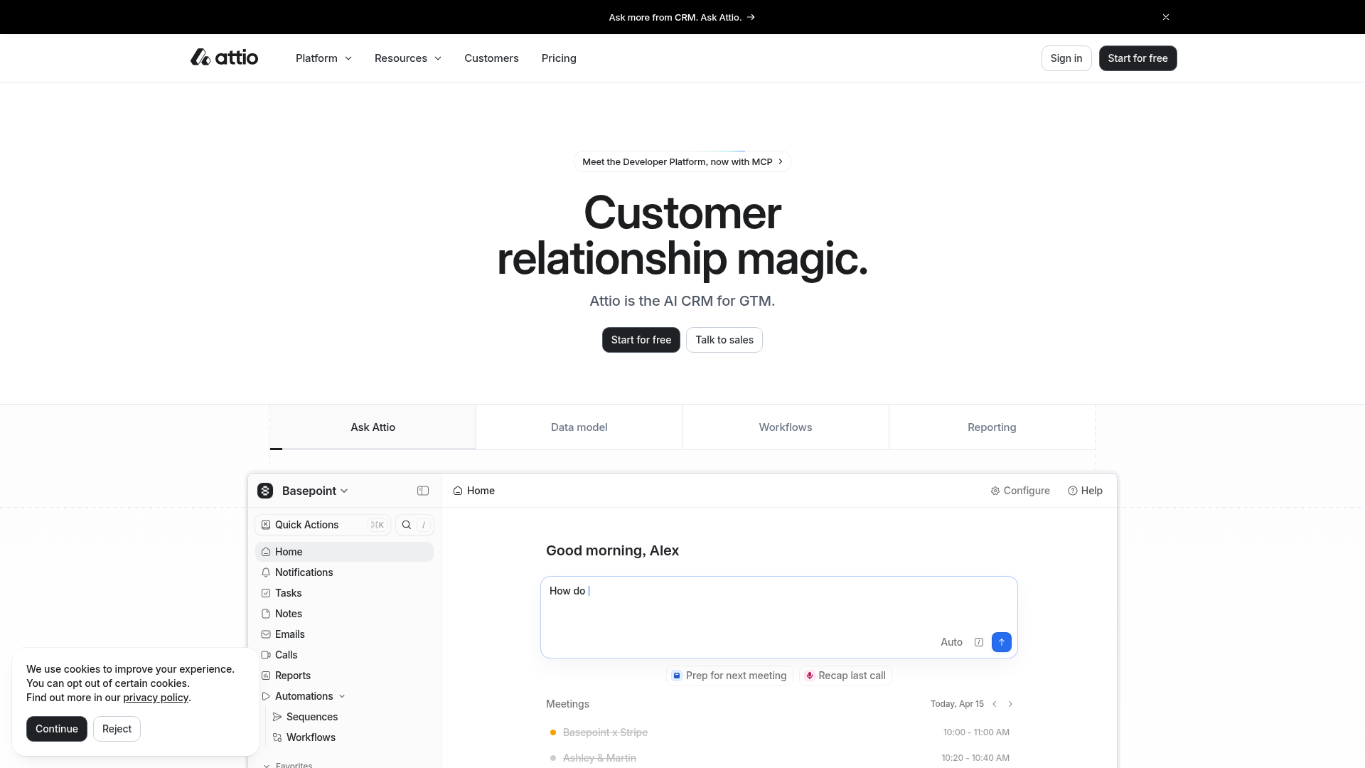
Attio AI CRM Landing Page
A clean SaaS landing page featuring a tiered navigation bar, a centered hero section with twin CTAs, and a detailed interactive dashboard preview.
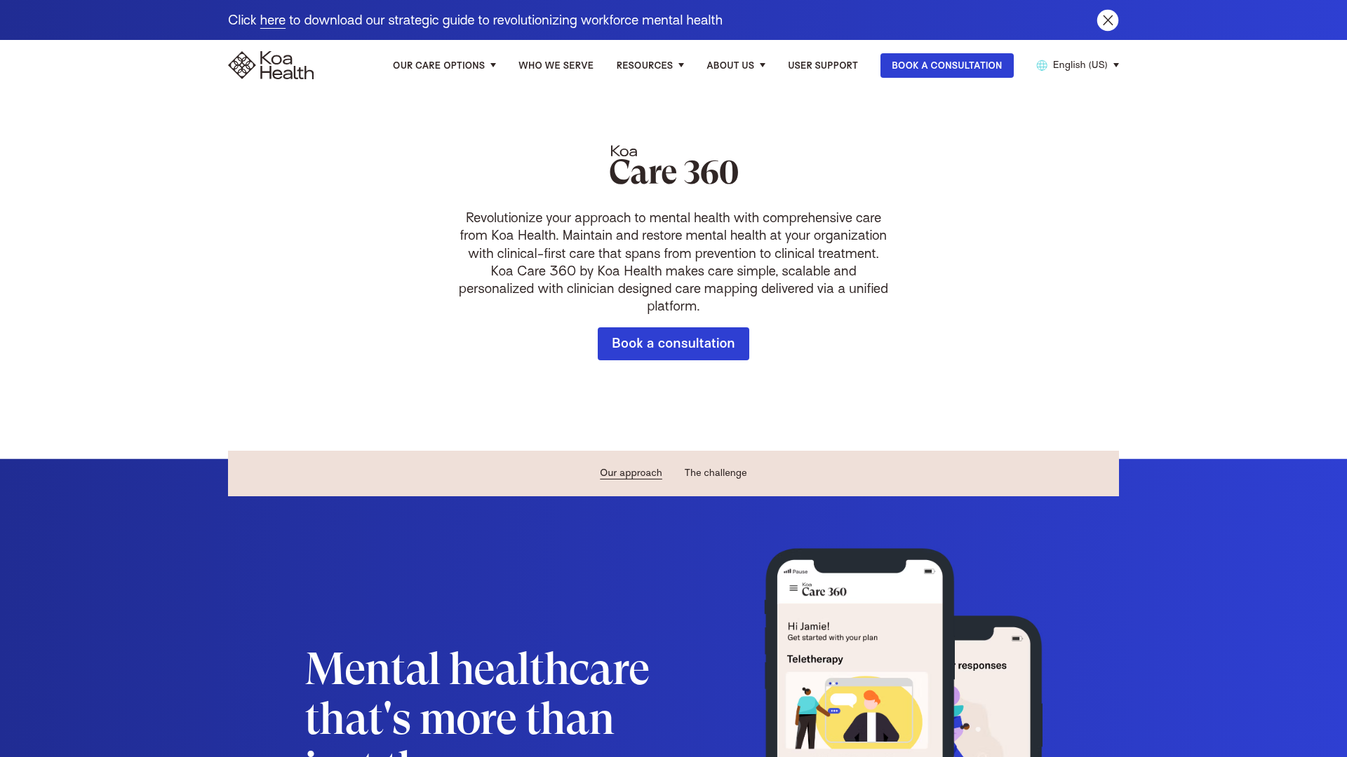
Koa Health Mental Care Landing Page
A clean healthcare landing page featuring a centered hero section, scroll-based fade-in animations, overlapping mobile mockups, and a multi-column feature grid with accent borders.
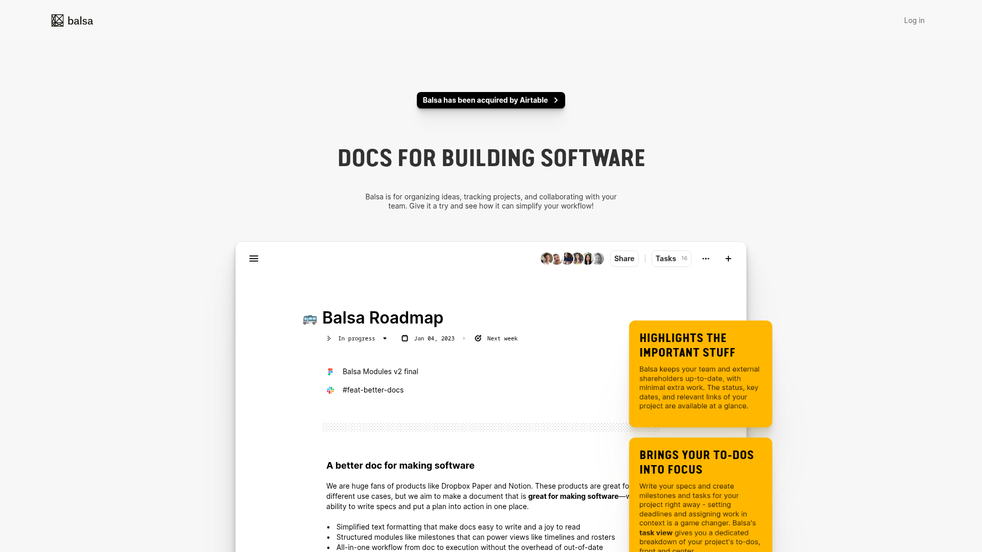
Balsa Software Documentation Landing Page
A clean document-centric layout featuring a centered hero section, high-contrast callout boxes, and a nested dashboard UI preview for collaborative tool showcases.
Firebase Hosting Site Not Found
A minimal placeholder layout for 404 error states including a centered logo, numbered troubleshooting guide, and linked utility text.
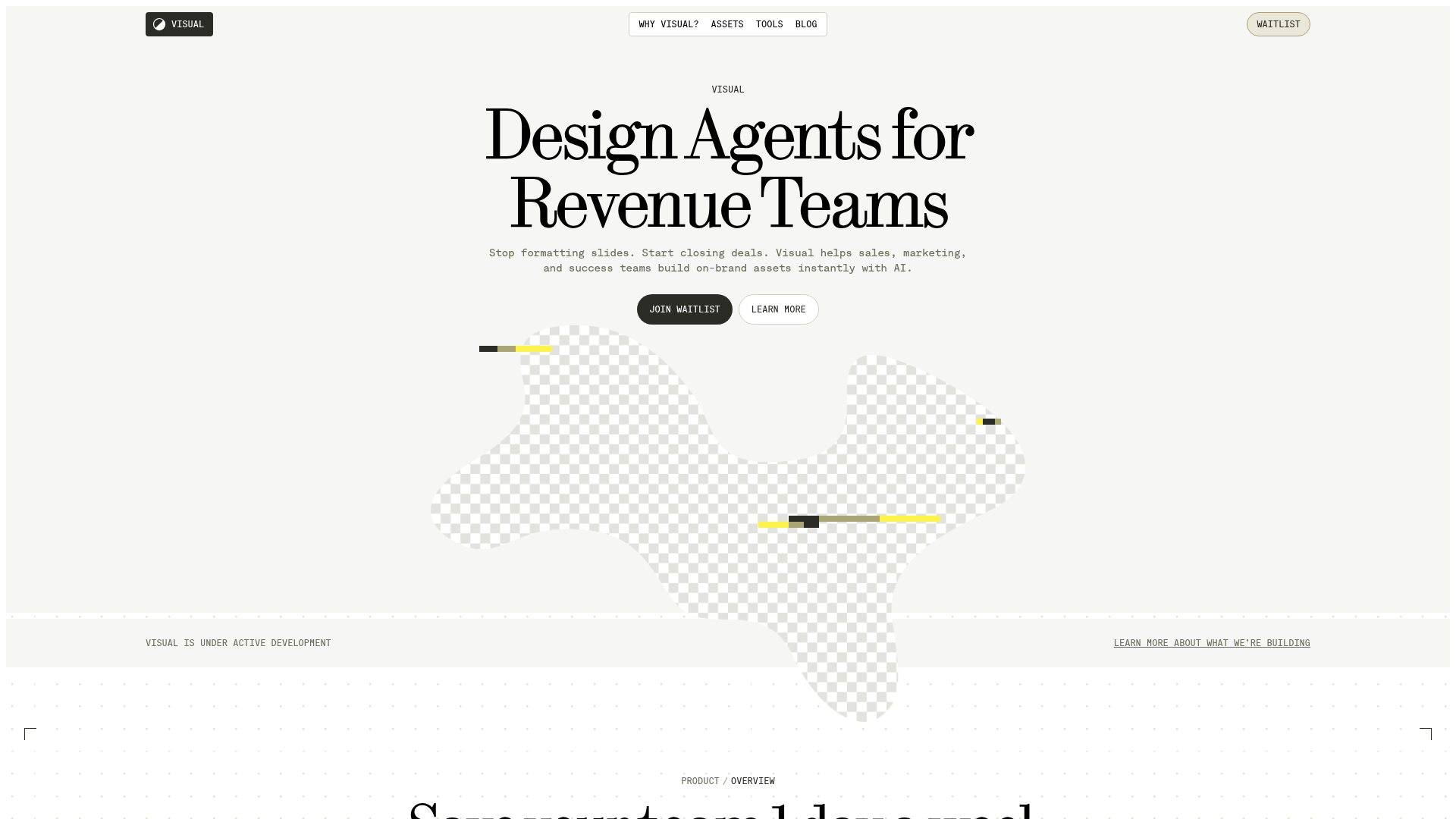
Visual AI Landing Page Templates
A high-end SaaS layout featuring a serif-heavy typography system, bento-style product showcase grids, accordion-style feature blocks, and minimalist wireframe UI components.
