Propelle AI Minimal Auth Page
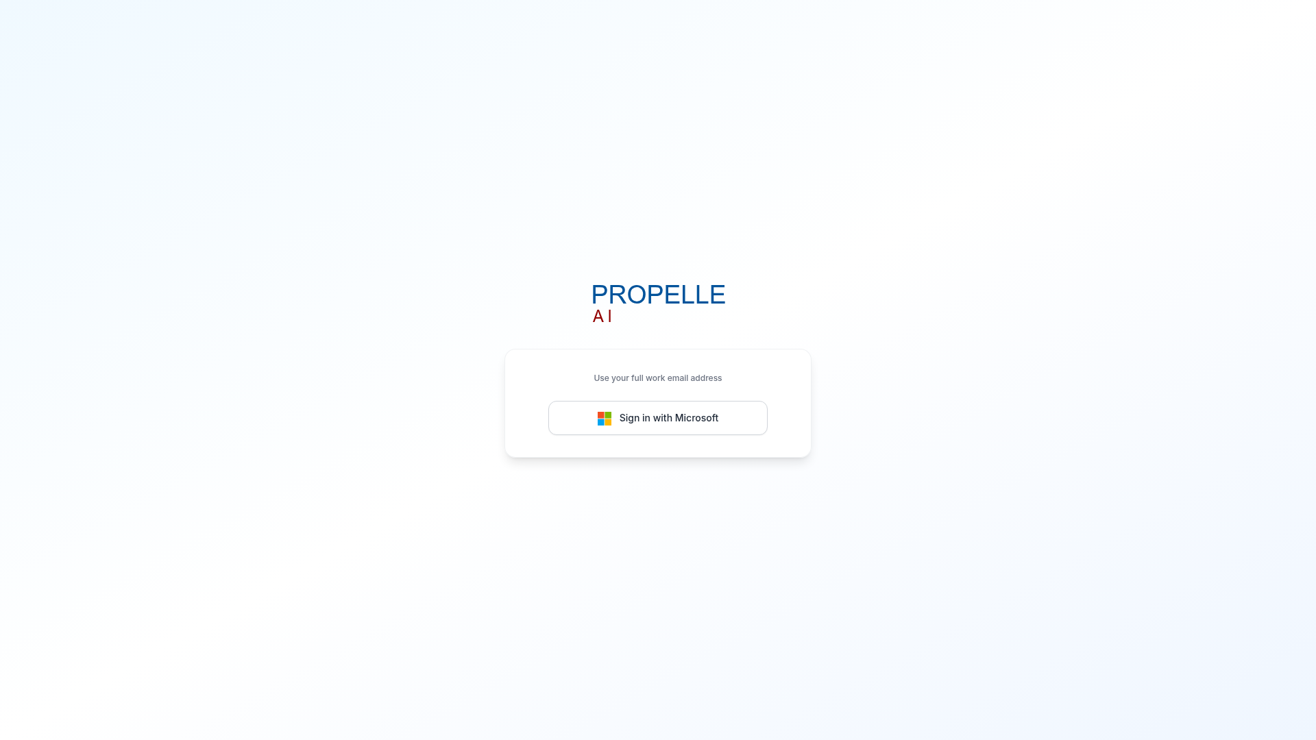
A clean, centered authentication layout featuring a backdrop-blur card, Microsoft OAuth button, and CSS gradient background.
Overview
This is a hyper-minimalist authentication portal for Propelle AI, utilizing a centered card layout on a soft gradient background. It serves as an excellent reference for builders wanting to implement a clean Microsoft-first OAuth experience while maintaining a high-end, professional enterprise aesthetic.
Design System
- Color Palette & Visual Hierarchy: The design uses a subtle
bg-gradient-to-brfeaturing "marine-50" and "primary-50" (soft blues/whites), creating a calm, airy atmosphere. The central focus is a white login card that stands out via abackdrop-blurand a lightgray-200/60border. - Typography: The interface utilizes a clean sans-serif stack. It emphasizes hierarchy through small-caps styling for the "AI" brand text (red) and
text-xs font-mediumfor instructional micro-copy ("Use your full work email address") in a secondary gray shade. - Page Structure: A simple vertical stack (Logo -> Instruction -> Action Button) centered both horizontally and vertically using Flexbox (
min-h-screen flex items-center justify-center). - Reusable Components:
- Auth Card: A
rounded-2xlcontainer with subtle shadowing and backdrop filtering. - Microsoft Button: A standardized OAuth button (
rounded-xl) with amin-w-[320px]constraint to ensure significant presence on desktop while remaining responsive.
- Auth Card: A
- Interactions: Based on the HTML, the button includes
transition-colorswith a light hover state (hover:bg-gray-50) and a focused ring offset for accessibility. - Mobile Behavior: The layout is responsive via Tailwind utilities (
w-full max-w-sm sm:max-w-md), ensuring the auth card scales appropriately for smaller screens while maintaining centered padding (px-4).
Use Cases
- Who should clone this: Developers building Internal Tools, B2B SaaS, or Enterprise platforms that rely exclusively on SSO/Microsoft identity providers.
- Effective Remixes: This pattern is perfect for quick status pages, minimal "Under Construction" sign-ups, or dedicated admin dashboard login screens.
- Remix Directions: Replace the Microsoft OAuth button with Google, Slack, or GitHub equivalents. The background gradient can be easily swapped for brand-specific colors or a dark-mode variant by updating the Tailwind gradient utility classes.
- Clone Scope: A full-page clone is recommended as the entire layout is concise enough to serve as a standalone boilerplate for an authentication route.
Related Inspirations
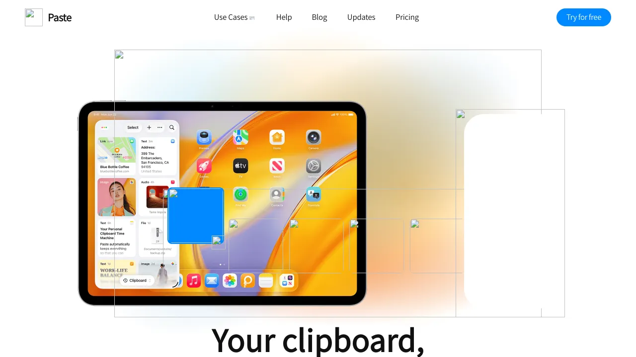
Paste Landing Page Product Showcase
A clean SaaS landing page featuring a modern navigation bar, centered typography, and a large tablet-focused product hero section with multi-layered visual overlays.
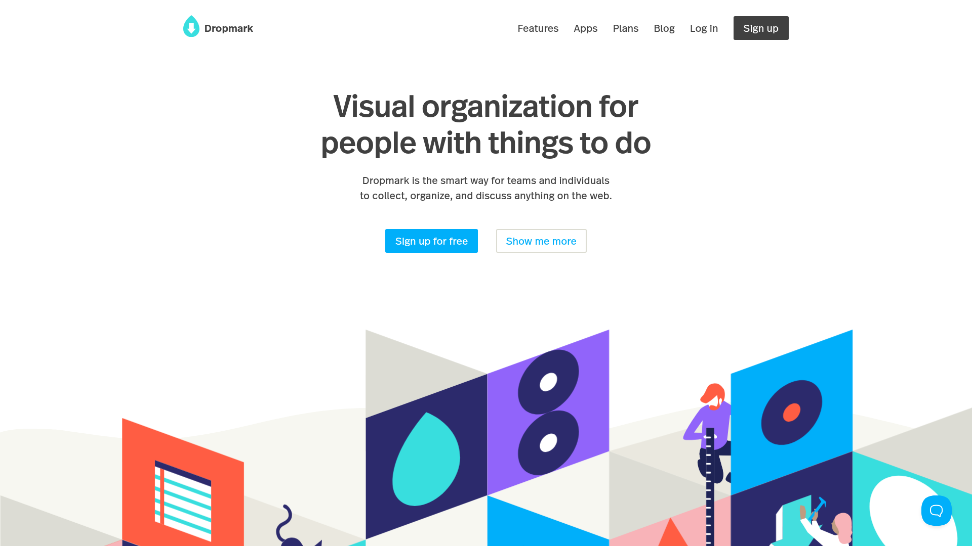
Dropmark Visual Organization Landing Page
Features a clean minimalist hero section with split-action buttons, a vibrant vector illustration footer, and an interactive horizontal flickity carousel for case studies.
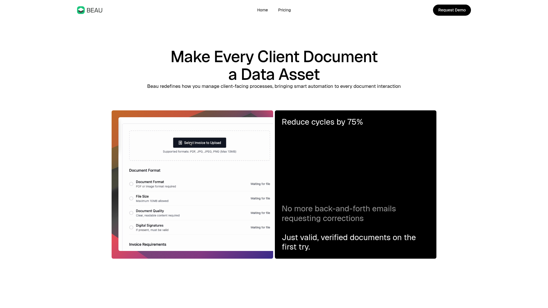
Beau Document Automation Landing Page
A modern software landing page featuring a bento-grid layout, split-screen hero assets with animated checkmarks, a step-by-step process guide, and a clean two-tier pricing table.
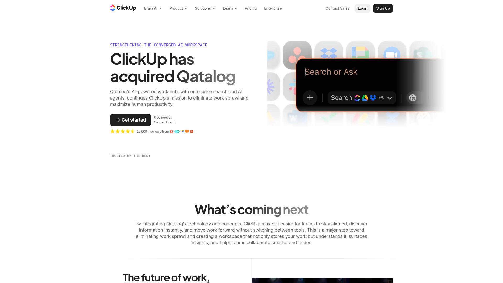
ClickUp Acquisition Hero Landing Page
Features a modern dark-themed hero section with a search UI graphic, bento-style feature grid, and a high-contrast CTA section with decorative gradients.
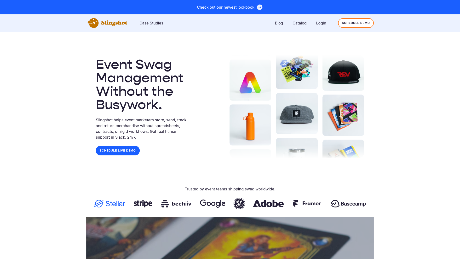
Slingshot Event Swag Hero and Logos
A clean SaaS landing page featuring a split hero layout with promotional product imagery, a call-to-action button, and a monochrome brand logo trust bar.
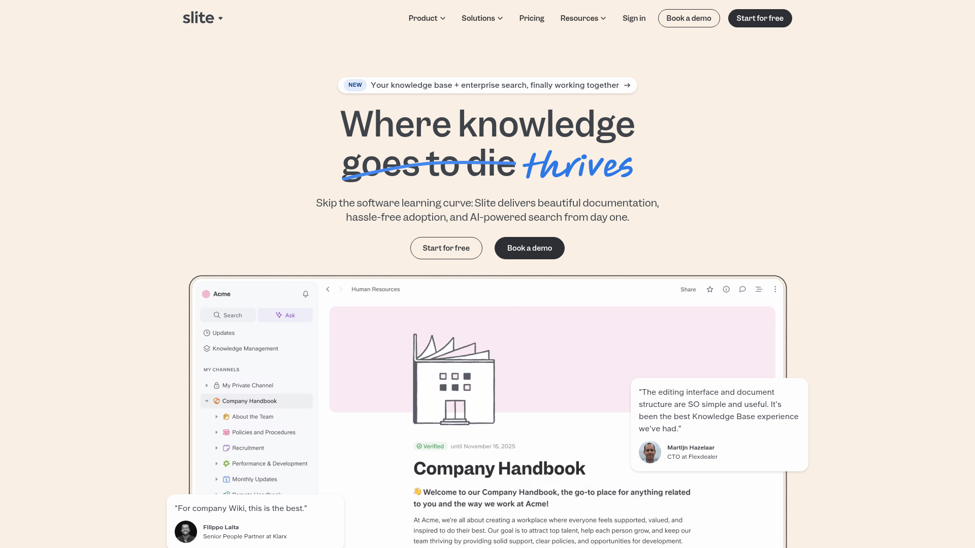
Slite SaaS Knowledge Base Landing Page
A clean SaaS hero section with a conversational headline, secondary call-to-action buttons, and a structured software interface preview featuring user testimonials.
