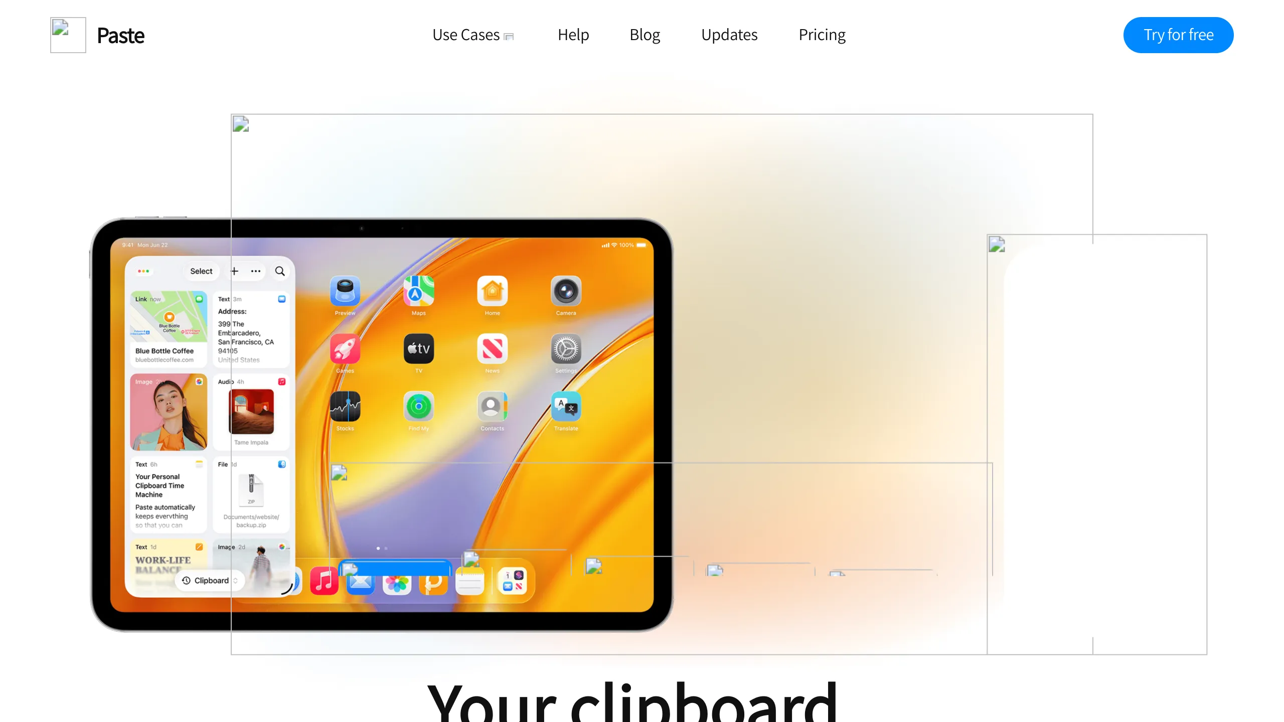
Paste Landing Page Product Showcase
A clean SaaS landing page featuring a modern navigation bar, centered typography, and a large tablet-focused product hero section with multi-layered visual overlays.
Overview
This is the landing page for Paste, a desktop and mobile clipboard manager designed for productivity. It serves as a strong clone reference for its sophisticated use of multi-layered hero visuals and a clean, high-contrast bento-style layout that effectively showcases software features across different device contexts.
Design System
- Color Palette & Visual Hierarchy: The design uses a clean white and soft gray base (
rgba(255, 255, 255, 0.8)for headers) with vibrant accent colors used for categorization: blue for "Collaborate" (rgb(0, 136, 255)), green for "Organize" (rgb(82, 204, 100)), and purple for "Search" (rgb(182, 99, 224)). Visual hierarchy is established via oversized typography and high-detail product mockups. - Typography: The site utilizes a modern sans-serif stack (system-default) with a clear scale. H1 titles are bold and significantly larger than body text, often using linear gradients (e.g., orange-to-yellow) to draw attention to value propositions.
- Page Structure & Flow: The sequence starts with a high-impact hero section containing a multi-layered iPad mockup. This is followed by a series of feature blocks categorized by "Keep," "Search," "Organize," and "Collaborate," concluding with a section on user segments (Developers, Designers, etc.) and social proof (testimonials).
- Reusable Components:
- Navigation Bar: A sticky header with a frosted glass effect (
backdrop-filter: blur(10px)) and sophisticated multi-level dropdowns. - Action Buttons: Rounded pill-shaped buttons with distinct hover states (
border-radius: 100px). - Feature Cards: The "Additional Features" section uses two-column blocks with specific border radii and card-based image containers.
- Navigation Bar: A sticky header with a frosted glass effect (
- Interaction Design: The HTML reveals a complex scroll-triggered system (e.g.,
Hero Image Zooming Scroll,Appearance of Block). Elements usewill-change: transformand opacity transitions to create a smooth, responsive feel as the user scrolls, particularly around the device mockups. - Mobile Behavior: The Framer-based structure includes explicit breakpoints for 1000px, 640px, and mobile, indicating a shift from horizontal multi-column layouts to vertical stacks for secondary features.
Use Cases
- Who should clone this: This pattern is ideal for SaaS companies, utility apps, or hardware startups that need to demonstrate a multi-device ecosystem (Mac, iPhone, iPad) simultaneously.
- Effective Remixes: Productivity tools or creative software can remix the visual overlays by replacing the clipboard elements with their own specific UI states (e.g., task cards, layers, or code snippets).
- Remix Directions: Builders can adapt the information architecture by reusing the high-fidelity navigation and hero structure while simplifying the scroll-triggered animations for faster loading. The "People Everywhere Love Paste" testimonial grid is a highly reusable pattern for any B2C service.
- Suggested Scope: A full-page clone is recommended to capture the sophisticated scroll-triggered narrative; however, the navigation component and the icon-text feature grid (found in the "Directions" section) are excellent candidates for standalone section cloning.
Related Inspirations
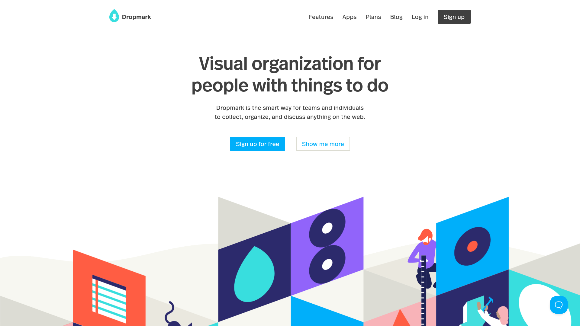
Dropmark Visual Organization Landing Page
Features a clean minimalist hero section with split-action buttons, a vibrant vector illustration footer, and an interactive horizontal flickity carousel for case studies.
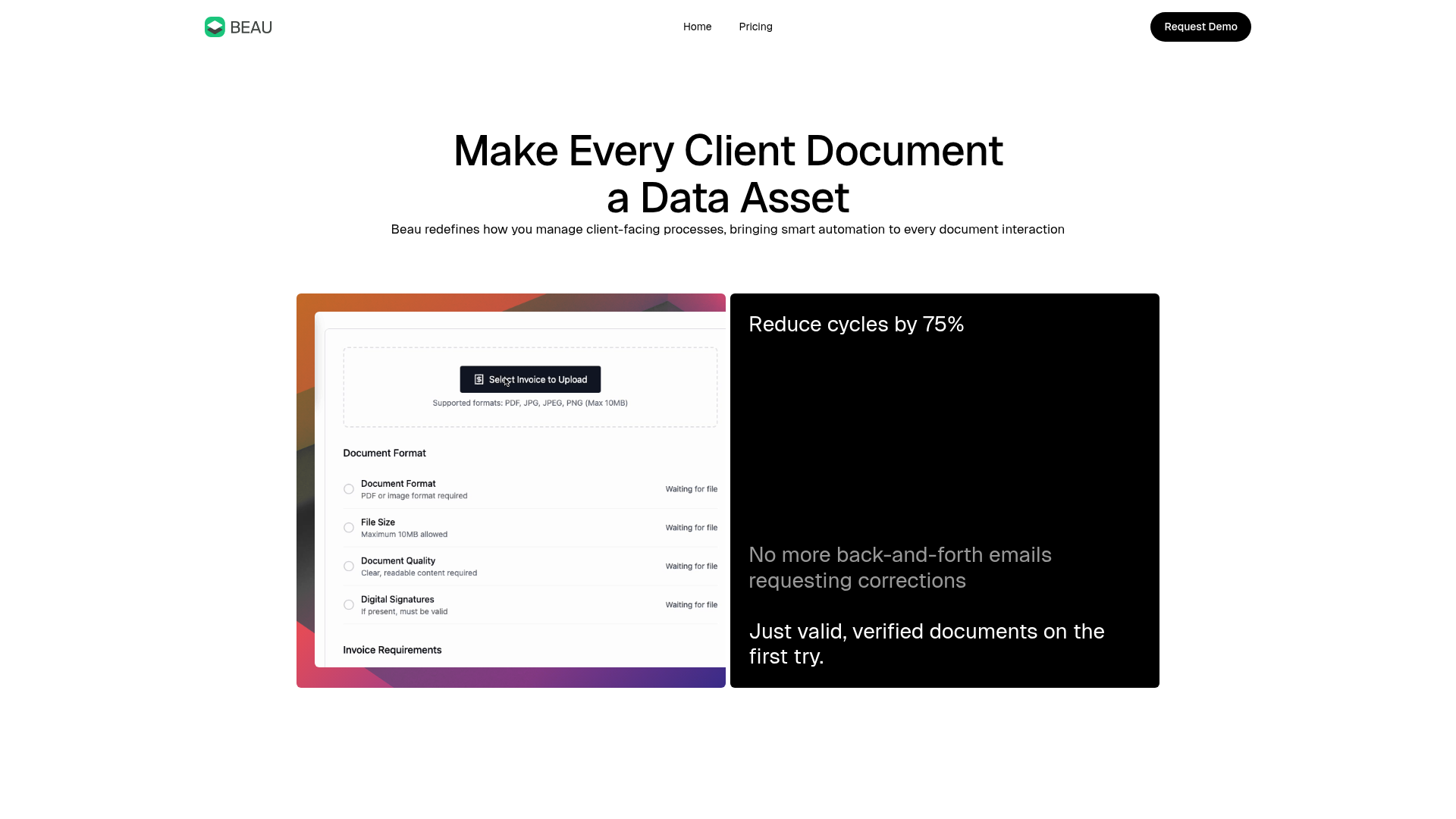
Beau Document Automation Landing Page
A modern software landing page featuring a bento-grid layout, split-screen hero assets with animated checkmarks, a step-by-step process guide, and a clean two-tier pricing table.
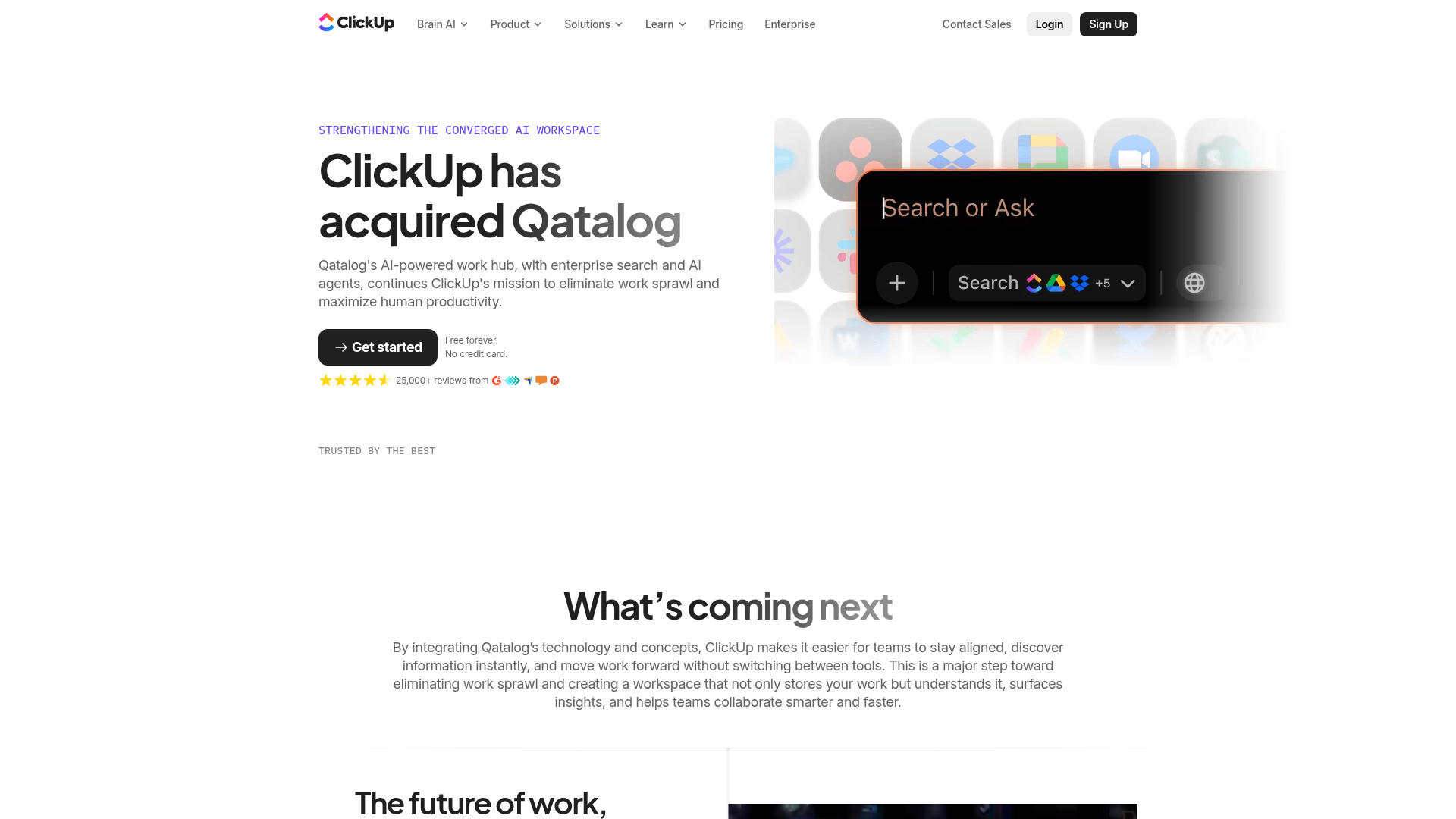
ClickUp Acquisition Hero Landing Page
Features a modern dark-themed hero section with a search UI graphic, bento-style feature grid, and a high-contrast CTA section with decorative gradients.
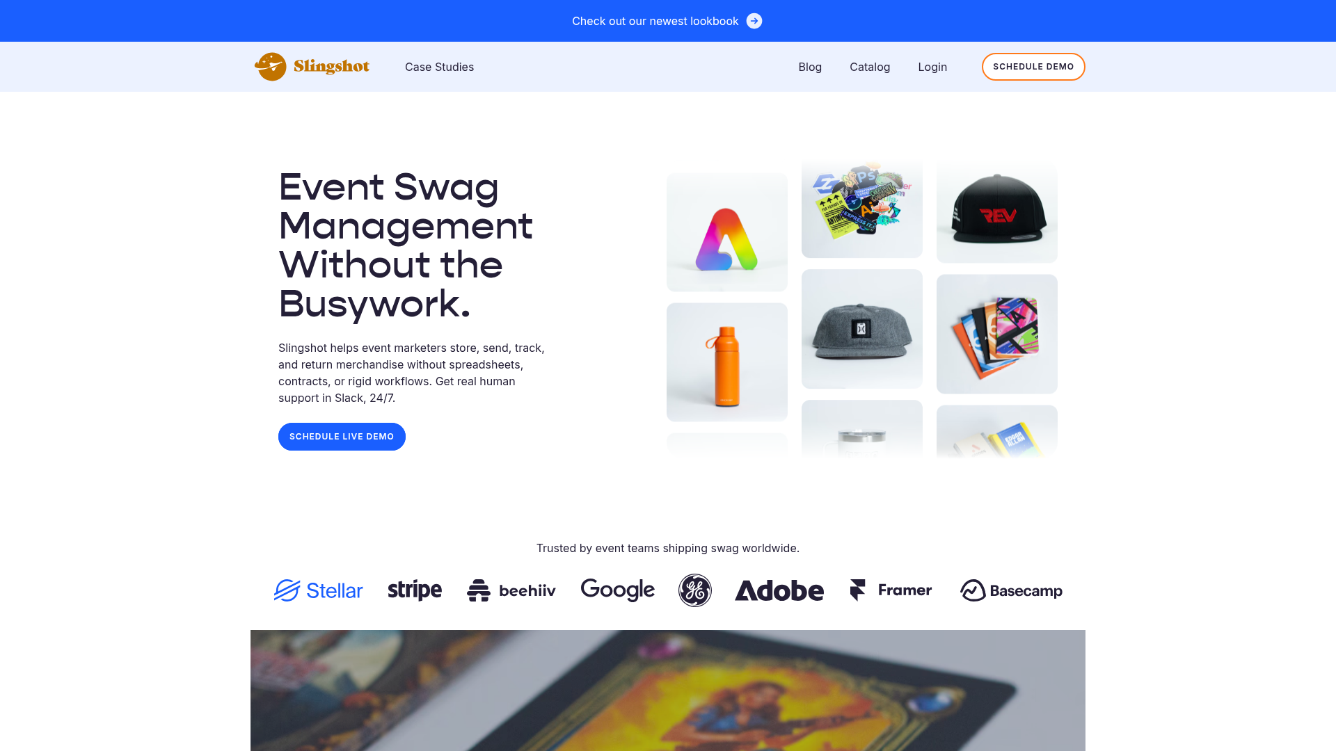
Slingshot Event Swag Hero and Logos
A clean SaaS landing page featuring a split hero layout with promotional product imagery, a call-to-action button, and a monochrome brand logo trust bar.

Slite SaaS Knowledge Base Landing Page
A clean SaaS hero section with a conversational headline, secondary call-to-action buttons, and a structured software interface preview featuring user testimonials.
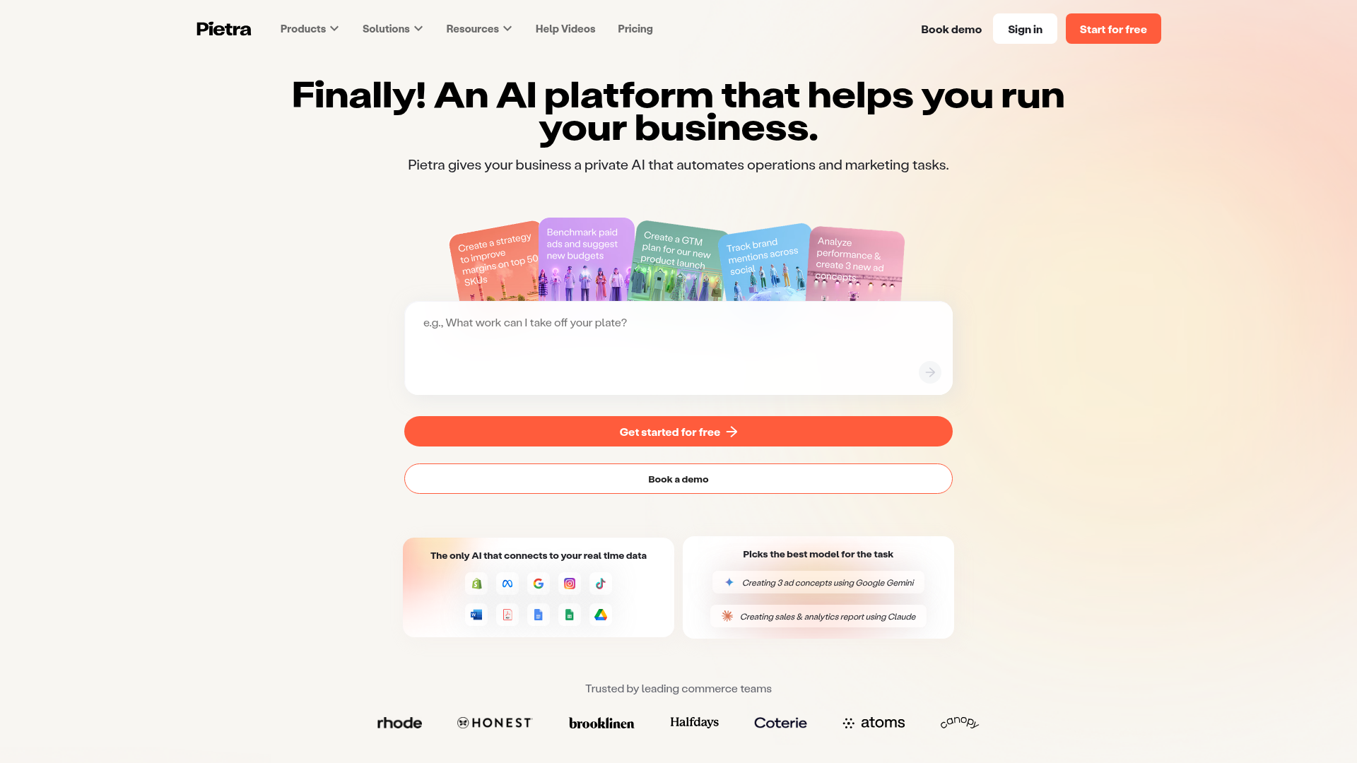
Pietra AI Platform Landing Page
A commerce-focused landing page featuring a centralized AI input hero, colorful floating value-prop cards, a bento-style integration showcase, and tabbed feature sections with side-by-side comparisons.
