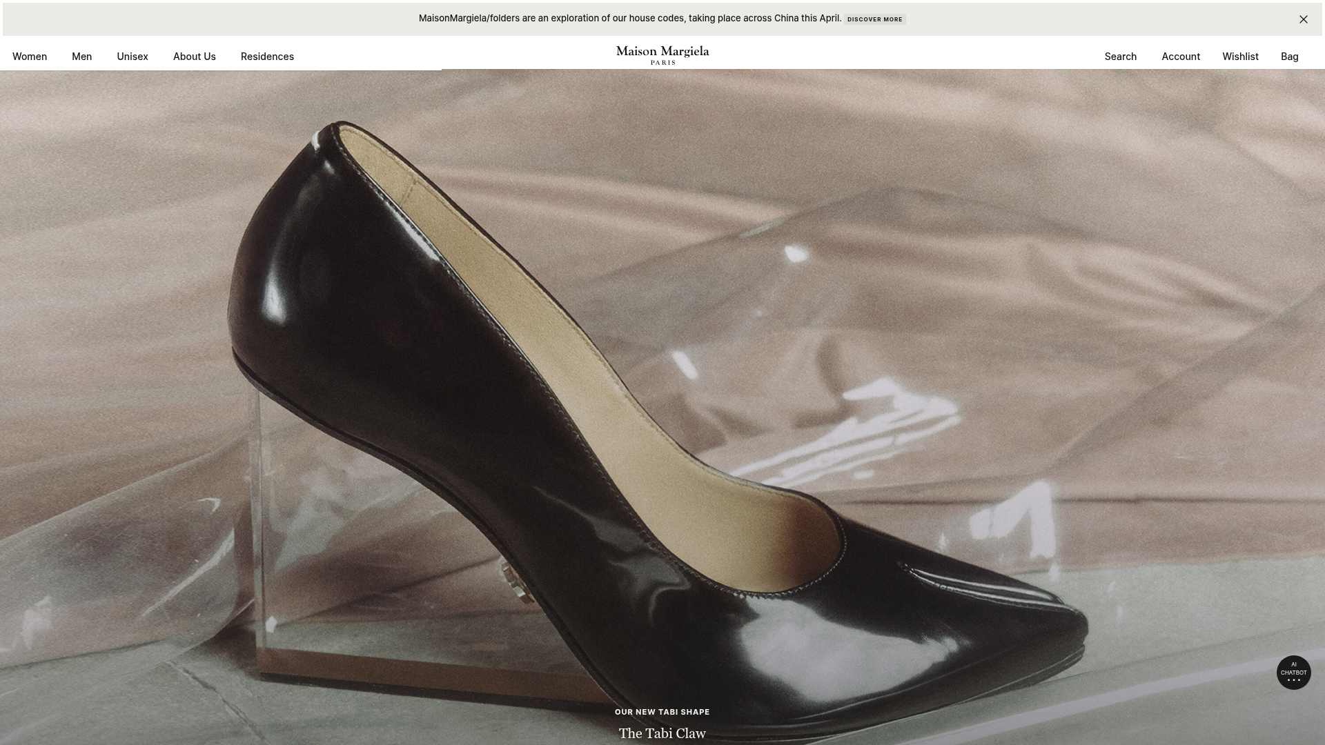
Maison Margiela Luxury E-commerce Landing
A high-fashion storefront featuring full-width immersive hero imagery, a clean swiper product carousel, and alternating two-column editorial content blocks with minimal typography.
Overview
This website is a premier example of luxury e-commerce design, utilizing a minimalist "white cube" aesthetic to foreground high-end fashion products. It is a strong reference for builders because it demonstrates how to balance immersive full-width media with a highly structured, whitespace-driven layout that feels both editorial and functional.
Design System
- Color Palette & Visual Hierarchy: The palette is strictly monochrome (pure white backgrounds
#FFFFFF, black text, and subtle grey accents) to ensure product photography provides the only color. Hierarchy is established through image scale and a vertical stack that alternates between hero banners and structured grids. - Typography: Features a clean, sophisticated serif for main headlines (e.g., "The Tabi Claw") and a minimalist sans-serif for navigation and metadata. Emphasis is achieved through generous letter-spacing and varied font weights rather than multiple colors.
- Page Structure & Section Flow: The layout follows a linear narrative: a thin promotional banner at the top, a centered logo/nav bar, followed by a full-bleed hero image. This transitions into a horizontal product swiper, then alternating two-column "editorial" blocks (image on one side, text/CTA on the other), concluding with a philosophical brand statement.
- Reusable Components: Key items to clone include the sticky
headroomnavigation bar, theswiper-containerfor product carousels with custom bullet pagination, and thetwo-columns-componentwhich uses a flexible media-position-left/right class to create an alternating rhythm. - Interactions & Motion: The site uses a
MMParallaxComponentfor smooth scrolling effects andtext-gradientoverlays on images to ensure legibility of white text on varied backgrounds. The AI Chatbot is a persistent floating action button (FAB) in the bottom right. - Responsive Behavior: The HTML reveals a mobile-first approach using
ratio-mobile-3x4andratio-desktop-16x9classes, ensuring images adapt their aspect ratio to fill vertical mobile screens while maintaining high resolution throughsrcsetoptimization.
Use Cases
- Who should clone this: Designers building storefronts for luxury brands, independent fashion labels, or high-end architectural and interior design firms.
- Effective Remixes: Perfect for any product category where visual storytelling is more important than technical specs (e.g., perfumes, premium spirits, or high-end furniture).
- Practical Directions: Builders can reuse the two-column editorial layout but swap the serif font for a bold grotesk for a more streetwear or tech-focused vibe. The "AI Chatbot" balloon and floating trigger can be repurposed for lead generation or customer support in any industry.
- Clone Scope: A quick section clone of the editorial two-column grid is ideal for portfolio sites. A full-page clone is best for those needing a comprehensive, ready-to-use e-commerce landing page framework.
Related Inspirations
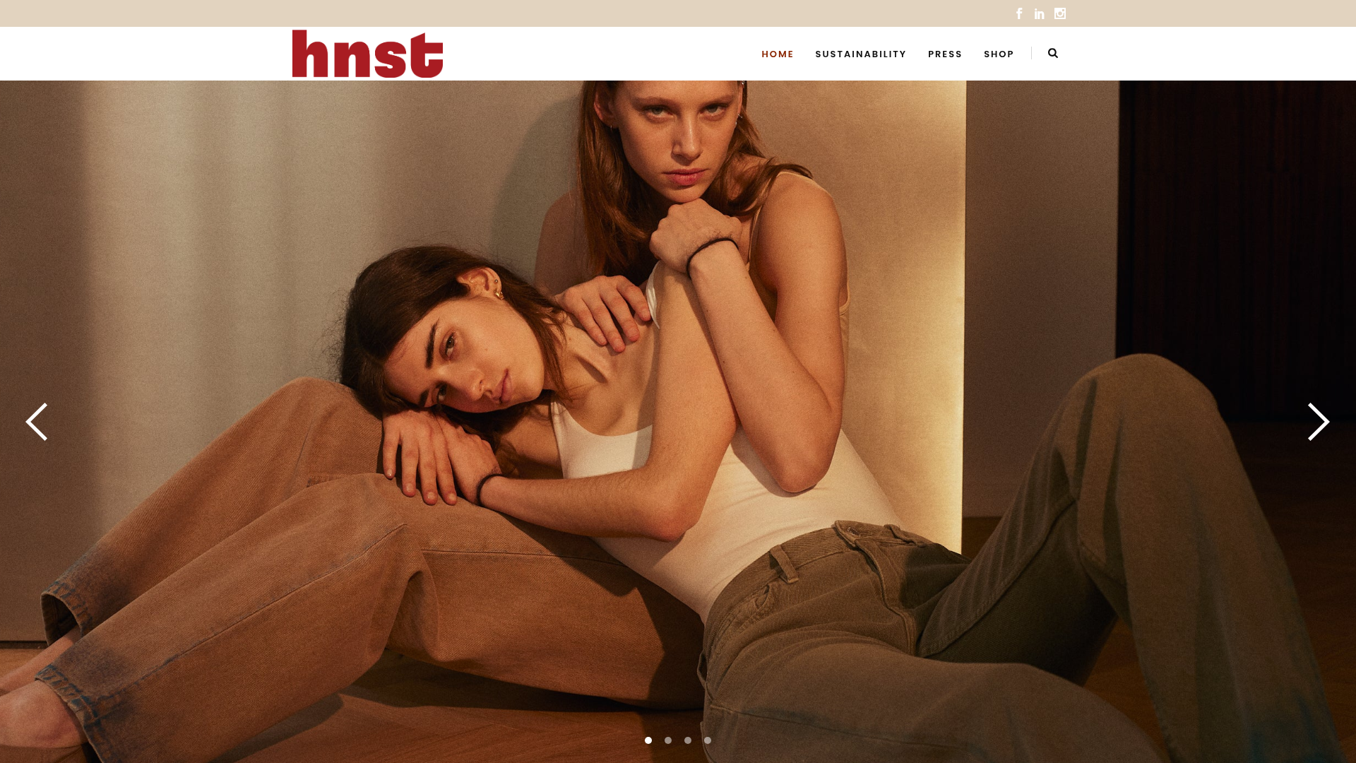
HNST Circular Fashion eCommerce Gallery
A minimalist apparel site featuring a full-screen image slider with parallax effects, grid-based product sections, and a clean typography-focused header for sustainable brand storytelling.

Context Gallery High-End Furniture Landing Page
A minimal editorial layout featuring a multi-column product carousel, designer biographies with image-text pairings, and a magazine-style content grid for curated design stories.

Glein Minimalistic Bento Grid eCommerce
A clean, modular layout using a bento-style responsive grid of text teasers and large-scale product imagery for lookbooks and collection browsing.
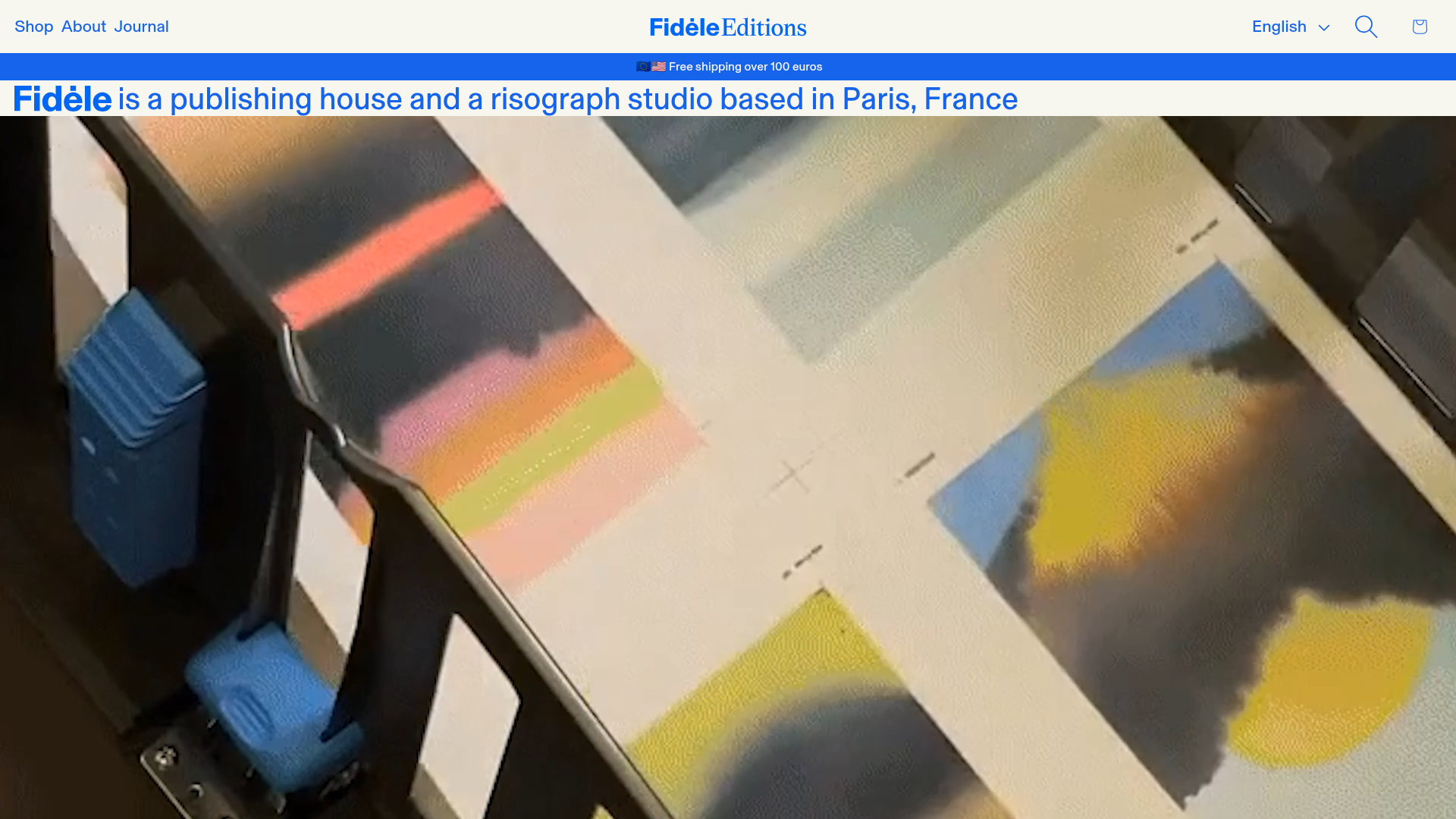
Fidèle Editions Art Studio Store
A minimalist e-commerce layout featuring a high-impact video hero, horizontal product carousels with hover-triggered image swaps, and a clean editorial-style blog section.
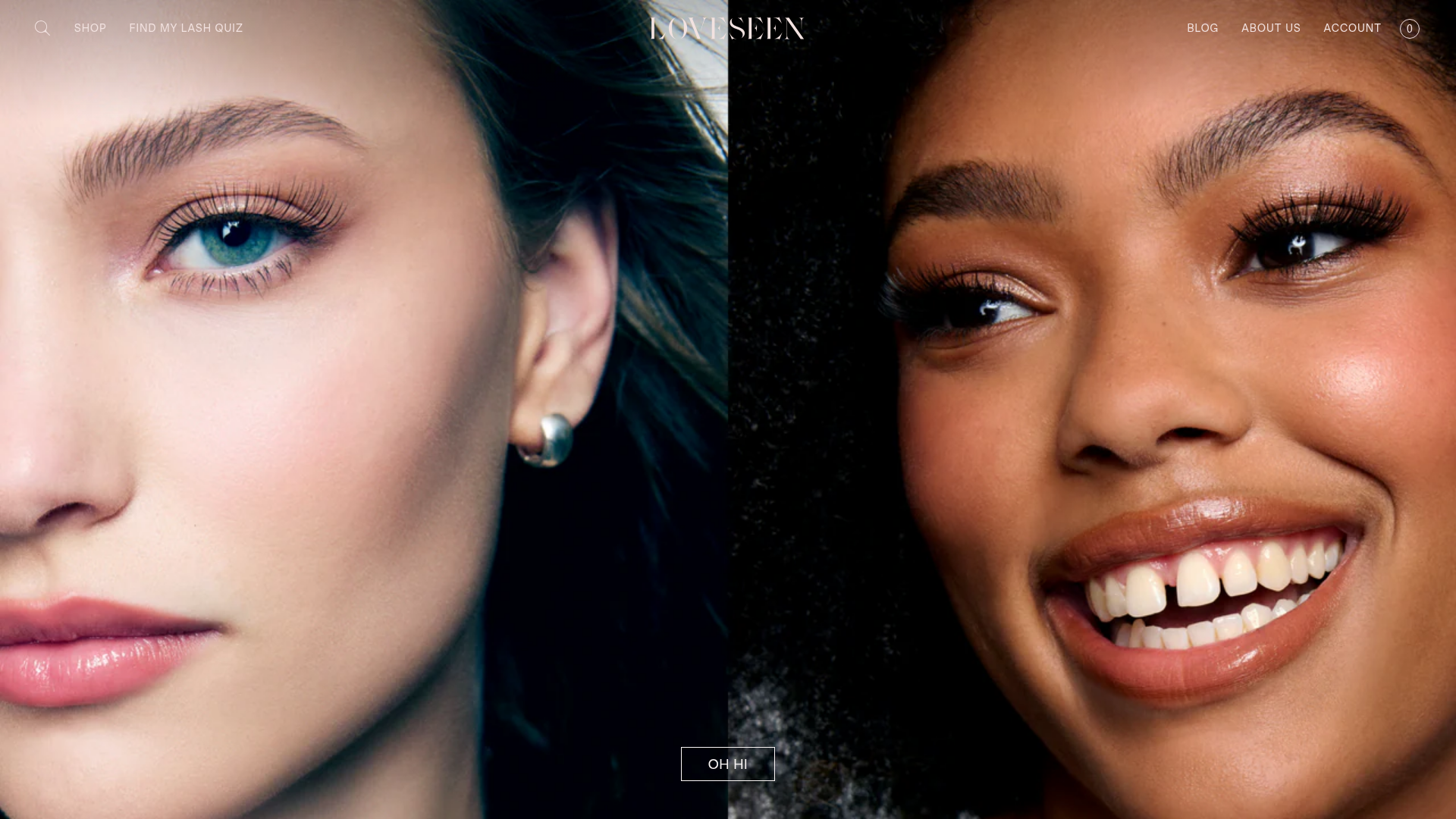
LoveSeen Beauty E-commerce Landing Page
A high-impact beauty retail site featuring a split-screen full-bleed hero image, minimalist navigation, and a horizontally scrolling user-generated content (UGC) Instagram slider.

Basic.Space E-commerce Gallery Clone
A minimalist product marketplace featuring a clean sticky navigation bar, nested flyout menus, and a horizontally scrollable product carousel with hover-state image switching.
