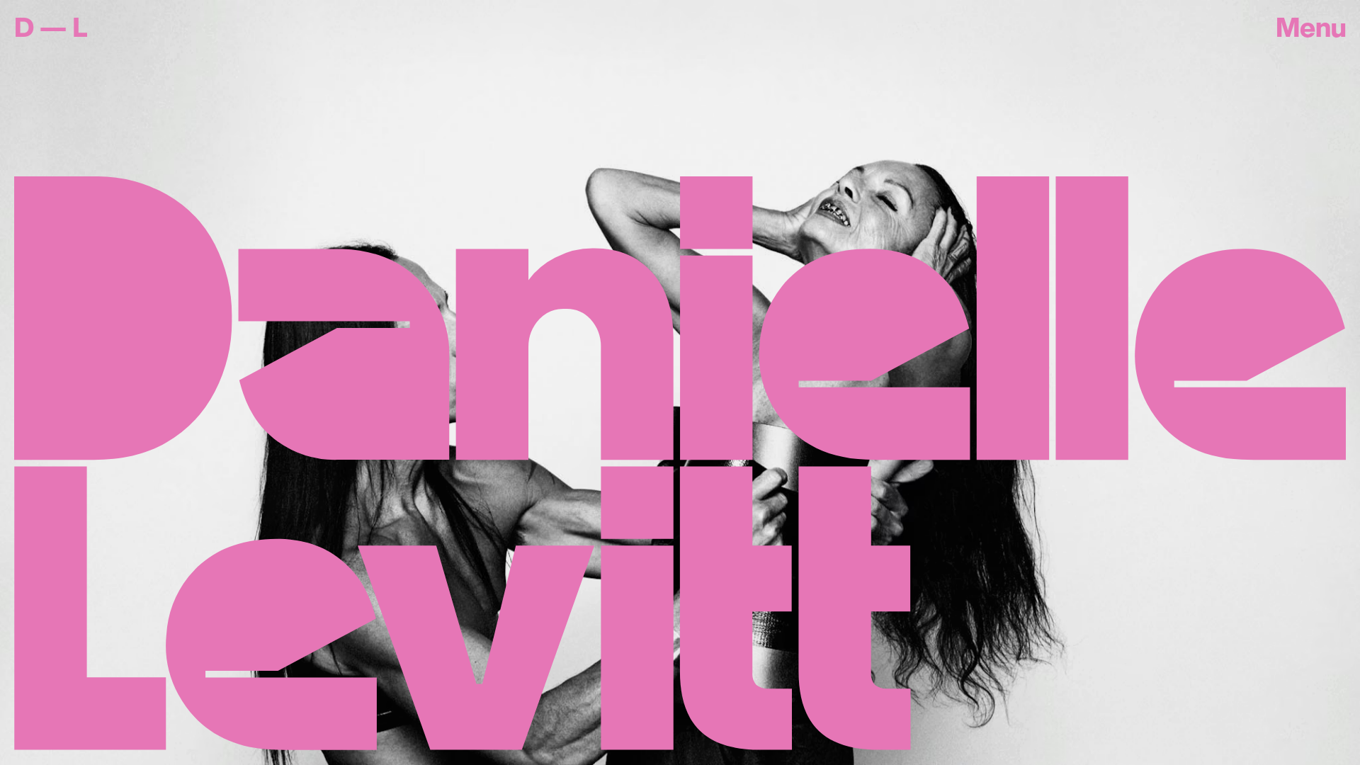
Danielle Levitt Portfolio Hero Layout
A high-impact photography landing page featuring giant typographic overlays, a full-screen image splash, and an interactive horizontal project slider with varied aspect ratios.
Overview
This portfolio landing page for filmmaker and photographer Danielle Levitt uses a high-impact, minimalist aesthetic centered around a bold typographic hero and immersive imagery. It is a premier reference for designers wanting to balance massive scale typography with a horizontal-scrolling image gallery that feels organic and non-rigid.
Design System
- Color Palette & Visual Hierarchy: The design relies on a high-contrast relationship between monochrome photography and a vibrant, changing palette of accent colors (e.g., #FE2BF7 pink as seen in the screenshot, or #E63E3E red as indicated in the data attributes). The oversized letters dominate the visual hierarchy, followed by the full-screen background image.
- Typography System: The brand identity uses an ultra-bold, condensed sans-serif for the logo and primary headings, designed with extremely tight kerning and overlapping characters to create a "block" effect. Body copy and utility links (Menu, D—L) use a clean, widely-spaced geometric sans-serif for legibility against busy backgrounds.
- Page Structure & Section Flow:
- Splash Hero: A full-screen container (
c-home__splash) featuring a responsive<picture>element and the giant name overlay. - Interactive Project Layer: A secondary layer (
c-home__items) containing absolute-positioned, floating image cards with varied aspect ratios that scroll horizontally. - Contact & About Grid: A structured footer-style section (
c-home__content-container) with a 12-column row layout for studio details, syndication, and social links.
- Splash Hero: A full-screen container (
- Reusable Components: The
c-home__itemcards are highly effective; they use varied widths (e.g., 18% to 27%) andtopoffsets to create a staggered, curated look. The minimalist navigation (D—L top left, Menu top right) is a classic pattern for high-end creative sites. - Interaction & Motion Patterns: The HTML reveals a
swup-transition-mainwrapper, indicating smooth page transitions. The layout usestranslate3dand CSStranslateproperties on project items, suggesting a parallax or horizontal-swipe interaction influenced by mouse movement or scroll. Data attributes suggest a dynamic theme-switching system that rotates through multiple background and logo color pairs. - Responsive Behavior: The HMTL uses
orientation: landscapeandorientation: portraitmedia queries within the hero<picture>tag, ensuring the high-impact photography remains centered and cropped correctly across different device ratios.
Use Cases
- Who should clone this: Photographers, directors, fashion brands, and creative agencies looking to make an aggressive visual statement upon entry.
- Effective Remixes: Artists can adapt the "staggered thumbnail" slider for architectural portfolios or high-end product showcases. The giant overlapping typography can be remixed as a mask for video backgrounds.
- Practical Directions: Replace the specific condensed font with a lighter serif for a more editorial, luxury feel. Use the data-theme system to change the site’s mood based on the specific project page being viewed.
- Clone Scope: A full-page clone is ideal to capture the relationship between the splash hero and the flowing gallery below. For a quick win, cloning the staggered
c-home__itemgrid provides a sophisticated alternative to standard masonry layouts.
Related Inspirations
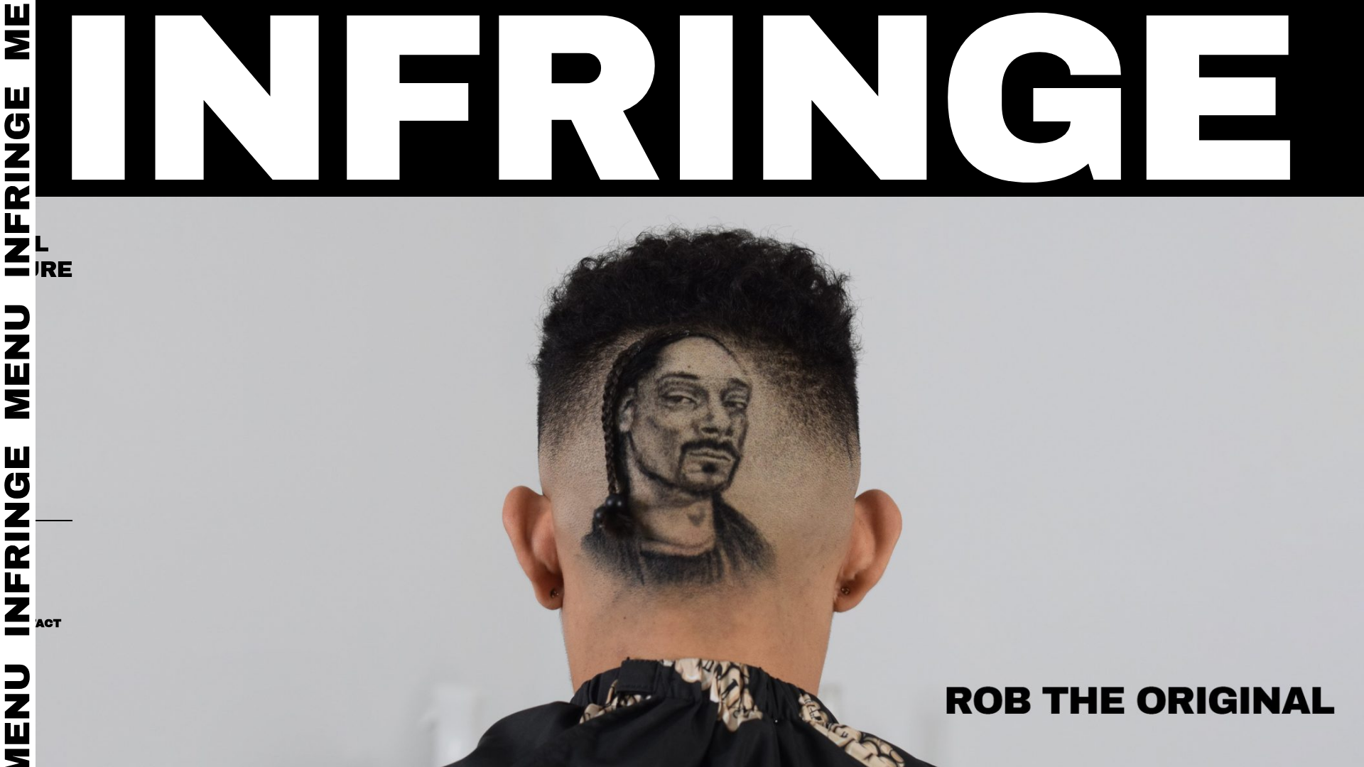
Infringe Hair Culture Portfolio Gallery
A minimalist, high-impact portfolio featuring a vertical sticky marquee sidebar and full-screen image scrolls that toggle between desktop and mobile assets.
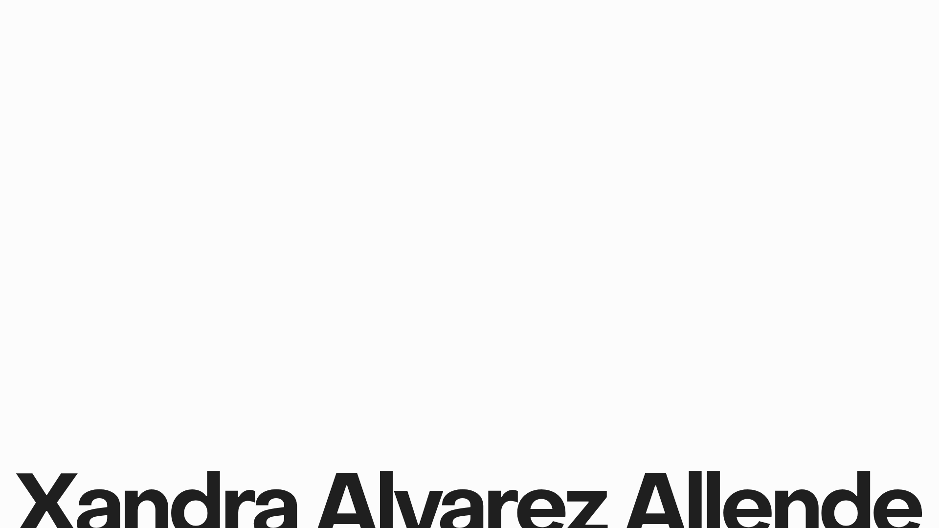
Xandra Alvarez Allende Photography Portfolio
A minimalist photography site featuring a marquee-style title bar, a staggered vertical image flow, and a full-screen light-box gallery for individual works.
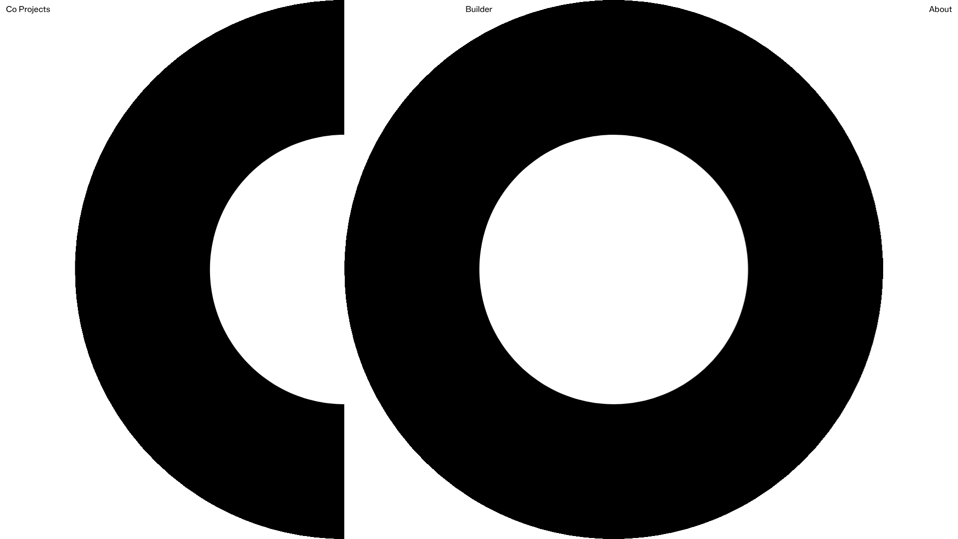
Co Projects Design Portfolio
Minimalist case study layout featuring a bold kinetic typography landing state, responsive staggered grid, sticky section headers, and a scroll-triggered image revealing interaction pattern.
Bruno Arizio Designer Portfolio Website
A minimalist creative director portfolio featuring a clean typographic layout, side-aligned image previews, and high-contrast spacing patterns suitable for luxury or design showcases.
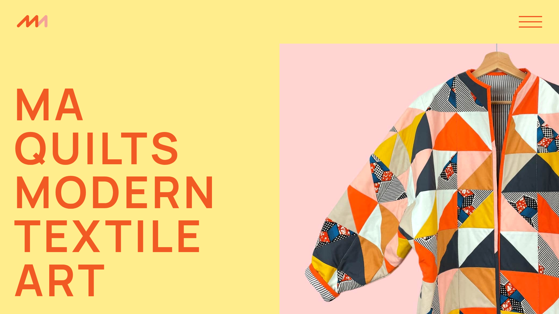
MA Quilts Textile Portfolio Site
A vibrant portfolio layout featuring a two-column animated hero, horizontal marquee text, and dynamic CMS-driven grid galleries for showcasing artistic products and blog posts.
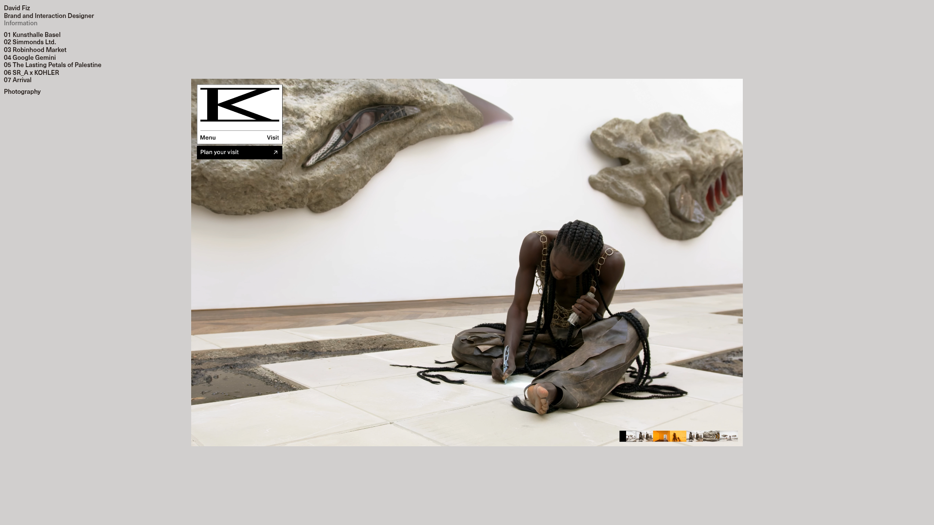
David Fiz Visual Design Portfolio
A minimalist portfolio featuring a fixed sidebar navigation paired with an immersive, full-screen media showcase and interactive project-specific image carousels.
