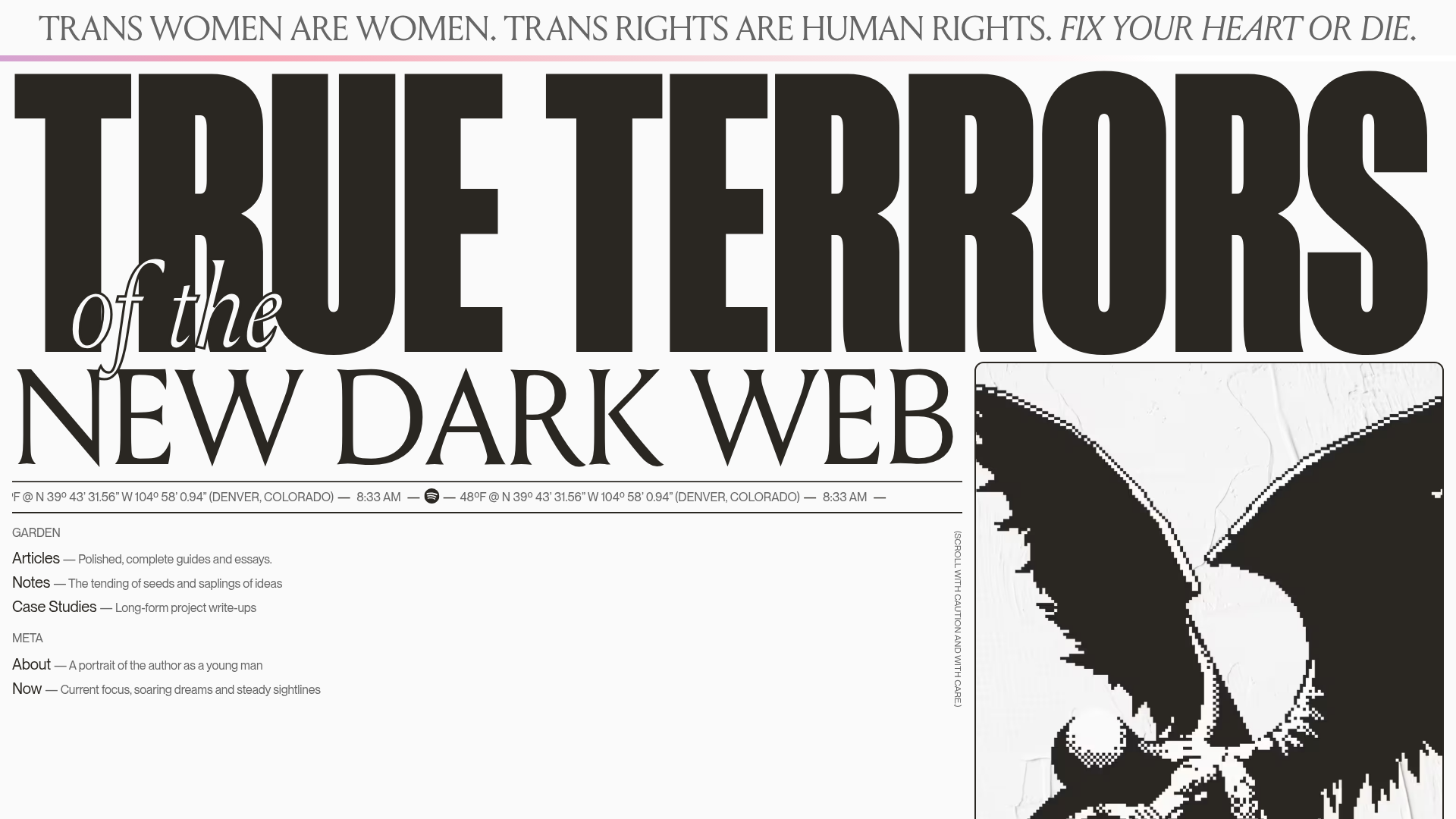
True Terrors Creative Developer Portfolio
A high-impact typography-driven portfolio featuring marquee animations, custom grid overlays, horizontal scroll case study rows, and a brutalist digital garden layout.
Overview
This high-impact creative developer portfolio utilizes a bold, brutalist aesthetic to showcase professional work and personal writing. It is a premier reference for builders looking to master extreme typography, horizontal scroll animations, and unconventional layout structures that prioritize personality and motion over standard corporate patterns.
Design System
- Color Palette & Visual Hierarchy: The palette is predominantly high-contrast monochrome (off-white and deep black) with subtle pink/blue gradients used in decorative accents. Hierarchy is established through massive font sizes and heavy black blocks that ground the layout.
- Typography: A striking mix of ultra-condensed heavy sans-serifs for headlines (
home-hero__title), elegant serifs for body copy and italics, and monospace for technical metadata. The hero section features a multi-layered typographic treatment where "of the" is set in a delicate script/serif style to contrast the brutalist main text. - Page Structure: The site follows a vertical flow with distinct themed sections: a heavy hero entry, a "Letter from the Editor" text block, an "About" section with a smooth horizontal marquee, and a dynamic "Selected Works" list that uses staggered horizontal offsets.
- Reusable Components:
- The Marquee: A robust
spotify-widgetand location/time ticker that usestransform: translate3dfor smooth performance. - Case Study Rows: Found in
.case-study-rows, these items use CSS variables (--factor,--coming-soon-width) to calculate horizontal parallax-like offsets based on scroll position. - Grid Overlay: A persistent
grid-overlaydiv with twelve cells provides a structured visual guide that reinforces the precision of the brutalist layout.
- The Marquee: A robust
- Interaction & Motion: High use of GSAP-style transforms. The
case-study-rowfeatures an "echo" effect where text repeats behind the main title, and the.article-block--clickablecomponents use clear state changes for navigation. The website notes a "Scroll with caution" warning, hinting at the heavy use of scroll-triggered repositioning. - Implementation Clues: Built with a modular structure using the
Taxilibrary for smooth client-side transitions (indicated bydata-taxiandrouter-target). The use of custom properties (CSS variables) for animation offsets suggests a highly performant, math-driven layout engine.
Use Cases
- Who should clone this: Creative developers, motion designers, and experimental digital artists who want a portfolio that functions as a technical demonstration of their CSS and animation skills.
- Effective Remixes: This layout is perfect for independent record labels, niche editorial magazines, or agency landing pages that want to convey a "New Dark Web" or avant-garde tech aesthetic.
- Practical Directions:
- Typography Swap: Replace the condensed sans-serif with a chunky display serif for a high-end fashion or editorial feel while keeping the scroll mechanics.
- Layout Adaptation: Reuse the
.case-study-rowslogic for a product catalog or a team member list where horizontal visual interest is needed.
- Suggested Scope: The hero section and marquee are excellent candidates for a quick section clone. A full-page clone is recommended only for those comfortable managing complex scroll-driven transforms and state-based transitions.
Related Inspirations
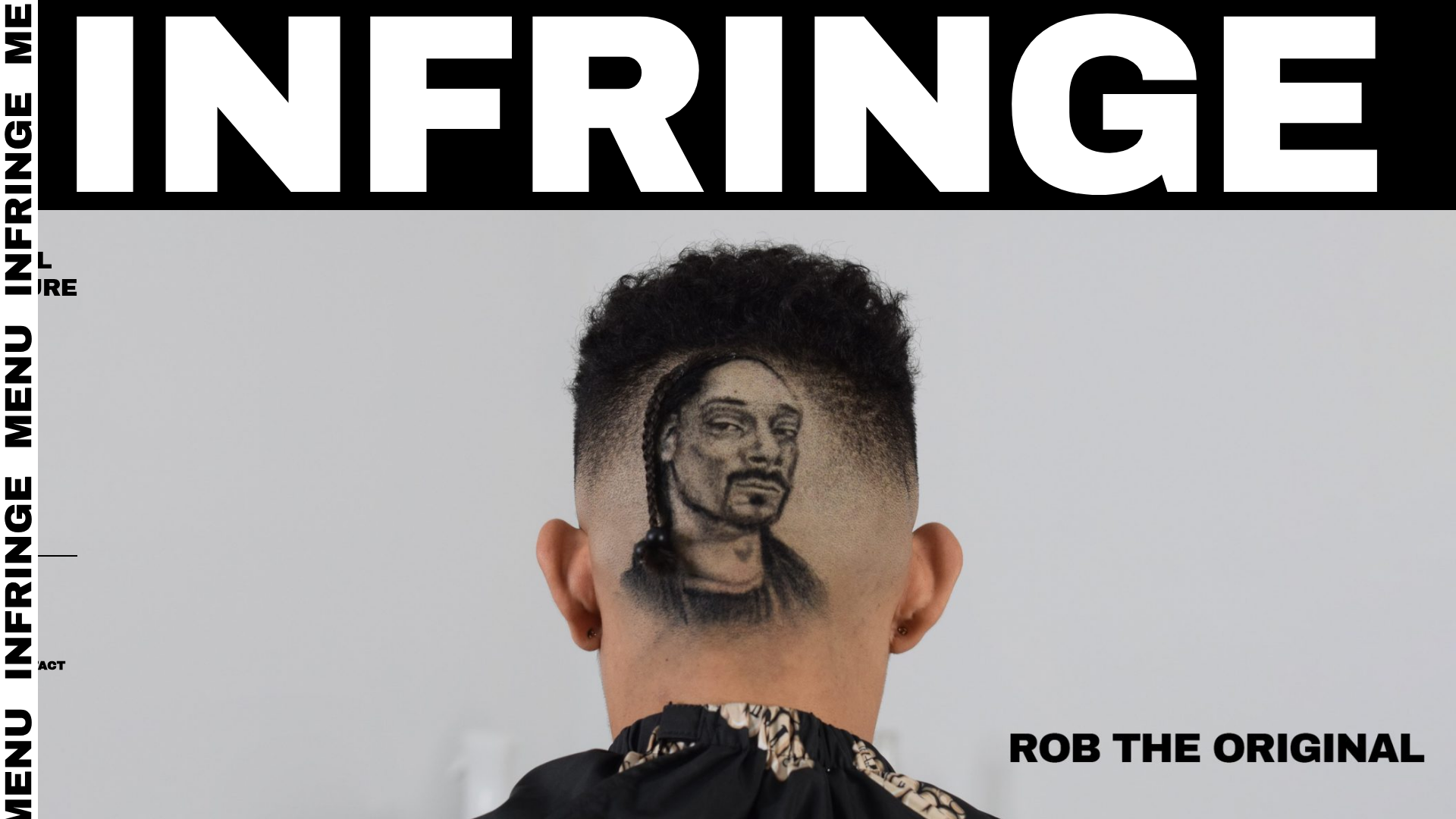
Infringe Hair Culture Portfolio Gallery
A minimalist, high-impact portfolio featuring a vertical sticky marquee sidebar and full-screen image scrolls that toggle between desktop and mobile assets.
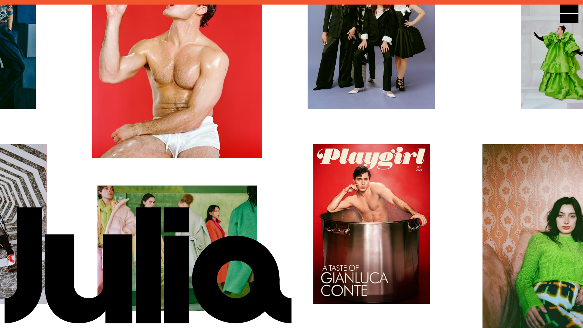
Julia Johnson Photography Portfolio Website
A creative portfolio featuring a masonry-style image grid, overlapping oversized typography, and a minimalist full-screen navigation overlay.
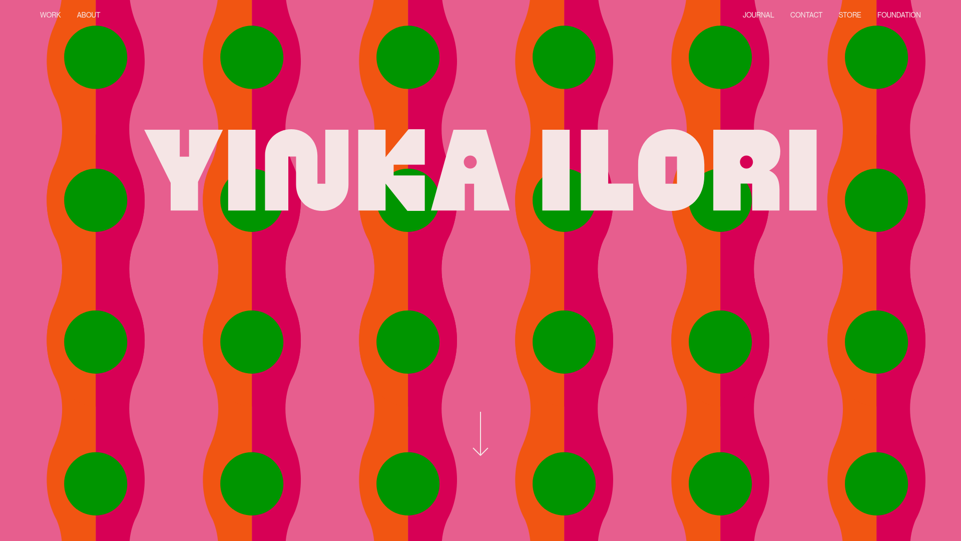
Yinka Ilori Portfolio Mosaic Grid
A vibrant portfolio featuring a scroll-activated parallax hero, bold typography, and a staggered mosaic image grid with asymmetric layouts and fade-in animations.
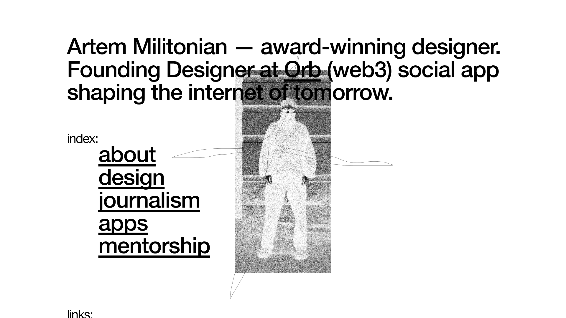
Artem Militonian Portfolio Landing Page
A minimalist, typography-focused designer portfolio featuring a layered grayscale hero image, staggered vertical navigation links, and a fixed header with utility data.
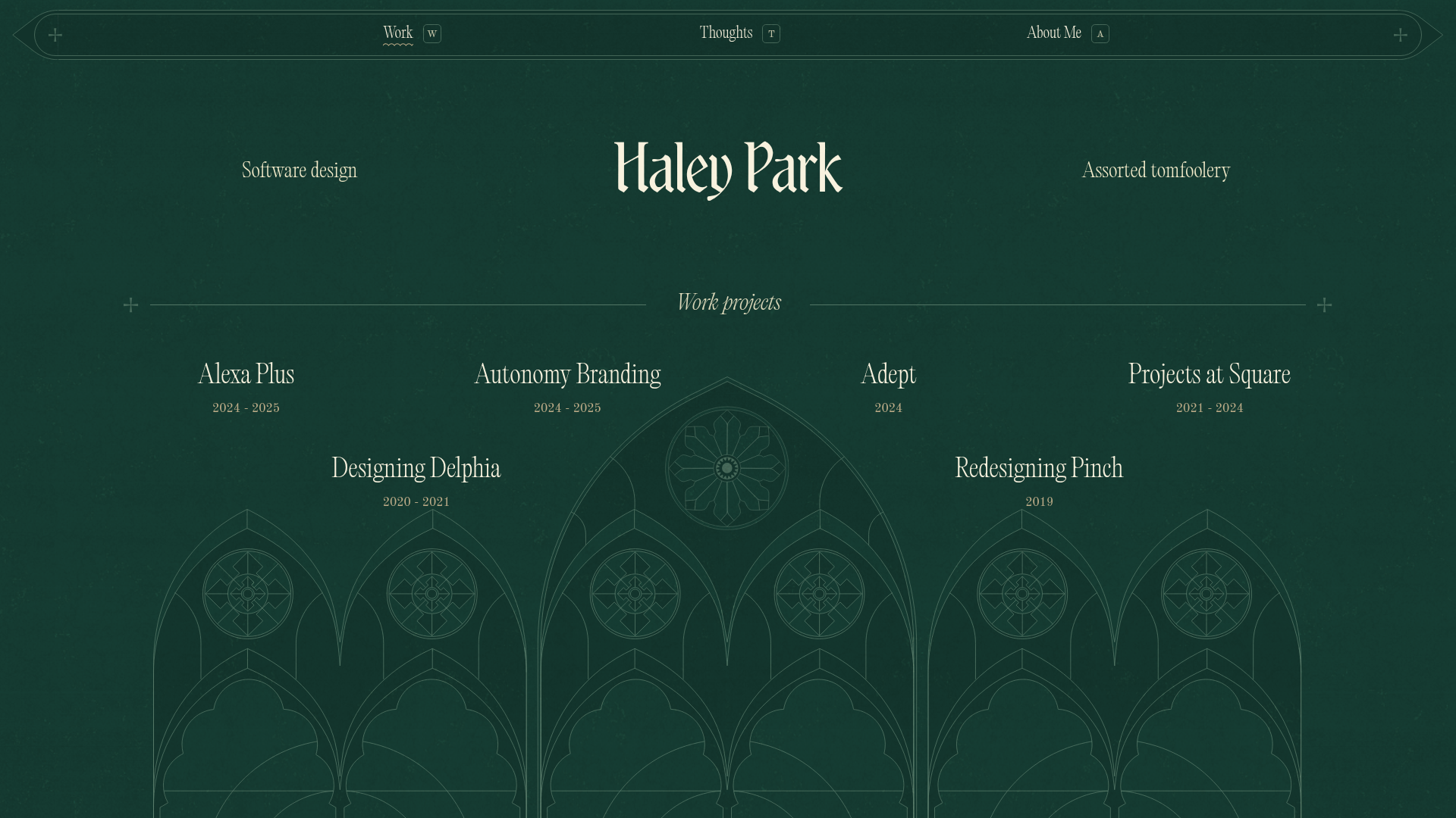
Haley Park Ornate Portfolio Landing
A dark-themed design portfolio featuring a Gothic architectural SVG background, editorial typography grid, and a project list with a subtle noise texture overlay.
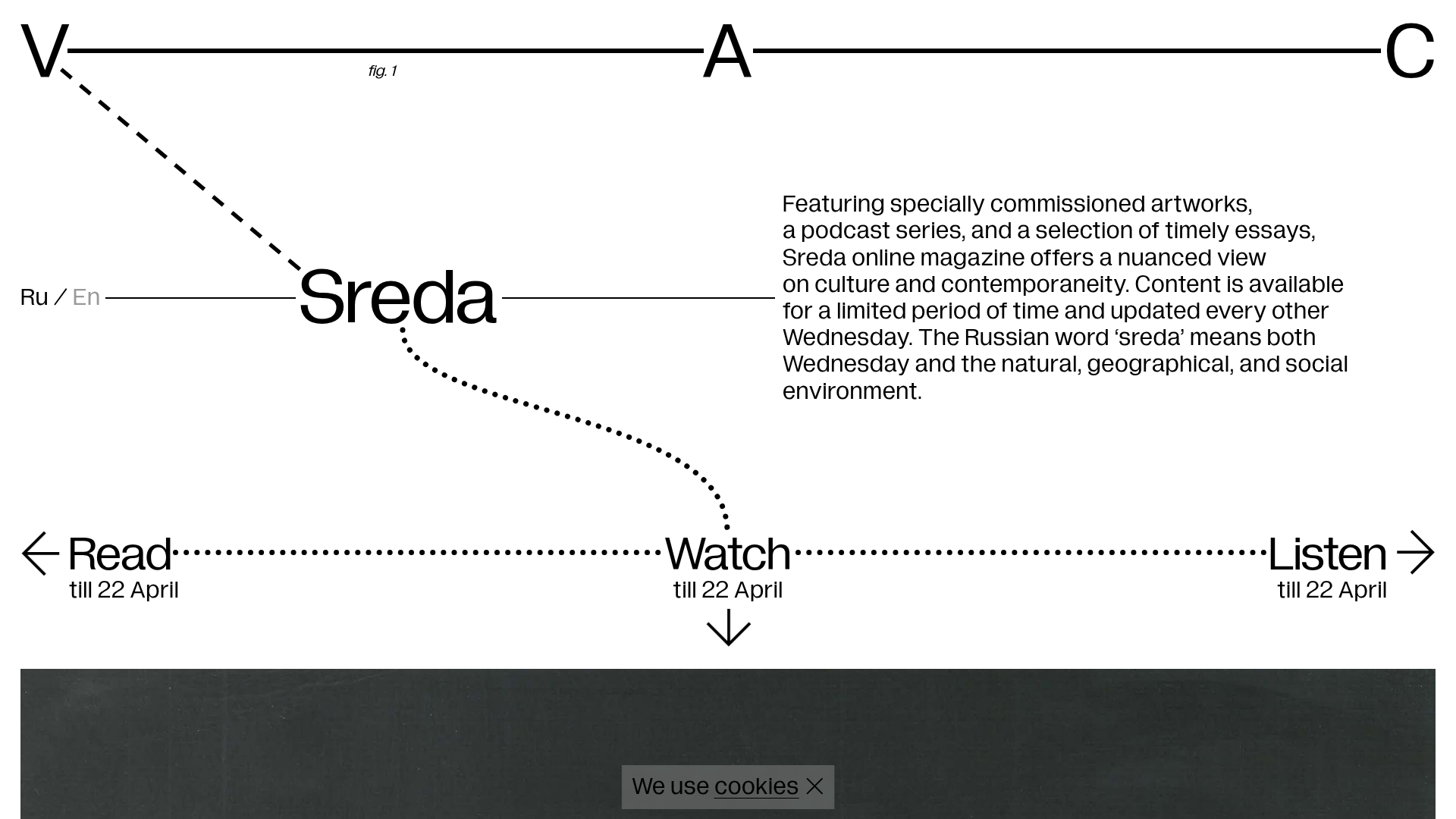
V–A–C Sreda Online Magazine Hub
Minimalist art magazine layout featuring a conceptual typographic header, interactive vertical navigation for mixed media content, and a clean grid for high-resolution archival imagery.
