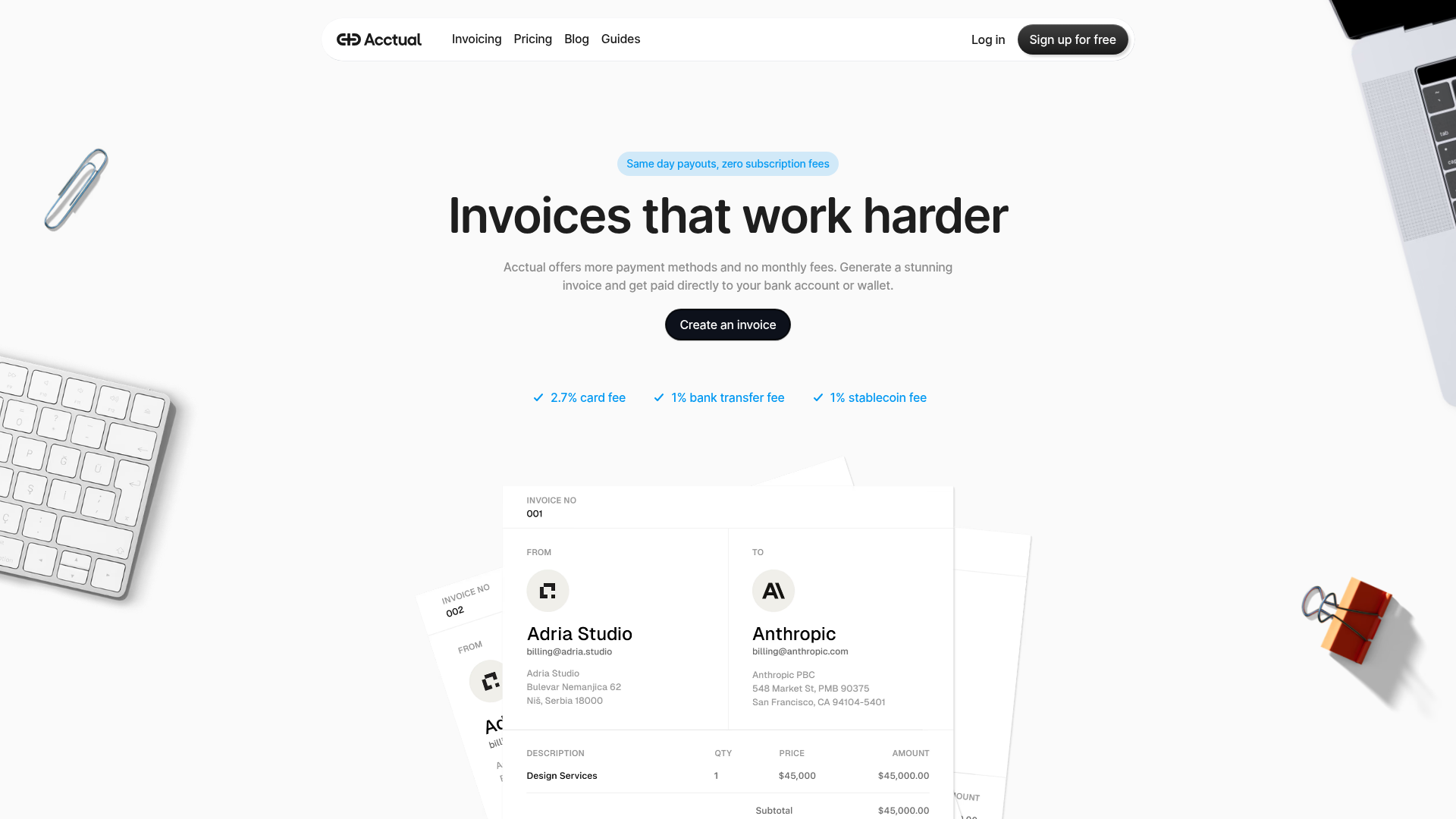
Acctual Payment Invoicing Landing Page
A clean SaaS landing page featuring a minimalist hero section, centered call-to-action, overlapping document cards, and a sleek top navigation bar.
Overview
Acctual provides a minimalist, high-conversion landing page specifically tailored for financial services and B2B SaaS. It is an excellent clone reference because of its balanced use of white space, clear typography hierarchy, and a modular hero section that manages to feel professional yet modern.
Design System
- Color Palette & Visual Hierarchy: The design uses a clean #FFFFFF background with high-contrast black (#111827) for primary typography and the main CTA. A soft sky-blue (#E0F2FE) is used for pill-shaped badges to draw attention to value propositions without breaking the monochromatic professional feel. Small blue accents are used for checkmarks and fee-related highlights.
- Typography: The header system features a bold, large-scale sans-serif for the H1 ("Invoices that work harder"). Subtext uses a medium-weight gray sans-serif for improved readability. Information on the invoice cards uses a strict grid-based typographic layout emphasizing labels (bold) versus data (regular).
- Page Structure: The layout follows a classic F-pattern: a sticky/fixed top navigation, a centered hero stack (badge, heading, subheading, CTA button, trust metrics), and a layered visual centerpiece consisting of overlapping invoice document elements to establish product context immediately.
- Reusable Components:
- Navigation: A floating-style white bar with a bold logo, utility links, and a primary "Sign up" button.
- Buttons: Pill-shaped, high-contrast buttons (Black background with white text) that include smooth hover states.
- Document Cards: Modular, shadows-based containers representing invoices—highly useful for dashboard or CRM previews.
- Pill Badges: Lightweight labels used for feature highlights above the main headline.
- Interaction Design: Transitions are subtle. The cards use z-index stacking and slight rotation (transform: rotate) to create depth without complex 3D assets.
Use Cases
- Who should clone this: Developers building B2B tools, fintech startups, or professional service platforms (consulting, legal, accounting) that need to convey trust and simplicity.
- Remixing for other products: This pattern works effectively for any document-based SaaS (Electronic signatures, HR portals, Project management). You can easily remix this by replacing the invoice graphical assets with dashboard widgets or terminal windows.
- Practical Remix Directions:
- Swap the monochrome palette for a brand-specific primary color (e.g., deep purple or forest green) while keeping the pill-button structure.
- Transition the invoice stack into a carousel for mobile responsiveness to avoid overlapping clutter on smaller screens.
- Suggested Clone Scope: A quick section clone of the Hero Component is recommended for those wanting a high-quality "above the fold" experience. For a complete brand launch, clone the full page including the refined top navigation and the footer layout.
Related Inspirations
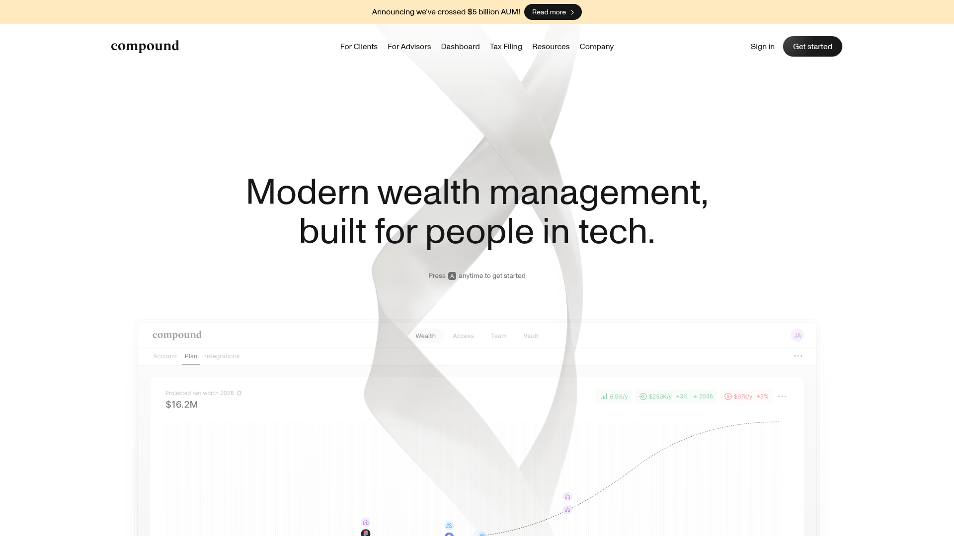
Compound Wealth Management Landing Page
A clean financial tech layout featuring a minimalist navigation bar, an abstract animated hero section, and a dashboard-style data visualization interface mockup.
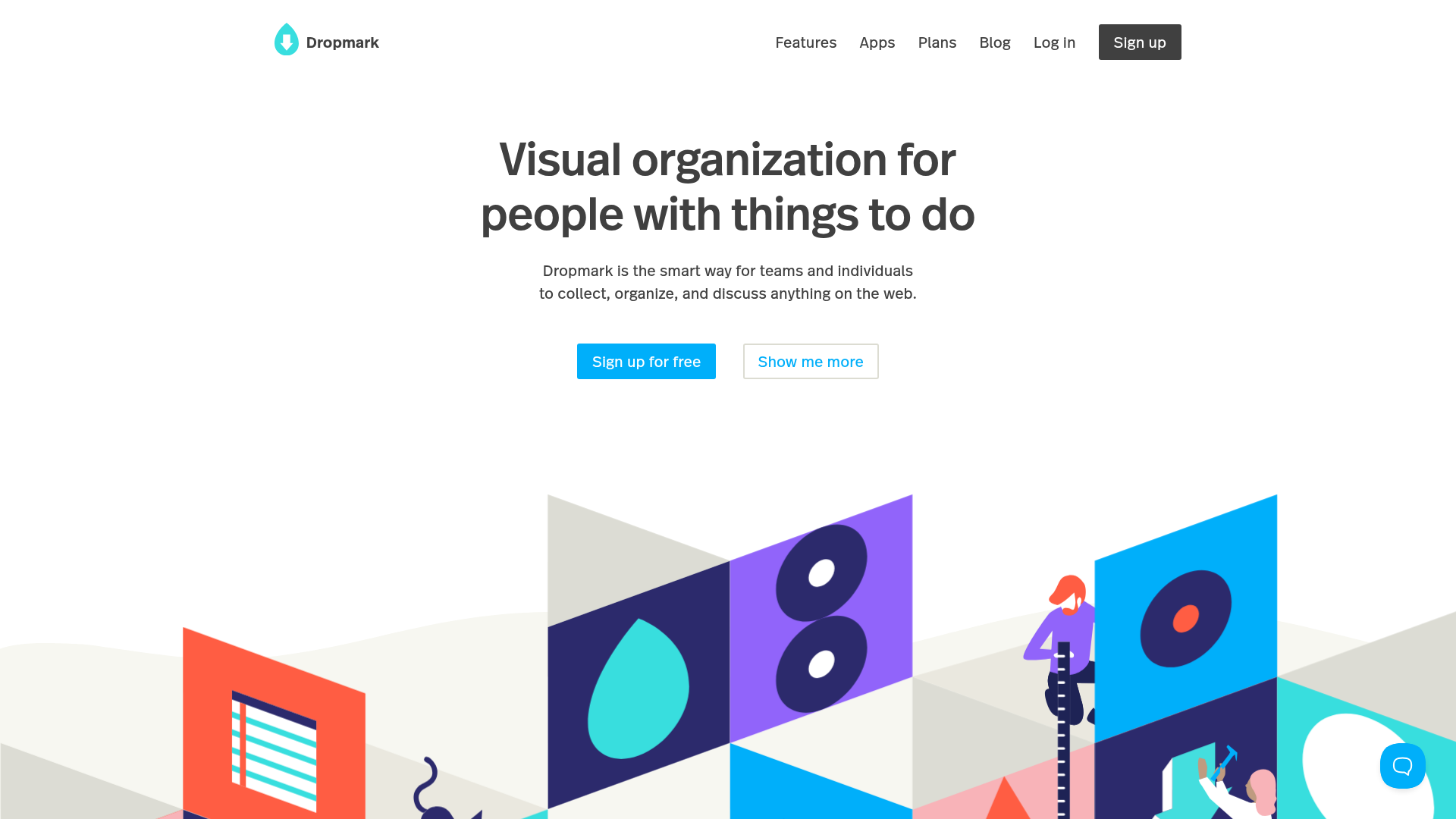
Dropmark Visual Organization Landing Page
Features a clean minimalist hero section with split-action buttons, a vibrant vector illustration footer, and an interactive horizontal flickity carousel for case studies.
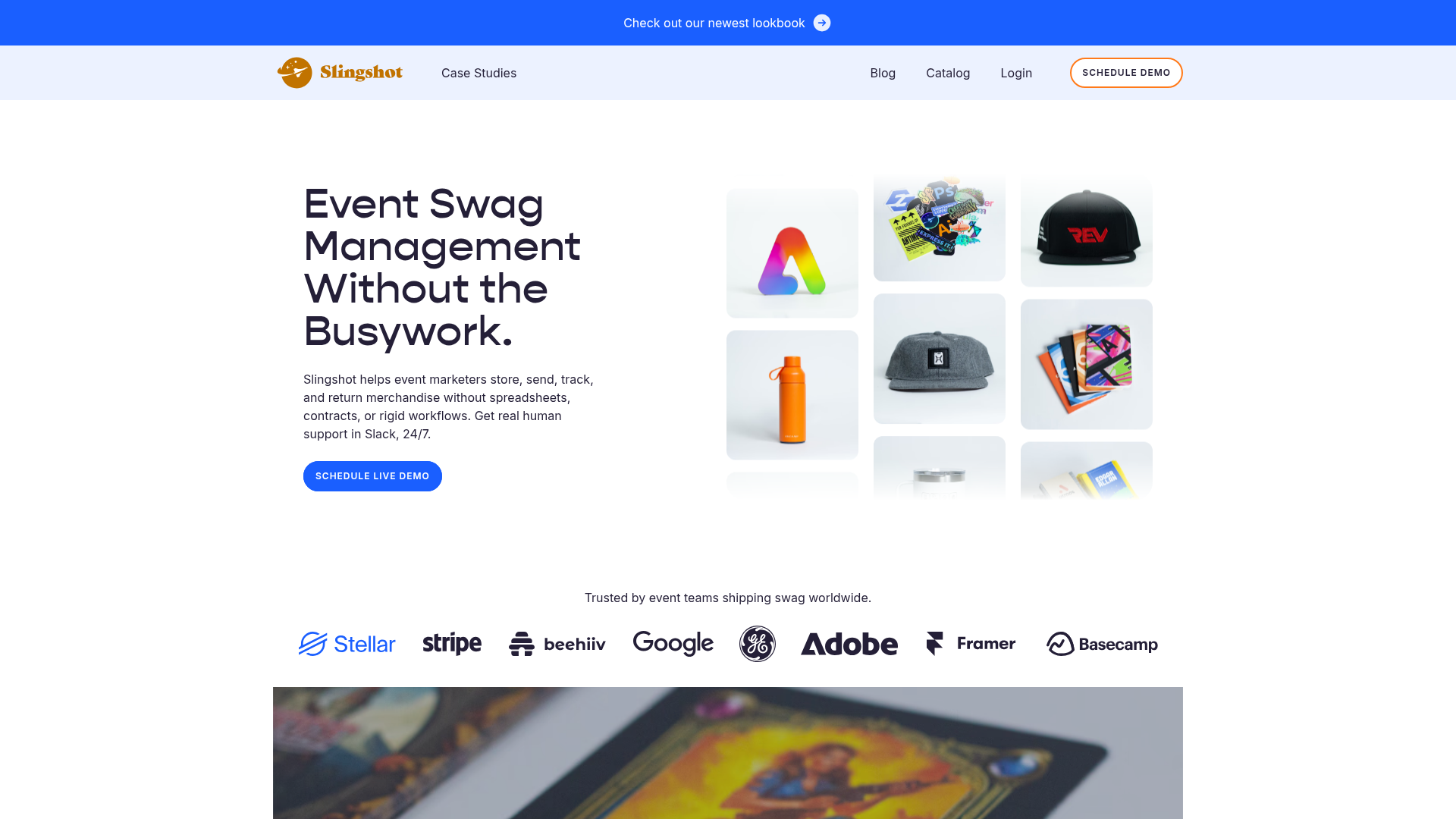
Slingshot Event Swag Hero and Logos
A clean SaaS landing page featuring a split hero layout with promotional product imagery, a call-to-action button, and a monochrome brand logo trust bar.

Slite SaaS Knowledge Base Landing Page
A clean SaaS hero section with a conversational headline, secondary call-to-action buttons, and a structured software interface preview featuring user testimonials.
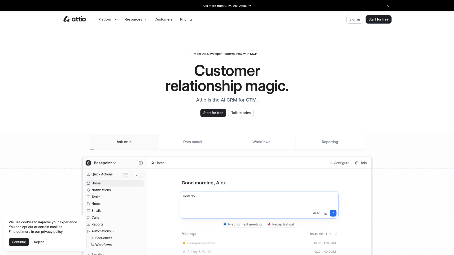
Attio AI CRM Landing Page
A clean SaaS landing page featuring a tiered navigation bar, a centered hero section with twin CTAs, and a detailed interactive dashboard preview.

Koa Health Mental Care Landing Page
A clean healthcare landing page featuring a centered hero section, scroll-based fade-in animations, overlapping mobile mockups, and a multi-column feature grid with accent borders.
