Compound Wealth Management Landing Page
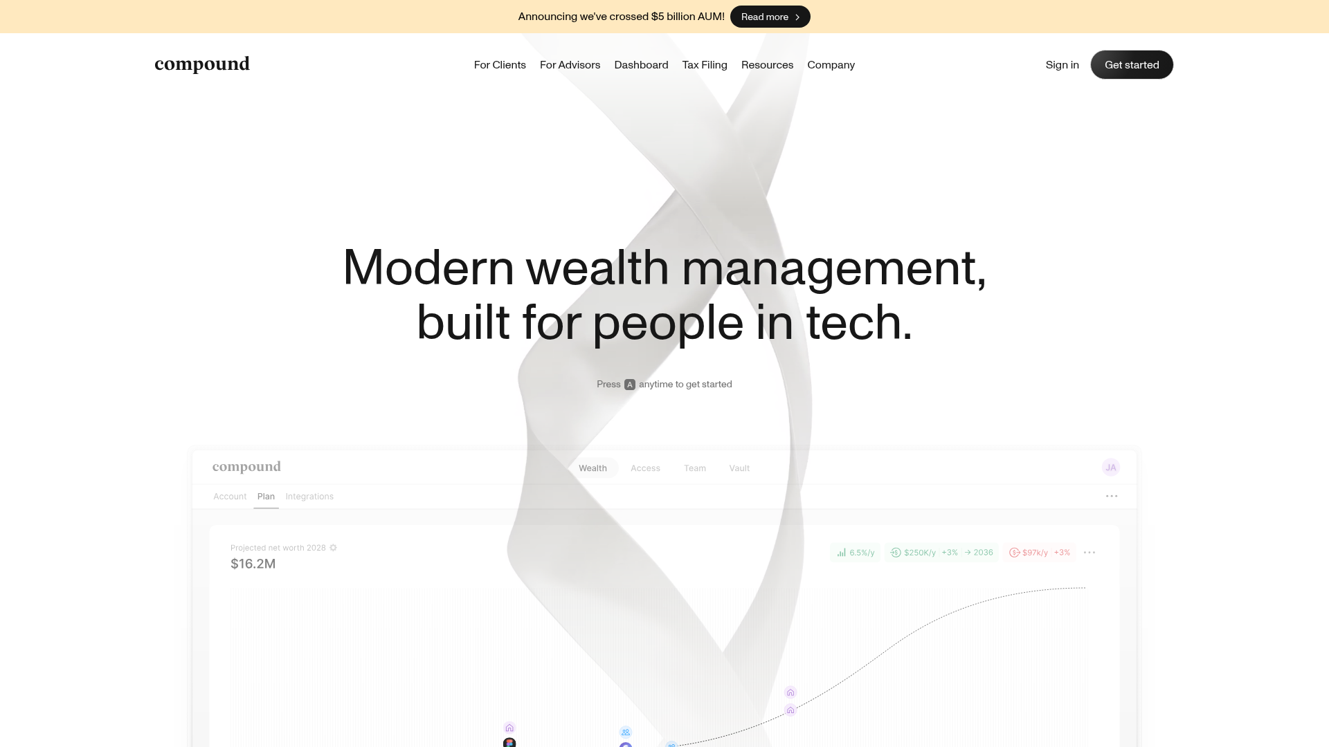
A clean financial tech layout featuring a minimalist navigation bar, an abstract animated hero section, and a dashboard-style data visualization interface mockup.
Overview
Compound’s landing page is a masterclass in high-end financial technology branding, blending minimalist aesthetics with a sophisticated data-driven interface. It is a strong reference for builders looking to establish instant credibility through clean whitespace, a refined typographic hierarchy, and subtle glassmorphism.
Design System
- Color Palette & Visual Hierarchy: The site uses a monochrome foundation of pure whites and deep charcoal text, contrasted by a soft beige announcement banner (#FEF0C7). Accents in the dashboard mockup use muted pastel greens and pinks to indicate financial performance without disrupting the professional tone.
- Typography: The typography centers on a bold serif for the logo and high-impact headings, paired with a geometric sans-serif for navigation and body text. This contrast signals a bridge between traditional banking (serif) and modern tech (sans-serif).
- Structure & Flow: The layout follows a classic F-pattern. A thin top banner precedes a sticky navigation bar with categorized links. This leads into a centered hero section with a massive H1 and a call-to-action that utilizes a unique keyboard shortcut pattern ("Press A anytime to get started").
- Reusable Components:
- Navigation: A sleek, text-heavy nav bar with clear hierarchy and a single high-contrast "Get started" button.
- Pill Badges: Used in the dashboard interface to display metrics like "6.5%/y" with subtle icons.
- Keyboard CTA: A minimalist interaction prompt that adds a sense of utility and speed.
- Interaction & Motion: The hero background features a high-quality abstract mesh/ribbon graphic that creates a sense of fluid movement and premium quality. Most interactive elements use subtle state changes, such as font weight shifts or background opacity tweaks on hover.
- Implementation Clues: The HTML reveals a containerized structure with a heavy reliance on utility classes for spacing (likely Tailwind or a custom system) and a preference for SVG icons to maintain sharpness at any scale.
Use Cases
- Who should clone this: Founders of B2B SaaS, fintech startups, or high-end consulting firms who need a landing page that feels "expensive" and trustworthy.
- Effective Remixes: This layout can be effectively adapted for data analytics platforms, legal tech services, or any high-stature subscription membership model (e.g., executive coaching).
- Practical Remix Directions: Builders can swap the serif headings for a monospaced font to lean into a "developer tool" aesthetic, or replace the abstract mesh with a product-specific 3D render. The keyboard-shortcut CTA is a specific feature that should be implemented globally if cloned.
- Suggested Scope: Developers should start by cloning the navigation and hero section to capture the brand's spatial rhythm before moving into the complex dashboard components.
Related Inspirations
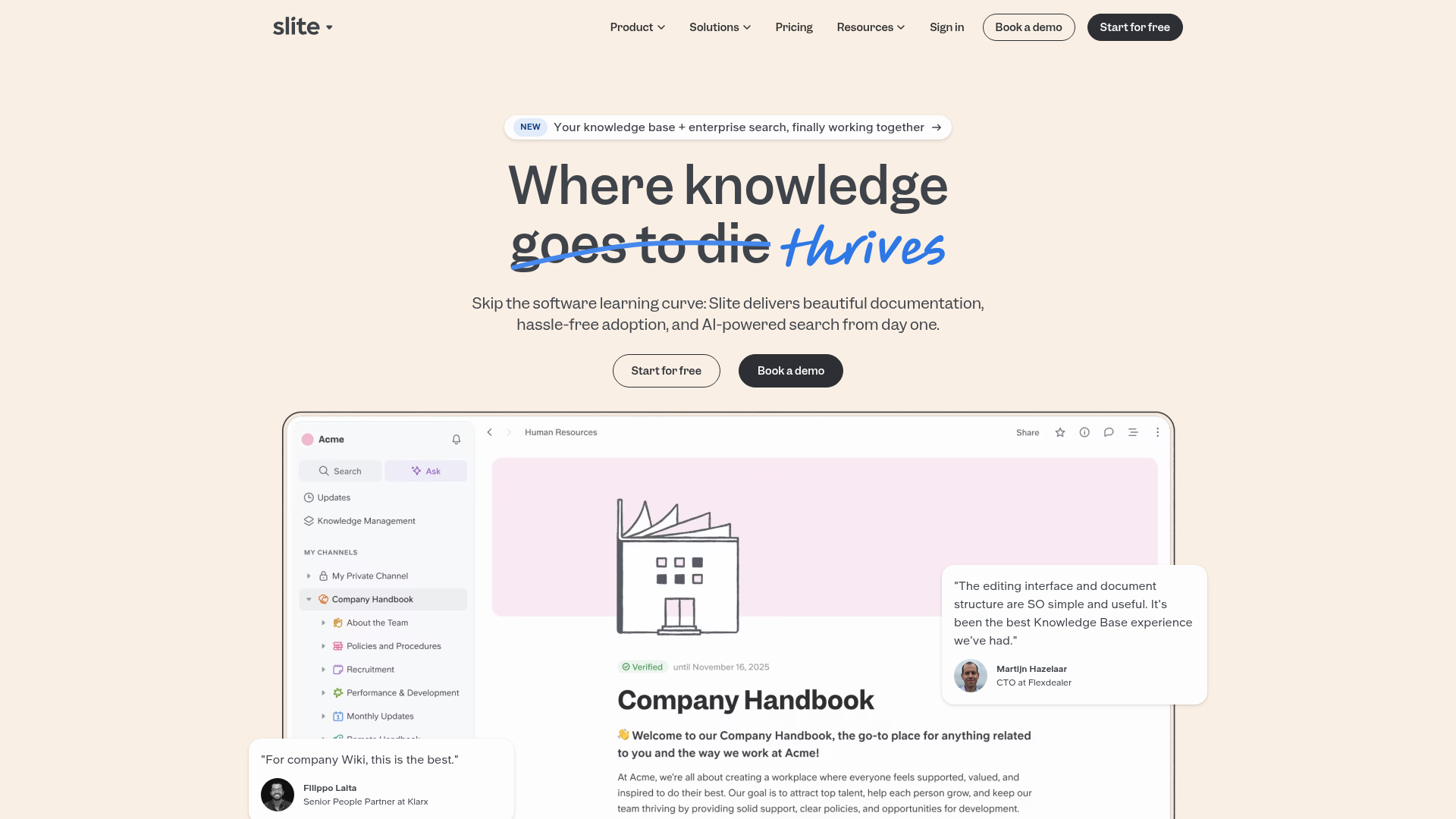
Slite SaaS Knowledge Base Landing Page
A clean SaaS hero section with a conversational headline, secondary call-to-action buttons, and a structured software interface preview featuring user testimonials.
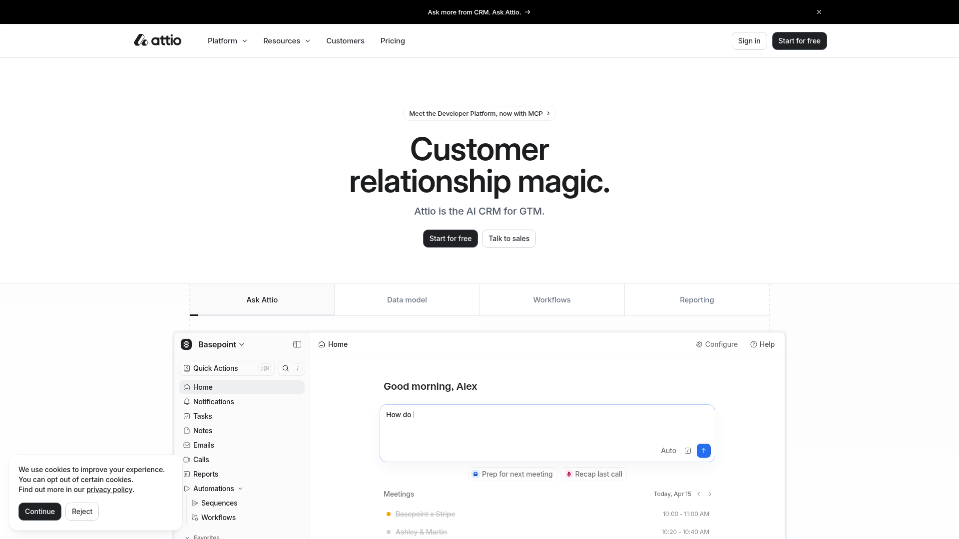
Attio AI CRM Landing Page
A clean SaaS landing page featuring a tiered navigation bar, a centered hero section with twin CTAs, and a detailed interactive dashboard preview.
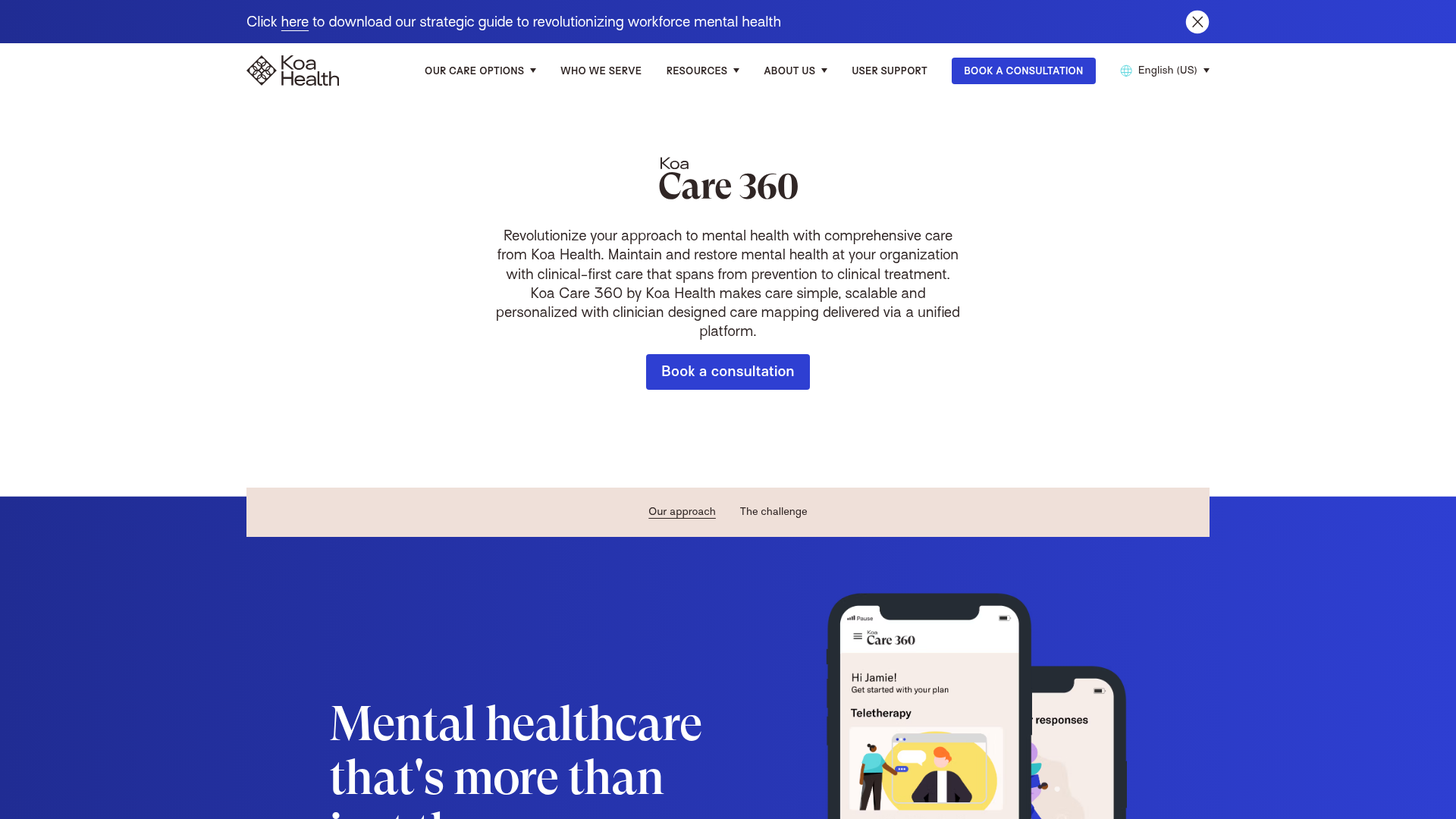
Koa Health Mental Care Landing Page
A clean healthcare landing page featuring a centered hero section, scroll-based fade-in animations, overlapping mobile mockups, and a multi-column feature grid with accent borders.
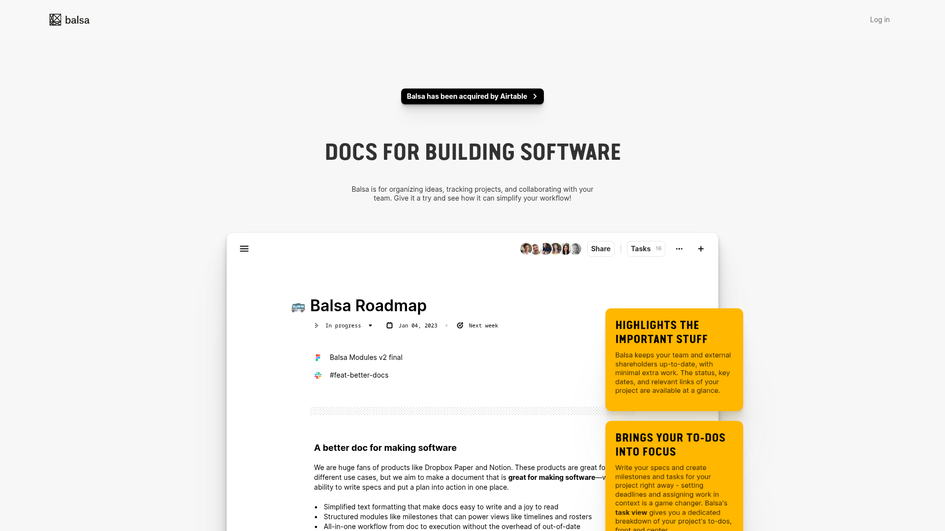
Balsa Software Documentation Landing Page
A clean document-centric layout featuring a centered hero section, high-contrast callout boxes, and a nested dashboard UI preview for collaborative tool showcases.
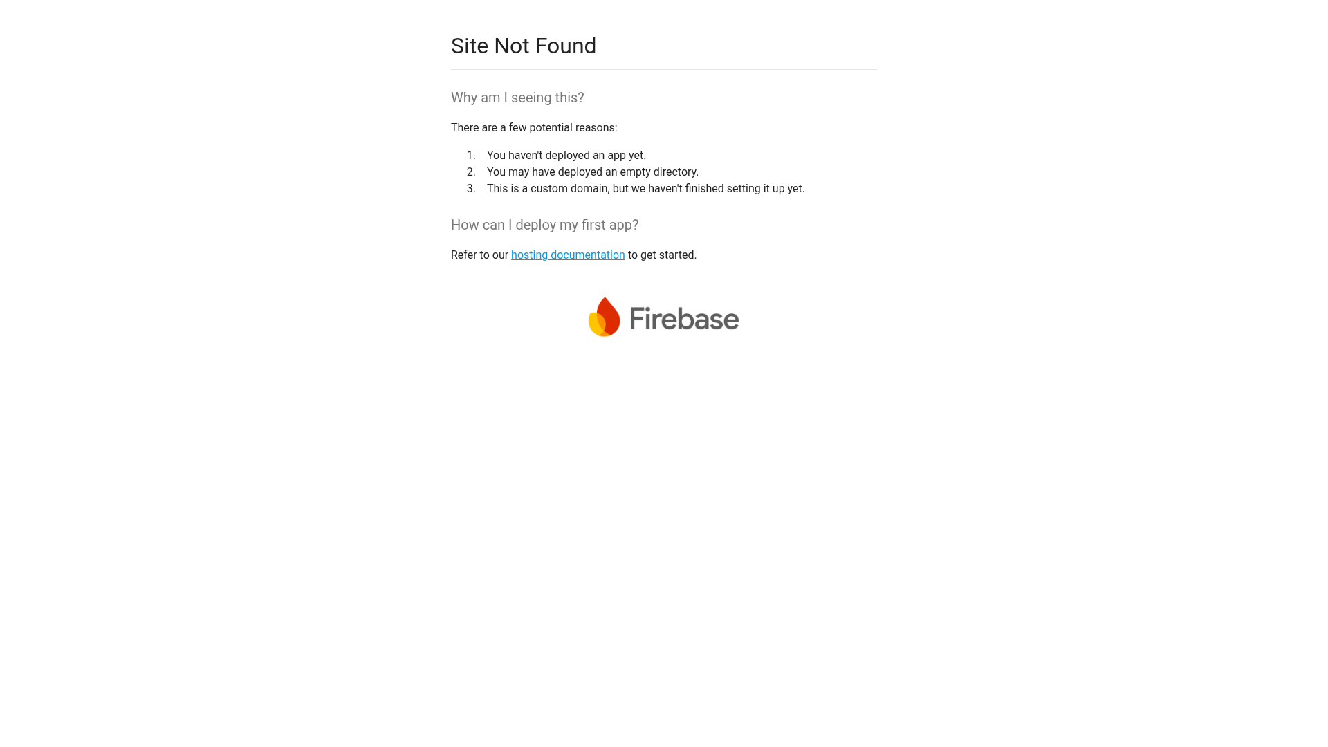
Firebase Hosting Site Not Found
A minimal placeholder layout for 404 error states including a centered logo, numbered troubleshooting guide, and linked utility text.
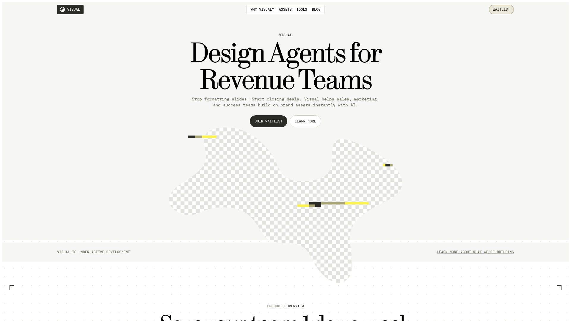
Visual AI Landing Page Templates
A high-end SaaS layout featuring a serif-heavy typography system, bento-style product showcase grids, accordion-style feature blocks, and minimalist wireframe UI components.
