Kirschberg Minimalist Site Header Template
A clean, dark-themed floating navigation bar featuring a centered brand label, integrated hamburger menu, and backdrop-filter blur effects.
Overview
This template features a sophisticated, minimalist navigation component designed by Kirschberg. It is an excellent reference for builders looking to implement a modern "floating" header that uses backdrop-filter effects to maintain legibility across various background content. Its strength lies in its compact footprint and high-end aesthetic, making it ideal for portfolio or product landing pages.
Design System
- Color Palette & Visual Hierarchy: The system utilizes a dark mode aesthetic centered around a semi-transparent dark gray (
rgba(13, 13, 13, 0.5)) pill-shaped container. It uses low-contrast borders (rgba(255, 255, 255, 0.05)) and high-contrast white text (#F8F8F8) to create a clear visual hierarchy. - Typography: The design uses a font-medium, tracking-wide sans-serif typeface. The brand label is set to a
body-largescale, emphasizing readability and minimalist elegance over decorative elements. - Layout Structure: The header is a fixed-position element (
fixed top-4) that remains centered via a transform-based centering technique (left-1/2with-translate-x-1/2). It has a fixed width of 450px on desktop but adapts to mobile screens vialeft-6 right-6margins. - Reusable Components: The primary clone-worthy component is the Glassmorphism Nav Bar. It integrates a centered text link with an absolute-positioned hamburger menu icon consisting of three rounded-full spans.
- Interaction & Motion: The design uses
backdrop-filter: blur(48px)for a frosted glass effect. Hover states are managed throughtransition-opacityandhover:opacity-70. The pill container usesrounded-2xlfor soft, modern corners. - Implementation Clues: The structure uses Tailwind CSS utility classes (e.g.,
flex,items-center,justify-center,pointer-events-auto) and is likely built with a modern framework like Next.js, as evidenced by thenext-route-announcerandbackface-visibilityCSS properties used for smooth animation performance.
Use Cases
- Who should clone this: Designers and developers building high-end creative portfolios, architectural agency sites, or tech product landing pages where content takes center stage.
- Remix Directions: Builders can easily swap the centered text with an SVG logo. The container width can be adjusted from the fixed 450px to a fluid width or a more narrow pill for mobile-first apps.
- Practical Adaptations: This pattern is perfect for a "Single Page App" navigation. Remix it by adding a circular profile icon on the left to transform it into a user dashboard header.
- Suggested Scope: This is best as a section-specific clone. Copying the specific container structure and the blur/opacity settings will provide a production-ready header that can be dropped into any existing project layout.
Related Inspirations

Jacob Leech Portfolio Portfolio Site
A minimalist developer portfolio with custom cursor interactions, scroll-triggered text animations, a clean resume layout, and unique full-width graphic components.
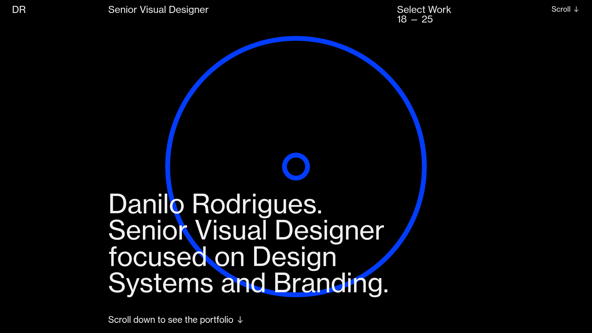
Danilo Rodrigues Designer Portfolio Landing
A minimalist, high-impact design portfolio featuring a full-screen image carousel hero, fluid typography, large scroll-triggered key visuals, and a clean grid-based case study layout.
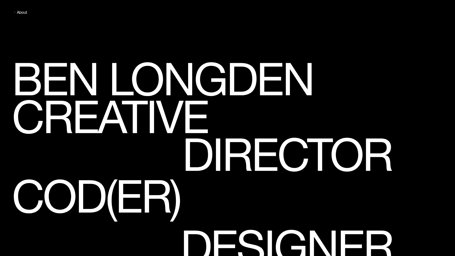
Ben Longden Minimalist Creative Portfolio
A bold typography-focused site featuring a large-scale overlapping hero section, horizontal image carousels for projects, and a scrolling text marquee footer.
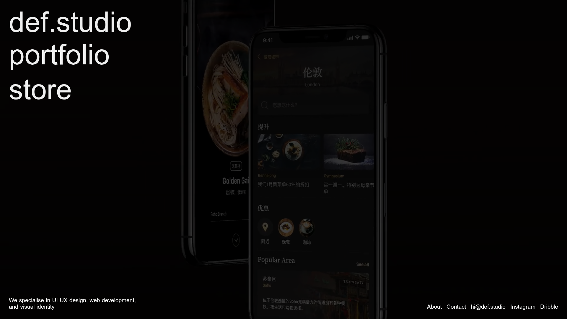
Def.studio Design Agency Portfolio
A dark-themed portfolio featuring a full-screen video background, smooth scroll transitions, and a vertical list of large-scale media-driven project cards with lazy-loaded video previews.
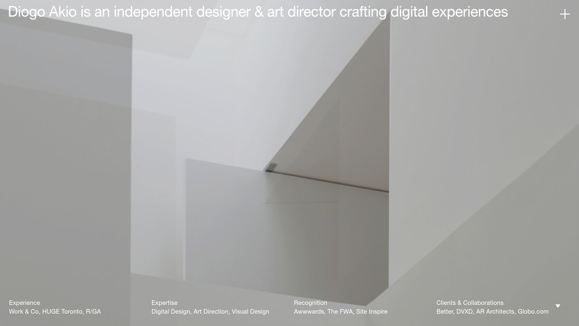
Diogo Akio Minimalist Portfolio Landing
A high-concept portfolio layout featuring a full-screen video hero, marquee footer components, and a smooth vertical-slide overlay for detailed bio and experience lists.
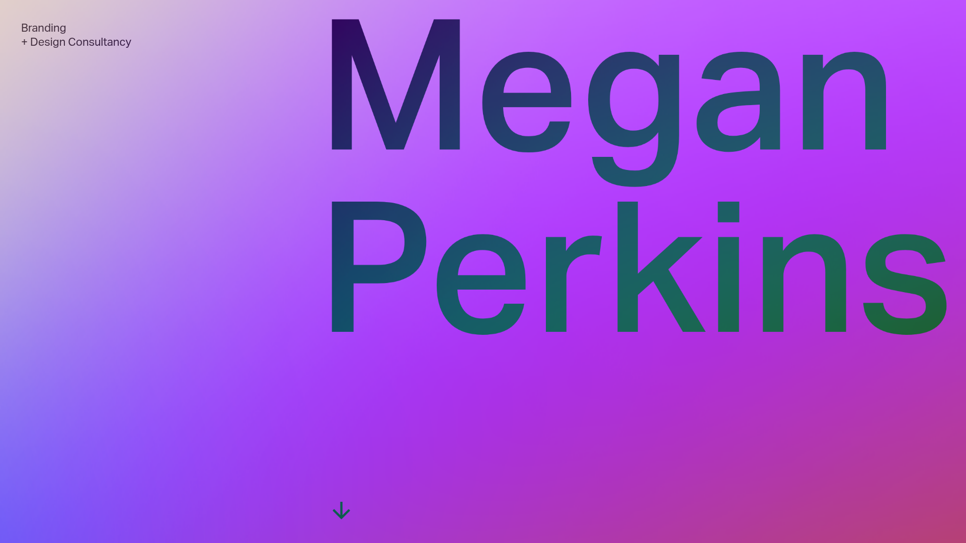
Megan Perkins Branding Portfolio Hero
A minimalist, typography-focused landing page featuring a full-screen vertical scroll interaction with a vibrant color gradient background and a high-contrast text overlay.
