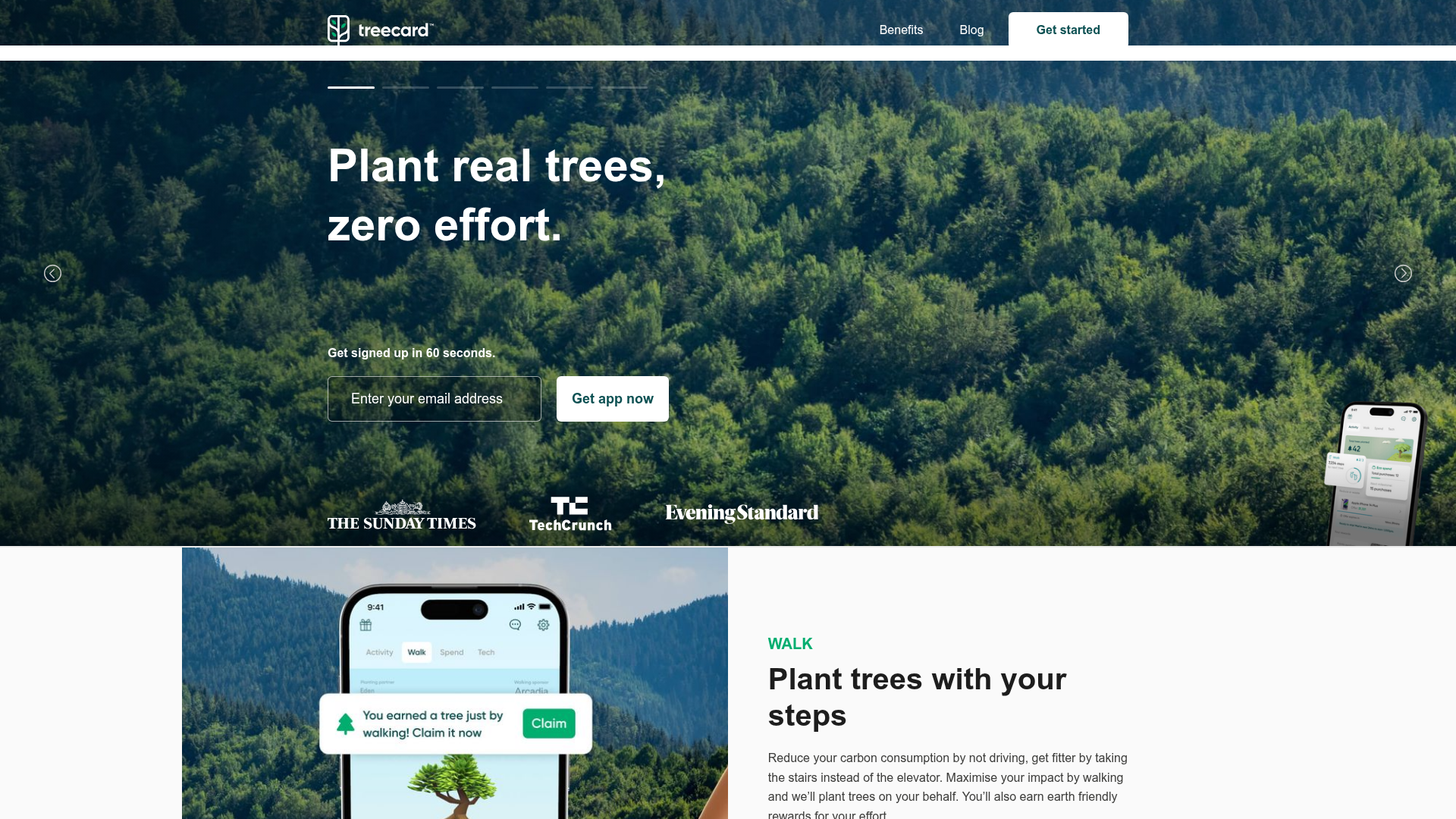
Treecard Eco-App Landing Page
An eco-friendly fintech landing page featuring an animated hero slider with progress bars, alternating content sections with mobile mockups, and a multi-form footer.
Overview
Treecard’s landing page is a high-performance eco-fintech template that effectively balances trust-building editorial content with direct conversion funnels. It is a premier reference for builders due to its sophisticated hero slider with synchronized progress indicators and its clean, alternating layouts that integrate mobile app mockups seamlessly into the narrative.
Design System
- Color Palette & Visual Hierarchy: The palette is rooted in "eco-digital" tones, featuring deep forest greens, crisp whites, and soft grays (
.grey-bg). High-contrast white text is used over dark natural imagery in the hero to establish an immediate emotional connection, while a vibrant mint green is reserved for primary action buttons (.rn-sign-up-button) and status indicators. - Typography System: The site uses a modern sans-serif typeface with a clear hierarchy. Large, bold h1 headers (
.rn-heading-slider) dominate the hero, while section headers use tight letter-spacing and a bold weight. Sub-headers like "WALK" or "SPEND" use all-caps and primary brand colors to categorize features. - Page Structure & Flow: The flow begins with a multi-slide hero carousel, followed immediately by trust signals (press logos). The body follows a "Z-pattern" alternating layout: Image-Left/Text-Right for the "Walk" section, then Text-Left/Image-Right for the "Spend" section, maintaining user engagement through visual variety.
- Reusable Components:
- Animated Hero Slider: A complex component (
.rn-section-slider) featuring a custom stories-style progress bar at the top. - Inline Form Wrapper: A consistent email capture field and button pair used in both the hero and footer (
.rn-hero-input-wrapper). - Feature Blocks: Flexible containers (
.rn-section.blocks) designed for high-resolution photography and descriptive copy.
- Animated Hero Slider: A complex component (
- Interaction & Motion: The sliders use a fade transition (
data-animation="fade") with a 4000ms delay. Progress bars (.rn-slide-stories-bar) provide visual feedback on the auto-play status. Buttons feature subtle hover states, and the navigation transitions from transparent to solid upon scrolling. - Implementation Clues: Built with Webflow, as evidenced by
w-slider,w-form, anddata-wf-page-idattributes. It utilizes high-density imagery (2x assets) and separate mobile/desktop image classes (.desktop,.mobile) for optimized performance.
Use Cases
- Who should clone this: Developers building apps for sustainability, personal finance, or wellness where establishing trust via a professional, content-heavy interface is critical.
- Effective Remixes: This pattern works perfectly for SaaS platforms, mobile-first service apps, or hardware products. The alternating feature blocks are highly adaptable for any product that needs to explain 3-4 distinct value propositions.
- Remix Directions:
- Brand Swap: Replace the forest imagery with architectural photos for a real estate app or abstract gradients for a crypto wallet.
- Architecture Adaptation: Convert the hero slider into a static video background if fewer value props are needed.
- Component Extraction: Reuse just the footer section for its unique triple-threat of reviews, status text (e.g., "6 million trees planted"), and email capture.
- Clone Scope: A full-page clone is recommended to capture the sophisticated interplay between the hero progress bars and the responsive content sections, but the review/form footer is also a standalone high-value component for existing sites.
Related Inspirations
Lamanna's Bakery Vibrant Landing Page
A bold, high-contrast Italian bakery site featuring massive typography, parallax floating elements, marquee banners, and a flickity-powered product carousel.
GENGTOTO Product Detail E-commerce Layout
A comprehensive product page featuring a vertical image gallery, detailed item specifications, color/size selection modules, and integrated user review and FAQ components.
Promly Youth Platform Landing Page
A vibrant dark-mode layout featuring a vertical image marquee, bento-style reward cards, and a press-worthy horizontal slider for community-focused organizations.

Transform Festival Event Landing Page
Features a full-width hero section, quote carousel for reviews, and a grid-based news listing using responsive card components and image-driven layout.
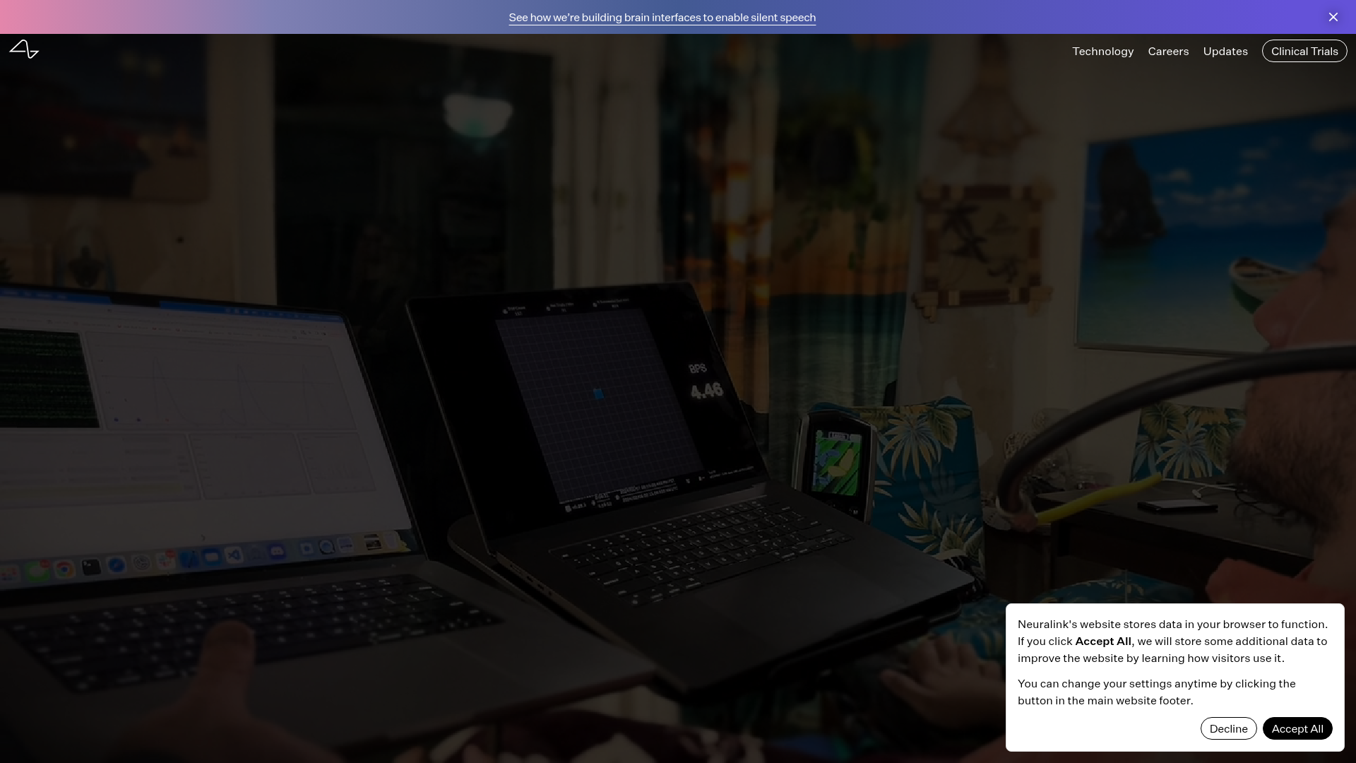
Neuralink Brain Technology Landing Page
A high-tech medical landing page featuring an immersive video hero section, typewriter animation effects, and a custom swiper carousel with integrated video testimonials.
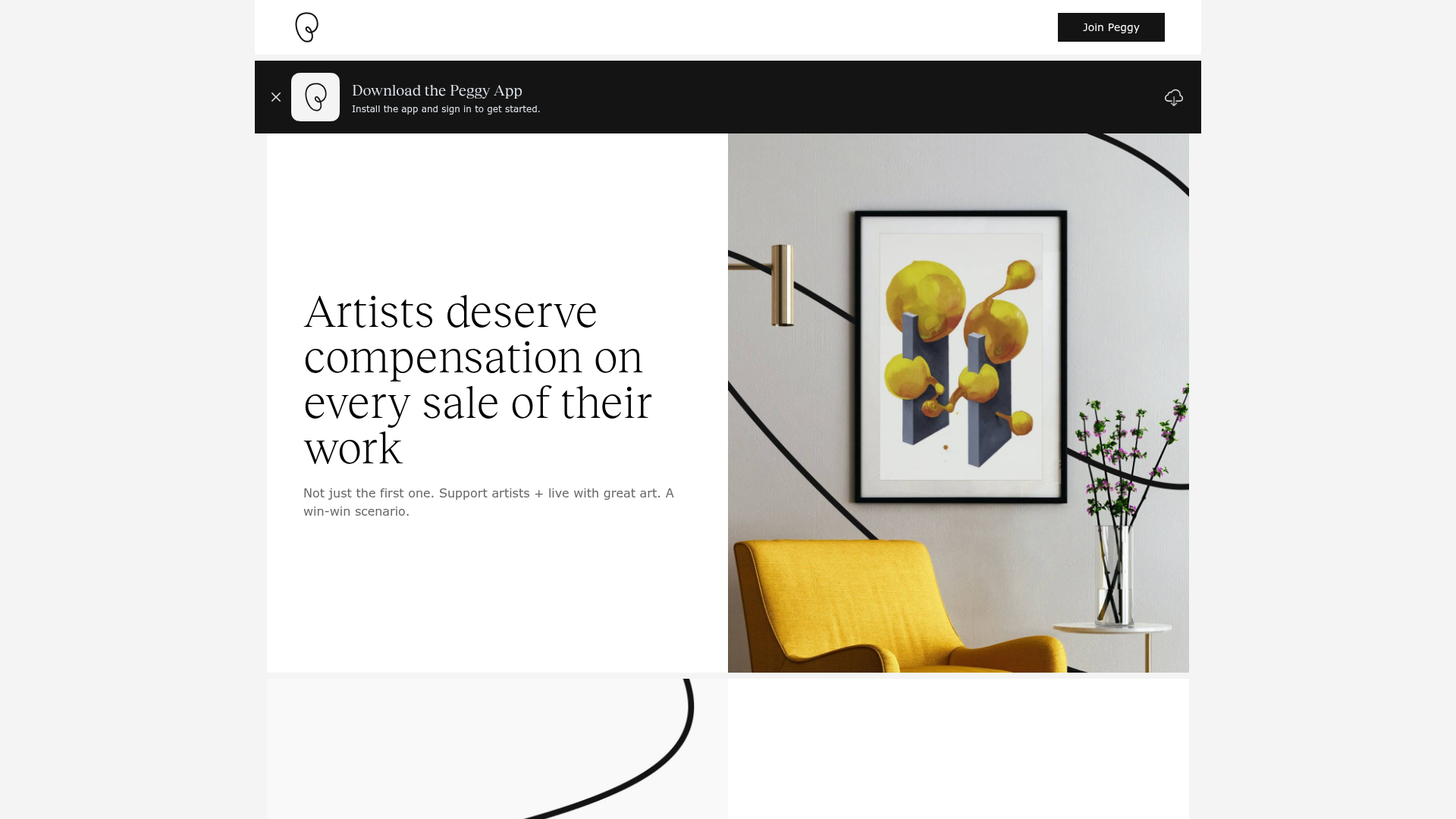
Peggy Art Royalties Pitch Page
A clean storytelling layout featuring alternating image-text sections, a three-column testimonial grid with circular avatars, and a icon-based feature grid for brand values.
