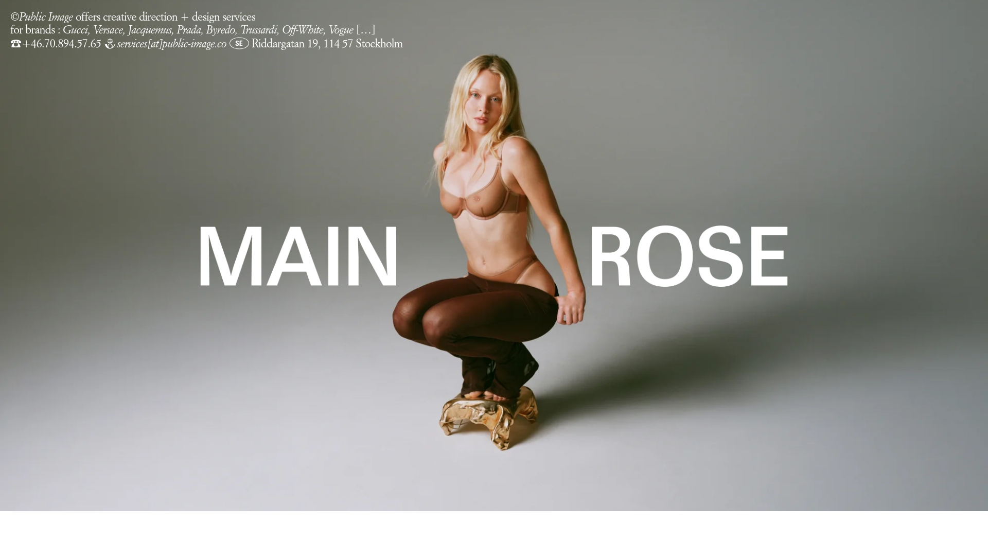
Public Image Minimalist Portfolio Carousel
A fullscreen media portfolio featuring a Fading Flickity carousel, integrated brand credits, and a synchronized thumbnail navigation bar for high-end fashion and creative direction showcases.
Overview
This website is a high-end portfolio for a creative agency, featuring a bold, fullscreen media carousel that prioritizes visual impact and brand prestige. It serves as an excellent reference for builders looking to implement a minimalist, high-contrast imagery display with seamless, synchronized navigation.
Design System
- Color Palette & Visual Hierarchy: The design utilizes a high-contrast monochromatic base (white text on dark backgrounds or vice-versa) to ensure brand messaging and media remain the focal point. Visual hierarchy is flat, with the media occupying 100% of the viewport and text overlays acting as secondary metadata.
- Typography: The system uses a clean, sans-serif typeface (likely a derivative of Helvetica or a similar Swiss style) in all-caps for primary labels. Text is categorized into ultra-large display types for project titles and small, italicized serif/sans-serif hybrids for the agency info block.
- Structure & Flow: The site is a single-page immersive experience. The primary content is held within a
main-carouselusing the Flickity library. Directly beneath (or overlapping) is anav-carouselconsisting of small thumbnail previews, allowing for non-linear navigation. - Reusable Components:
- Fading Flickity Carousel: Features an
is-fadetransition class rather than a standard slide, creating a more cinematic feel. - Dynamic Header/Info Block: The
.site-introblock contains condensed contact info and a client list, positioned to not interfere with the central visuals. - Integrated Thumbnail Bar: A synchronized
nav-carouselwhere selecting a thumbnail updates the main view.
- Fading Flickity Carousel: Features an
- Interactions & Motion: The primary interaction is the fade transition between
carousel-cellelements. The logic includesis-white-textclasses applied to specific cells to dynamically flip text color based on the underlying media contrast. - Responsive Behavior: The HTML reveals specific
image-mobile(is-cover) andimage-desktop(is-contain/is-cover) classes, indicating a custom-tailored crop and aspect ratio strategy for different breakpoints. The agency info text usesis-portrait-onlyandis-landscape-onlyclasses to reformat contact details for mobile vs. desktop viewing.
Use Cases
- Who Should Clone This: Photographers, fashion designers, creative directors, and luxury brand agencies who want a "lookbook" style landing page that emphasizes visuals over lengthy copy.
- Remix Directions:
- E-commerce: Replace project slides with high-resolution product hero shots and link the project titles directly to a checkout experience.
- Cinematography Portfolio: Utilize the
carousel-videostructure seen in the HTML to create an auto-playing reel of silent video loops as the primary background. - Adaptation: Builders can extract just the synchronized thumbnail navigation bar (
nav-carousel) to enhance any standard image gallery.
- Clone Scope: For maximum impact, a full-page clone is recommended to maintain the immersive fullscreen aspect ratios and synchronized transitons.
Related Inspirations

Christopher Doyle Agency Portfolio Layout
A minimalist, typography-led portfolio featuring a wide-margin grid system, smooth fade-in animations, and simple image-focused project cards.
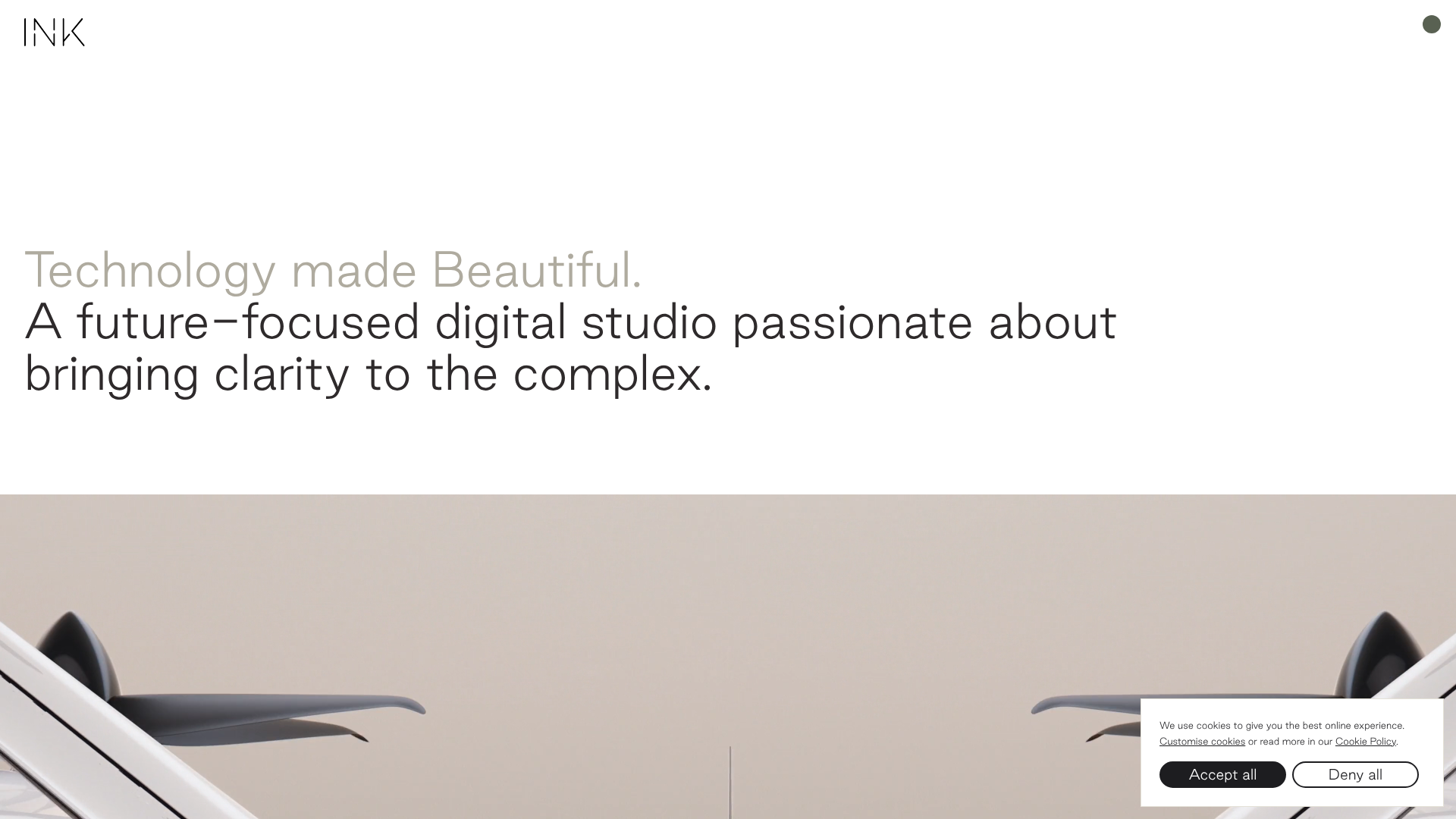
INK Digital Studio Portfolio Site
A high-end portfolio featuring an animated text hero, a full-bleed video slideshow with progress counters, and a masonry grid of project thumbnails with color-coded transition overlays.
Bruno Arizio Designer Portfolio Website
A minimalist creative director portfolio featuring a clean typographic layout, side-aligned image previews, and high-contrast spacing patterns suitable for luxury or design showcases.

Isla Beauty Skincare E-commerce Store
A clean Shopify-based storefront featuring a split-hero landing page, a step-by-step product system carousel, and a split-screen testimonial section with localized product image sidebars.
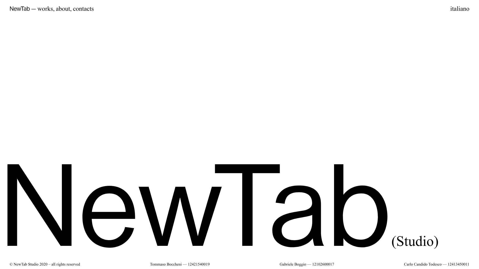
NewTab Studio Minimalist Portfolio Landing Page
A clean, typography-focused landing page featuring an oversized SVG/canvas hero title, a top-aligned navigation bar, and a minimalist footer layout.

Finn Pet Supplements Landing Page
An e-commerce landing page featuring high-contrast typography, a sticky brand logo banner, parallax scroll effects on product headers, and a clean product grid.
