Order and Movement Portfolio Gallery
A minimalist artist portfolio featuring full-screen side-by-side slideshows for paintings and tattoos with integrated metadata captions.
Overview
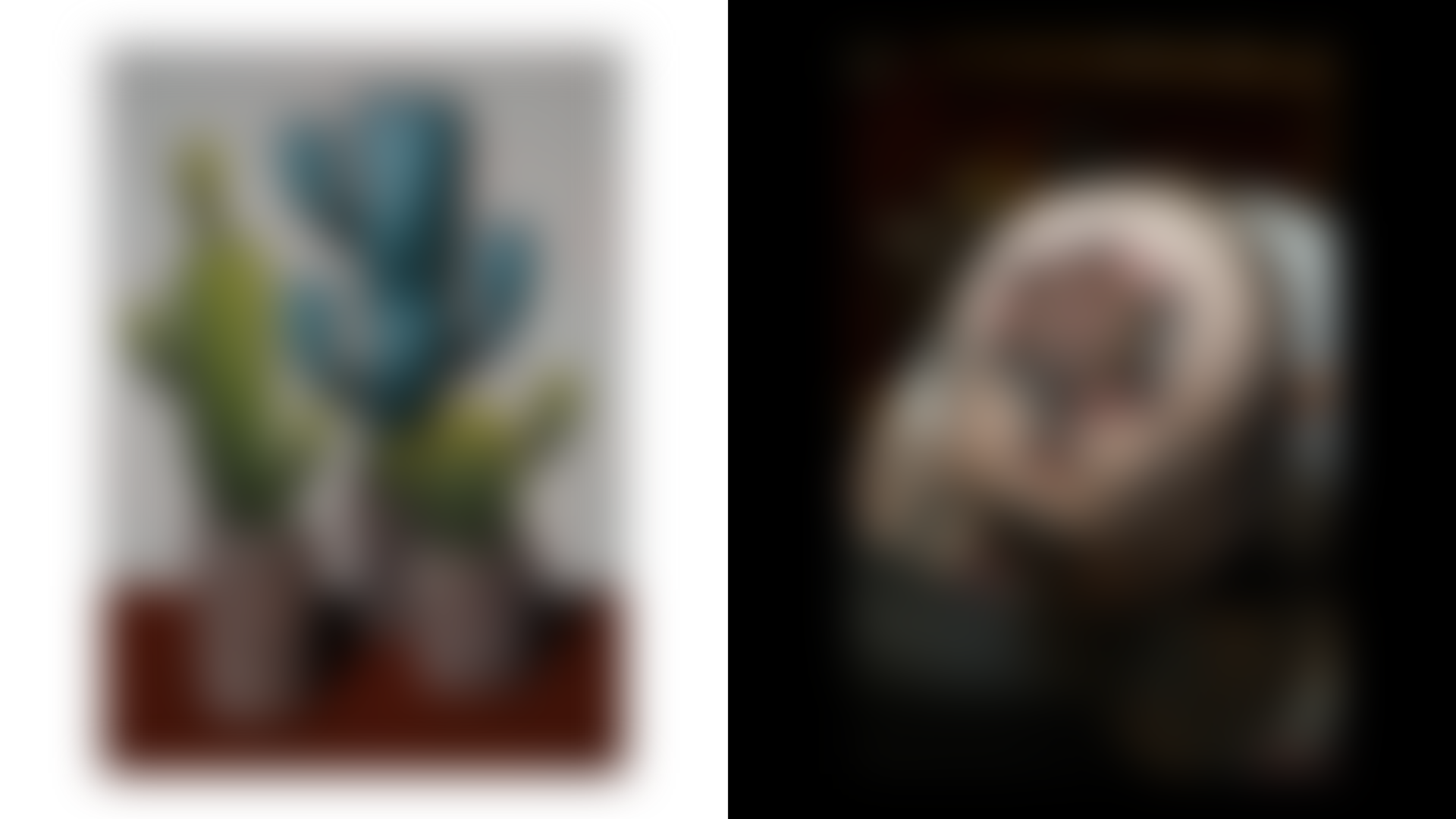
This website is a minimalist, split-screen artist portfolio designed to showcase two distinct bodies of work—Paintings and Tattooing—simultaneously. It serves as an excellent reference for builders looking to create high-impact visual galleries that prioritize imagery over interface, using a balanced dual-column layout.
Design System
- Color Palette & Visual Hierarchy: The site uses a high-contrast binary system. The left side ("Order/Paintings") features a light background with dark text, while the right side ("Movement/Tattooing") uses a dark background with light text. This creates a clear visual separation between the artist's traditional and contemporary mediums.
- Typography: The system relies on a clean, uppercase sans-serif font for navigation and section headers (e.g., "PAINTINGS", "TATTOOING"). Captions use a smaller scale for metadata like dimensions and materials, often presented in a serif or monospaced style to denote technical details.
- Page Structure: The layout is a full-height container divided into two
subsectionblocks. Each block contains aslideshowelement. On desktop, these appear side-by-side; on mobile (per themobile hiddenclasses), the layout stacks or adapts to a single-view focus. - Reusable Components:
- Dual Slideshows: The
ul > listructure within each section is highly clonable for any side-by-side comparison or portfolio. - Integrated Captions: The
figcaptionuses a consistent<p>structure with<br>tags to handle multi-line metadata (Title, Material, Dimensions, Year) without breaking the clean aesthetic. - Dynamic Logo: The logo is split into components (
logo-left,logo-middle,logo-right) allowing for responsive behavior or potential layout shifts.
- Dual Slideshows: The
- Interactions: The design implies a synchronized or independent scroll/swipe for each column. The HTML uses data attributes like
data-color="white"anddata-color="inverse"to manage the thematic split programmatically.
Use Cases
- Who should clone this: Photographers with two distinct styles (e.g., Wedding vs. Street), architectural firms comparing "Before" and "After" projects, or fashion designers showing "Concept" vs. "Final Product."
- Effective Remixes: Swap the side-by-side slideshow for a split video/image layout for a digital agency, or use the layout as a landing page to funnel users into two different product categories (e.g., Men's vs. Women's collections).
- Remix Directions: Adapting the information architecture could involve changing the split to a 70/30 ratio for a primary focus and a sidebar, or swapping the monochrome palette for brand-specific colors while maintaining the mirrored caption styles.
- Suggested Scope: Builders should prioritize cloning the split-section CSS and the
figure/figcaptionrelationship to maintain the sophisticated, gallery-like feel.
Related Inspirations
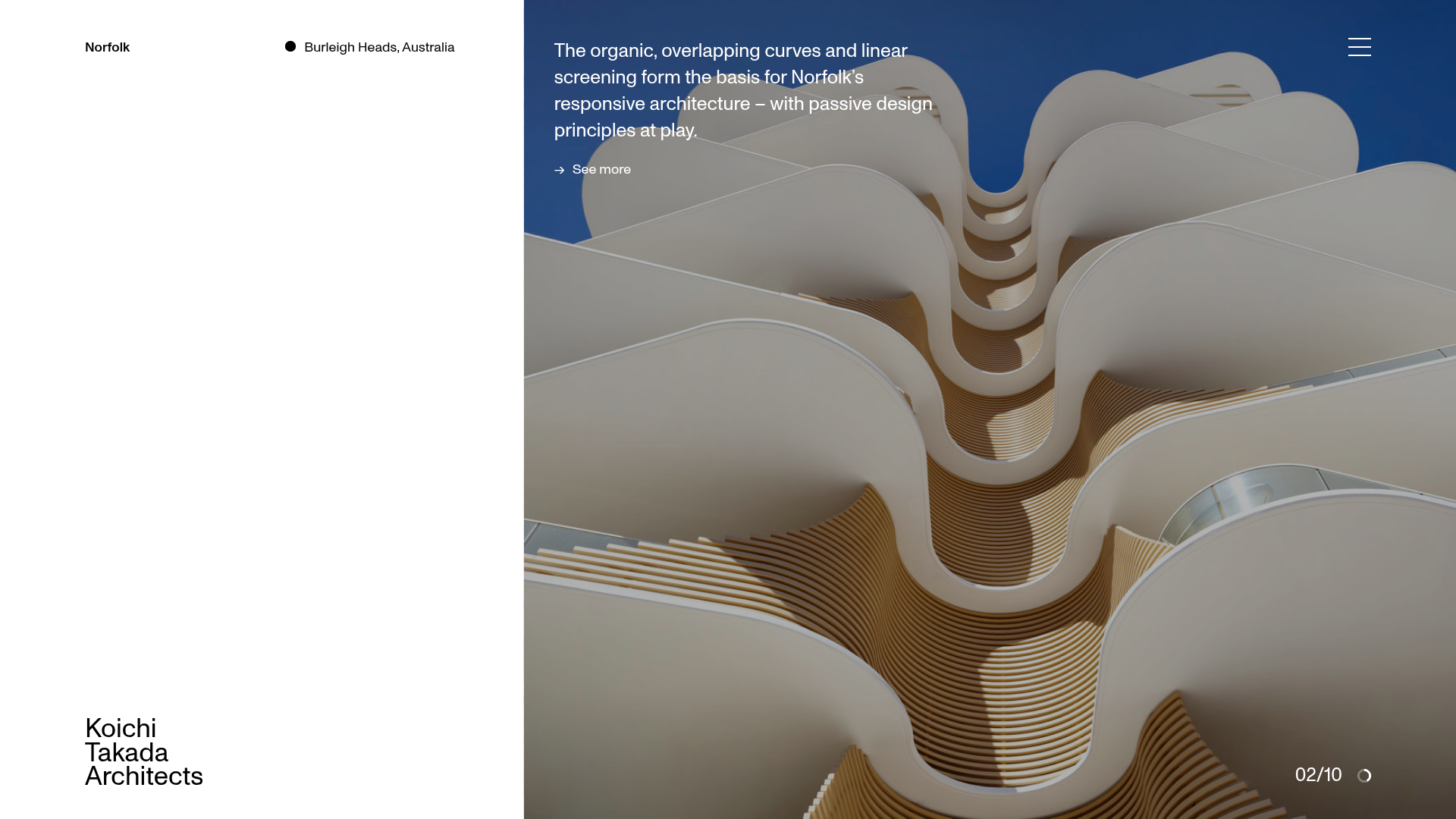
Koichi Takada Architects Portfolio Home
A high-end architectural portfolio featuring a split-screen layout with an interactive project slider, sticky typography, and smooth transition animations.
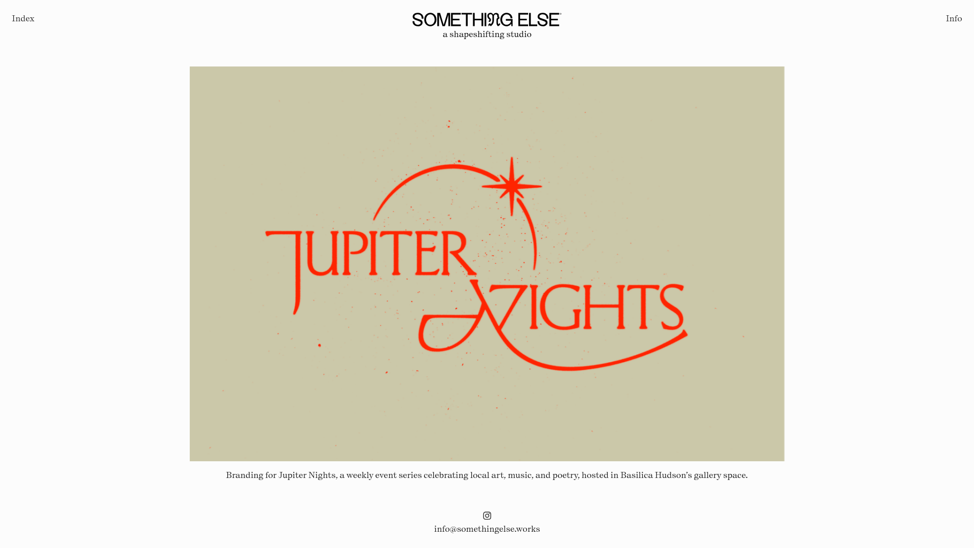
Something Else Portfolio Slideshow
A minimalist design studio portfolio featuring a full-width image and video slideshow with large-scale typography, sticky navigation, and centered captions.
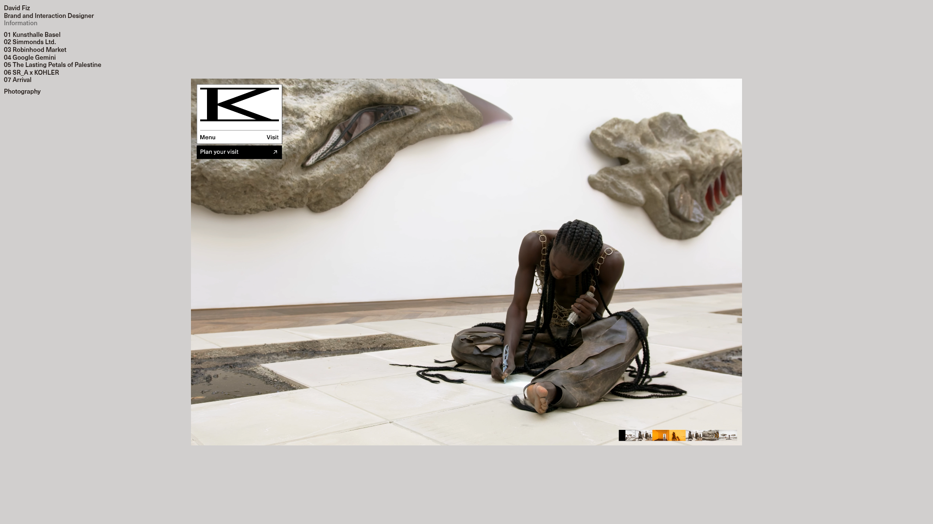
David Fiz Visual Design Portfolio
A minimalist portfolio featuring a fixed sidebar navigation paired with an immersive, full-screen media showcase and interactive project-specific image carousels.
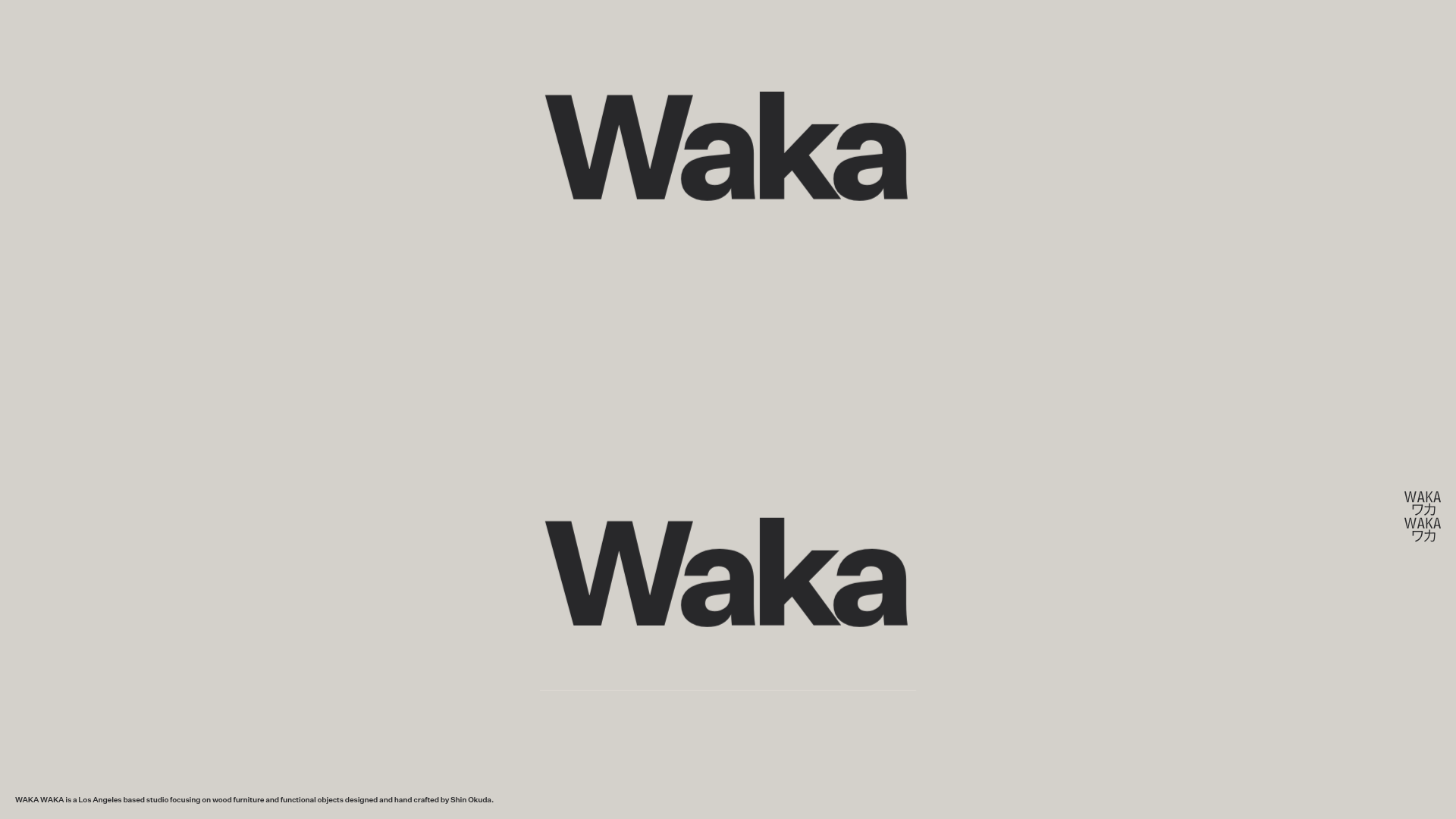
Waka Waka Furniture Portfolio
A minimalist design showcase featuring a custom cursor, parallax scroll effects, and a vertical image grid layout for high-end product displays.
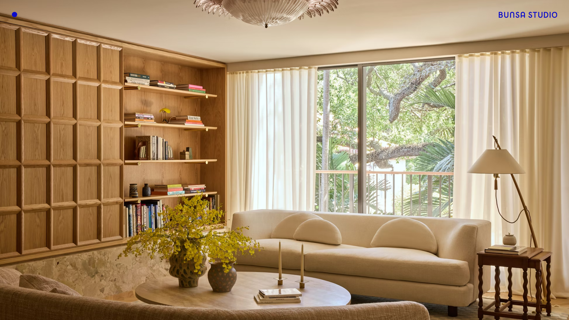
BUNSA STUDIO Portfolio Landing
A minimalist design professional portfolio featuring a full-bleed immersive slideshow hero, sticky top corner branding, and responsive media-focused galleries.
Unknown Untitled Design Portfolio Screensaver
A minimalist, experimental design agency website featuring an automated image-layout screensaver and oversized typography overlays.
