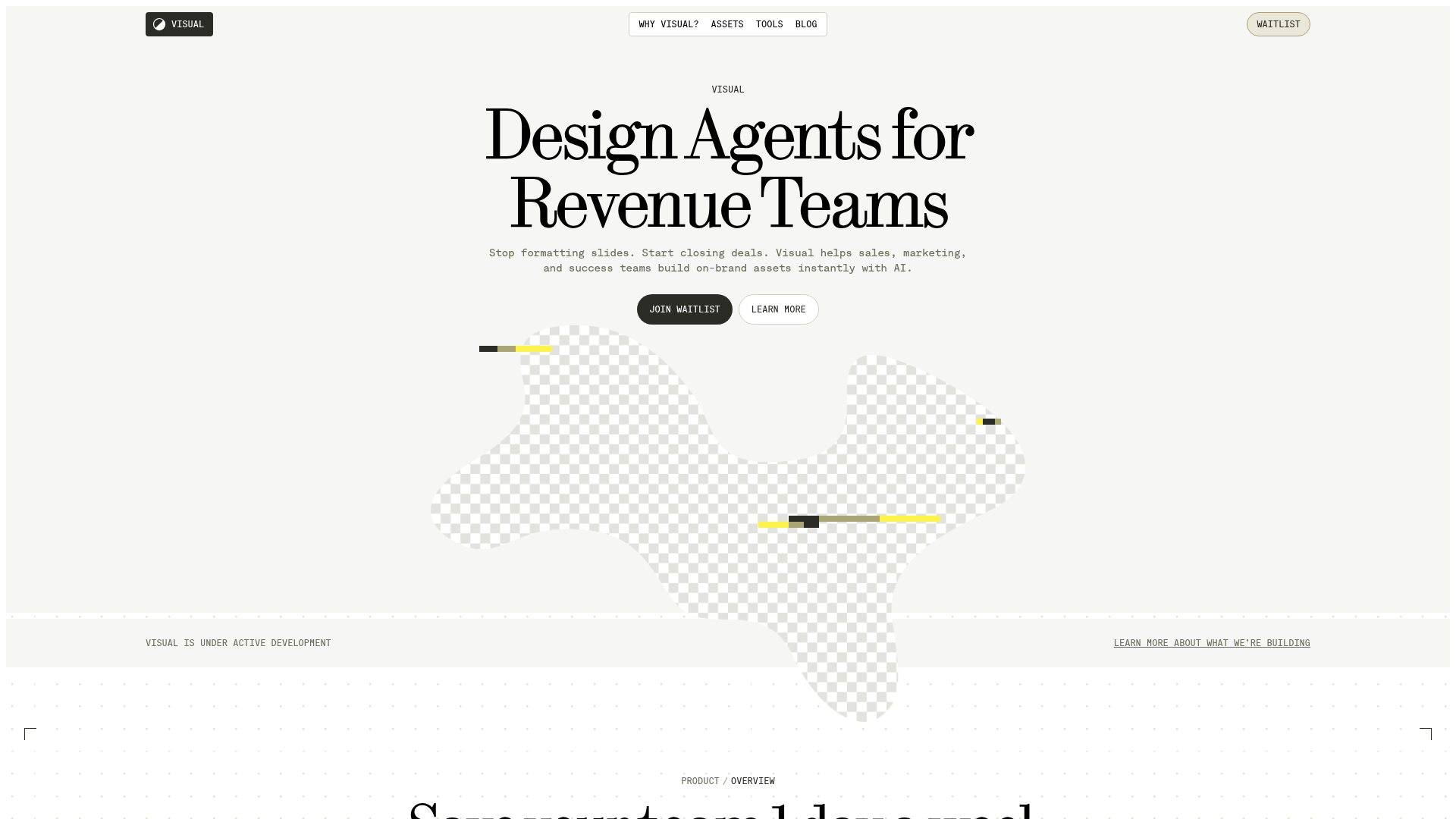
Vercel Workflow Landing Page Template
A clean SaaS landing page featuring a bold typographic hero, copy-to-clipboard command component, logo ticker, and detailed observability section with dark-themed visual grids.
Overview
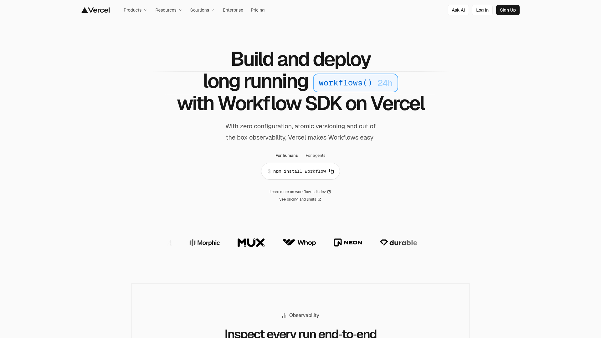
This landing page is a high-performance developer marketing template designed by Vercel to launch the Workflow SDK. It is an excellent reference for cloning because it masters the balance between minimal aesthetics and high-density technical information, utilizing a sophisticated typographic system and clean component architecture.
Design System
- Color Palette & Visual Hierarchy: The design uses a high-contrast monochromatic base (pure white backgrounds and deep black text) with subtle accents. A primary brand color—a bright sky blue—is used sparingly to highlight code-centric elements like the
workflows()box and links, creating a clear visual path for technical readers. - Typography System: The page features a bold, tight-tracked sans-serif display font for headlines. Hierarchy is established through extreme scale shifts; the hero headline uses a large font-weight and size, while supporting body text remains significantly smaller to maintain white space.
- Page Structure & Flow: The layout follows a classic conversion funnel: a high-impact hero with a CTA, followed by a social proof logo ticker featuring brands like Mux and Neon, moving into a detailed "Observability" feature section defined by a structured grid.
- Reusable Components:
- Command Line Component: A specialized input box with a copy-to-clipboard button and a toggle for "For humans / For agents."
- Logo Ticker: A balanced grayscale row of partner logos that provides social proof without distracting from the main content.
- Section Header: Compact headers featuring a small icon (like the bar chart for Observability) paired with a centered title.
- Interactions: The UI suggests a high level of polish with clean hover states on pill-shaped navigation items and subtle external link icons. The use of a "24h" timer visual within the header suggests dynamic or animated elements intended to communicate duration.
- Implementation Clues: The HTML structure indicates a modern utility-first approach (likely Tailwind CSS) with a focus on semantic accessibility and responsive Flexbox/Grid layouts for the feature sections.
Use Cases
- Who should clone this: Developers launching open-source tools, API providers, or SaaS infrastructure products that need to communicate complex technical features with simplicity.
- Effective Remixes: This template is highly effective for any "developer-first" tool. You can remix it by swapping the monochromatic palette for a brand-specific gradient or modifying the command line component to display API keys or code snippets.
- Practical Directions: For a quick win, clone the hero section and the logo ticker. For a deeper build, reuse the feature section layout to showcase dashboard screenshots or technical documentation logs.
- Suggested Scope: A full-page clone is ideal for product launches, while individual components like the navigation bar and the command-copy block are perfect for integration into existing documentation sites.
Related Inspirations

Slite SaaS Knowledge Base Landing Page
A clean SaaS hero section with a conversational headline, secondary call-to-action buttons, and a structured software interface preview featuring user testimonials.
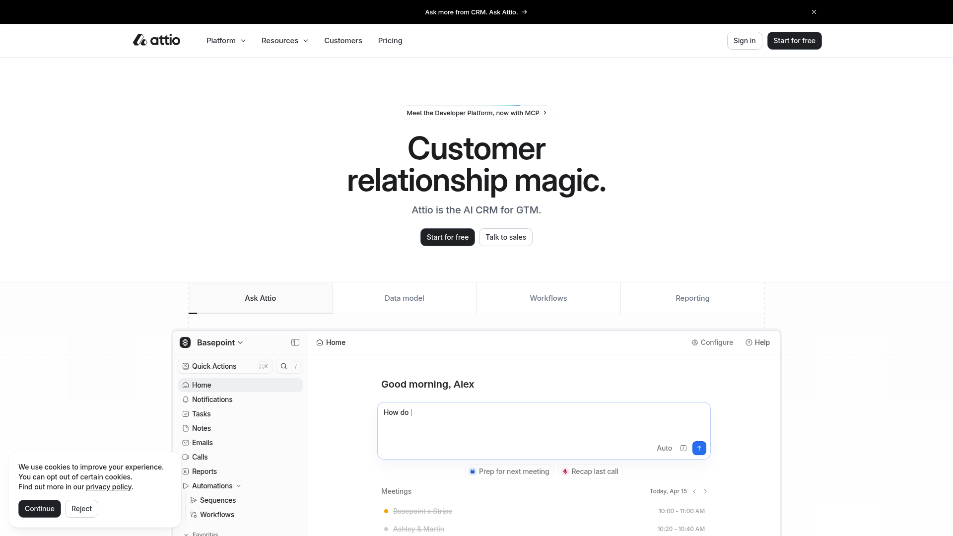
Attio AI CRM Landing Page
A clean SaaS landing page featuring a tiered navigation bar, a centered hero section with twin CTAs, and a detailed interactive dashboard preview.
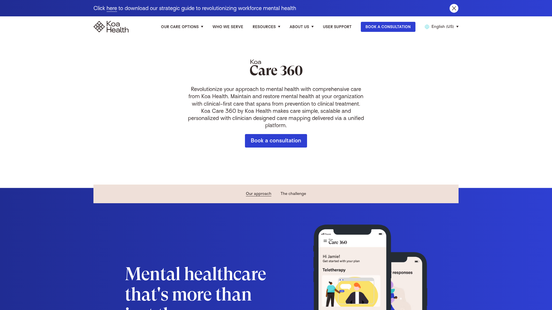
Koa Health Mental Care Landing Page
A clean healthcare landing page featuring a centered hero section, scroll-based fade-in animations, overlapping mobile mockups, and a multi-column feature grid with accent borders.
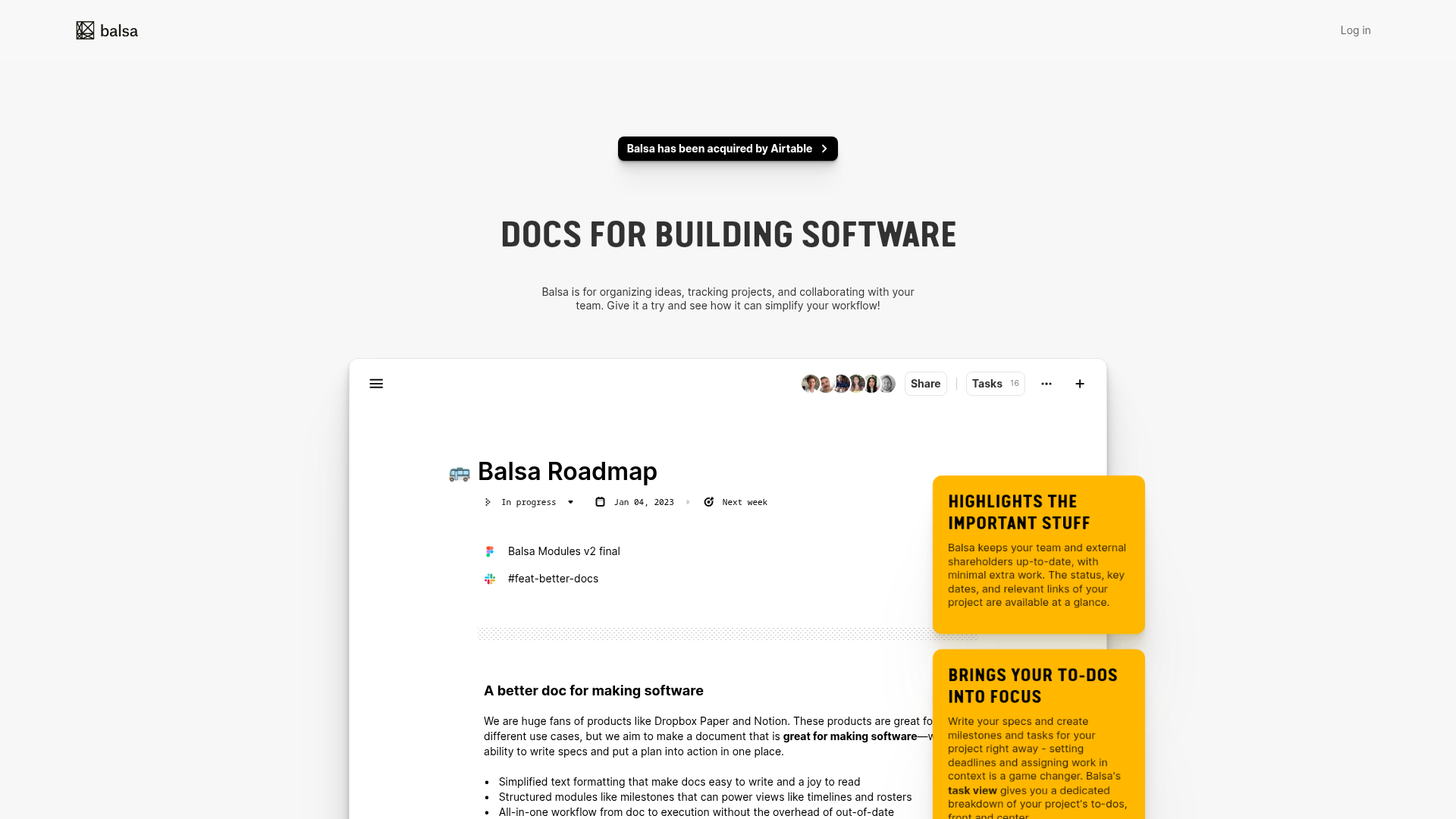
Balsa Software Documentation Landing Page
A clean document-centric layout featuring a centered hero section, high-contrast callout boxes, and a nested dashboard UI preview for collaborative tool showcases.
Firebase Hosting Site Not Found
A minimal placeholder layout for 404 error states including a centered logo, numbered troubleshooting guide, and linked utility text.
Visual AI Landing Page Templates
A high-end SaaS layout featuring a serif-heavy typography system, bento-style product showcase grids, accordion-style feature blocks, and minimalist wireframe UI components.
