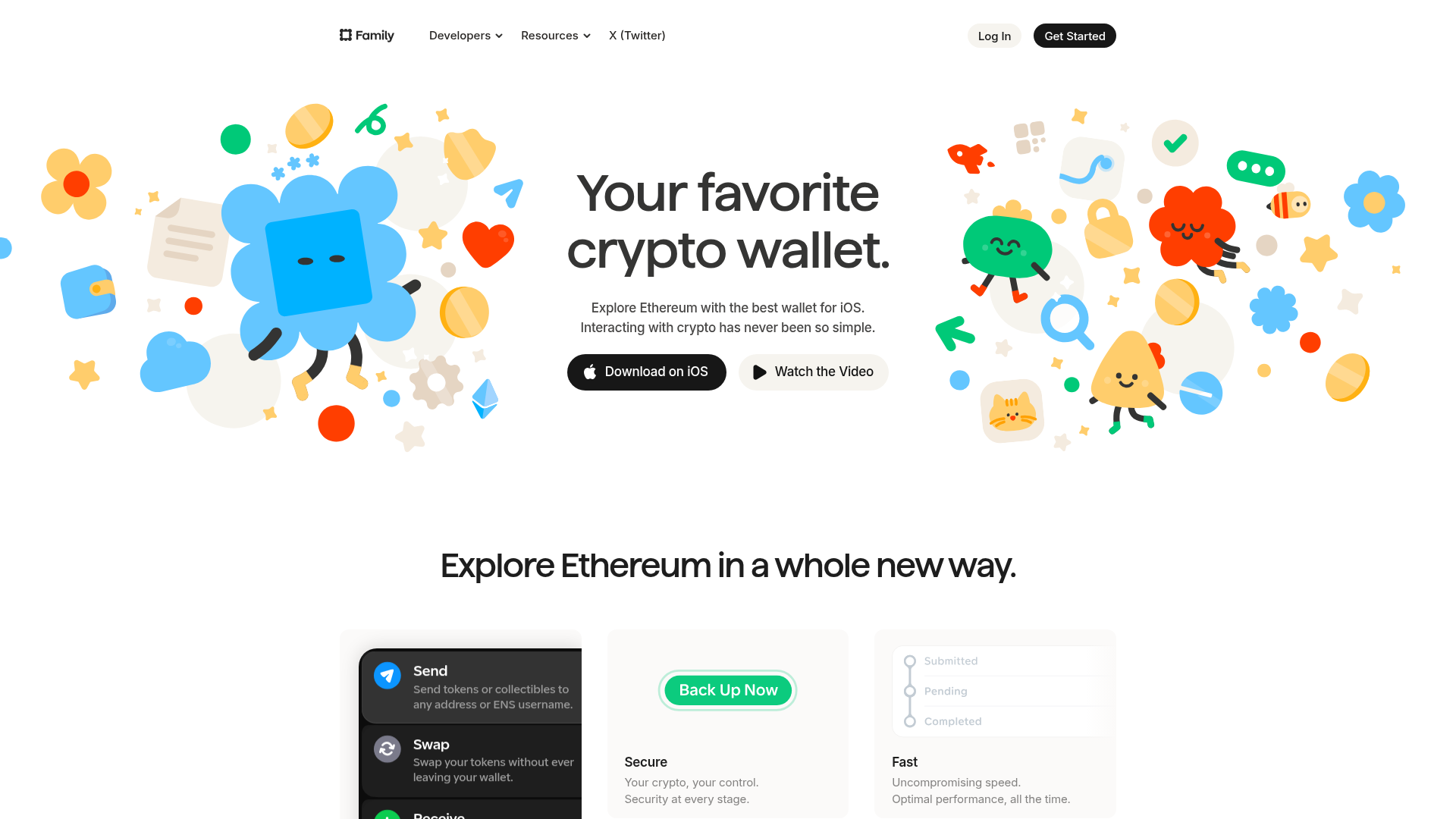
Family Crypto Wallet Landing Page
A playful fintech layout featuring vibrant illustrated character hero sections, custom card modules for features, and a clean minimalist navigation bar.
Overview
Family.co is a high-end fintech landing page for an Ethereum wallet that masterfully blends professional financial utility with playful, colorful brand personality. It is an exceptional clone reference for builders looking to humanize complex technical products through custom illustrations and a spacious, modern layout.
Design System
- Color Palette & Visual Hierarchy: The design uses a stark white background to allow a vibrant, multi-colored palette of primary blues, oranges, greens, and yellows to pop. Dark charcoal is used for primary text and call-to-action buttons, creating high contrast for essential navigation and conversion points.
- Typography System: A bold, sans-serif typeface (Inter or similar) is used with tight tracking. Headline hierarchy is clear, featuring large display weights for value propositions (“Your favorite crypto wallet”) and secondary semi-bold weights for feature titles.
- Page Structure: The layout follows a classic high-conversion flow: a centered hero module with dual CTAs, flanked by symmetrical illustration clusters, leading into a three-column feature grid showcasing specific app functionalities (Send, Swap, Backup, Speed).
- Reusable Components:
- Navigation Bar: A clean, horizontal bar with dropdown menus and pill-shaped 'Log In' and 'Get Started' buttons.
- App Store CTAs: The black rounded button for "Download on iOS" provides a solid template for mobile-first software products.
- Feature Cards: Three distinct card styles: an interactive-looking list module for transactions, a minimalist security card with a signature green button, and a vertical progress tracker for transaction states.
- Implementation Clues: The HTML structure indicates a modern component-based architecture (likely React/Next.js) using modular divs for the complex hero illustration layouts and clean nesting for the navigation architecture.
Use Cases
- Target Audience: Fintech startups, Web3 dApps, and consumer productivity tools that want to feel accessible rather than intimidating.
- Effective Remixes: Swap the crypto-specific illustrations for SaaS workflow icons or lifestyle photography while keeping the typography and spacing. The information architecture is highly adaptable for any mobile app launch page.
- Practical Directions: Reuse the hero section layout for high-impact visual branding; clone the three-column feature grid to explain complex technical processes (like "Secure," "Fast," and "Swap").
- Clone Scope: A quick section clone of the hero and feature cards is sufficient for most landing page needs, though full-page cloning is recommended for those wanting to maintain the sophisticated balance of whitespace and playfulness across the entire user journey.
Related Inspirations
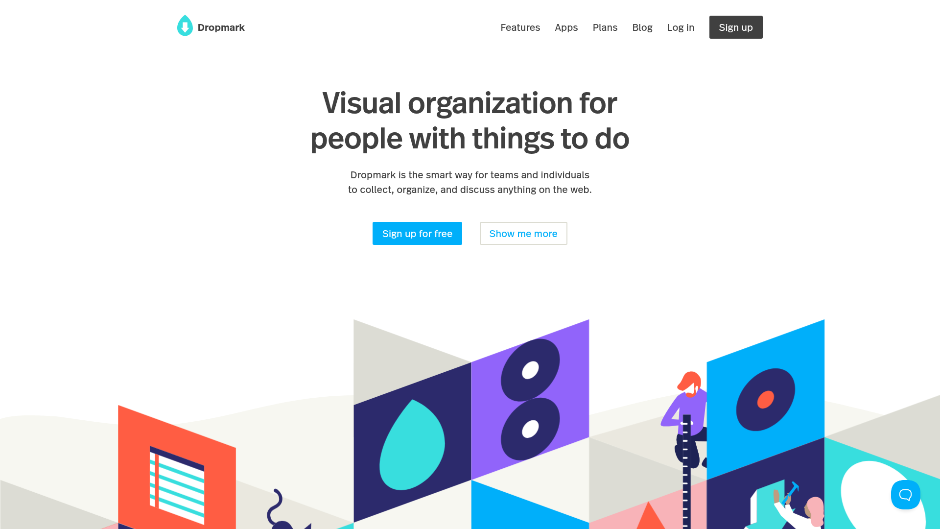
Dropmark Visual Organization Landing Page
Features a clean minimalist hero section with split-action buttons, a vibrant vector illustration footer, and an interactive horizontal flickity carousel for case studies.

Slite SaaS Knowledge Base Landing Page
A clean SaaS hero section with a conversational headline, secondary call-to-action buttons, and a structured software interface preview featuring user testimonials.
MetaMusic Service Landing Page
Features a horizontal scrolling card deck, animated SVG illustrations, a partner logo marquee, and a multi-step process layout with notched corner UI components.
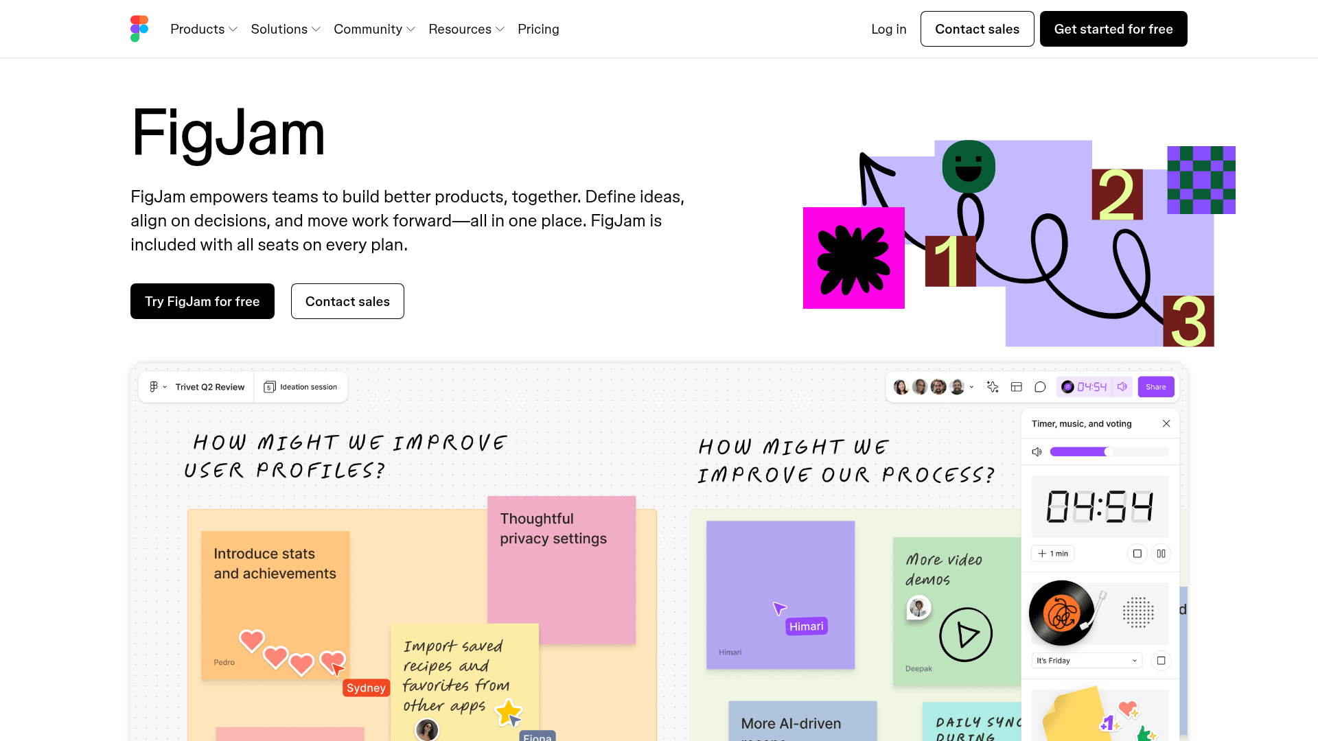
FigJam Product Landing Page
A collaborative tool showcase featuring a centered hero section, logo marquee, vertical tabbed feature switcher, and interactive carousel for templates.
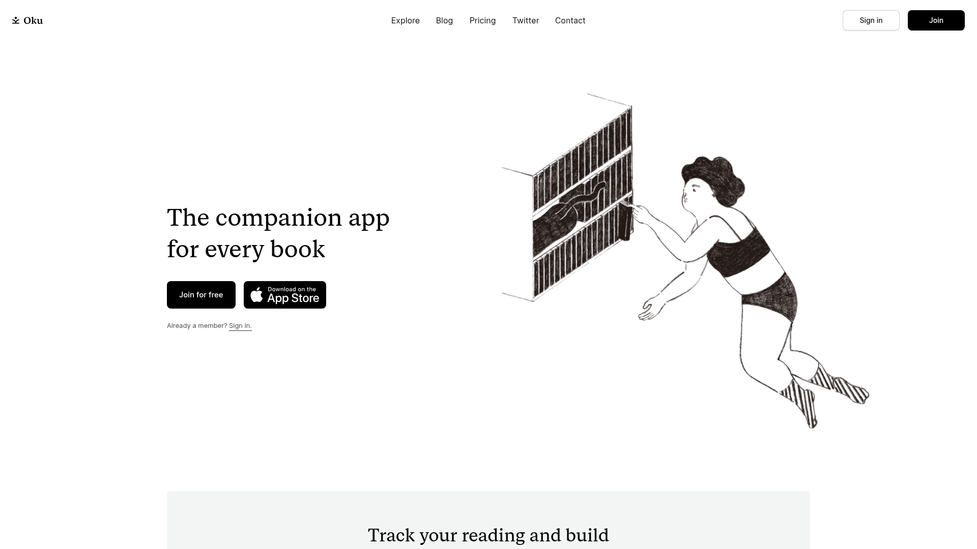
Oku Minimalist Book Tracking Landing Page
A clean, typography-focused landing page featuring a minimalist header, illustrated hero section, and clear call-to-action buttons for app downloads.
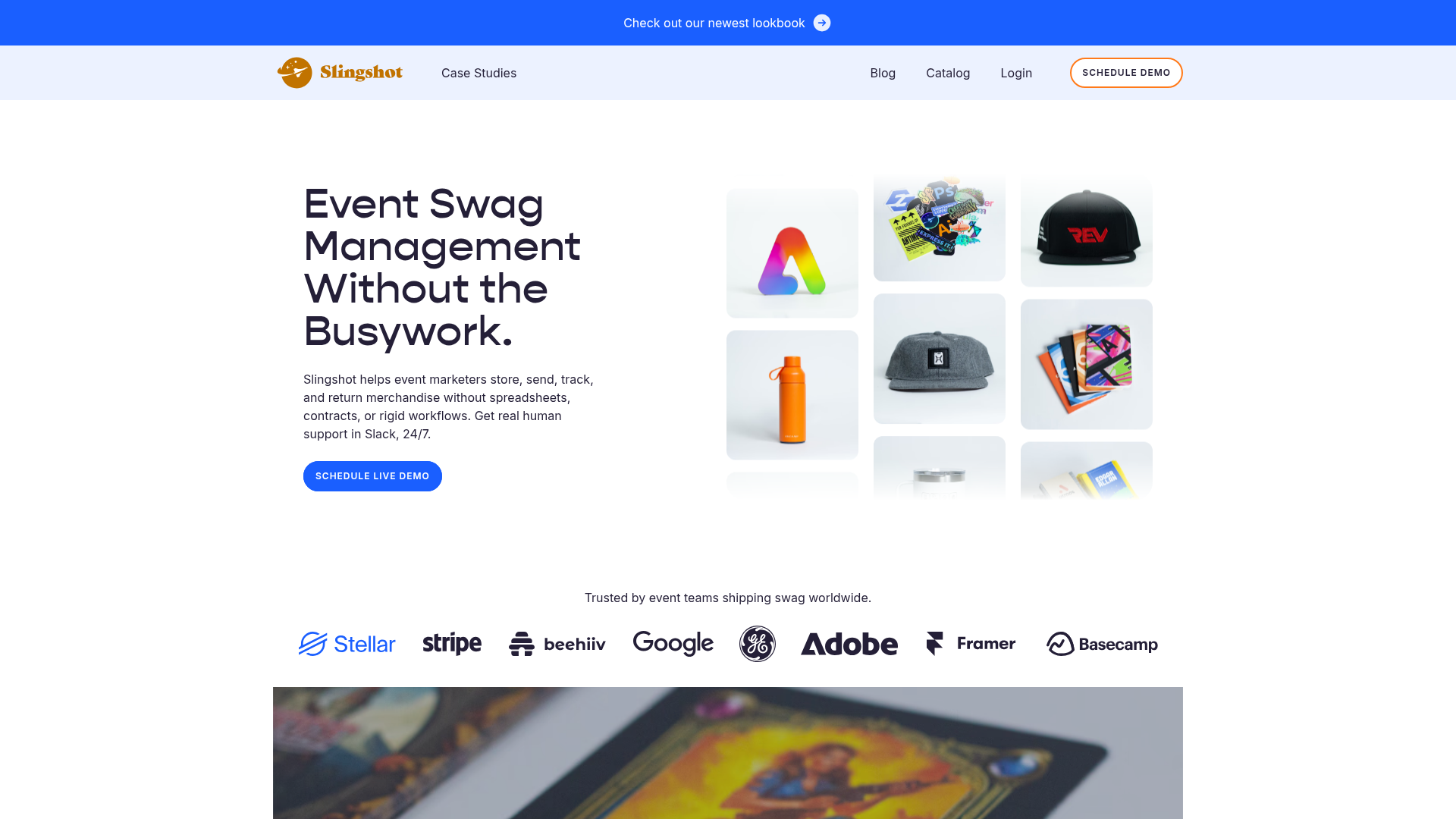
Slingshot Event Swag Hero and Logos
A clean SaaS landing page featuring a split hero layout with promotional product imagery, a call-to-action button, and a monochrome brand logo trust bar.
