MetaMusic Service Landing Page
Features a horizontal scrolling card deck, animated SVG illustrations, a partner logo marquee, and a multi-step process layout with notched corner UI components.
Overview
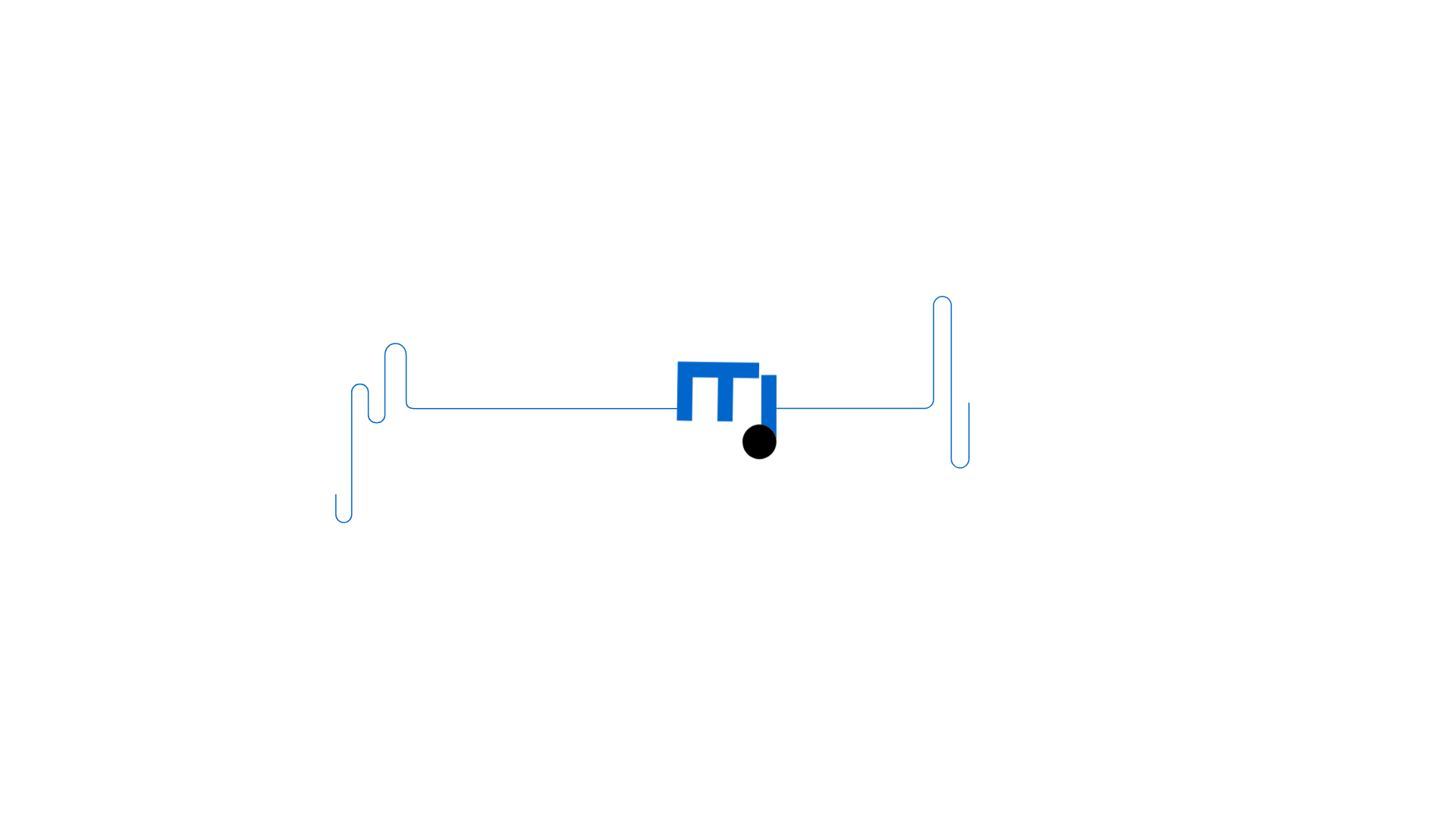
MetaMusic is a sophisticated service landing page designed for managing complex industry data. It is a premier reference for cloning due to its unique "notched corner" UI language and highly polished horizontal scrolling carousels. It demonstrates how to present dense technical information through a playful, modern aesthetic that balances technical utility with creative industry appeal.
Design System
- Color Palette & Visual Hierarchy: The site uses a high-contrast palette featuring a vibrant primary blue (
-primary-500), deep purples (-lilac-500), and dark neutrals (-neutral-700). Background colors shift between sections to define distinct content blocks, using these bold colors to guide the eye toward call-to-action (CTA) elements. - Typography: The system uses a clean, sans-serif font scale. It utilizes heavy weights for oversized hero titles (
c-hero_title) and smaller, all-caps overlines (c-overline) to provide categorization and structural hierarchy. - Page Structure: The layout follows a modular flow: an immersive hero section with floating SVG illustrations, a vertical feature list, a large horizontal scrolling card deck for value propositions, a multi-step process guide, and finally a logo marquee for social proof.
- Reusable Components:
- Notched UI Elements: The core visual hook is the
o-notchcomponent used for buttons and cards, which features a cut-out corner containing indices or icons. - Interactive Cards: The
c-cardcomponent combines icons, titles, and descriptions within a specific geometric frame. - Logo Marquee: A seamless horizontal infinite scroll (
c-marquee) for partner logos.
- Notched UI Elements: The core visual hook is the
- Interaction & Motion: The site heavily utilizes parallax scrolling (
data-scroll-parallax) for floating illustrations and horizontal scroll triggers for the card decks. Entry animations use transform offsets (translating from 120px to 0px) combined with opacity fades to create a staged entrance for text blocks. - Implementation Clues: HTML classes indicate a utility-first approach with a custom component library (prefixed with
o-for objects andc-for components). It usesflickityfor carousels and appears to rely on GSAP or a similar engine for sophisticated scroll-based transformations.
Use Cases
- Who should clone this pattern: B2B SaaS builders or service providers who need to explain a complex workflow or a multi-stakeholder platform without overwhelming the user.
- Target Products: Creative agencies, music distribution platforms, Fintech dashboards, or educational tools that benefit from a "guide-style" horizontal flow.
- Practical Remix Directions:
- Geometric Branding: Swap the notched corner radius or shape (e.g., change the
-radius-smclass) to match different brand identities. - Simplified Architecture: Reuse the multi-step
c-stepsection to create onboarding guides or "How it Works" sections for any product. - Icon Swap: The floating SVGs in the hero can be replaced with 3D renders or product screenshots to shift from an illustrative to a literal style.
- Geometric Branding: Swap the notched corner radius or shape (e.g., change the
- Suggested Clone Scope: Start by cloning the
o-notchCSS and the horizontal card container (o-horizontal-layout) as a standalone feature section before committing to the full multi-layered page structure.
Related Inspirations
FigJam Product Landing Page
A collaborative tool showcase featuring a centered hero section, logo marquee, vertical tabbed feature switcher, and interactive carousel for templates.
Figma Landing Page Gallery Hero
A dynamic landing page featuring a center-focused search bar hero, a horizontally-scrolling interactive video carousel, and a clean brand logo grid.
Dropmark Visual Organization Landing Page
Features a clean minimalist hero section with split-action buttons, a vibrant vector illustration footer, and an interactive horizontal flickity carousel for case studies.

Slite SaaS Knowledge Base Landing Page
A clean SaaS hero section with a conversational headline, secondary call-to-action buttons, and a structured software interface preview featuring user testimonials.
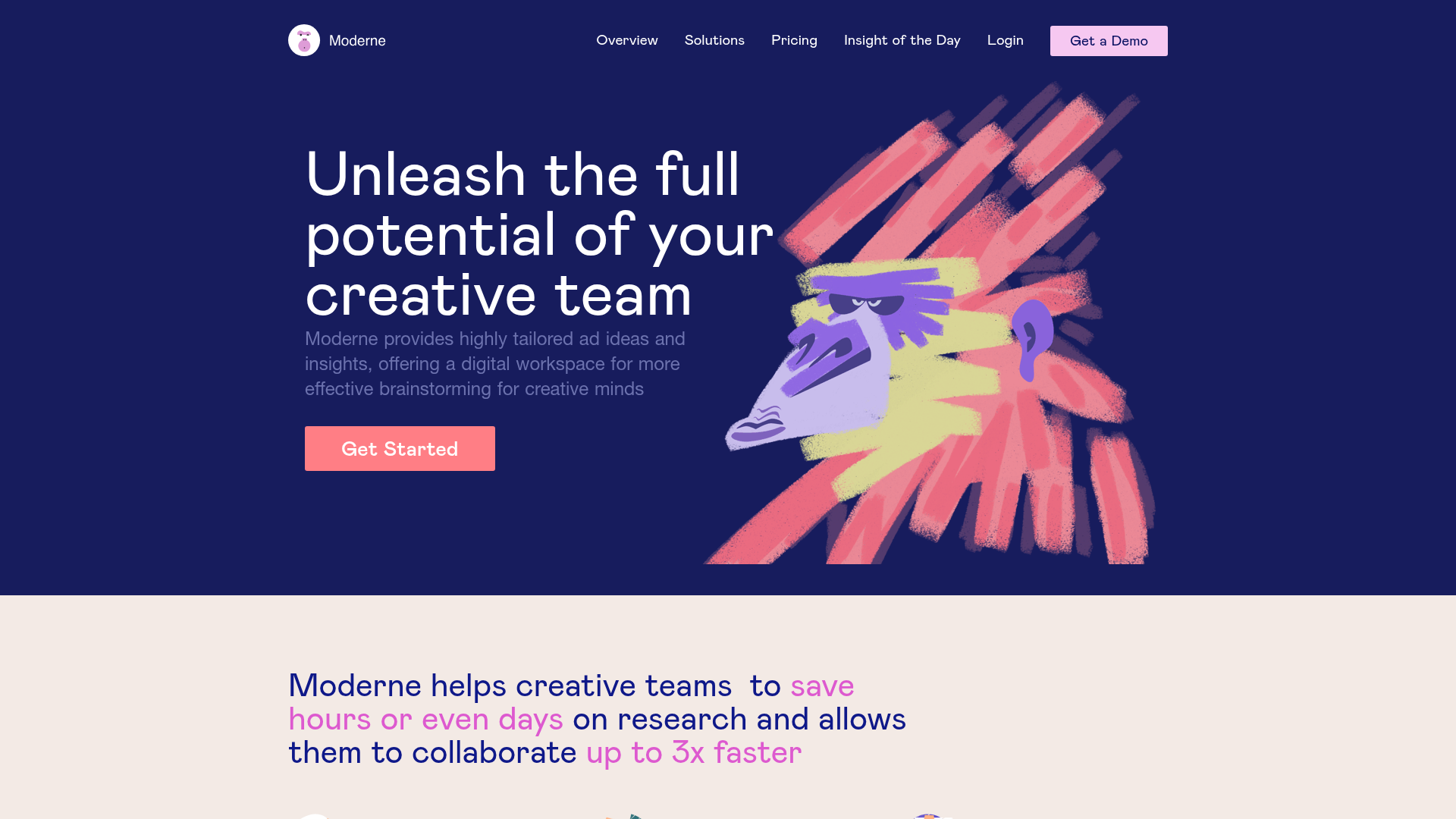
Moderne Creative Landing Page
A high-contrast landing page featuring a dark hero section with an artistic illustration overlay, distinct alternating content blocks, and a visual comparison bar chart component.
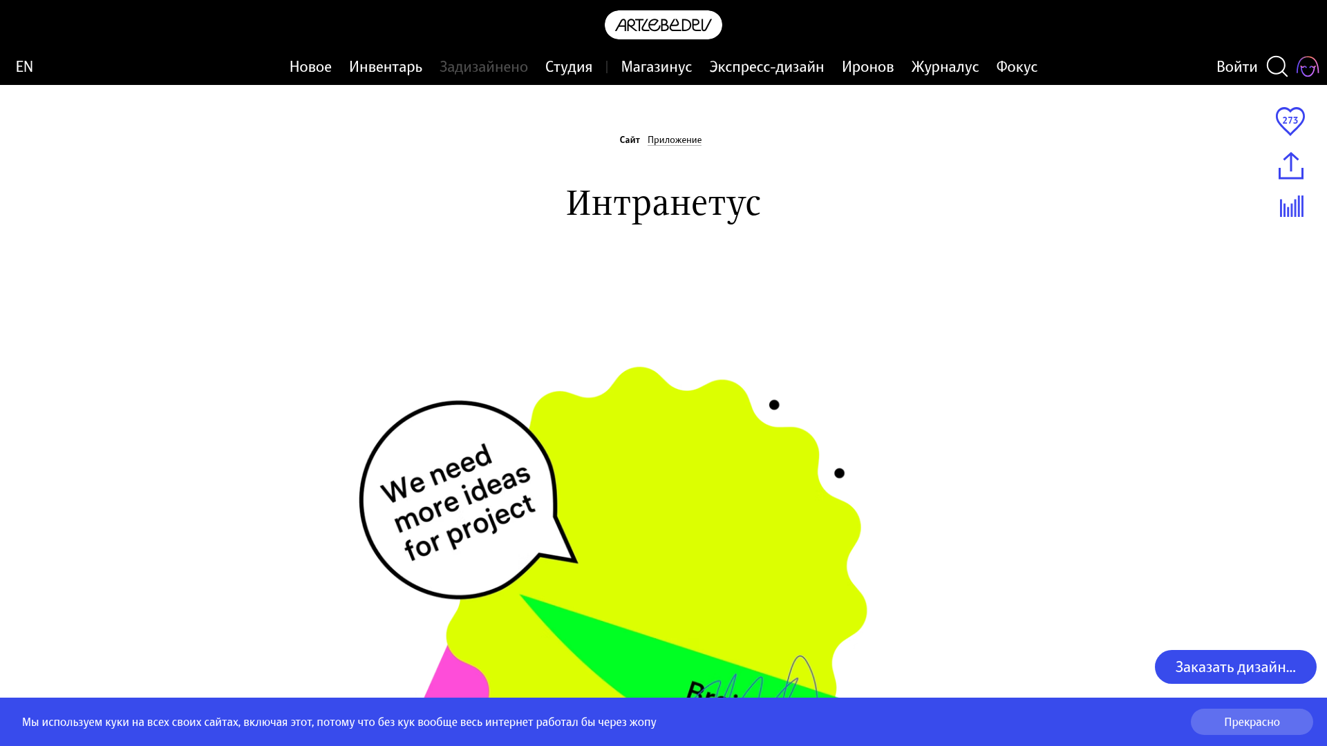
Intranetus Project Showcase Landing Page
A high-concept portfolio page featuring a large-scale video hero, Lottie animations, layered parallax transition effects, and a vertical grid of browser-mockup feature cards.
