Woset Illustrative E-commerce Product Grid
A whimsical retail layout featuring a hand-drawn aesthetic, high-contrast typography, and a unique animated product filtering system for creative brands.
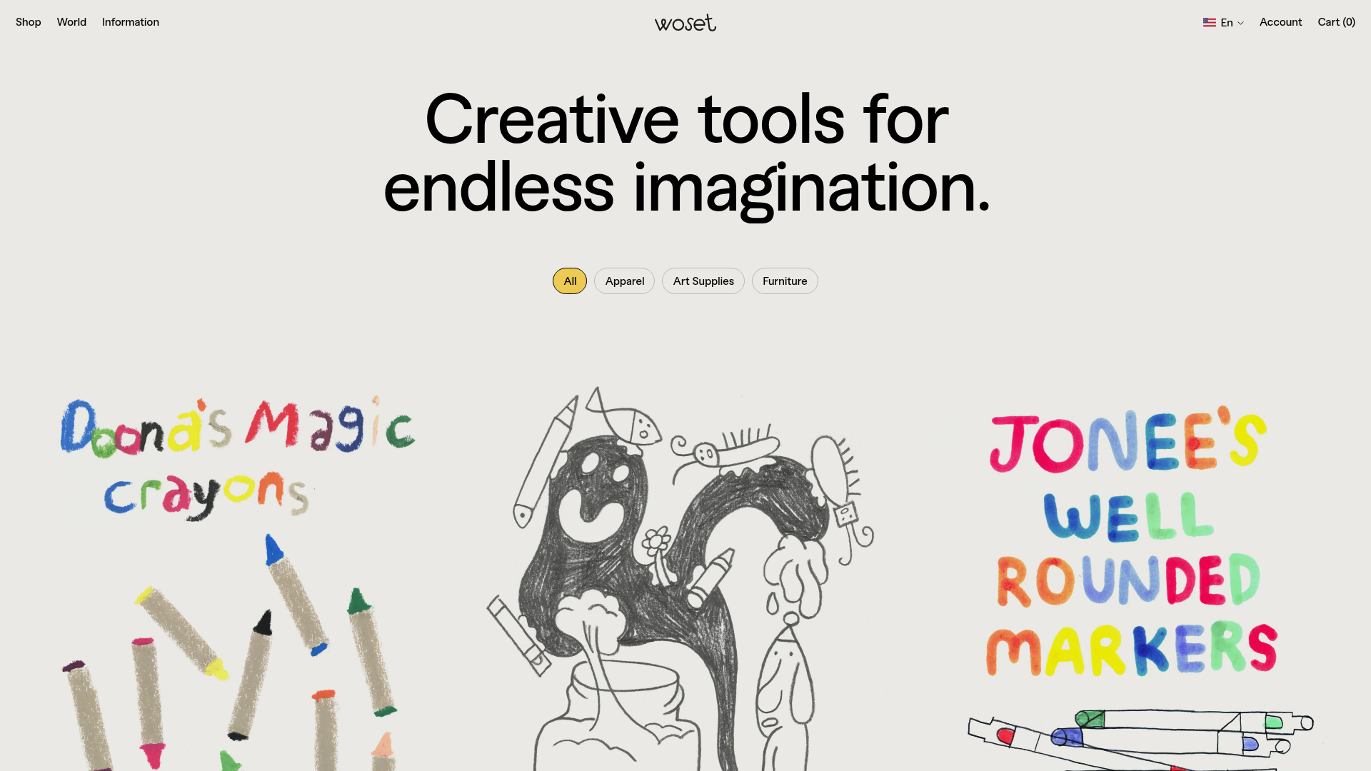
Overview
Woset is a playful, illustrative e-commerce platform that challenges traditional retail aesthetics with a hand-drawn, "creative-first" approach. It serves as a strong reference for builders looking to implement non-grid-based layouts, custom filtering animations, and high-energy product storytelling within a functional Shopify framework.
Design System
- Color Palette & Visual Hierarchy: The background uses a soft, off-white/cream hex (#FDFBF7) to mimic paper, providing a neutral canvas for the vibrant, primary-color-heavy illustrations. Hierarchy is established through size rather than color; the bold black typography commands attention while yellow accent buttons (
btn--yellow) serve as the primary calls to action. - Typography System: The site uses a high-contrast serif/gothic mix. The hero headline is oversized and tightly tracked. Product titles in the grid use a clean, medium-weight sans-serif (A1 Gothic), while interactive elements like filters use uppercase labels for clarity.
- Page Structure & Section Flow:
- Header: Minimalist centered logo with utility links (Shop, World, Information) and a localized language switcher.
- Hero: Large, centered typography statement.
- Interaction Layer: Horizontal pill-shaped filter buttons with a rotate-on-hover effect.
- Product Grid: A staggered, masonry-style layout where product cards are defined by oversized, illustrative JPG/WebP images rather than strict borders.
- Reusable Components:
- Interactive Pilling Filters: The
js-product-filterbuttons utilize a uniquebtn--hover-rotateclass that adds organic motion to a standard UI element. - Illustrative Product Cards: Each card contains a large image link, a "Quick Add" button that appears on hover, and basic metadata (title and price) positioned below.
- Interactive Pilling Filters: The
- Interaction & Motion: The HTML reveals a
js-loading-overlayandjs-cart-msgnotification system, suggesting a seamless AJAX-based shopping experience. Filters use active state classes (is-active) to provide immediate visual feedback. - Implementation Clues: Built on Shopify, the layout uses custom CSS classes like
product-grid-itemand a containerized structure (hero-text .container). It relies on lazy-loading for image performance while maintaining a complex, illustrative aesthetic.
Use Cases
- Who should clone this: Brands in the education, stationery, kid-focused tech, or artisanal craft spaces that want to emphasize creativity over corporate efficiency.
- Effective Remixes: This pattern works perfectly for digital marketplaces selling assets (fonts, brushes, templates) or boutique apparel brands wanting an "art-gallery" feel for their collections.
- Practical Remix Directions: Builders can retain the staggered grid logic but swap the hand-drawn illustrations for high-fashion editorial photography. The "Quick Add" button logic can be easily integrated into more standard layouts to improve conversion without clutter.
- Suggested Clone Scope: Start by cloning the Product Filter + Staggered Grid combination. This allows you to capture the core "look and feel" of the site without needing to build out the entire world-building content (the "World"/"Information" sections).
Related Inspirations
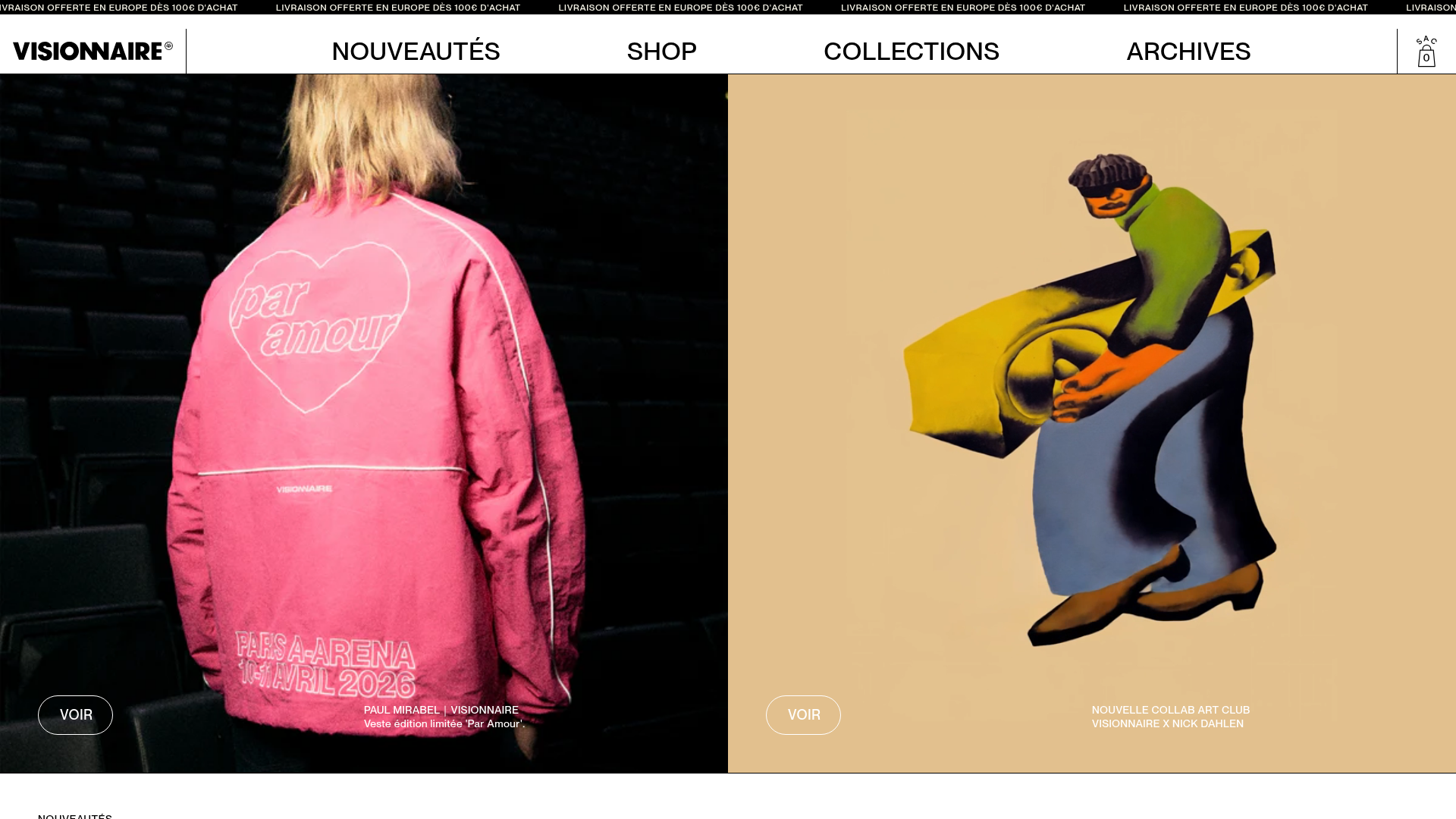
Visionnaire E-commerce Streetwear Layout
A clean Shopify-based fashion storefront featuring high-impact image/video split hero sections, a horizontal product carousel with size indicators, and a minimalist full-screen navigation bar.
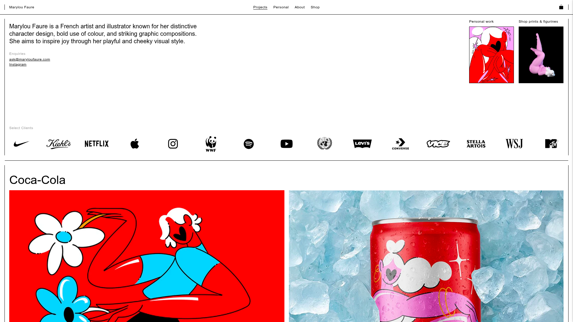
Marylou Faure Illustration Portfolio
A minimalist Shopify-based portfolio featuring a grid-based project layout, sticky navigation, a client logo marquee, and image-rich project carousels.
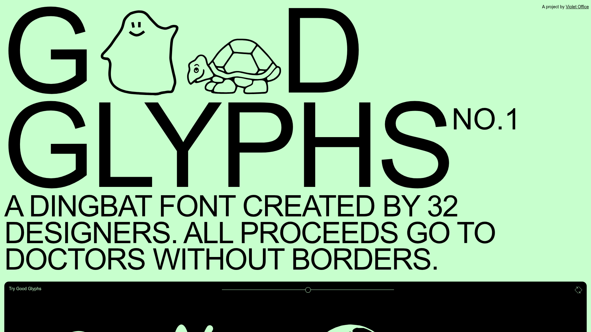
Good Glyphs Font Showcase Landing Page
A single-page layout featuring an interactive type tester, donation form with custom amount logic, and a contributor gallery using swiper-based glyph previews.
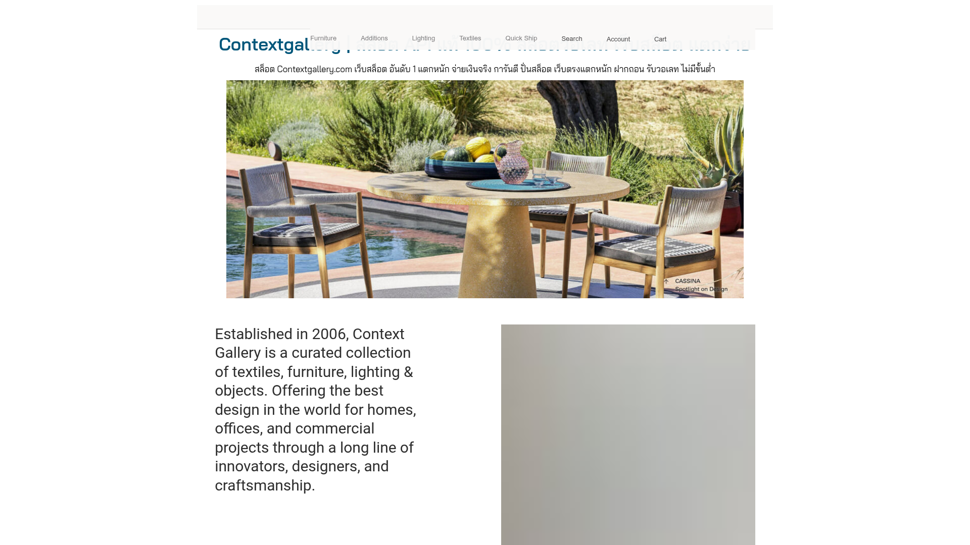
Context Gallery High-End Furniture Landing Page
A minimal editorial layout featuring a multi-column product carousel, designer biographies with image-text pairings, and a magazine-style content grid for curated design stories.
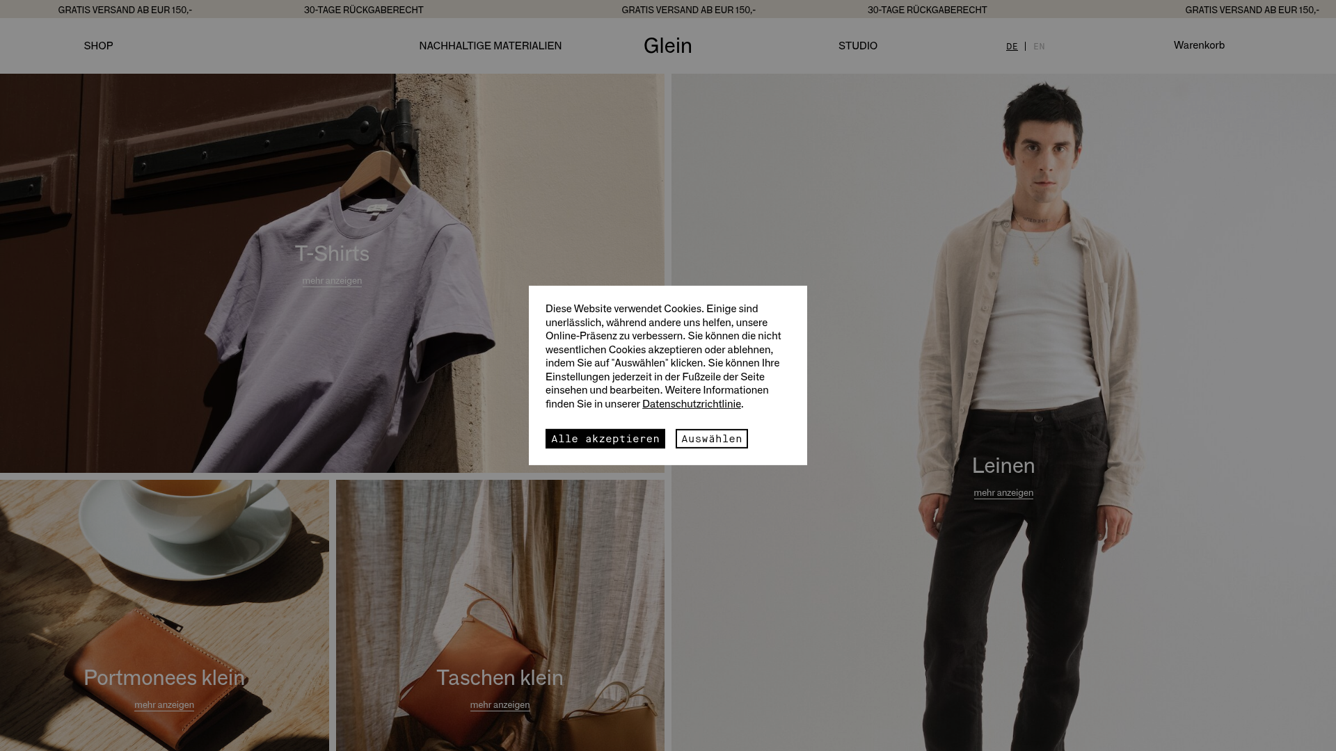
Glein Minimalistic Bento Grid eCommerce
A clean, modular layout using a bento-style responsive grid of text teasers and large-scale product imagery for lookbooks and collection browsing.
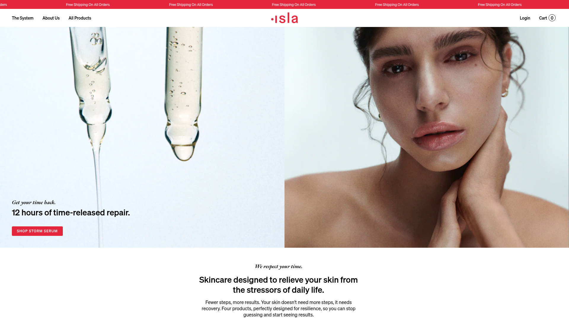
Isla Beauty Skincare E-commerce Store
A clean Shopify-based storefront featuring a split-hero landing page, a step-by-step product system carousel, and a split-screen testimonial section with localized product image sidebars.
