Visionnaire E-commerce Streetwear Layout
A clean Shopify-based fashion storefront featuring high-impact image/video split hero sections, a horizontal product carousel with size indicators, and a minimalist full-screen navigation bar.
Overview
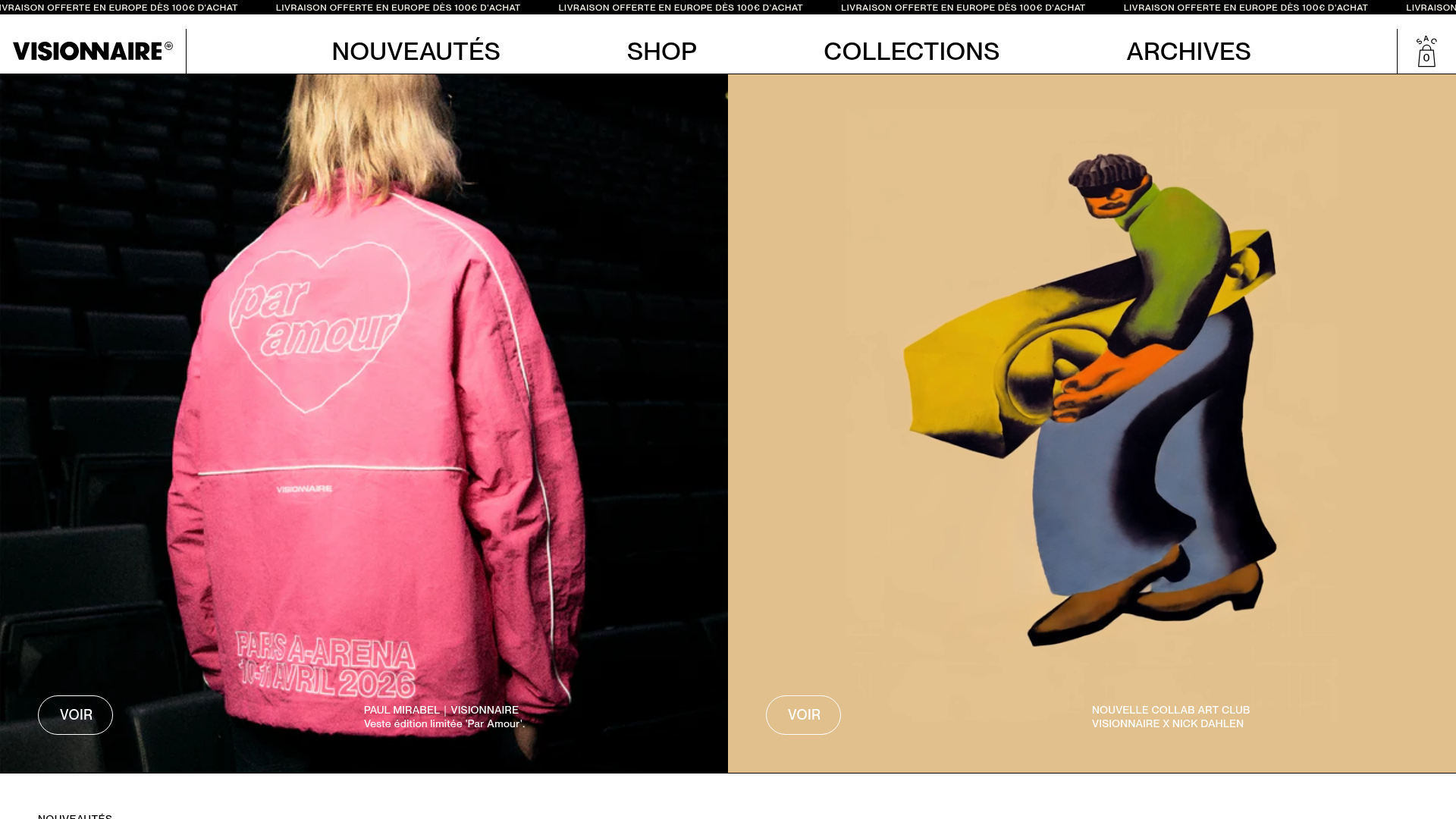
Visionnaire is a modern, high-fashion streetwear storefront built on Shopify that prioritizes cinematic imagery and bold white space. It's a premier reference for creators looking to bridge the gap between editorial lookbooks and high-conversion e-commerce through its seamless blend of full-bleed media and minimalist UI.
Design System
- Color Palette & Visual Hierarchy: The site uses a high-contrast foundation of absolute black (#000000) for headers and background sections, accented by ivory whites (#F7F5E8). This monochrome base allows the vibrant product photography—often featuring bright pinks, greens, and ochres—to serve as the primary visual driver.
- Typography: The interface utilizes a clean, sans-serif font family with a heavy reliance on uppercase transformations. The navigation and product titles prioritize legibility with generous letter spacing, while specific brand callouts (e.g., "EST. 2017") use bold weight for emphasis.
- Page Structure & Flow: The layout follows a modular "Push" architecture. It opens with an announcement bar ticker, followed by static or video split-hero sections (push--half). Below the primary fold, a horizontal product grid (home-products) transitions into vertical editorial blocks and a masonry-style collection list.
- Reusable Components:
- Ghost Buttons: Transparent CTA buttons with thin white/black borders and "VOIR" (View) labels that float over imagery.
- Dynamic Product Cards: Features a 'hover-to-swap' image feature and an integrated size inventory display (S, M, L) directly on the grid.
- Marquee Announcement Bar: A CSS-animated ticker for rotating store news.
- Interaction Patterns: The design uses Lottie animations for brand logos and subtle smooth-scale transitions on image hovers. The cart and navigation appear as minimalist side-drawers (vCart) to maintain a focal point on content.
- Implementation Clues: The HTML reveals a custom Shopify Liquid structure utilizing utility-first classes (flex, justify-center, gap-2). It incorporates modern media handling with
<lottie-player>and<video loop muted playsinline>for a living storefront feel.
Use Cases
- Target Audience: Designers looking to build a "drop-style" brand site where inventory is limited but visual impact needs to be maximum.
- Remix Strategy: Highly effective for photography-led industries such as boutique jewelry, architectural furniture, or limited-run print magazines.
- Remix Directions: Swap the high-energy streetwear photography for a moody, low-light aesthetic to create a luxury brand feel. Maintain the size-picker on the category page to reduce friction for apparel brands.
- Clone Scope: Beginners should clone the
push--halfsplit video/image sections for hero areas. Intermediate builders can replicate the full-screen side-drawer menu and the integrated size-indicator product grid.
Related Inspirations

Context Gallery High-End Furniture Landing Page
A minimal editorial layout featuring a multi-column product carousel, designer biographies with image-text pairings, and a magazine-style content grid for curated design stories.

Glein Minimalistic Bento Grid eCommerce
A clean, modular layout using a bento-style responsive grid of text teasers and large-scale product imagery for lookbooks and collection browsing.

Isla Beauty Skincare E-commerce Store
A clean Shopify-based storefront featuring a split-hero landing page, a step-by-step product system carousel, and a split-screen testimonial section with localized product image sidebars.

Stojo Collapsible E-commerce Storefront
A Shopify layout featuring a prominent discount modal, mosaic grid hero sections, and clean product cards with integrated color swatches and quick-buy functionality.

Basic.Space E-commerce Gallery Clone
A minimalist product marketplace featuring a clean sticky navigation bar, nested flyout menus, and a horizontally scrollable product carousel with hover-state image switching.

Ashley & Co Lifestyle E-commerce
An elegant Shopify-based storefront featuring a split-screen animated hero, horizontal ticker-tape collection carousel, and dynamic mega-menus with scent-specific color switching and image previews.
