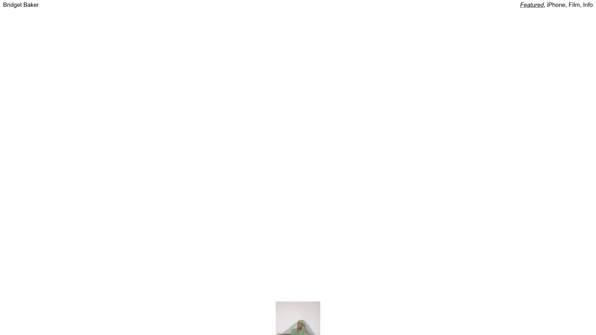
Bridget Baker Photography Portfolio
A minimalist photography showcase featuring a full-screen image slider, overlapping absolute-positioned gallery thumbnails, and a custom numerical navigation counter.
Overview
Bridget Baker’s portfolio is a high-impact, minimalist photography showcase built for maximum visual immersion. It features a unique dual-layered navigation system: an interactive "scattered" thumbnail landing page and a full-screen Swiper-based slider for controlled browsing. This is an excellent reference for builders looking to implement non-linear gallery layouts and custom numerical navigation.
Design System
- Color Palette & Visual Hierarchy: The site uses a high-contrast, text-on-white approach (white background, black text). The visual hierarchy is almost entirely flat, allowing the photography's colors to dictate the mood of the experience.
- Typography: A clean, sans-serif typeface is used in a very small scale for the top-level navigation and the numerical counter (0041 / 0041). The branding ("Bridget Baker") is placed in the top-left, while category links ("iPhone, Film, Info") occupy the top-right, creating a balanced frame around the central content.
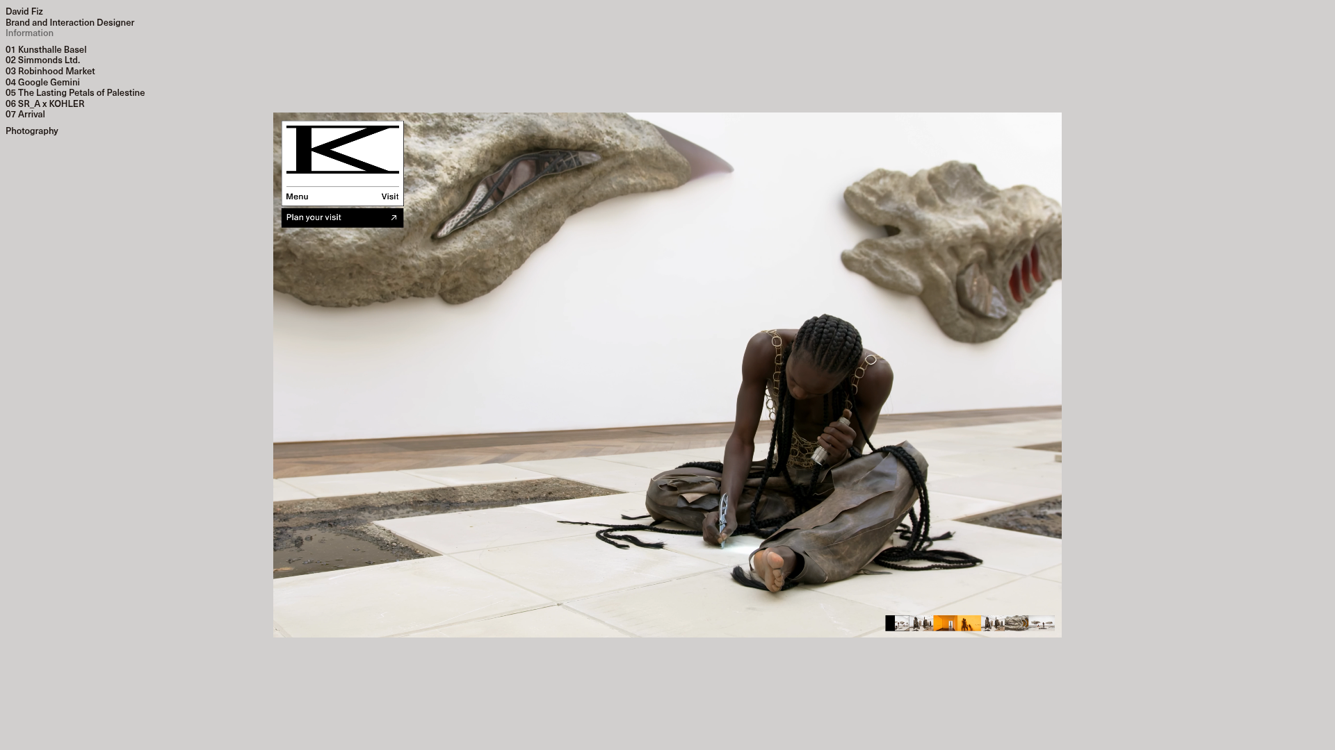
- Page Structure & Flow: The entry point features a
scrollContainercontaining images withabsolutepositioning and randomizedtransform: translate3d()values. This creates a messy, tactile "stack" of photos. Clicking an image expands it into thegalleryInnerslider (built with Swiper.js), providing a structured, linear viewing experience. - Reusable Components:
- Scattered Gallery: The most unique component, using CSS transforms to overlap images.
- Numerical Counter: A custom
<span class="num">component that counts individual images rather than standard pagination dots. - The Curtain: A
div.curtainelement used for smooth transitions between the overview and the slider.
- Interaction & Motion: The site relies heavily on CSS transforms for positioning and likely uses smooth-scrolling or dragging for the thumbnail layer. The slider includes a "Close" action that returns the user to the scattered view.
- Implementation Clues: Built using Svelte (indicated by
svelte-scoped classes) and Swiper.js for the slider functionality. Sanity.io is used as the Headless CMS, evidenced by the image CDN URLs.
Use Cases
- Who should clone this: Editorial photographers, fashion stylists, and creative directors needing a digital portfolio that mirrors the feel of a physical scrapbook or mood board.
- Remixing the pattern: The scattered thumbnail layout can be remixed for a retail "Lookbook" where clicking a scattered item opens a shopping modal. The numerical counter is a perfect replacement for standard "Next/Back" buttons in high-end luxury sites.
- Practical Directions: Reuse the absolute-positioned thumbnail grid for a homepage, but swap the full-screen slider for a more standard project detail page to improve SEO. For a quick win, clone the top navigation bar and the fixed numerical footer for a clean minimalist aesthetic.
- Clone Scope: A full-page clone is recommended to preserve the transition logic between the "messy" grid and the "ordered" slider, though the numerical counter is an easy individual component extract.
Related Inspirations
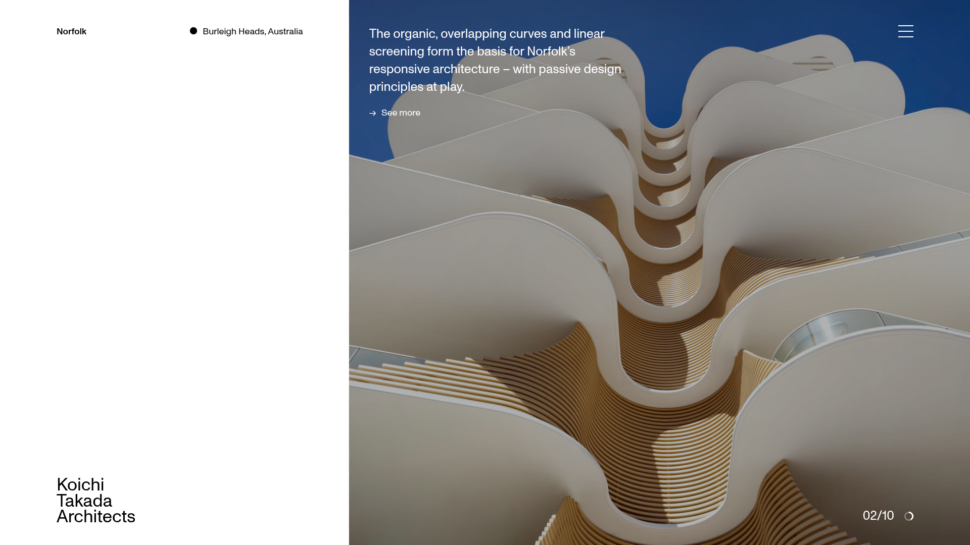
Koichi Takada Architects Portfolio Home
A high-end architectural portfolio featuring a split-screen layout with an interactive project slider, sticky typography, and smooth transition animations.

Xandra Alvarez Allende Photography Portfolio
A minimalist photography site featuring a marquee-style title bar, a staggered vertical image flow, and a full-screen light-box gallery for individual works.
Bruno Arizio Designer Portfolio Website
A minimalist creative director portfolio featuring a clean typographic layout, side-aligned image previews, and high-contrast spacing patterns suitable for luxury or design showcases.

Caserne Design Studio Portfolio
A minimalist, high-impact portfolio featuring a dynamic masonry grid of project thumbnails with overlay text and a clean, oversized typography-driven footer.
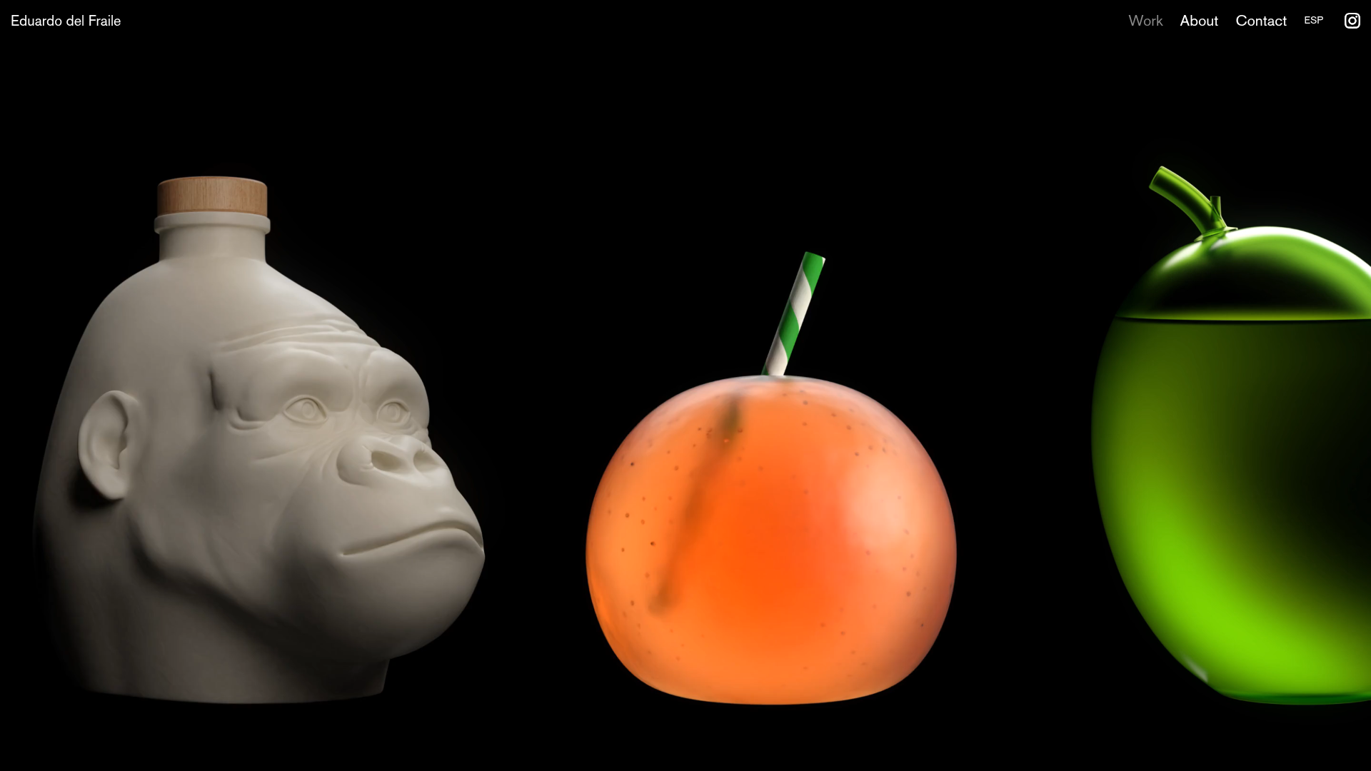
Eduardo del Fraile Horizontal Portfolio
A minimalist horizontal-scroll gallery featuring large-scale media blocks with integrated video-on-hover effects and a custom scrollbar tracker.
David Fiz Visual Design Portfolio
A minimalist portfolio featuring a fixed sidebar navigation paired with an immersive, full-screen media showcase and interactive project-specific image carousels.
