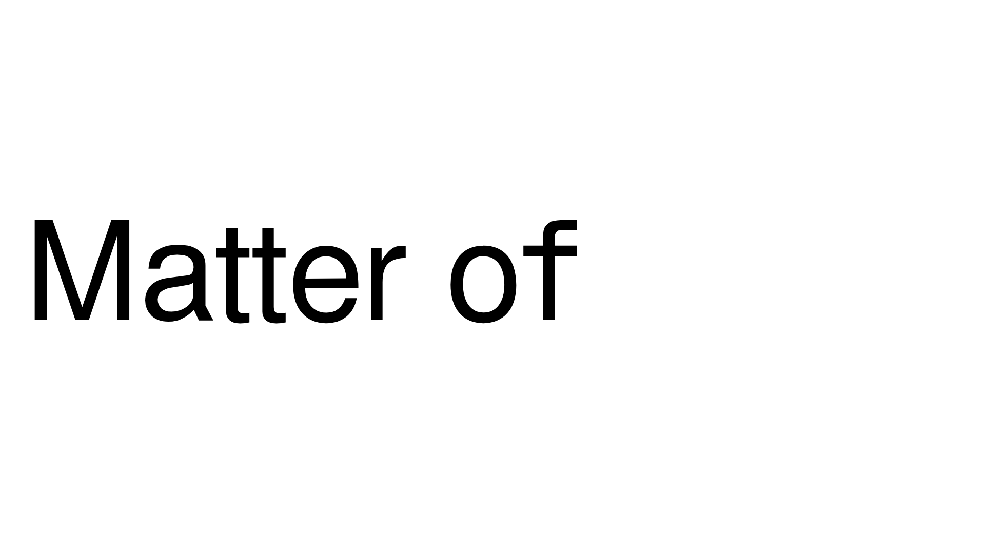
Matter of Fact Typography Landing Page
A minimalist landing page featuring a vertical scrolling text marquee animation for dynamic hero typography using GSAP or CSS transitions.
Overview
This project is a minimalist, high-impact typography landing page that centers on a vertical scrolling word marquee. It is an excellent reference for builders wanting to master "motion typography" where the central brand message dynamically cycles through various states or synonyms using GSAP-driven scroll or time-based triggers.
Design System
- Color Palette & Visual Hierarchy: The design follows a strict monochrome theme (pure black on white), placing 100% of the visual emphasis on the letterforms. There are no distracting UI elements, creating a stark, high-contrast look.
- Typography System: The site uses a clean, sans-serif grotesque typeface. The scale is massive, likely exceeding 15vw, intended to function as the primary graphic element rather than just text. The HTML structure uses an
.is-sr-onlyH1 for SEO while the visual display is split into.title-startand.title-endcontainers. - Page Structure: The layout is extremely focused, consisting of a single
main-contentarea and ananimation-wrapper. The content flow is simple: a static prefix ("Matter of") followed by a vertical stack of interchangeable words. - Reusable Components: The core component is the
animation-wrapper. This consists of a masked overflow container where a long list of words (.title-end) vertically translates and changes opacity as it moves through the focal point. - Interaction & Motion: Based on the HTML attributes, the motion involves complex
translate3dandopacityproperties. As words move up, their opacity fades from 1 to 0, creating a motion-blur or "persistence of vision" effect. The transitions are likely orchestrated via GSAP, as evidenced by the fine-grainedtranslateYpercentages. - Framework Evidence: The HTML reveals use of the Nuxt.js framework (
#_nuxt,#_layout) and custom CSS modules for layout and animation handling.
Use Cases
- Who should clone this: Creative agencies, font foundries, or portfolio owners looking for a sophisticated hero section that makes a bold statement with minimal assets.
- Remixing for products: Saas companies can use this for a "Hero Feature" section where a single sentence prefix remains static (e.g., "Manage your...") while the revolving text cycles through "Team," "Tasks," "Budget," and "Design."
- Practical remix directions: To adapt this, swap the monochrome palette for brand colors, or replace the vertical scroll with a horizontal marquee if the brand name is long. Adding a background video or grain texture behind the text would add depth without breaking the logic.
- Clone scope: This is best as a quick section clone. The specific animation logic within
.title-endis the primary value, which can be dropped into any landing page as a high-conversion hero module.
Related Inspirations

Zeus Jones Agency Landing Page
A minimalist, Gatsby-powered brand agency layout featuring a clean typography focus and a blank canvas aesthetic for high-end portfolio builds.
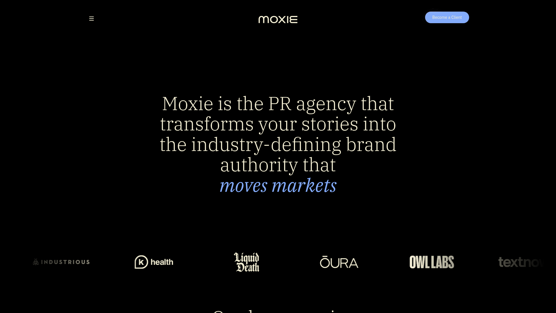
Moxie PR Agency Landing Page
A dark-themed agency site featuring an animated typewriter hero, ticker-style marquee, interactive case study cards with video backgrounds, and a vertical sticky services section.
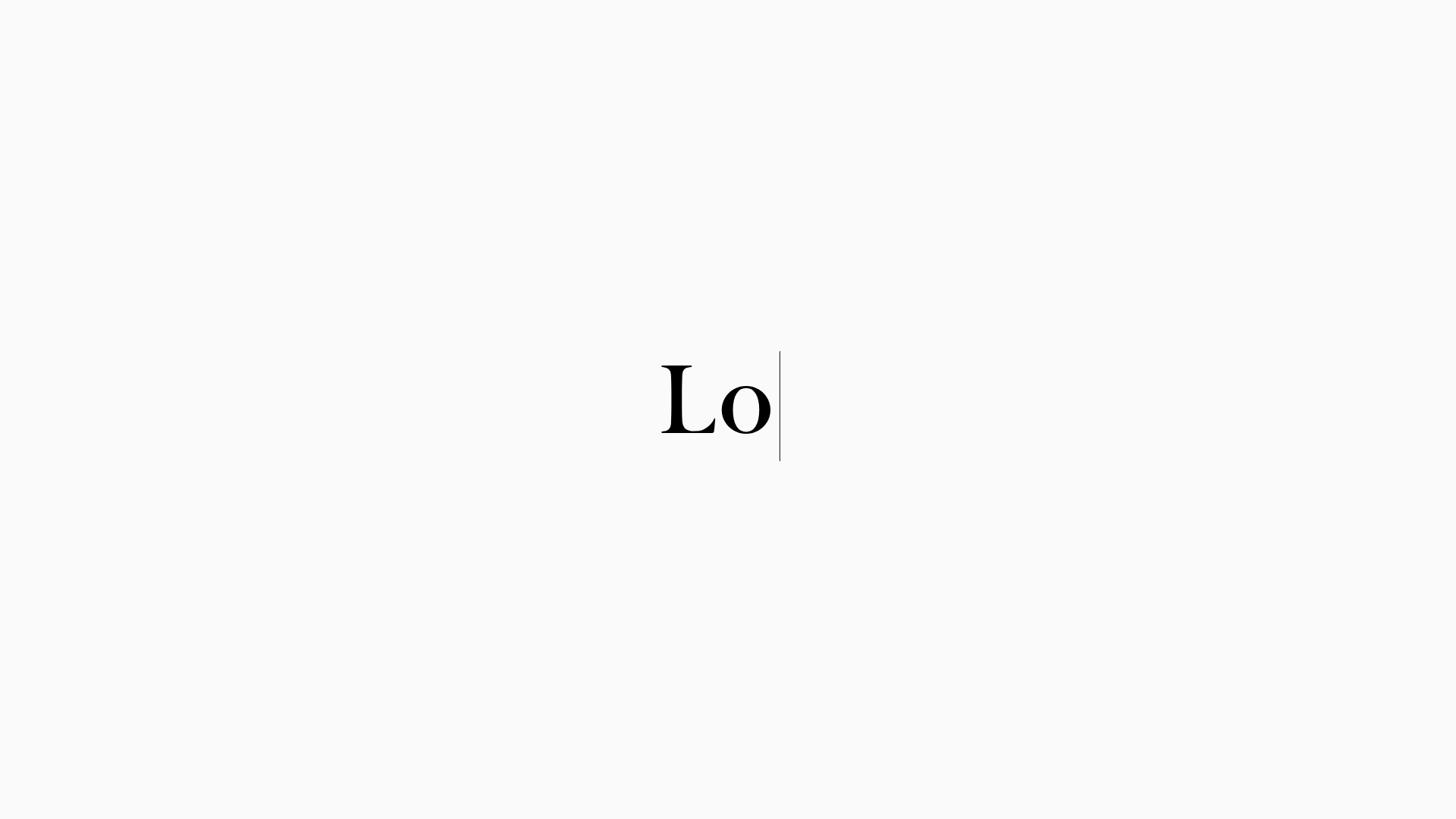
LoveFrom Minimalist Animated Wordmark Landing
A minimalist landing page featuring a center-aligned animated wordmark, a hidden info panel, and a decorative bear animation overlay.
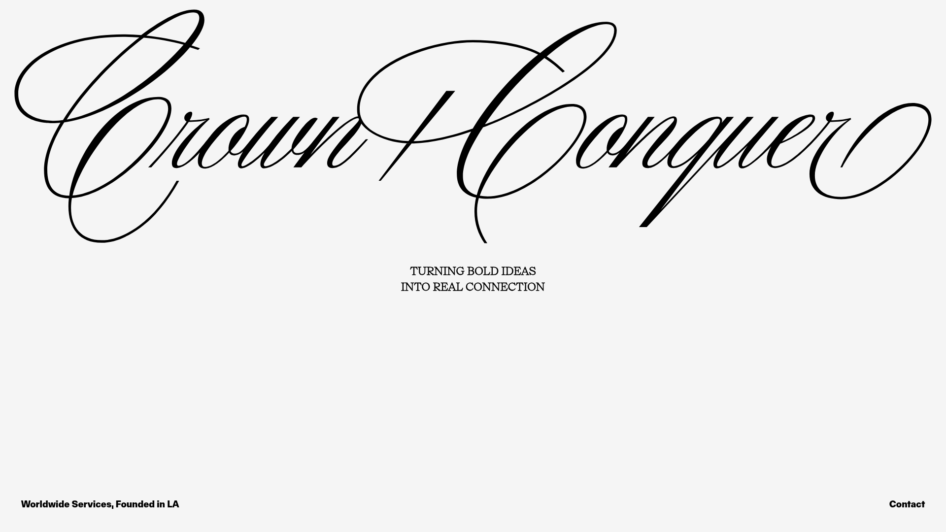
Crown & Conquer Agency Landing Page
A minimalist landing page featuring elegant script typography, a centered hero tagline, and a clean, whitespace-heavy layout for high-end branding.
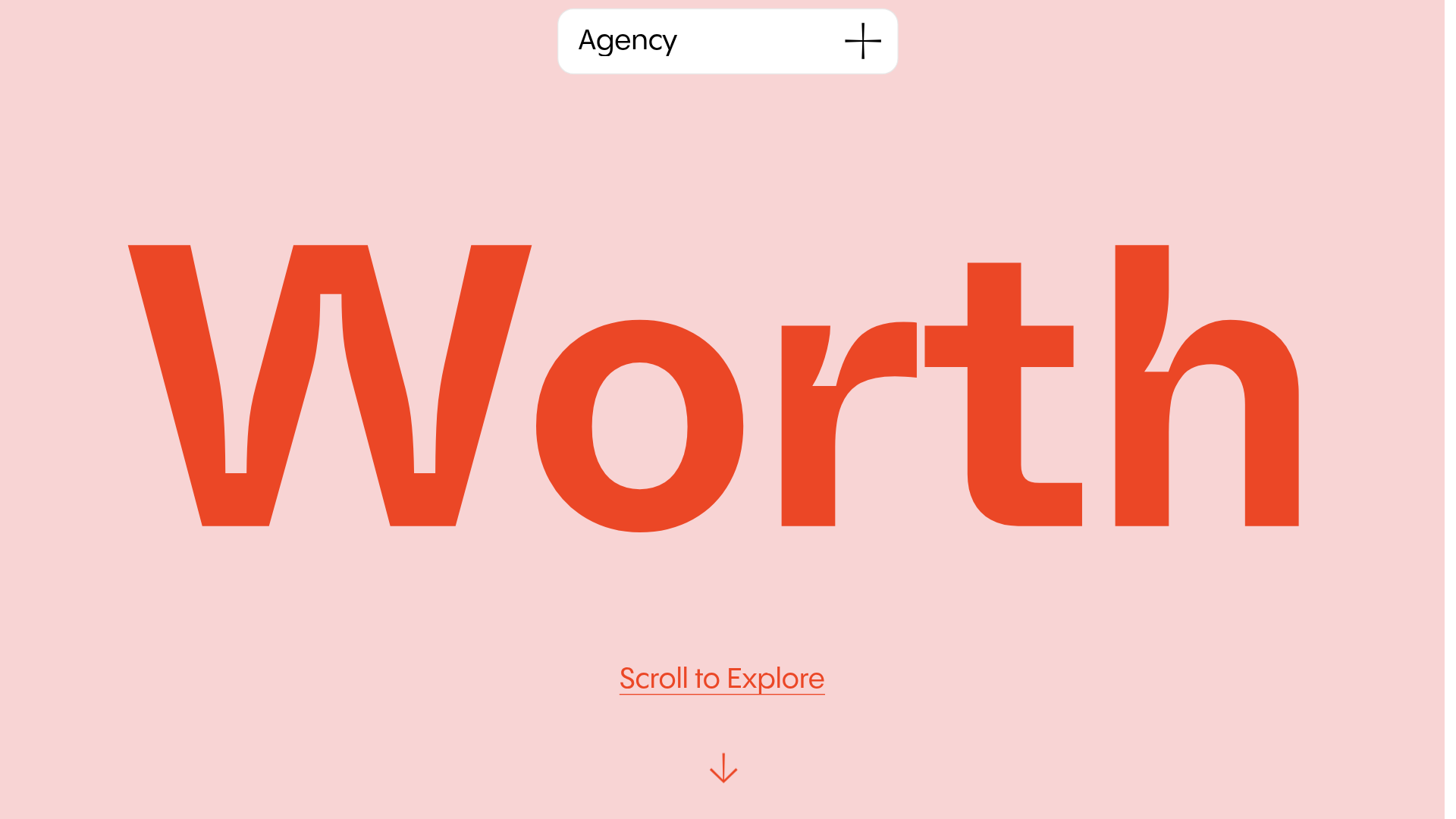
Worth Agency Minimalist Portfolio Landing
A vertical-scroll landing page with large typography, sticky navigation elements, and a clean portfolio grid featuring on-hover image animations and smooth scroll transitions.
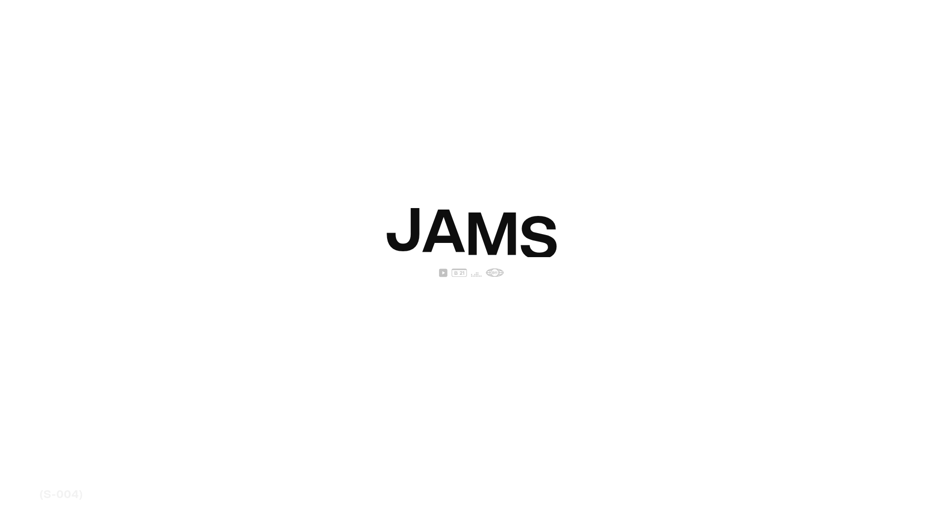
JAMS Agency Landing Page Hero
A minimalist, high-contrast hero section featuring bold typography and clean iconographic navigation over a white canvas.
