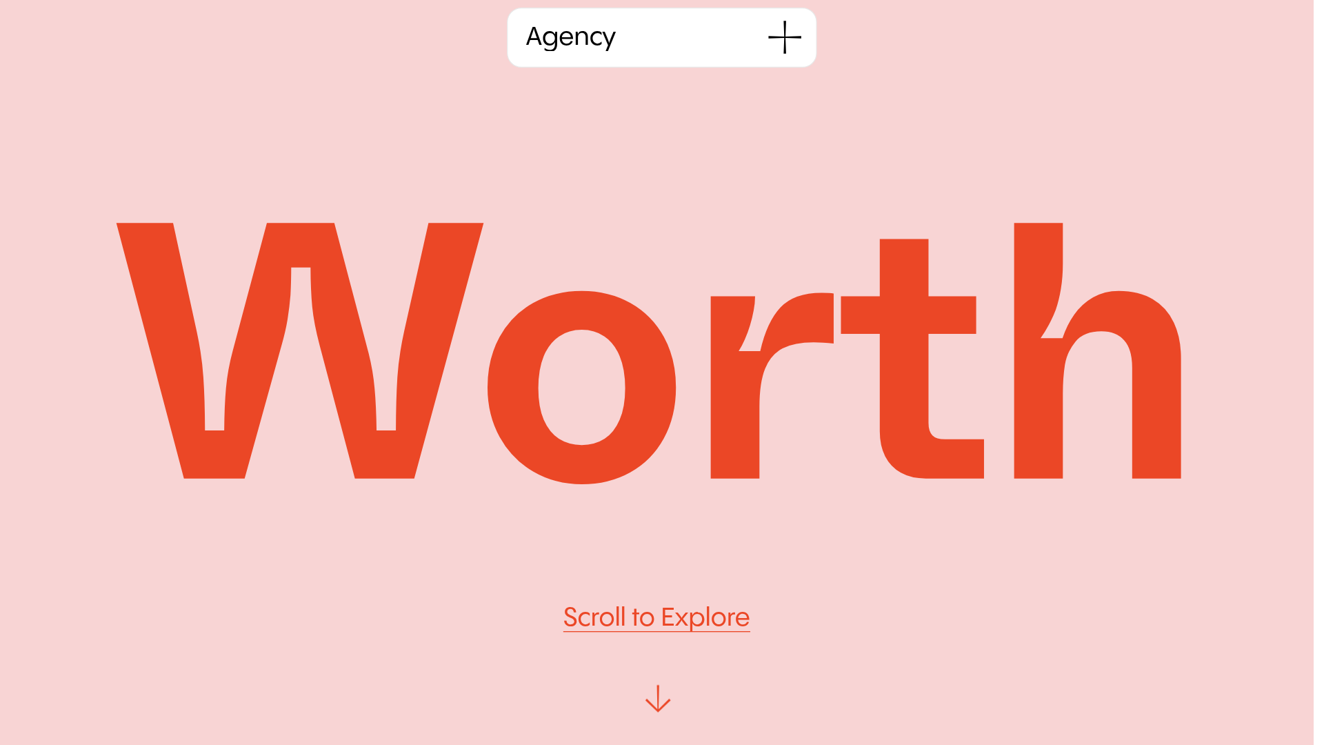
Worth Agency Minimalist Portfolio Landing
A vertical-scroll landing page with large typography, sticky navigation elements, and a clean portfolio grid featuring on-hover image animations and smooth scroll transitions.
Overview
This minimalist agency landing page uses high-impact typography and a vertical scroll architecture to showcase creative work. It is a strong reference for builders looking to master 'scrollytelling' layouts where content pieces are revealed through smooth transitions and fixed-position backgrounds.
Design System
- Color Palette & Visual Hierarchy: The design features a soft pastel pink background (
#f8d4d4) paired with high-contrast, bold monochromatic and coral accents (rgba(235, 71, 38, 1)). The hierarchy is driven by scale rather than complex layouts, using massive hero text to anchor the viewer's attention. - Typography: The system relies on custom sans-serif fonts with exaggerated scales. Hero titles use a heavy weight (approx.
400pxsize) with tight letter spacing (-4.5px). Body copy maintains readability at22pxto28pxwith generous line heights, creating a luxury editorial feel. - Page Structure: The site flows from a massive typographic hero section into a clean, single-column portfolio grid. A 'Let's Talk' section follows, ending with a high-contrast black footer with coral text.
- Reusable Components:
- Sticky Navigation: A rounded pill-shaped header (
Agency +) that remains fixed during the scroll. - Pill Buttons: Small, rounded tags used for project categories (e.g., 'BRANDING', 'WEB DESIGN') with custom border-radii (
20px). - Project Cards: Large-format image blocks with rounded corners (
30px) and custom hover states. - Overlay Form: A hidden 'Let's talk' modal containing a clean 4-field vertical form with subtle input backgrounds (
#f7f7f7).
- Sticky Navigation: A rounded pill-shaped header (
- Interaction & Motion: The HTML reveals a
viewer-type-vertical-stickystructure, indicating that elements frequently fix in place as the user scrolls. Hover animations on images include subtle scaling (scale(0.9)toscale(1)) and opacity shifts. The 'Scroll to Explore' element features a constant vertical bounce animation. - Implementation Clues: The site is built using the Readymag platform, evidenced by class names like
rmwidgetandmag-pages-container. It uses absolute positioning within responsive containers to manage z-index layers effectively.
Use Cases
- Who should clone this: Creative directors, independent designers, or boutique studios who want a high-end, gallery-style digital presence with minimal text.
- Remixing the pattern: This layout works perfectly for fashion lookbooks or architecture portfolios. A builder could swap the pastel palette for a dark mode (black/charcoal) and replace the bold coral with neon accents for a tech-focused feel.
- Practical Directions: Reuse the sticky 'Agency +' header and the large-scale typographic hero for an immediate impact. The portfolio grid can be easily adapted into a two-column layout for denser content, though the single-column approach is better for preserving the 'worthy' aesthetic.
- Scope: Best as a full-page clone to preserve the specific scroll-transition timing and fixed-element interactions.
Related Inspirations

Christopher Doyle Agency Portfolio Layout
A minimalist, typography-led portfolio featuring a wide-margin grid system, smooth fade-in animations, and simple image-focused project cards.

NewTab Studio Minimalist Portfolio Landing Page
A clean, typography-focused landing page featuring an oversized SVG/canvas hero title, a top-aligned navigation bar, and a minimalist footer layout.

Play Studio Minimalist Portfolio Landing
A high-impact agency layout featuring a oversized typography header, a full-width integrated Vimeo video background, and a unique expandable accordion list for industry showcases.

Baubauwerk Minimal Agency Portfolio Homepage
A clean studio site featuring a centered text hero, scatter-plot filterable project gallery, and full-bleed image sections for case studies.
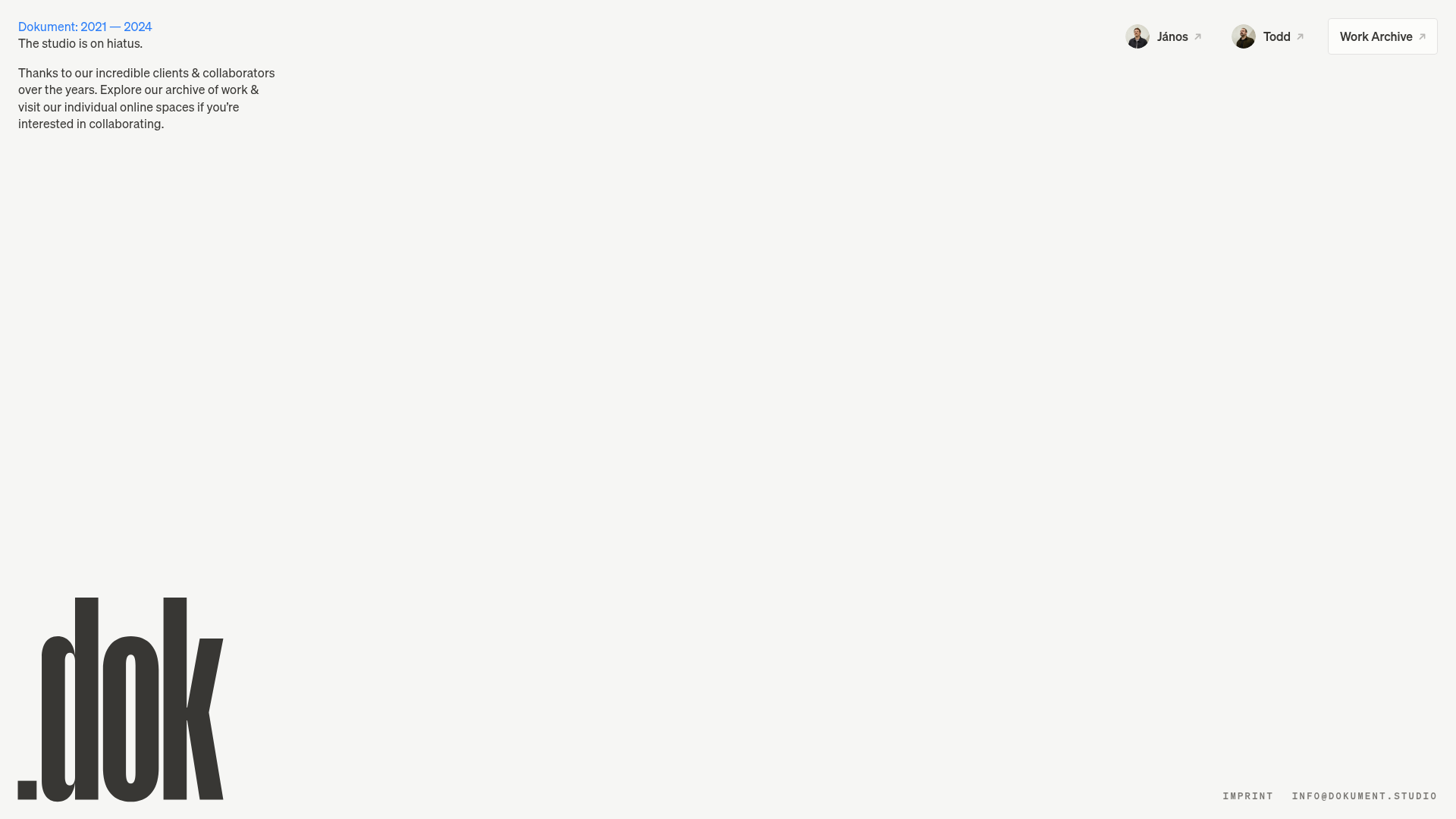
Dokument Studio Minimalist Portfolio Landing
A clean, high-contrast landing page featuring a bottom-aligned oversized logo, top-right profile links, and a minimalist typography-focused layout.
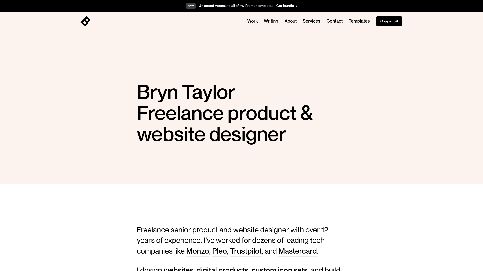
Bryn Taylor Portfolio Landing Page
A minimalist, typography-focused designer portfolio featuring a clean hero section, sticky navigation bar, and dark-mode 'Copy email' button.
