Zeus Jones Agency Landing Page
A minimalist, Gatsby-powered brand agency layout featuring a clean typography focus and a blank canvas aesthetic for high-end portfolio builds.

Overview
Zeus Jones is a premier brand agency website that utilizes a 'blank canvas' aesthetic to emphasize strategic depth and high-end minimalism. Built with Gatsby, this project is a strong clone reference for developers seeking a high-performance, typography-driven layout that feels like a premium physical portfolio.
Design System
- Color Palette & Visual Hierarchy: The site uses a subtle off-white background (#f9f8f5) to reduce eye strain and provide a more sophisticated, organic feel than pure white. Visual hierarchy is established through extreme negative space and bold black typography rather than color blocks.
- Typography System: A focus on high-quality sans-serif typefaces with generous leading and tracking. Headlines are prominent, while body metadata often uses smaller, categorized labels to organize information without clutter.
- Page Structure & Section Flow: The layout follows a modular grid. It typically starts with a large-format hero statement, followed by a vertically scrolling list of case studies and agency philosophy blocks that prioritize readability over imagery.
- Reusable Components: Key components to clone include the minimalist navigation header, the clean 'Expertise' cards, and the structured grid system used for the portfolio showcase.
- Interaction & Motion Patterns: Based on the Gatsby implementation, the site features smooth page transitions and 'fade-in' scroll triggers that maintain the serene, intentional pace of the brand experience.
- Responsive Behavior: The design is built on a flexible fluid grid that collapses into a single-column stack on mobile, maintaining the large type scale for readability on smaller screens.
- Implementation Clues: The HTML use of the
#___gatsbywrapper indicates a React-based architecture using the Gatsby framework, suggesting a focus on static site generation (SSG) for fast load times and optimized SEO.
Use Cases
- Who should clone this pattern: Creative agencies, independent consultants, and design studios who want to lead with their thinking and philosophy rather than just a gallery of images.
- Effective Remixes: This pattern works well for architect portfolios, boutique law firms, or high-end editorial blogs.
- Practical Remix Directions: Swap the off-white for a dark-mode charcoal aesthetic, but retain the generous padding and typography scales to keep the premium feel. Developers can also swap the static text blocks for dynamic CMS-fed content while maintaining the grid logic.
- Suggested Clone Scope: A full-page clone is recommended to capture the specific spatial relationships between sections, though the navigation and footer components are excellent standalone pieces for minimalist projects.
Related Inspirations
LoveFrom Minimalist Animated Wordmark Landing
A minimalist landing page featuring a center-aligned animated wordmark, a hidden info panel, and a decorative bear animation overlay.
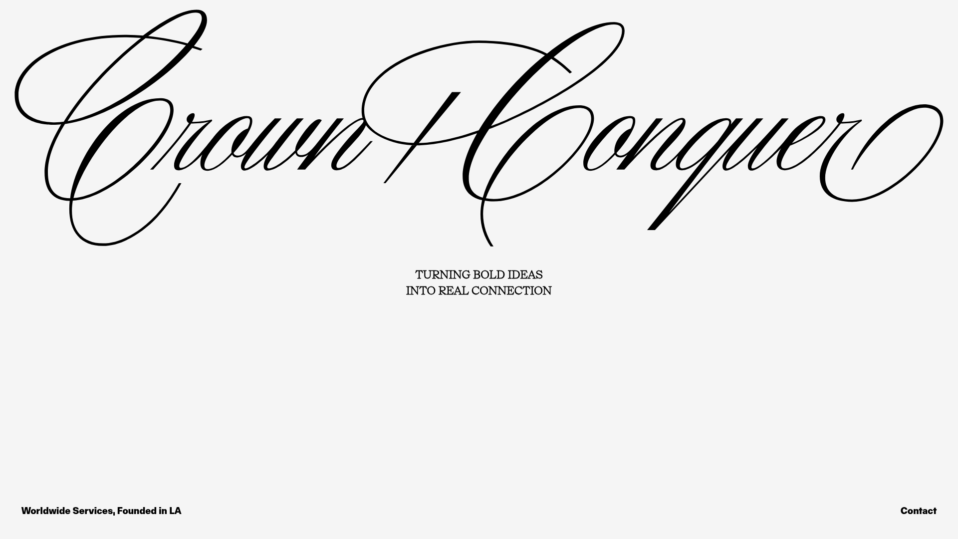
Crown & Conquer Agency Landing Page
A minimalist landing page featuring elegant script typography, a centered hero tagline, and a clean, whitespace-heavy layout for high-end branding.
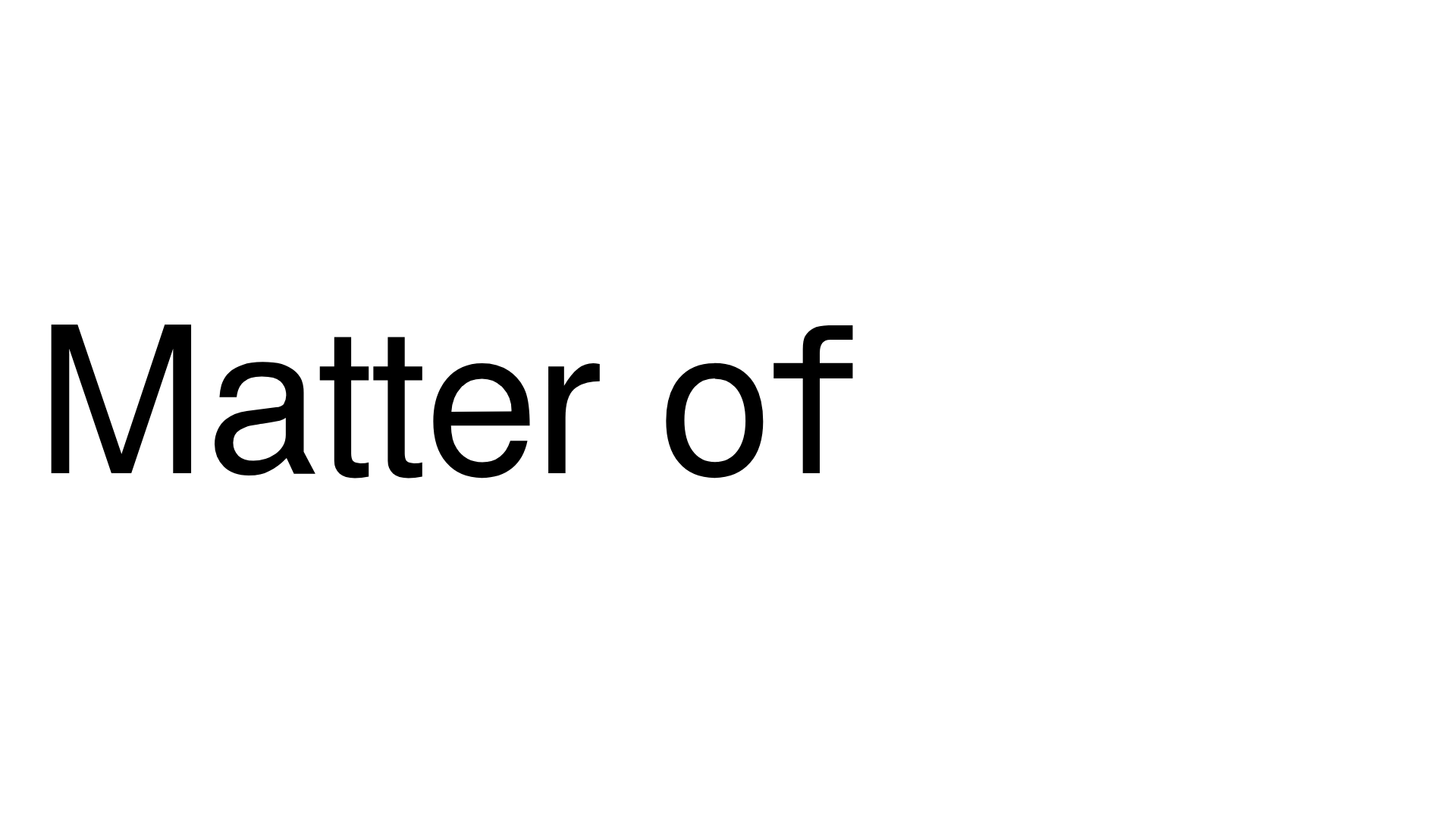
Matter of Fact Typography Landing Page
A minimalist landing page featuring a vertical scrolling text marquee animation for dynamic hero typography using GSAP or CSS transitions.
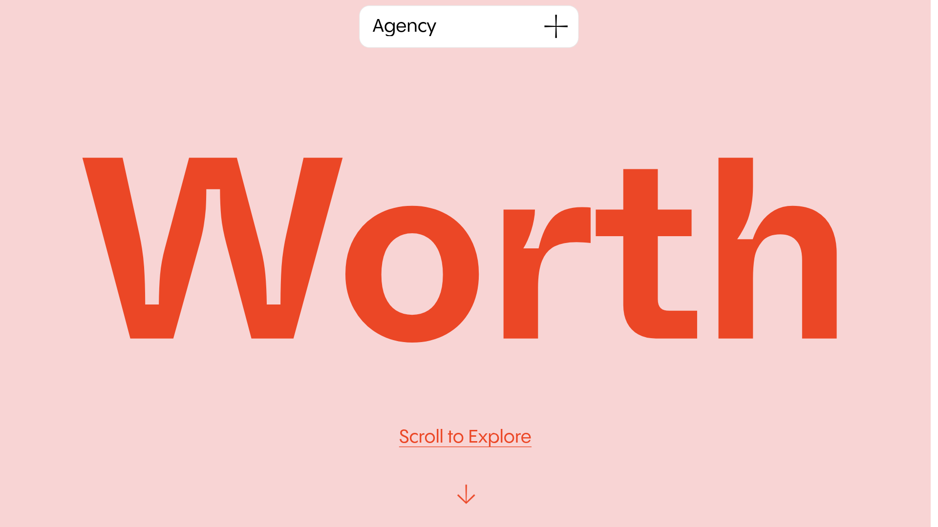
Worth Agency Minimalist Portfolio Landing
A vertical-scroll landing page with large typography, sticky navigation elements, and a clean portfolio grid featuring on-hover image animations and smooth scroll transitions.
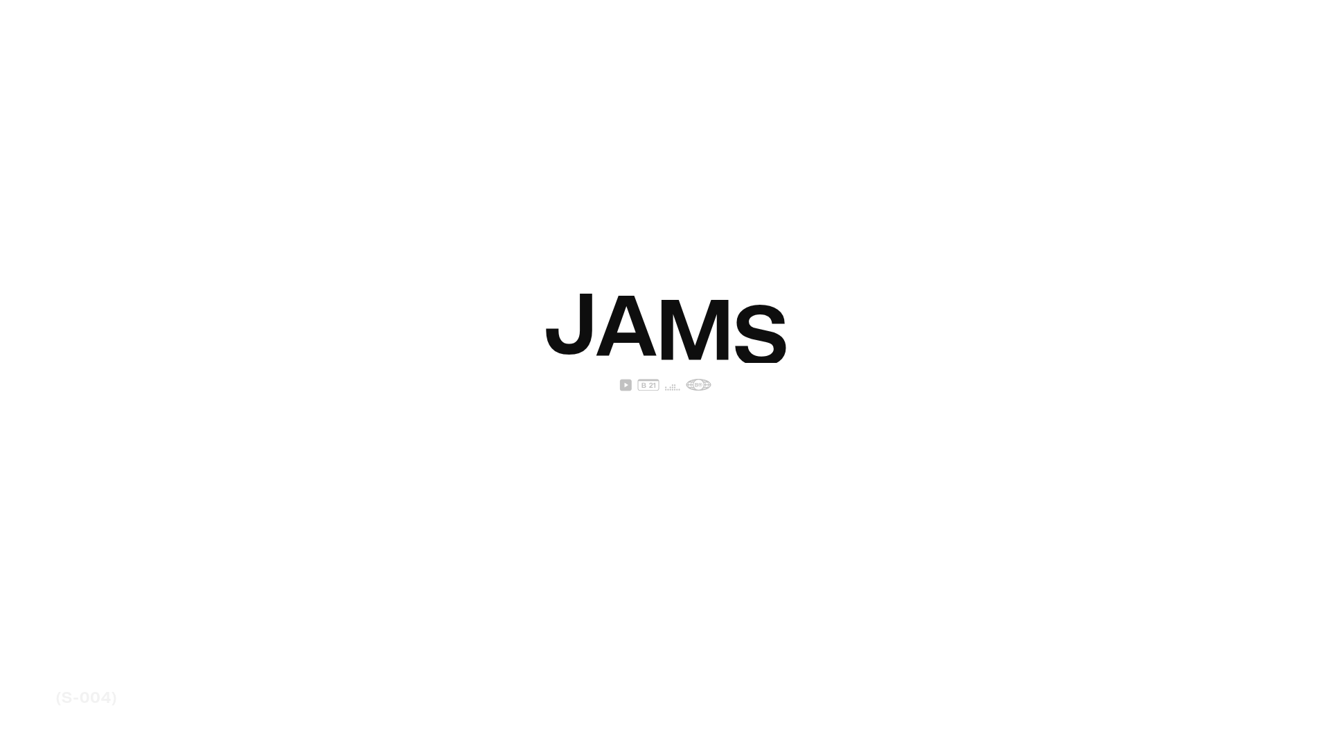
JAMS Agency Landing Page Hero
A minimalist, high-contrast hero section featuring bold typography and clean iconographic navigation over a white canvas.

Christopher Doyle Agency Portfolio Layout
A minimalist, typography-led portfolio featuring a wide-margin grid system, smooth fade-in animations, and simple image-focused project cards.
