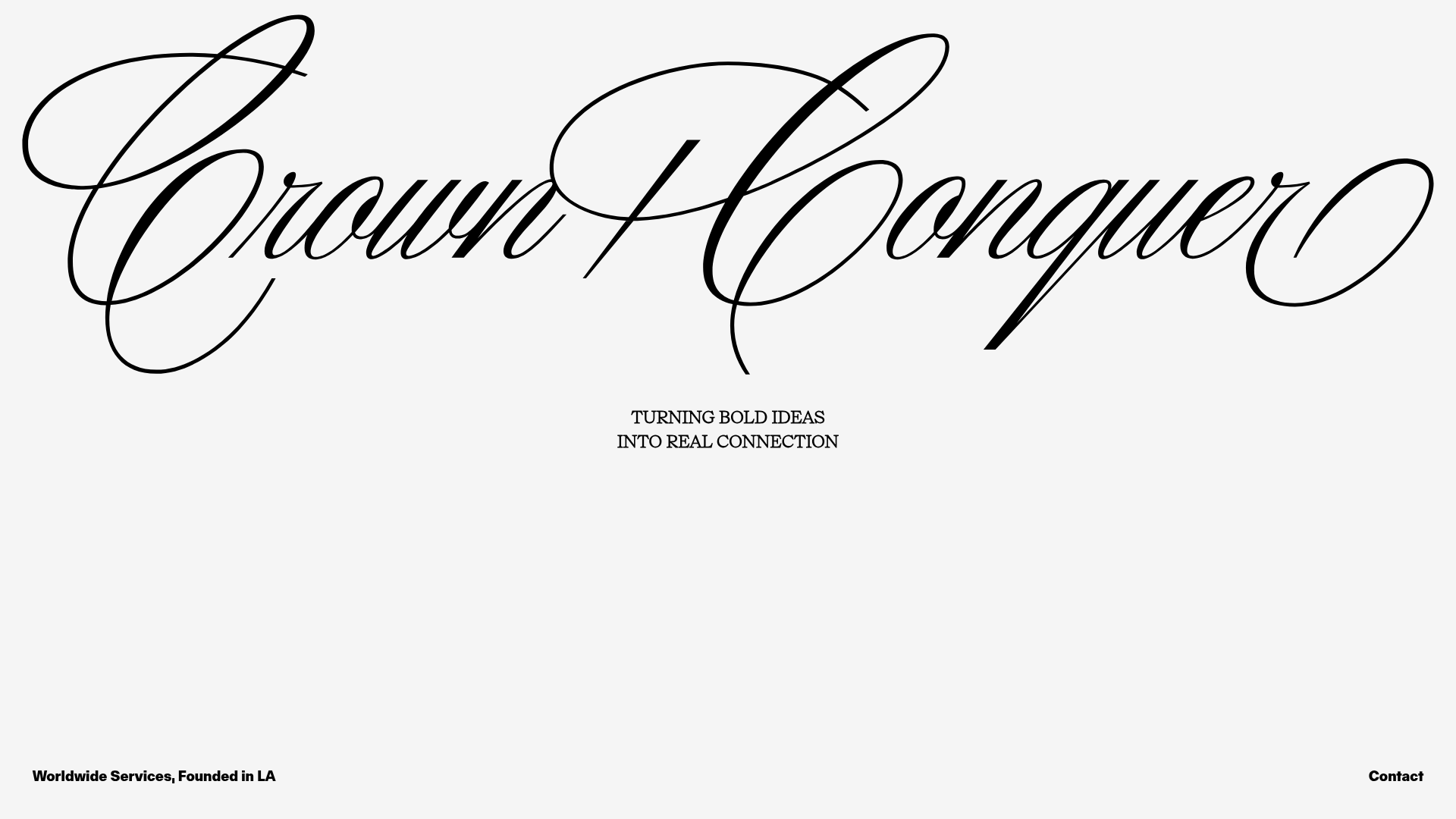
Crown & Conquer Agency Landing Page
A minimalist landing page featuring elegant script typography, a centered hero tagline, and a clean, whitespace-heavy layout for high-end branding.
Overview
This landing page is a masterclass in minimalist luxury branding, centered around a high-impact, custom script wordmark that dominates the visual field. It serves as a strong reference for creators looking to build a "digital business card" or creative agency entry point where whitespace and high-end typography take precedence over complex functional modules.
Design System
- Color Palette & Visual Hierarchy: The design employs a high-contrast, monochrome palette featuring deep black text (#000000) against an off-white/bone background (#F2F2F2). The hierarchy is strictly top-down: the large script logo attracts initial attention, followed by the centered tagline and finally the peripheral utility links at the bottom.
- Typography System: The system uses two extremes: a decorative, fluid script for the primary brand logo and a clean, high-legibility serif (likely a classic Roman variant) for the tagline. The tagline uses all-caps with generous line-height to maintain a sophisticated feel. Auxiliary information at the bottom transitions to a functional, sans-serif typeface to denote utility.
- Page Structure & Layout: The layout follows a symmetrical, frame-like structure. The central vertical axis is occupied by the logo and tagline, while the bottom corners are pinned with metadata ("Worldwide Services") and navigation ("Contact").
- Reusable Components: The most valuable component to clone is the responsive hero layout that maintains perfect vertical and horizontal centering. The footer layout with dual-aligned corner text is also a reusable pattern for minimalist utility navigation.
- Interaction & Motion: Based on the HTML
fade-inclasses, the site uses subtle opacity transitions on load. Theflex-1structure suggests a full-height (VH-based) layout that ensures content never feels crowded regardless of viewport size. - Implementation Clues: The HTML reveals a Next.js framework structure with Tailwind CSS utility classes (
flex,flex-col,items-center,justify-center). The styling relies on flexbox to maintain the balanced, centered composition.
Use Cases
- Who should clone this: Independent creative directors, boutique marketing agencies, and high-fashion brands that want a "less is more" digital presence.
- Product Remixing: This pattern works exceptionally well as a splash page for a design portfolio, a landing page for an exclusive event, or a placeholder for a brand in stealth mode.
- Practical Remix Directions: Swap the central script for a bold grotesque font for a tech-focused agency; replace the off-white background with a muted earth tone to shift the brand mood; or use the centered layout to host a single high-quality video loop instead of a static logo.
- Suggested Clone Scope: A quick section clone of the centered flex-container is sufficient for most users, though the full-page layout is ideal for those needing a complete, single-page professional landing site.
Related Inspirations

Zeus Jones Agency Landing Page
A minimalist, Gatsby-powered brand agency layout featuring a clean typography focus and a blank canvas aesthetic for high-end portfolio builds.
LoveFrom Minimalist Animated Wordmark Landing
A minimalist landing page featuring a center-aligned animated wordmark, a hidden info panel, and a decorative bear animation overlay.
Matter of Fact Typography Landing Page
A minimalist landing page featuring a vertical scrolling text marquee animation for dynamic hero typography using GSAP or CSS transitions.
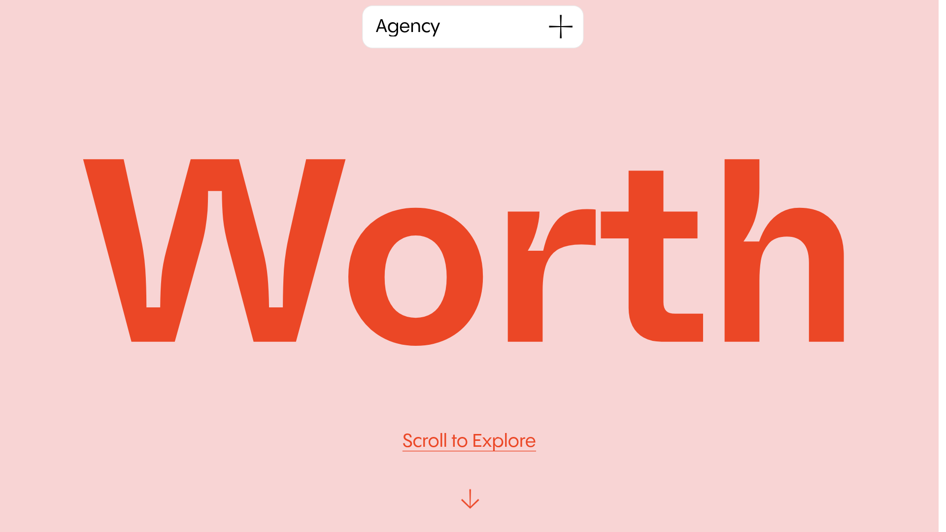
Worth Agency Minimalist Portfolio Landing
A vertical-scroll landing page with large typography, sticky navigation elements, and a clean portfolio grid featuring on-hover image animations and smooth scroll transitions.
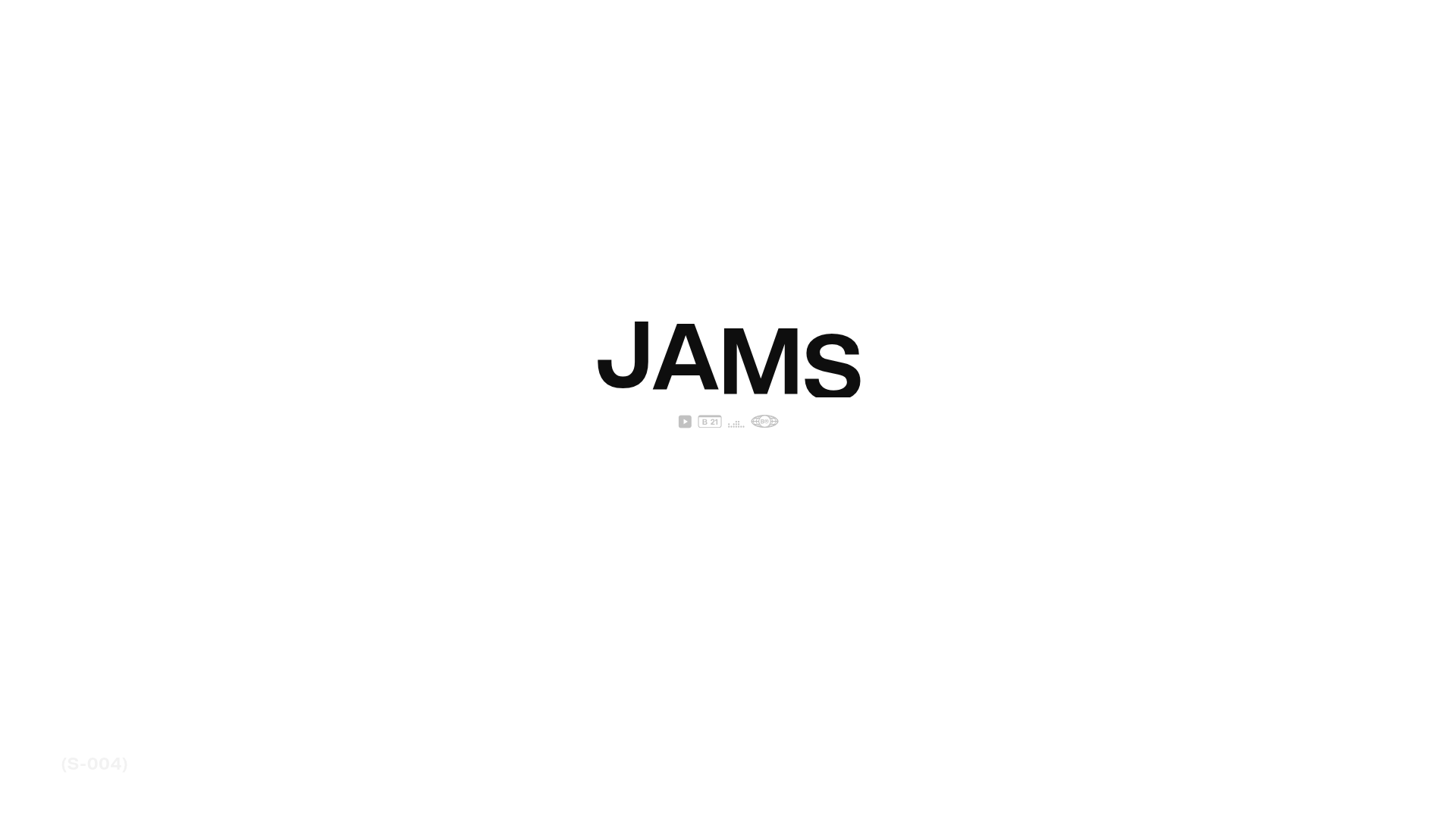
JAMS Agency Landing Page Hero
A minimalist, high-contrast hero section featuring bold typography and clean iconographic navigation over a white canvas.

Christopher Doyle Agency Portfolio Layout
A minimalist, typography-led portfolio featuring a wide-margin grid system, smooth fade-in animations, and simple image-focused project cards.
