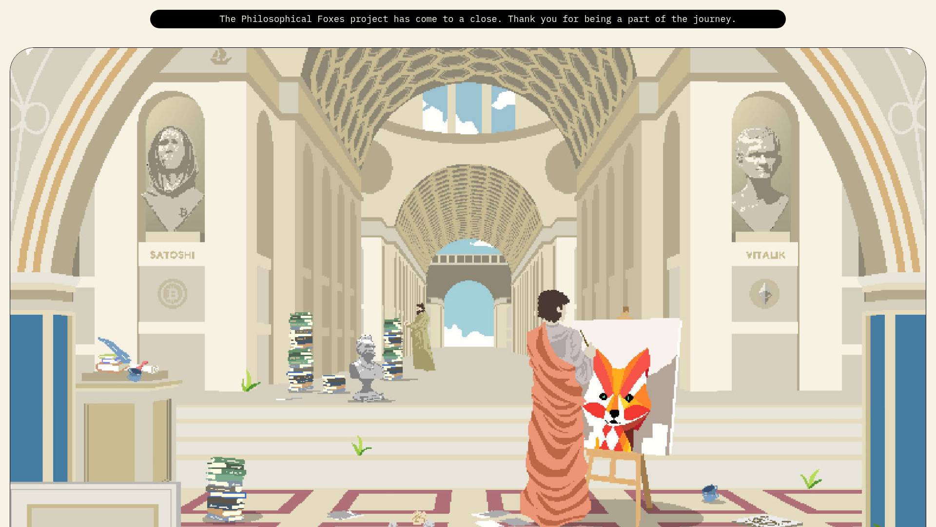
Philosophical Foxes NFT Project Archive
A storytelling-focused landing page featuring pixel art, scroll-triggered character building animations, sticky property cards, and a minimalist roadmap grid.
Overview
Philosophical Foxes is a storytelling-driven NFT landing page that combines high-fidelity pixel art with sophisticated scroll-based storytelling. It serves as an excellent reference for builders wanting to move beyond static grids by using sticky positioning and layered animations to explain complex digital asset properties.
Design System
- Color Palette & Visual Hierarchy: The site uses a neutral "parchment" background (
#f5f5dcstyle) contrasted with deep black and occasional highlights of "Ethereum blue" and "Fox orange." The hierarchy is established through extreme typography scaling and generous whitespace, giving the pixel art room to breathe as the primary focal point. - Typography System: A combination of a monospace font for technical metadata (headers like "01" or "Verified smart contract") and a bold, sans-serif display face for high-impact section titles (e.g., "BE THE FOX"). The scale varies from massive 3-line marquee headings to medium-weight serif body text.
- Page Structure:
- Announcement Bar: Fixed-top banner for status updates.
- Hero Animation: A Lottie-driven scroll sequence (
hero-seq--3.json) that centers a large pixel-art scene. - Introduction Marquee: Horizontal text-masking animation.
- Sticky Property Cards: A split-screen layout where text stays fixed on the left while five feature cards (
attributes-card) stack vertically on the right. - Personality Apparatus: A scroll-triggered "build-a-character" section that layers PNG assets onto an outline as the user scrolls down.
- Roadmap Grid: A minimalist, percentage-based vertical list using mono spacing.
- FAQ Accordion: A numbered, clean list for project utility details.
- Reusable Components:
- Interactive Buttons:
button w-inline-blockwith a dual-arrow hover state (one colored, one light). - The "Pixel" Icon: A recurring small square decorative element used to prefix sub-headers.
- Sticky Cards: The
.attributes-cardcomponent is highly modular and useful for any feature-list section.
- Interactive Buttons:
- Interaction & Motion: The site relies heavily on
data-scroll-stickyanddata-scroll-targetattributes, suggesting a high-performance scroll library like Locomotive Scroll or GSAP ScrollTrigger. Opacity fades and 3D transforms (translate3d(0px, 15%, 0px)) are used to animate text into view as the character "assembles." - Implementation Clues: Developed using Webflow (classes like
w-node,w-inline-block, anddata-w-id) with external Lottie JSON files for complex pixel-art movements.
Use Cases
- Who should clone this: NFT creators, indie game developers, or digital storytellers who want to display a character's traits or a product's build process dynamically.
- Effective Remixes:
- Product Feature Tours: Replace the "fox" with a software dashboard or physical product, using the building animation to highlight specific modules.
- Modern Editorial: Use the oversized typography and sticky-scrolling card patterns for a long-form article or annual report.
- Practical Directions: Builders should prioritize cloning the
.attributes-card--sticky-cardslogic to handle long lists of features without losing page context. For a quick win, the roadmap grid can be easily adapted for any project timeline. - Clone Scope: A full-page clone is recommended for high-concept projects requiring 1:1 narrative flow, whereas the FAQ and Sticky Property sections are ideal for individual component reuse.
Related Inspirations
Schauspielhaus Zurich Saison Interactive Preview
An artistic landing page featuring parallax scrolling SVG illustrations, a unique hand-drawn aesthetic, and a horizontal carousel for showcasing seasonal event premieres.
Lamanna's Bakery Vibrant Landing Page
A bold, high-contrast Italian bakery site featuring massive typography, parallax floating elements, marquee banners, and a flickity-powered product carousel.
Summer Drive Event Landing Page
A vibrant event page featuring bold typography, a smooth scroll-triggered hero section, a video car animation, and a decorative logo marquee for portfolio teams.

Pa’lais Plant-Based Product Homepage
A food product landing page featuring an animated video hero, a recipe carousel with filtering icons, organic blob-shaped layout containers, and a parallax-scrolling decorative element system.
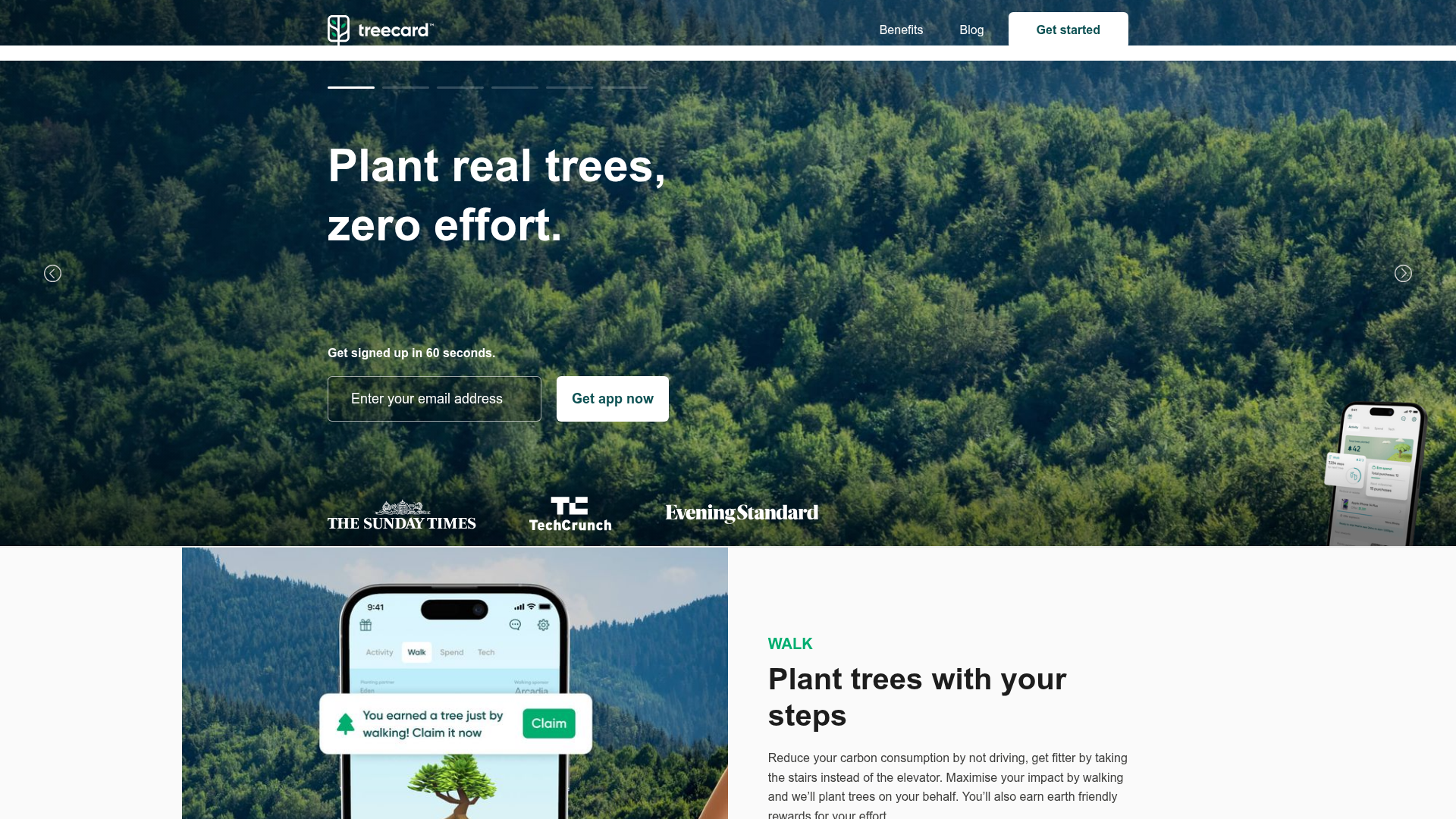
Treecard Eco-App Landing Page
An eco-friendly fintech landing page featuring an animated hero slider with progress bars, alternating content sections with mobile mockups, and a multi-form footer.
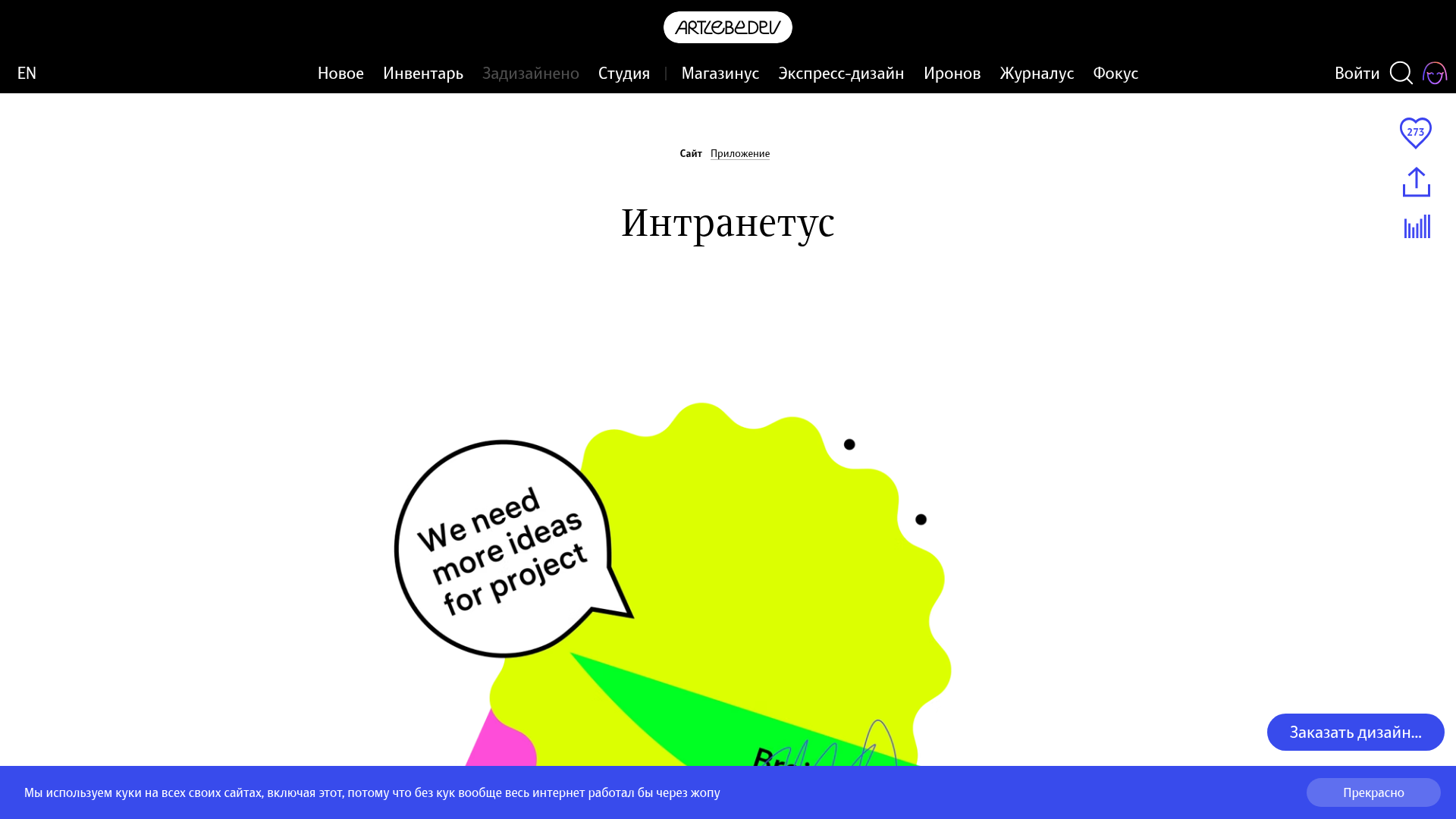
Intranetus Project Showcase Landing Page
A high-concept portfolio page featuring a large-scale video hero, Lottie animations, layered parallax transition effects, and a vertical grid of browser-mockup feature cards.
