Bryn Taylor Portfolio Landing Page
A minimalist, typography-focused designer portfolio featuring a clean hero section, sticky navigation bar, and dark-mode 'Copy email' button.
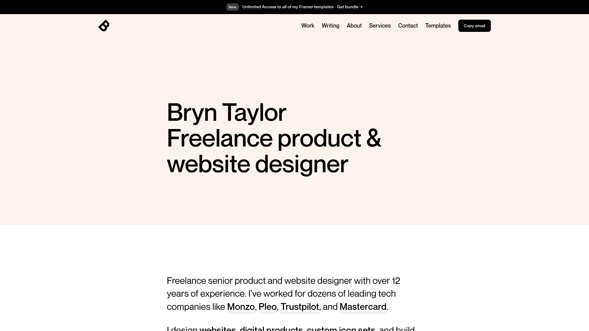
Overview
This portfolio landing page for Bryn Taylor is a masterclass in minimalist, typography-driven web design. It is a strong clone reference for professionals seeking a high-signal, low-noise aesthetic that prioritizes clarity, whitespace, and established brand authority through bold headings.
Design System
- Color Palette & Visual Hierarchy: The design utilizes a sophisticated off-white or light beige background (#F7F0ED or similar) to reduce eye strain compared to pure white. High-contrast black text creates a stark visual hierarchy, while a single dark-themed button serves as the primary call-to-action.
- Typography System: The site relies on a clean, modern Sans-Serif typeface (Inter or similar). The hero section features a massive headline font size with tightly tracked letter spacing and a slightly condensed leading, creating a block-like impact.
- Page Structure: The layout follows a classic vertical stack: an announcements banner at the very top, a high-impact horizontal navigation bar with an integrated logo and CTA, followed by a hero title and a descriptive secondary paragraph.
- Reusable Components:
- Sticky Navbar: A sleek top-level navigation containing text links and a 'Copy email' button with a rounded black pill container.
- Announcement Bar: A thin, dark top bar for temporary updates or promotions.
- Bold Paragraphs: Large-scale body text used for the 'About' section, featuring bolded brand names (Monzo, Pleo, etc.) for social proof.
- Interaction Design: The 'Copy email' button hints at a clipboard interaction, a clever alternative to standard mailto links that improves user workflow. The navigation links suggest subtle hover state changes for interactivity.
- Responsive Behavior: The generous horizontal padding and centered text blocks suggest a mobile-first or highly fluid responsive layout where text scales down while maintaining legibility.
Use Cases
- Who should clone this: Freelance designers, developers, and consultants who want an authoritative but understated digital presence that emphasizes their body of work over flashy visuals.
- Remix Directions: Replace the off-white background with a subtle grain texture or a bold primary color to shift the mood. The information architecture can be adapted by swapping the hero text for a value proposition and the 'Work' links for a project grid.
- Suggested Clone Scope: This is an ideal full-page clone for personal branding. Alternatively, developers should clone the navigation and hero section pattern to use as a template for minimalist landing pages or documentation headers.
Related Inspirations
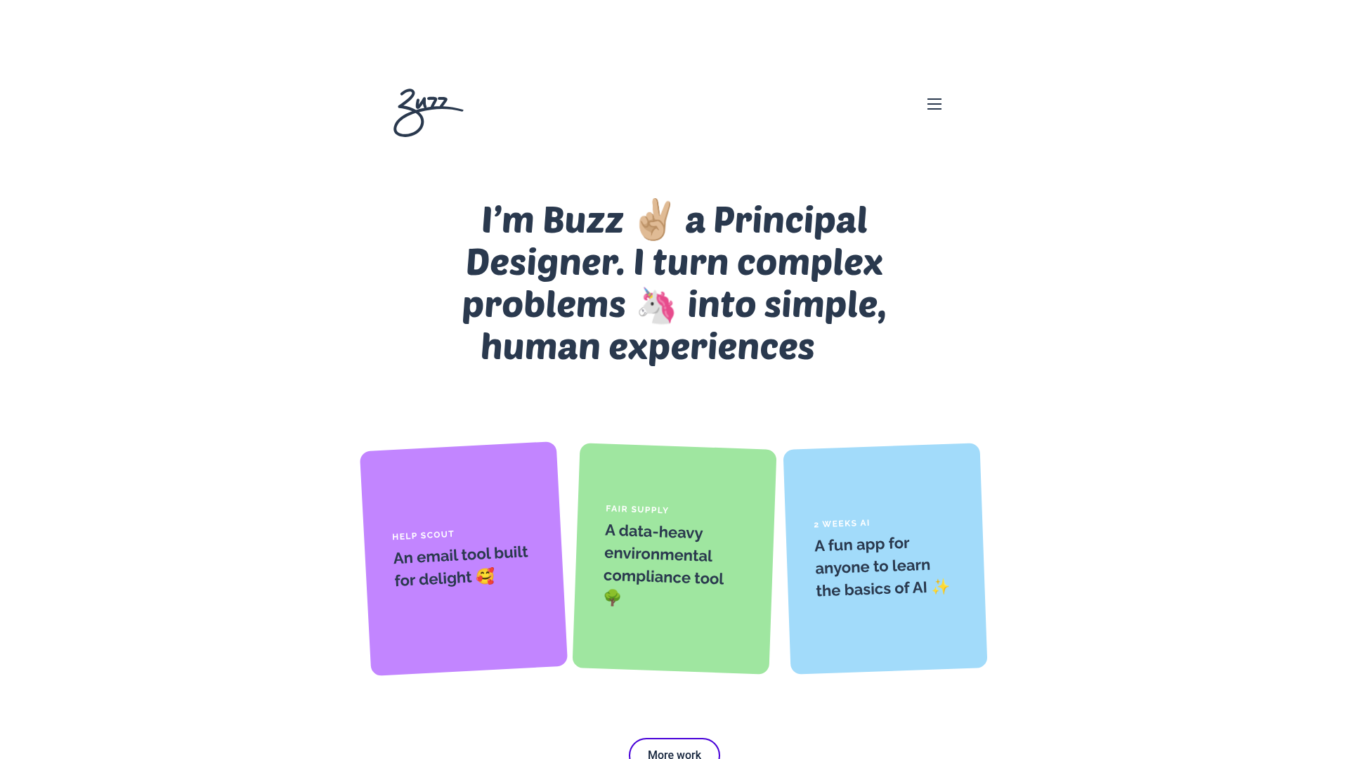
Buzz Usborne Designer Portfolio Landing
A minimalist portfolio layout featuring a large typography-driven hero section with animated emojis and a responsive grid of colorful, card-based project previews.
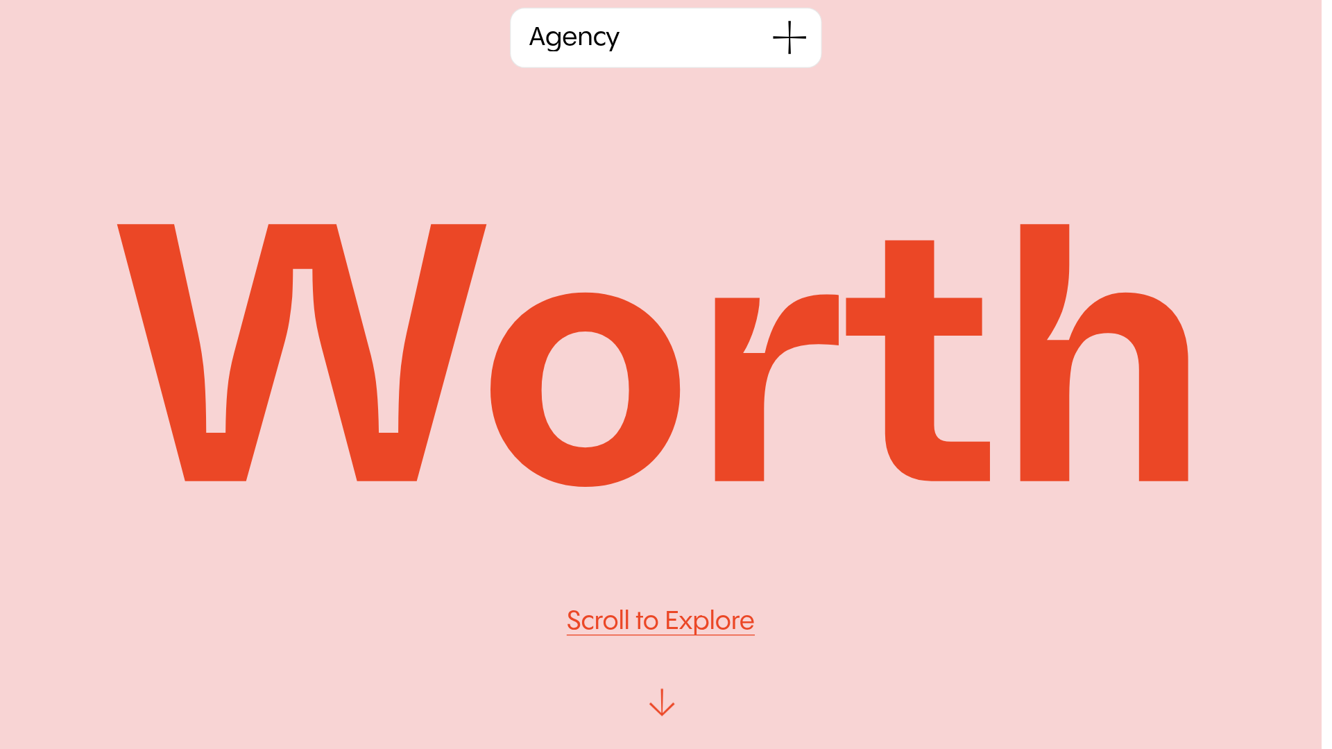
Worth Agency Minimalist Portfolio Landing
A vertical-scroll landing page with large typography, sticky navigation elements, and a clean portfolio grid featuring on-hover image animations and smooth scroll transitions.

Egstad Minimalist Design Portfolio
A refined Nuxt.js portfolio featuring bold variable typography, interactive canvas elements, and a clean grid-based layout for showcasing design work.

Bruno Arizio Designer Portfolio Website
A minimalist creative director portfolio featuring a clean typographic layout, side-aligned image previews, and high-contrast spacing patterns suitable for luxury or design showcases.

Christopher Doyle Agency Portfolio Layout
A minimalist, typography-led portfolio featuring a wide-margin grid system, smooth fade-in animations, and simple image-focused project cards.

NewTab Studio Minimalist Portfolio Landing Page
A clean, typography-focused landing page featuring an oversized SVG/canvas hero title, a top-aligned navigation bar, and a minimalist footer layout.
