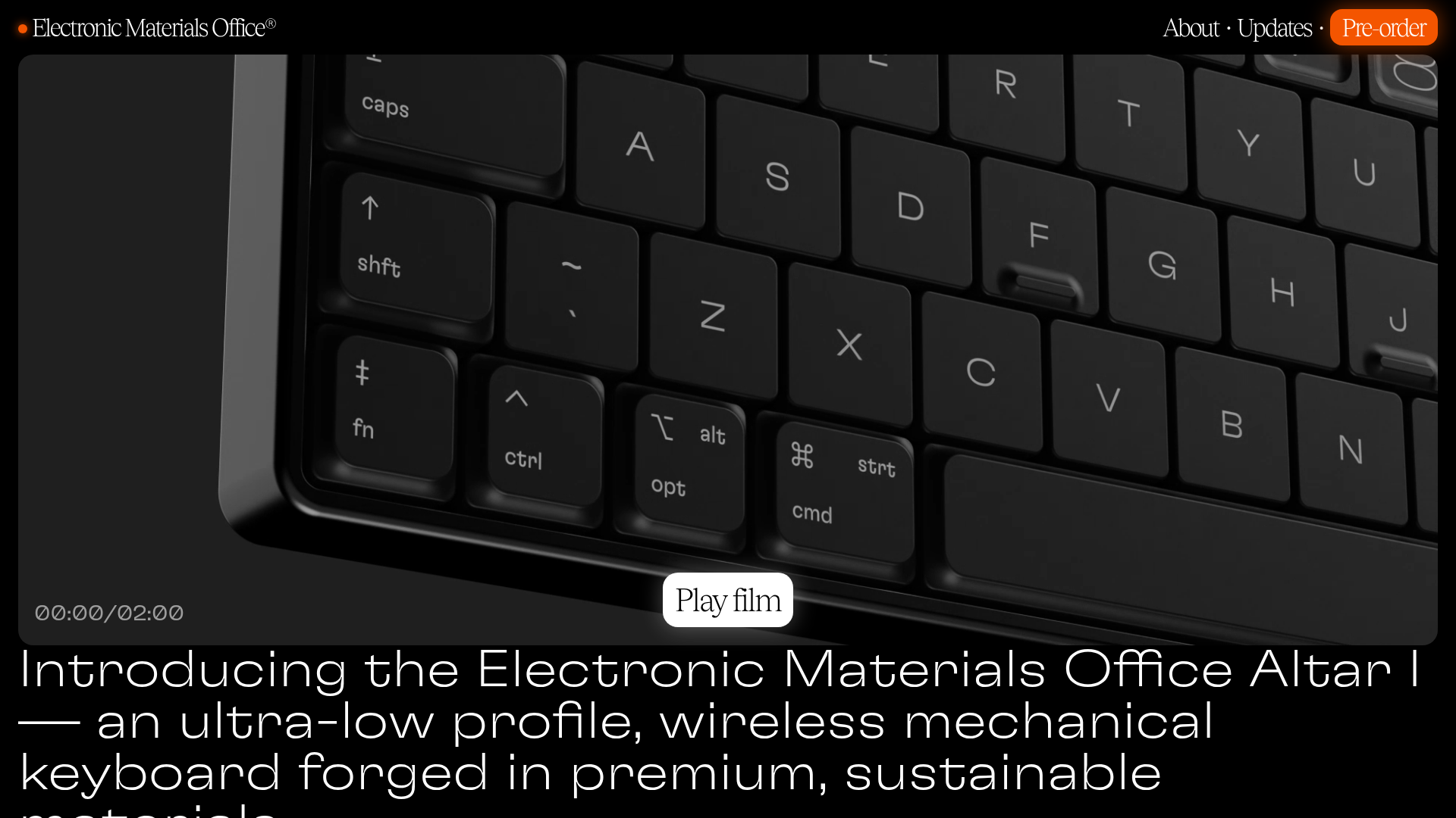
Electronic Materials Office Altar I Showcase
A dark-themed product landing page featuring fullscreen autoplay video, marquee section headers, a photo-heavy bento grid, and a clean technical specification table.
Overview
This landing page is a masterclass in high-end, minimalist hardware product presentation. It uses a sophisticated dark aesthetic, large-scale video backgrounds, and a bento-style product gallery to communicate premium value through visual hierarchy and white space. It is a strong reference for builders looking to create atmospheric, information-dense yet clean pages for physical goods or software-as-a-service with a 'utilitarian-cool' brand identity.
Design System
- Color Palette & Visual Hierarchy: A monochromatic 'true black' background (#000000) provides extreme contrast for high-resolution product photography. Text uses pure white for primary headings and a muted grey for secondary descriptions and labels (implemented via the
.grey-textclass), creating a clear semantic hierarchy. - Typography: The site uses a dual-type system. Large, wide-tracking sans-serif headers (GT Flexa) create a technical, modern feel, while serif accents (Tobias) are used for buttons and specific callouts like 'Play film' to add a touch of editorial elegance.
- Page Structure: The flow begins with an immersive autoplay video hero, followed by a large-type value proposition. It then transitions into a 'bento grid' feature gallery, large-scale material showcases, and concludes with a clean, row-based technical specification table.
- Reusable Components:
- Section Marquees: Repeating horizontal scrolls for category headers (e.g., 'KEY FEATURES').
- Bento Cards: A flexible grid system using
.col-4,.col-6, and.col-12classes with rounded images and bottom-aligned text labels. - Technical Spec Table: A minimalist alternating row layout that avoids borders, using vertical alignment and grey labels to organize data.
- Play Film Button: A centered, pill-shaped overlay with a serif font that acts as a modal trigger.
- Interaction & Motion: The primary visual interest comes from looping background video and the marquee text animations. The project uses a
<dialog>element for video modals, indicating a focus on native browser features for performance. - Mobile Behavior: The HTML reveals a responsive strategy using
<picture>tags withsrcsetto swap between mobile and desktop-specific crops (e.g.,monobody-mobile.jpgvsmonobody-desktop.jpg), ensuring the high-detail images remain legible on smaller screens.
Use Cases
- Who should clone this: Designers and developers launching premium physical products, boutique hardware, or industrial design studios.
- Remix Directions: Swap the black background for a deep navy or forest green for a different mood; adapt the bento grid to showcase software features or integration logos; or reuse the technical spec table for price comparisons and service tiers.
- Suggested Scope: A full-page clone is ideal for a single-product launch. For larger sites, the bento feature grid and the unique marquee section headers are excellent components to extract and integrate into existing brand pages.
Related Inspirations
Minimalist Dark Designer Portfolio Grid
A clean, dark-themed portfolio featuring a bold typography hero section and a staggered two-column image grid with subtle entrance animations.
BAGGU Minimalist E-commerce Hero Template
A clean retail landing page layout featuring a full-width high-impact hero section, a sticky integrated banner, and a minimalist navigation header optimized for product launches.
Goodfit E-commerce Puzzle Landing Page
A dark-themed Shopify storefront featuring a bold serif hero, scrolling marquee, tabbed product grids, and asymmetrical rich text blocks with image-led storytelling.
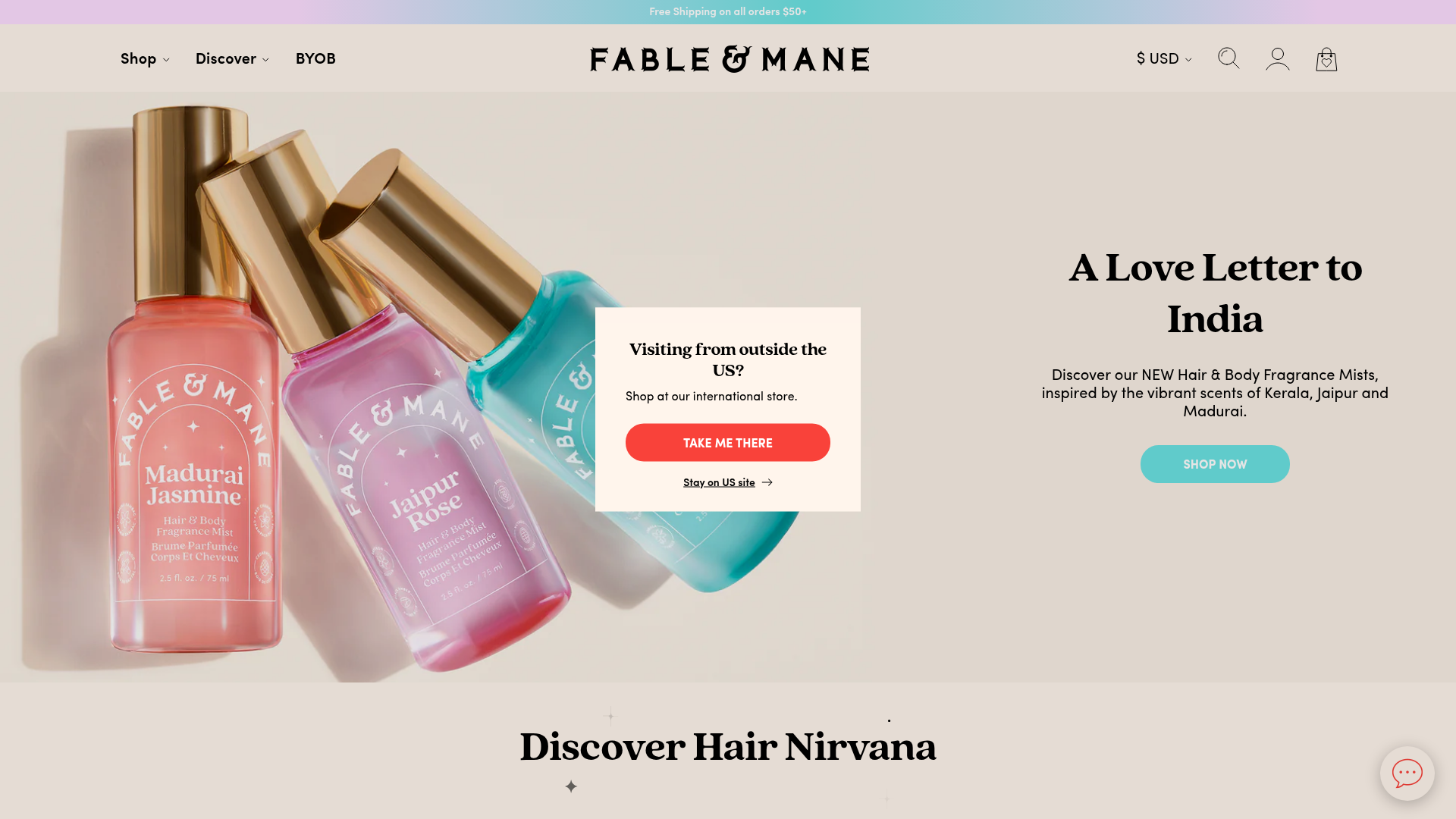
Fable & Mane Beauty Storefront
A clean e-commerce layout featuring a high-impact hero slider with localized entry popups and a product carousel with hover-triggered secondary images.
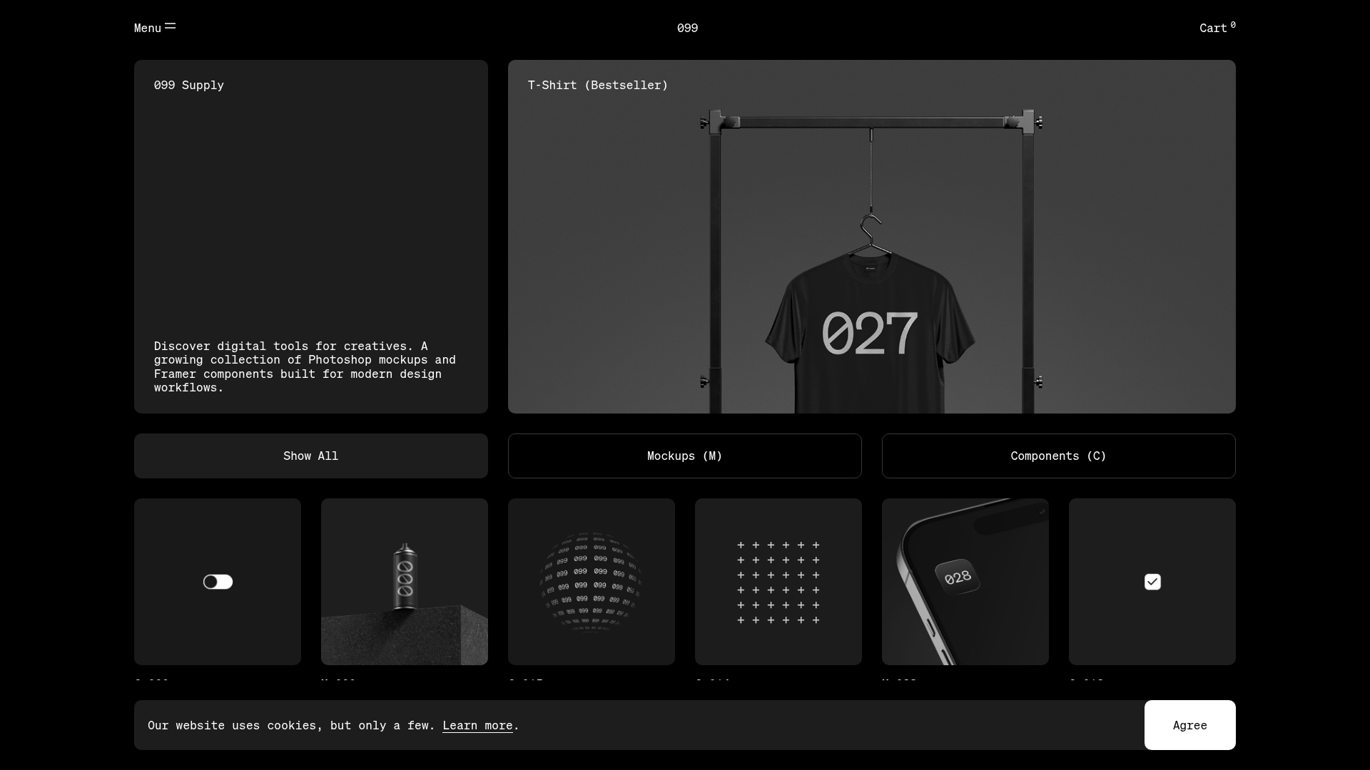
099 Supply Minimalist Bento Asset Gallery
A dark-themed asset store featuring a bento grid layout, video-on-hover card interactions, and category filters for digital products and Photoshop mockups.
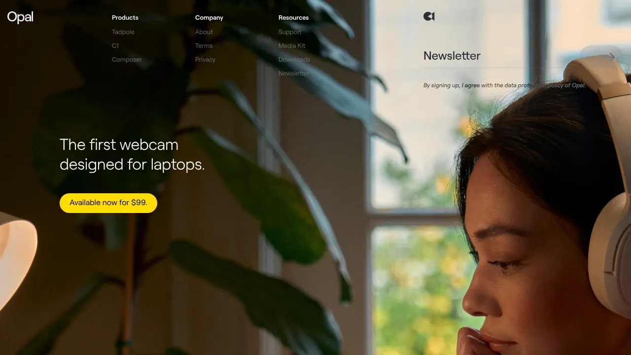
Opal Camera Tech Showcase Landing Page
A minimalist hardware-focused layout featuring a full-width hero image, a clean navigation menu with multi-column dropdowns, and a three-column product grid with rounded action buttons.
