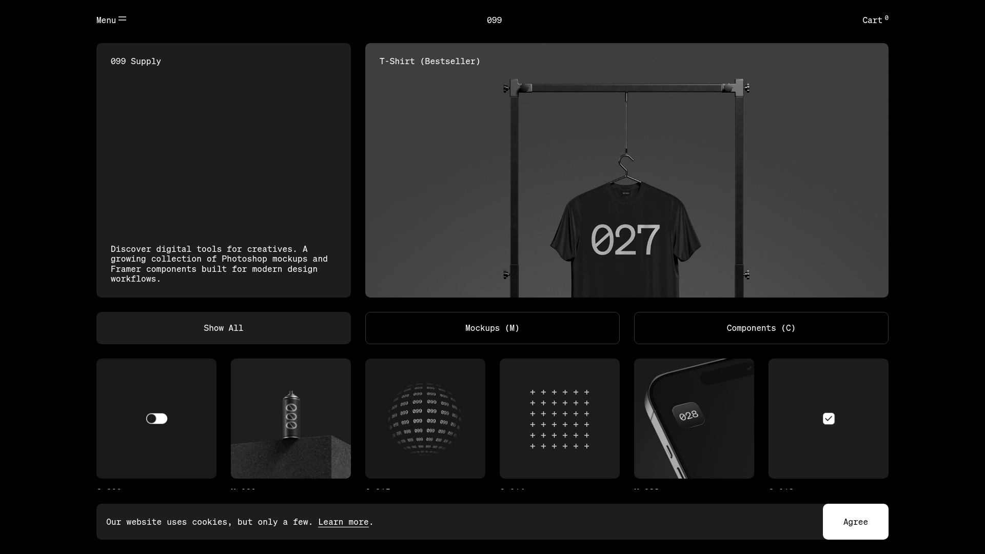
099 Supply Minimalist Bento Asset Gallery
A dark-themed asset store featuring a bento grid layout, video-on-hover card interactions, and category filters for digital products and Photoshop mockups.
Overview
This site is a premium digital asset store showcasing Photoshop mockups and Framer components through a sophisticated, high-contrast bento grid layout. It serves as an excellent reference for builders looking to create catalog-driven marketplaces with a minimalist, "brutalist-lite" aesthetic that prioritizes visual content and effortless navigation.
Design System
- Color Palette & Visual Hierarchy: A strictly monochromatic dark theme using deep blacks (
#000000) for backgrounds and varying shades of dark grey for card containers. High-contrast white and light grey are used for data labels and primary actions, creating a clear visual hierarchy where product imagery is the primary focus. - Typography: The interface utilizes a monospace font family (e.g., used in labels like "Mockups (M)") and a clean sans-serif for body text and headers. Typography is used sparingly with a focus on uppercase labels and compact heading styles to maintain a utilitarian, technical feel.
- Page Structure: The site leads with a two-column hero bento: a text-based introduction card and a wide "Bestseller" hero product. This is followed by a horizontal sticky-ready filter bar and a dense multi-column grid of product cards.
- Reusable Components: Notable components include the category filter buttons (using ghost and solid variants), the product cards with integrated media, and the floating cookie consent bar. Each card features a systematic naming convention (e.g., "M 028" for Mockups) for easy identification.
- Interactions & Motion: The design heavily relies on video-on-hover triggers (
card_video__UFQ_x) and image swaps for static mockups. The HTML reveals the use of GSAP-style transforms (translate3d,scale) for entrance animations and state transitions, particularly visible in the filtering logic where cards fade and scale out. - Responsive Behavior: The grid is highly fluid, utilizing a CSS grid system that collapses from multiple columns on desktop to a single-column stack on mobile, as evidenced by the
grid_cardHero__bEkAkand responsive<picture>sources in the HTML. - Implementation Clues: Built with Next.js (indicated by
__next-route-announcer), the site uses CSS Modules for scoping styles and utilizes<video>tags withmuted loop playsinlinefor performant, autoplaying previews on interaction.
Use Cases
- Target Audience: Designers or developers launching boutique asset stores, template marketplaces, or creative portfolio sites.
- Effective Remixes: This pattern is highly effective for any product catalog that is visually driven, such as typeface foundries, icon sets, or high-end physical hardware stores.
- Remix Directions: Builders should prioritize swapping the monochromatic palette for brand-specific colors while keeping the rigid grid structure. The technical indexing system (M 001, C 015) can be adapted to any categorized inventory.
- Recommended Scope: A full-page clone is ideal for those needing a cohesive end-to-end shopping experience, but the bento-style card component and the hover-triggered video interaction can be extracted as standalone features for any landing page.
Related Inspirations
Goodfit E-commerce Puzzle Landing Page
A dark-themed Shopify storefront featuring a bold serif hero, scrolling marquee, tabbed product grids, and asymmetrical rich text blocks with image-led storytelling.

Context Gallery High-End Furniture Landing Page
A minimal editorial layout featuring a multi-column product carousel, designer biographies with image-text pairings, and a magazine-style content grid for curated design stories.

Glein Minimalistic Bento Grid eCommerce
A clean, modular layout using a bento-style responsive grid of text teasers and large-scale product imagery for lookbooks and collection browsing.

Isla Beauty Skincare E-commerce Store
A clean Shopify-based storefront featuring a split-hero landing page, a step-by-step product system carousel, and a split-screen testimonial section with localized product image sidebars.

Stojo Collapsible E-commerce Storefront
A Shopify layout featuring a prominent discount modal, mosaic grid hero sections, and clean product cards with integrated color swatches and quick-buy functionality.

Basic.Space E-commerce Gallery Clone
A minimalist product marketplace featuring a clean sticky navigation bar, nested flyout menus, and a horizontally scrollable product carousel with hover-state image switching.
