Build in Amsterdam Portfolio Grid
A high-end creative portfolio featuring an asymmetrical multi-column masonry grid with mixed aspect ratios, hover-triggered case details, and integrated platform badges.
Overview
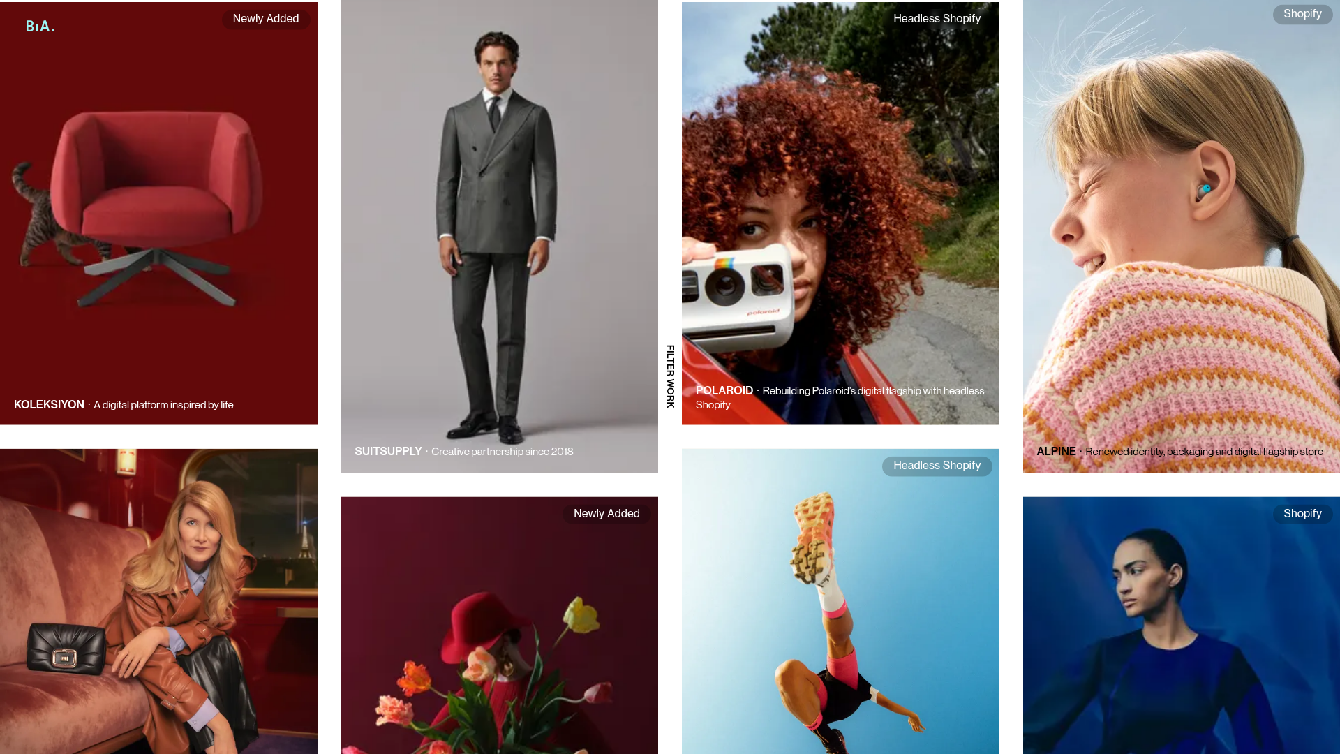
This portfolio grid from Build in Amsterdam is a premier example of high-end, immersive digital curation. It utilizes a sophisticated asymmetrical masonry layout that prioritizes visual storytelling through varying aspect ratios and layered metadata, making it an excellent reference for high-fashion, architecture, or creative agency portfolios seeking a premium feel.
Design System
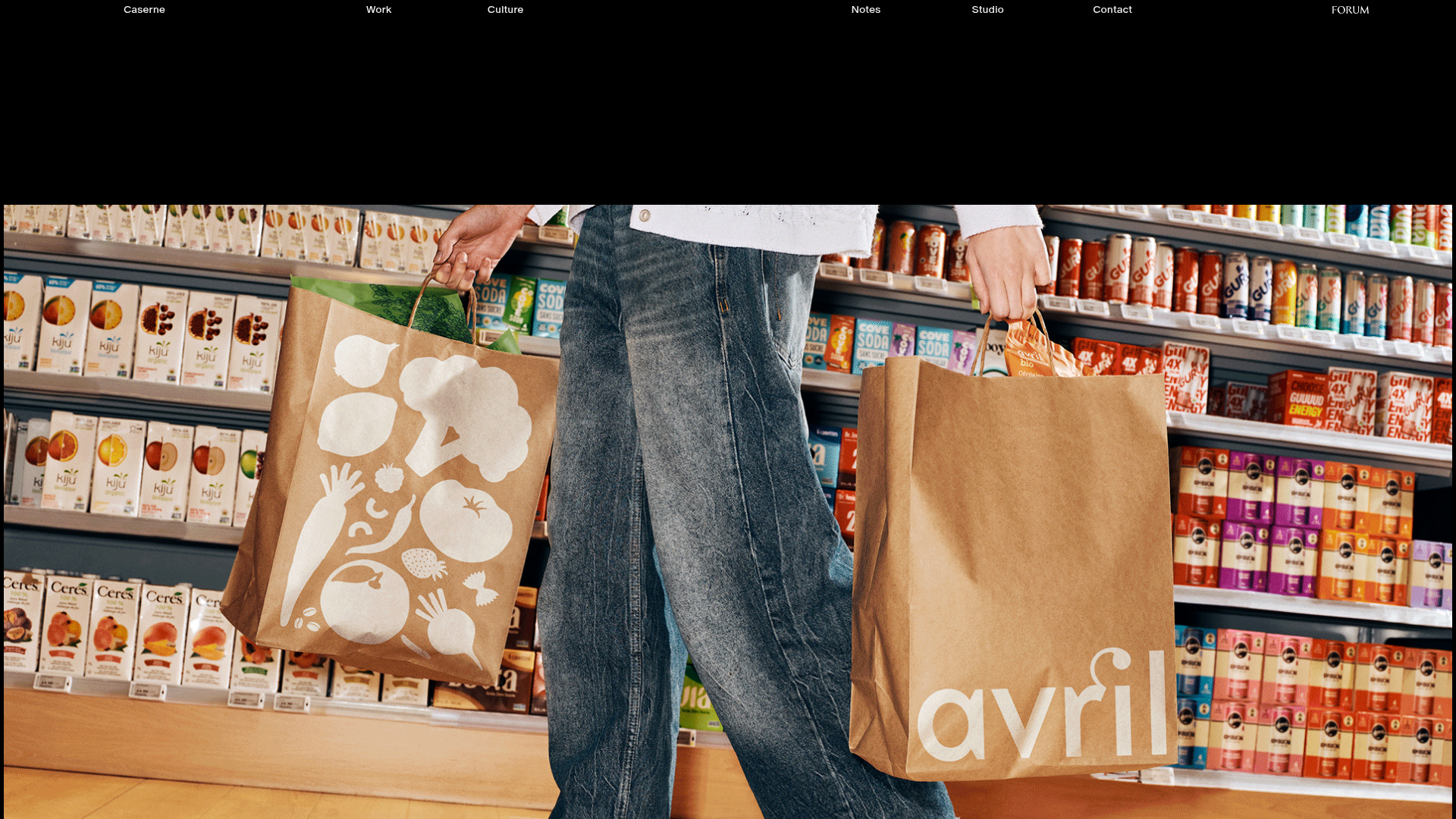
- Color Palette & Visual Hierarchy: The design relies on a neutral container strategy where the imagery provides the color. Hierarchy is established through image scale and density, with occasional accents provided by small, high-contrast badges (e.g., pill-shaped labels for "Shopify" or "Newly Added") in dark navy or light blue.
- Typography System: A clean, geometric sans-serif (appearing to be a custom brand font or similar to Matter/Inter) is used at a small scale. Typography is understated to ensure the photography remains the focal point. Titles use a bold weight, while descriptions use a lighter weight separated by a middle dot (
·). - Page Structure: The grid is organized into three distinct vertical columns (
sc-460e6d5-0) within a flex or grid container. Each column contains a staggered sequence of case studies, creating a dynamic "waterfall" effect rather than a rigid horizontal row scan. - Reusable Components:
- The Case Card: A complex container (
sc-d5272702-0) holding a relative-positioned image withobject-fit: coverand absolute-positioned overlays for text and badges. - Status Badges: Rounded pill shapes (
sc-5444211c-0) that provide context without distracting from the main image. - Floating Filter Button: A fixed-position vertical label ("Filter Work") that stays accessible during the scroll.
- The Case Card: A complex container (
- Interaction & Motion: The HTML indicates the use of
transform: translateYandopacitytransitions, suggesting a smooth reveal animation as the user scrolls. Hover states on<a>tags trigger the appearance of project metadata (Title · Description) typically positioned at the bottom-left of the image. - Implementation Clues: Built with Next.js (
__next) and styled-components (indicated by thesc-class prefixes). The images utilize thenext/imagecomponent for optimized delivery and responsive filling of parent containers.
Use Cases
- Who should clone this: Digital agencies, independent photographers, luxury fashion brands, and high-end furniture manufacturers looking to showcase a high-volume gallery without feeling repetitive.
- Effective Remixes: This pattern works perfectly for "Lookbooks" or "Brand Campaigns." A developer could remix this by swapping the fixed vertical filter for a horizontal category bar or by making the text metadata always visible for better accessibility.
- Practical Directions: Replace the imagery with product shots to create a non-linear e-commerce category page. Use the integrated status badges to highlight "Limited Edition" or "Sale" items instead of platform types.
- Suggested Scope: A full-page clone is recommended to capture the specific staggered rhythm of the three-column layout, as the visual balance depends on the relationship between cards of different heights.
Related Inspirations
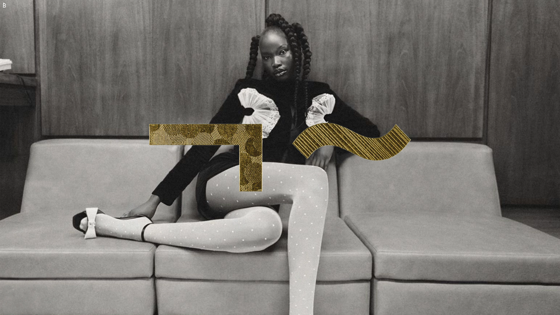
Bibliothèque Design Portfolio Landing Page
Black and white editorial layout featuring an centered hero image with abstract gold geometric overlays and a minimalist sans-serif design aesthetic.
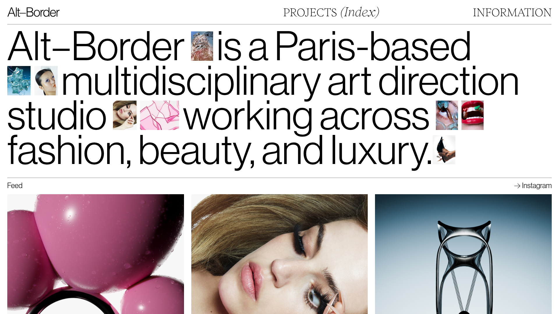
Alt-Border Portfolio With Inline Images
A minimalist art direction portfolio featuring an editorial hero section with inline small-scale images, a horizontal scroll feed, and a variable-density project grid.
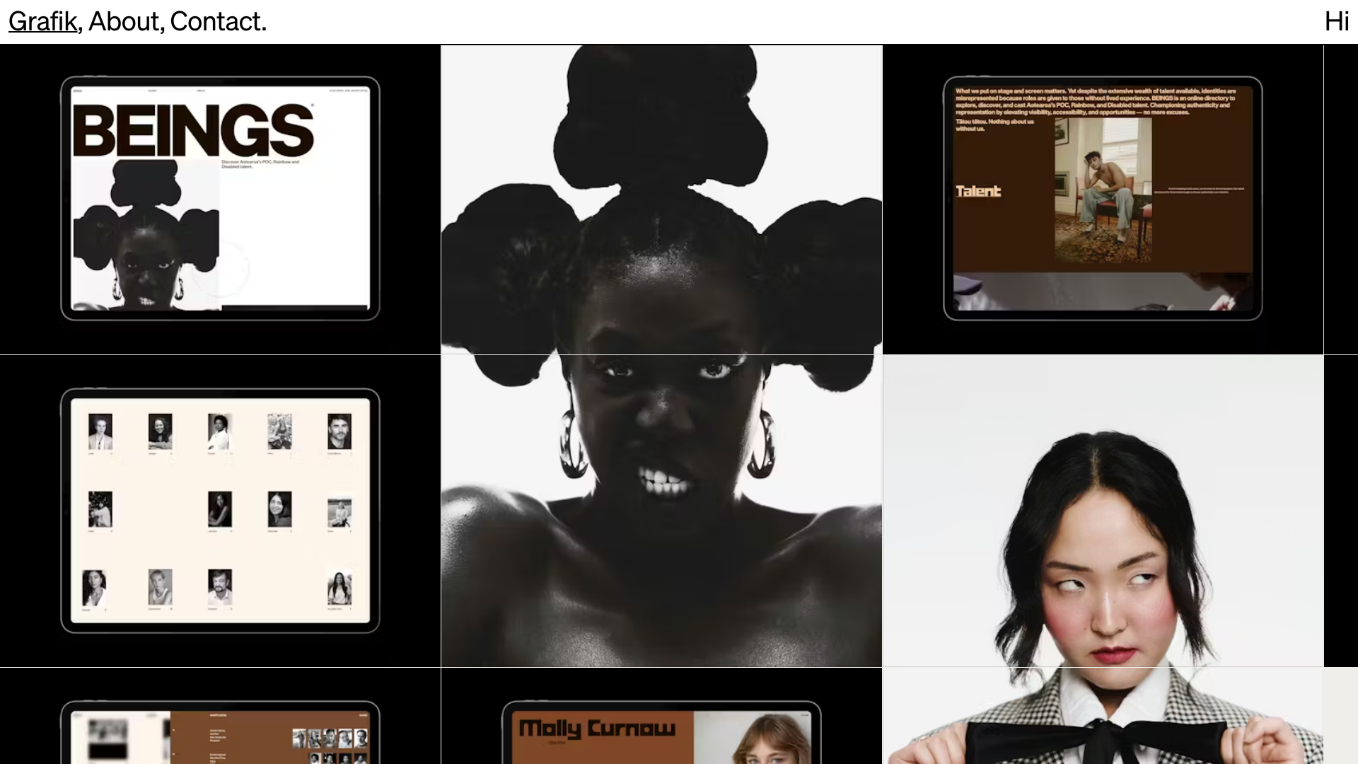
Grafik Portfolio Portfolio Grid Layout
A high-impact portfolio featuring a bold typography header, fixed sidebar navigation, and a large-scale imagery grid suitable for talent directories or creative agencies.

Grand Matter Agency Portfolio Layout
A creative agency site featuring a full-screen image hero, asymmetrical masonry work grids, and bold typography sections across a clean responsive layout.

Clase Agency Branding Portfolio
A minimalist design agency portfolio featuring a typographic hero section, full-width image articles, sticky title bars, and integrated scrolling text marquees for a clean editorial layout.
Caserne Design Studio Portfolio
A minimalist, high-impact portfolio featuring a dynamic masonry grid of project thumbnails with overlay text and a clean, oversized typography-driven footer.
