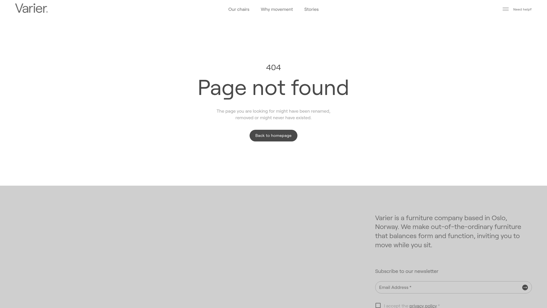
Varier Furniture 404 Error Page
A minimalist error page layout featuring a clean typography hierarchy, a centered call-to-action button, and a structured two-column footer for newsletter signup and company info.
Overview
This 404 error page from Varier Furniture is a masterclass in minimalist utility, transforming a potentially frustrating user experience into a calm, functional interaction. It is an excellent reference for builders looking to implement a "brand-first" error state that maintains design continuity while guiding users back to the core product journey.
Design System
- Color Palette & Visual Hierarchy: The design uses a sophisticated, muted palette: off-white (
#FFFFFF) for the main content area and a light grey (#D9D9D9) for the footer. Contrast is achieved through a dark charcoal button (#444444) and black text, ensuring high legibility and a premium feel. - Typography System: The site employs a clean, geometric sans-serif typeface. It features a clear scale: a small '404' label (H5 styling) acts as a header followed by a large, prominent 'Page not found' (H1). Supporting body text uses a smaller, lighter weight to minimize visual noise.
- Page Structure: The layout follows a classic vertical stack: a slim navigation header, a vertically centered hero error message with a primary call-to-action (CTA), and a heavy-set footer containing secondary information.
- Reusable Components:
- Core CTA: A rounded pill-shaped button with a dark background and white text, used here for 'Back to homepage'.
- Footer Information Block: A two-column setup where the left remains empty/spacious and the right contains a concise company bio and a text-based newsletter signup input.
- Input Fields: A minimalist newsletter input with a bottom border and an inline arrow icon for submission.
- Implementation Clues: The HTML reveals a React-based architecture (
__next) using Material UI (MUI) components (e.g.,MuiTypography,MuiButton). This suggests a system built on a component library where spacing and typography are managed via standardized utility classes.
Use Cases
- Who should clone this: Small-to-medium e-commerce brands, high-end furniture boutiques, or design-focused portfolios that want to ensure their fallback pages don't look like an afterthought.
- Effective Remixes: This pattern works well for SaaS dashboards or luxury lifestyle brands. You can remix it by adding a "Recommended Products" grid below the 404 message to keep users on the site.
- Practical Directions: Swap the charcoal button color for your brand's primary action color. The structured footer is highly reusable for any landing page; it provides a clean way to integrate a newsletter signup without cluttering the main navigation.
- Suggested Scope: This is ideal for a quick section clone. Builders should focus on the typography hierarchy and the pill-shaped button component to establish a professional baseline for all system pages.
Related Inspirations

Isla Beauty Skincare E-commerce Store
A clean Shopify-based storefront featuring a split-hero landing page, a step-by-step product system carousel, and a split-screen testimonial section with localized product image sidebars.
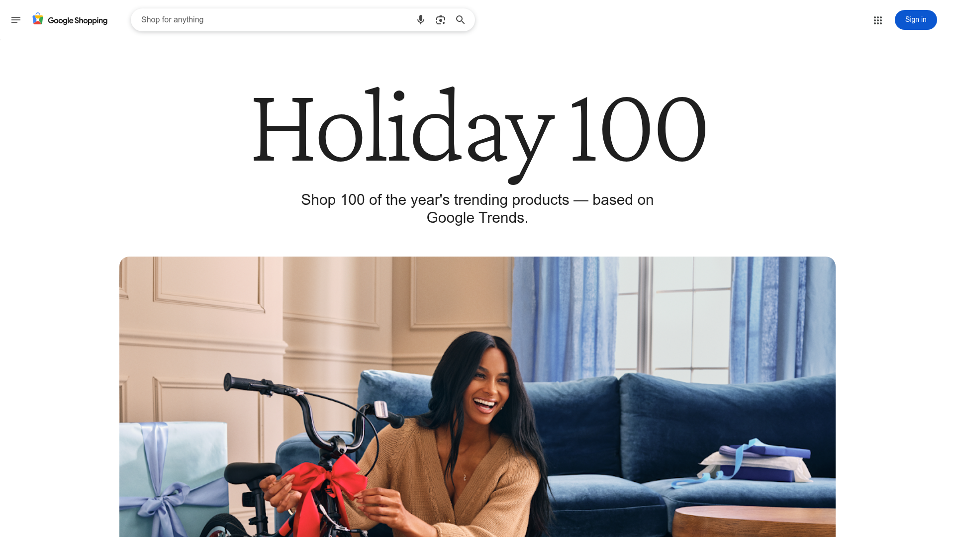
Google Holiday 100 Curator Landing Page
A minimalist e-commerce showcase featuring a wide hero section, clean search integration, and a bold typography-driven header designed for trending product collections.

Finn Pet Supplements Landing Page
An e-commerce landing page featuring high-contrast typography, a sticky brand logo banner, parallax scroll effects on product headers, and a clean product grid.
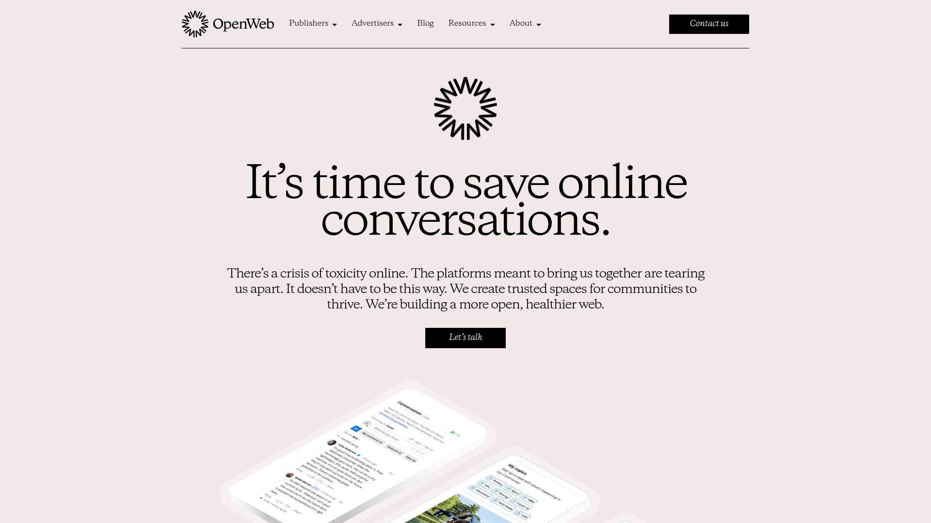
OpenWeb B2B Service Landing Page
A professional landing page layout featuring a central animated hero area, data visualization counters, a client logo grid, testimonial slider, and tabbed lead generation forms.
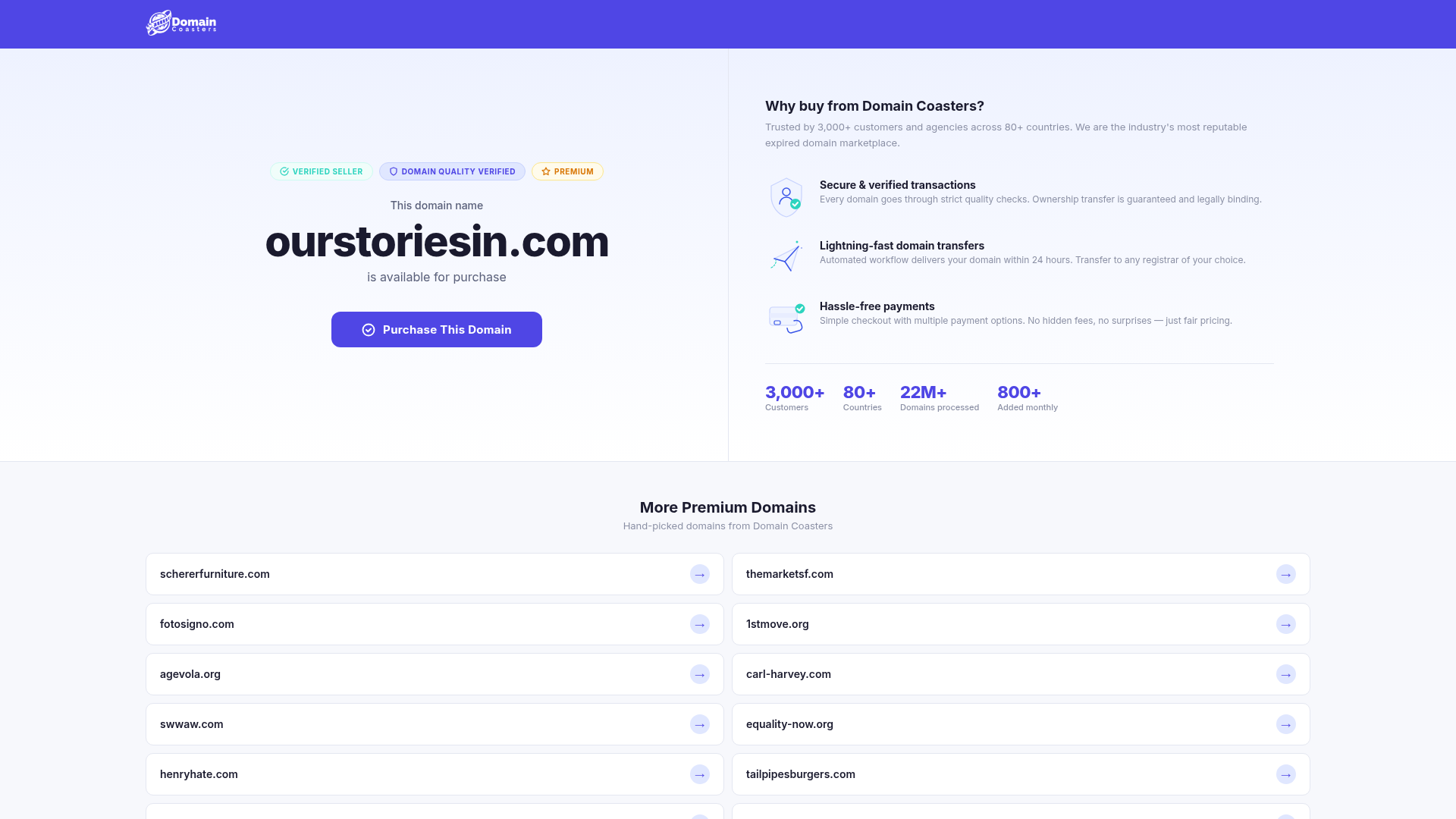
Domain Coasters Landing Page Layout
A clean domain marketplace landing page featuring a split-screen hero with trust badges, statistical counters, and a responsive grid of card-based links for additional inventory.
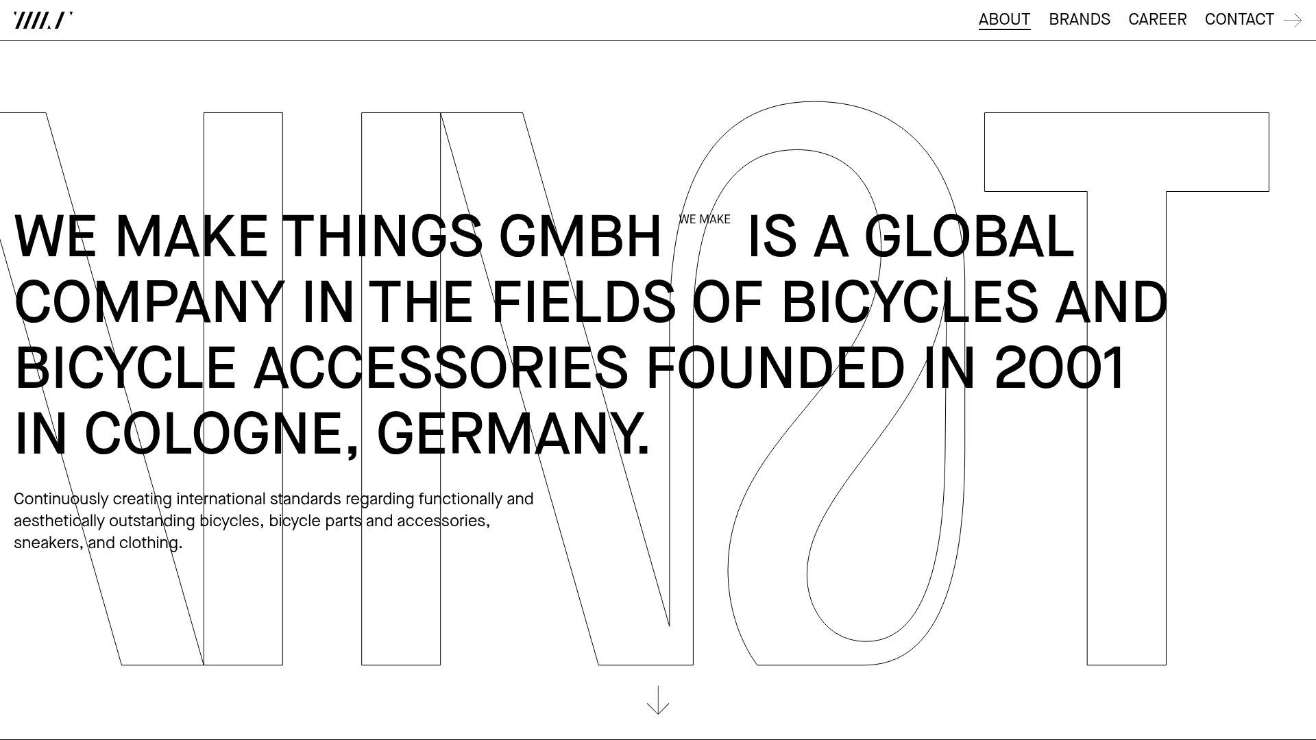
WE MAKE THINGS Corporate Portfolio
A minimalist corporate site featuring a bold typography-heavy hero section and an accordion-style brand list with integrated image galleries and external links.
