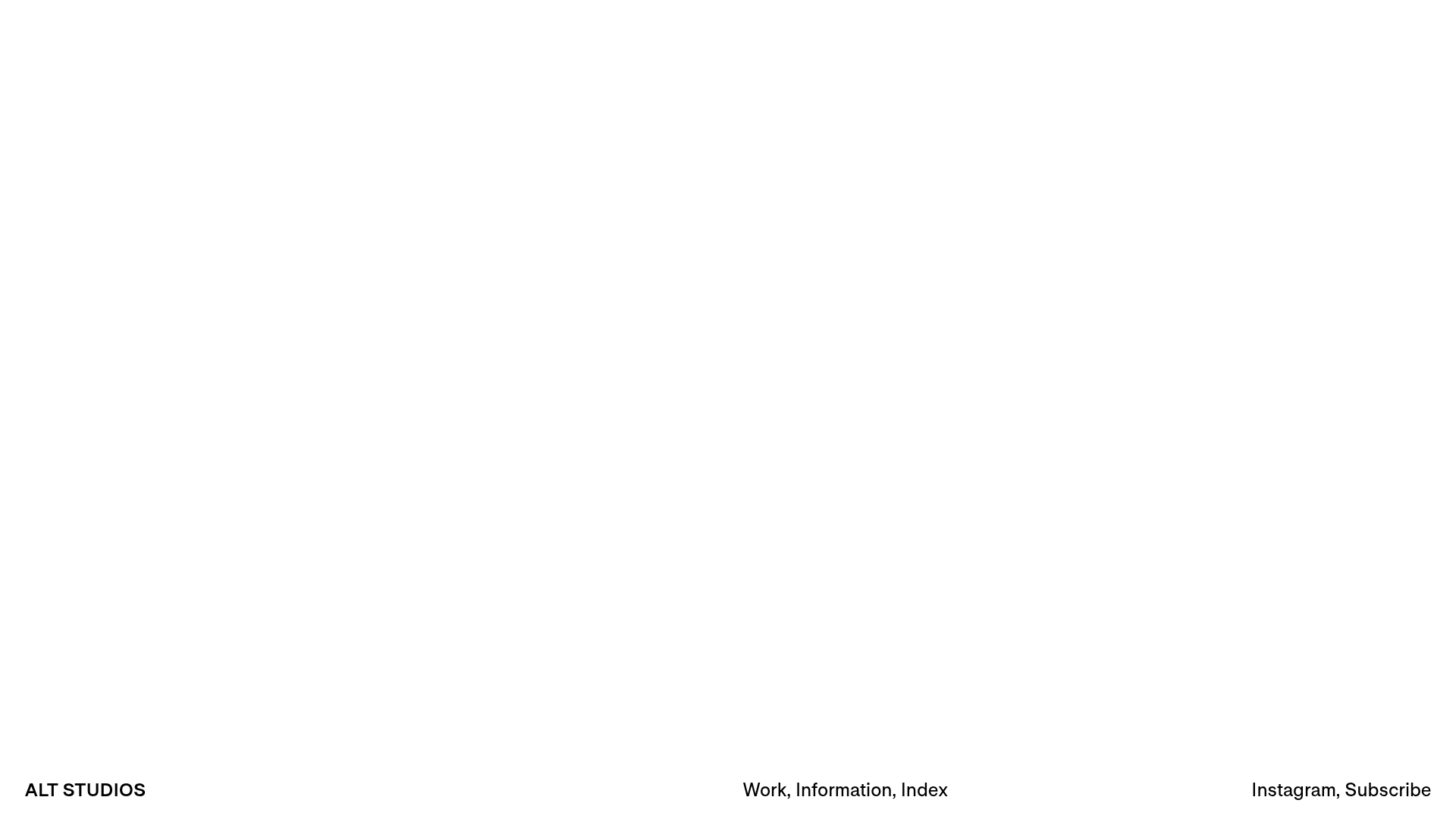
ALT Studios Minimalist Infinite Scroller
An ultra-minimalist portfolio featuring an infinite-scrolling typographic comparison list and a clean sticky footer navigation layout.
Overview
This project features a bold, ultra-minimalist portfolio design centered around a vertical infinite-scrolling typographic ticker. It is an excellent reference for builders wanting to master 'less is more' aesthetics, focusing on high-contrast typography and a persistent, distributed navigation layout that maximizes whitespace.
Design System
- Color Palette & Visual Hierarchy: The system uses a strict monochrome palette (pure white background and pitch-black text). Hierarchy is established purely through scale and spatial positioning rather than color decoration.
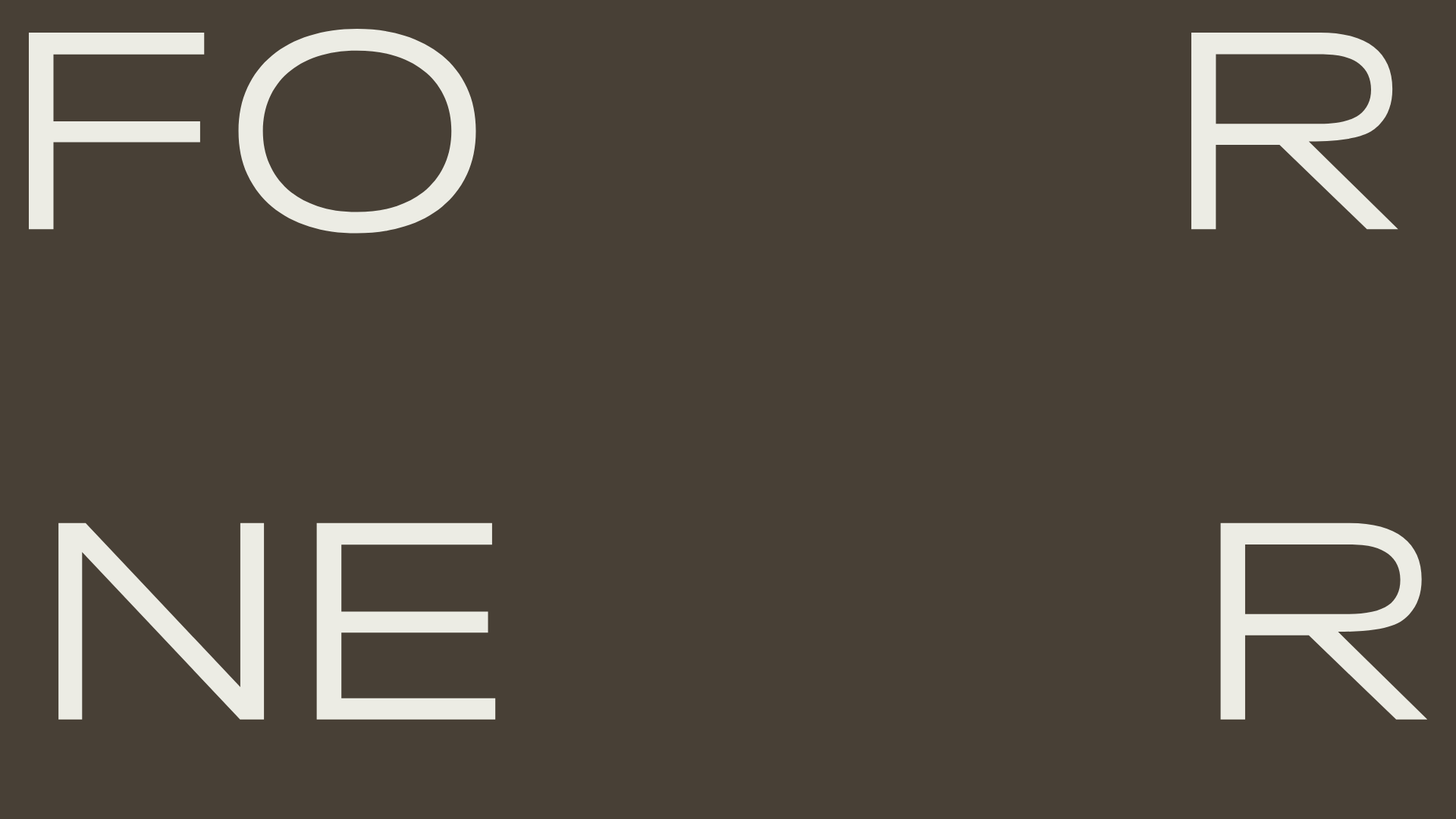
- Typography: A clean, sans-serif neo-grotesque (similar to Helvetica or Inter) is used throughout. The central content employs a significant scale increase for 'Less/More' statements, while the footer utilizes small-caps or standard weights for administrative links.
- Page Structure & Section Flow: The layout is unconventional, featuring a full-bleed typographic scroller as the primary visual interest. A fixed sticky footer at the bottom of the viewport contains all navigation, grouped into three distinct zones: brand identity (left), main navigation (center), and social/secondary links (right).
- Reusable Components:
- The Comparison Block: The
more-less-blockcomponent uses a split-grid container (colspan-6) to create perfectly aligned columns of text statements. - Sticky Tri-Zone Footer: A minimalist navigation bar that sits at the bottom edge of the screen, providing constant access to site areas without obscuring the content.
- The Comparison Block: The
- Interaction and Motion: The primary mechanic is an infinite scroll. As seen in the HTML, the
infinite-scroll-elemis duplicated to create a seamless looping effect, allowing the 'philosophy' statements to scroll vertically without a visible break. - Responsive Behavior: The HTML classes
m-colspan-12indicate a mobile breakpoint strategy where the horizontal 'Less/More' pairs stack vertically into a single column on smaller screens to maintain readability.
Use Cases
- Who should clone this: Creative directors, copywriters, or design agencies who want to lead with a philosophy or brand manifesto rather than a traditional image grid.
- Product Remixing: This pattern is perfect for 'About Us' pages, brand core values sections, or landing pages for boutique hardware or fashion brands.
- Remix Directions: Replace the black-on-white scheme with a brand-specific duo-tone (e.g., deep green on cream). You could also remix the scroller to display client names, project service menus, or testimonials.
- Suggested Clone Scope: The sticky tri-zone footer is a high-impact, quick clone for any minimalist site. For a full-page clone, ensure you implement the CSS animation logic required to make the
infinite-scroll-wraploop smoothly.
Related Inspirations
Forner Studio Minimalist Agency Landing Page
A minimalist design featuring a large-scale liquid typography layout, high-contrast dark theme, and a clean grid-based navigation structure.

Egstad Minimalist Design Portfolio
A refined Nuxt.js portfolio featuring bold variable typography, interactive canvas elements, and a clean grid-based layout for showcasing design work.

Christopher Doyle Agency Portfolio Layout
A minimalist, typography-led portfolio featuring a wide-margin grid system, smooth fade-in animations, and simple image-focused project cards.

NewTab Studio Minimalist Portfolio Landing Page
A clean, typography-focused landing page featuring an oversized SVG/canvas hero title, a top-aligned navigation bar, and a minimalist footer layout.
Someone & Others Studio Landing Page
A minimalist studio portfolio featuring scroll-reveal typography, overlapping sticky case study cards, and a vibrant glassmorphism CTA with animated glow rings.

Play Studio Minimalist Portfolio Landing
A high-impact agency layout featuring a oversized typography header, a full-width integrated Vimeo video background, and a unique expandable accordion list for industry showcases.
