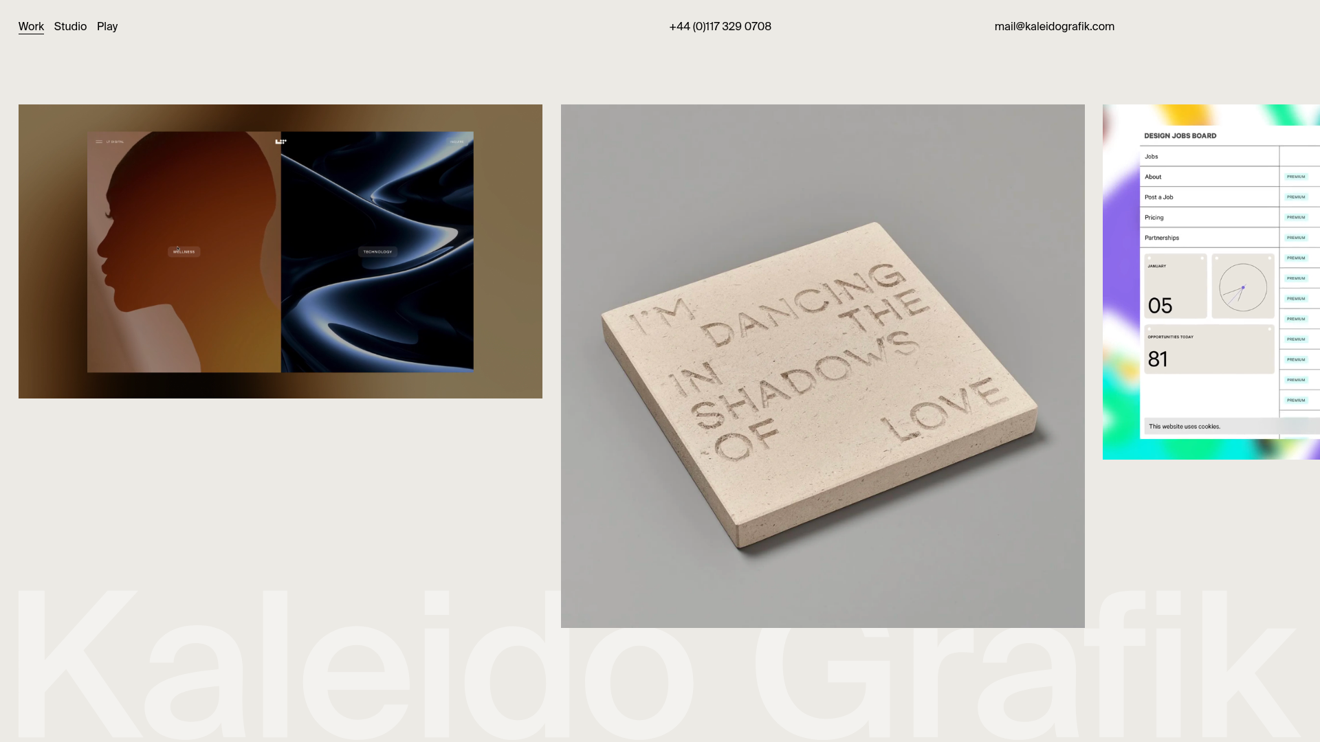
Kaleido Grafik Horizontal Portfolio
A horizontal-scrolling portfolio showcasing high-resolution video thumbnails and image carousels in a dynamic, varied aspect ratio grid layout.
Overview
This website is a sophisticated horizontal-scrolling portfolio designed for creative agencies and studios. It represents a strong clone/remix reference because it balances a minimalist, high-end aesthetic with a dynamic grid that accommodates mixed media types like high-resolution video thumbnails and image carousels.
Design System
- Color Palette & Visual Hierarchy: The site uses a neutral "off-white" or light beige background (
#f0ede9approximate) to let its high-contrast project media stand out. Hierarchy is established through a subdued, fixed header and a massive, low-opacity watermark logo (.fixed-background-logo) that remains static while content scrolls over it. - Typography: The system relies on a clean, sans-serif font. The header uses small, spaced-out links for "Work," "Studio," and "Play," while project titles use a bolder weight. Contact details in the header use a light-weight monochrome style.
- Structure & Flow: The layout is a horizontal flexbox (
.inner-page-content) where "page blocks" are arranged side-by-side. Blocks vary in aspect ratio (notablysixteen-nine,one-one, andfour-three) and vertical alignment (top-alignvs.bottom-align), creating a rhythmic zigzag effect as the user scrolls horizontally. - Reusable Components:
- Video Wrap: An auto-playing, muted video container with a lazy-loaded poster image.
- Image Carousel: A fade-transition carousel (
.flickity-enabled .is-fade) for static project images. - Fixed Header: A three-column utility bar providing quick access to menu and contact links.
- Inverted Watermark: A massive background SVG that provides brand identity without interfering with readability.
- Motion Patterns: The primary interaction is the horizontal scroll, which is often implemented with a smooth-scroll library. Hovering over a project block (
.work-project-hover) triggers an custom cursor effect using a.cursor-dotthat follows the mouse. - Implementation Clues: The HTML reveals the use of Tailwind CSS (classes like
flex,justify-between,whitespace-no-wrap) for layout and Flickity for carousels. It uses a B-Lazy script for performance-focused image and video loading.
Use Cases
- Who should clone this: Independent designers, architectural firms, and high-fashion agencies looking to emphasize visual impact over heavy text content.
- Effective Remixing:
- Photography Portfolios: Swap out the studio videos for cinematic high-res stills using the varied aspect ratios to mimic a magazine spread.
- B2B Creative Services: Remix the grid to include small text cards between images to provide context or testimonials without breaking the horizontal flow.
- Practical Remix Directions: Adapt the information architecture by unhiding the
.project-infosection on click—currently, the HTML shows these ashiddenelements, implying they are meant to be revealed via a modal or slide-over. - Scope: A quick section clone of the
page-blockflex containers is ideal for landing pages, while the full-page clone is best suited for immersive desktop experiences.
Related Inspirations
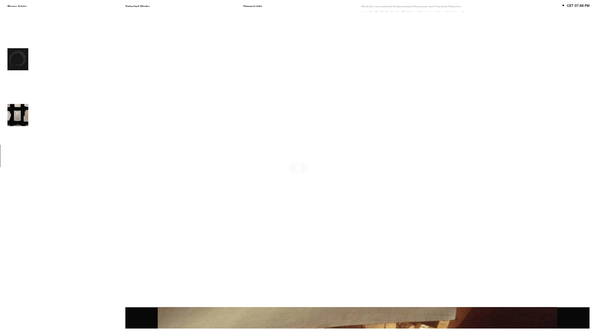
Bruno Arizio Designer Portfolio Website
A minimalist creative director portfolio featuring a clean typographic layout, side-aligned image previews, and high-contrast spacing patterns suitable for luxury or design showcases.
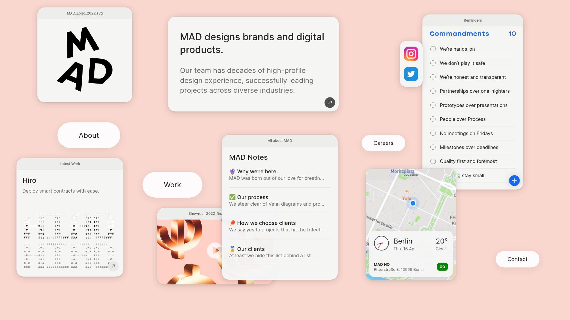
MAD Agency Interactive Dashboard Portfolio
A creative workspace-style layout featuring draggable OS-like applets, including interactive notes, a map widget with live weather, and a custom task checklist.
Catherine Peacock Designer Portfolio Home
A minimalist portfolio layout featuring a vertically stacked masonry project grid, sticky navigation with animated icons, and offset typography.
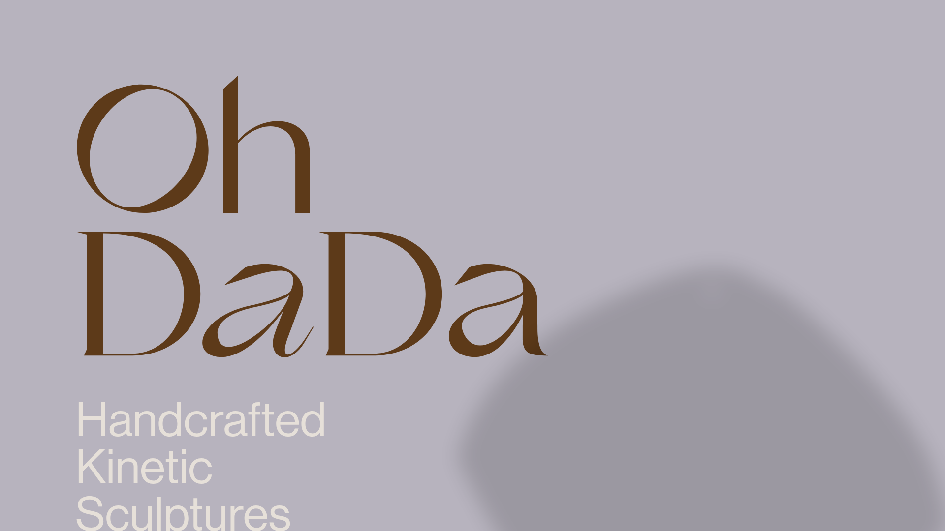
OhDaDa Handcrafted Kinetic Sculpture E-commerce
A minimalist Svelte-based store featuring a horizontal-scroll product showcase, transform-driven image gallery, and a full-screen sliding cart overlay.
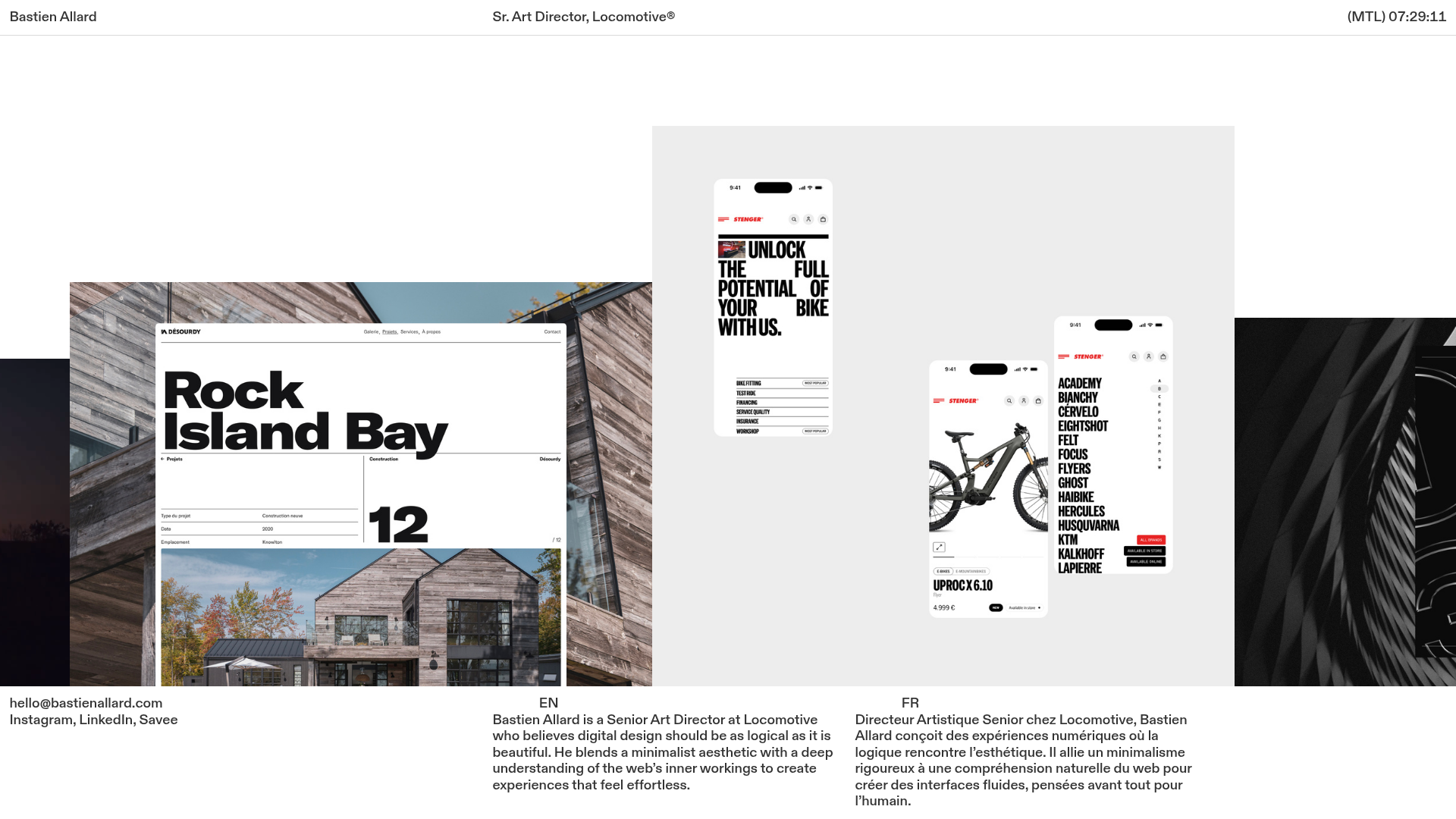
Bastien Allard Minimalist Portfolio Gallery
A clean, horizontal marquee-based portfolio featuring a sticky header/footer layout, digital clock integration, and responsive bilingual text columns for minimalist art director showcases.
Magda Reyman Designer Portfolio
A minimalist portfolio layout featuring a fixed hero intro, absolute-positioned mobile UI mockups, and a distinctive high-contrast footer with rounded interaction buttons.
