Adam Vella Minimalist Design Portfolio
A clean, text-heavy professional portfolio layout featuring a fixed-width single column, pill-shaped action buttons, and a minimalist typography-led design system for creative bios.

Overview
This site is an ultra-minimalist professional portfolio that prioritizes pure typography and information clarity over visual flair. It serves as an excellent reference for builders who need a fast-loading, text-centric landing page that removes all friction from reading a professional bio and finding contact details.
Design System
- Color Palette & Visual Hierarchy: The design uses a high-contrast monochromatic palette with a white background (#FFFFFF) and deep black text (#000000). Hierarchy is established through font weight and spacing rather than color, utilizing light-gray backgrounds (
#F1F1F1) for pill-shaped interaction elements to draw subtle attention. - Typography System: The site uses a clean, sans-serif typeface. It employs three distinct text formats defined in the HTML:
_Primaryfor the main bio (larger leading and font size),_Secondaryfor section headings (grey/muted labels like "Selected clients"), and_Defaultfor body lists and contact links. - Page Structure: A simple, single-column layout. The flow begins with the site title in the top-left, followed by the primary biography, a secondary list of clients, and finishing with a vertically stacked contact section.
- Reusable Components: The most unique reusable element is the
laybutton1class—a pill-shaped button with generous padding and subtle rounded corners used for hyperlinks, email, and phone numbers. This converts standard text links into touch-friendly interactive targets. - Interaction Patterns: The design features a static, non-scrolling title (
sitetitle) fixed at the top-left. Links and action buttons change state on hover (captured by thelaybuttonclass behavior), providing a clear affordance for clickable elements in an otherwise flat layout. - Responsive Behavior: The HTML structure (
lay-mobile-icons-wrapandmobile-title) indicates a simplified mobile view where the fixed elements remain at the top and the single column collapses to fit the viewport width, maintaining the readability of the text block.
Use Cases
- Who should clone this: Creative directors, copywriters, or developers who want a "business card" style digital presence that emphasizes their pedigree and contact info over a visual gallery.
- Product Remixes: This pattern is perfect for a "Coming Soon" page, a minimal Linktree alternative for social profiles, or a personal resume site for academics and writers.
- Practical Remix Directions: Builders can easily remix this by swapping the monochromatic theme for a bold brand color (e.g., deep blue background with white text) or by replacing the "Selected clients" list with a succinct list of services or project links.
- Suggested Clone Scope: This is best cloned as a full-page layout because its strength lies in the cohesive, uncluttered composition of the entire viewport.
Related Inspirations

Christopher Doyle Agency Portfolio Layout
A minimalist, typography-led portfolio featuring a wide-margin grid system, smooth fade-in animations, and simple image-focused project cards.
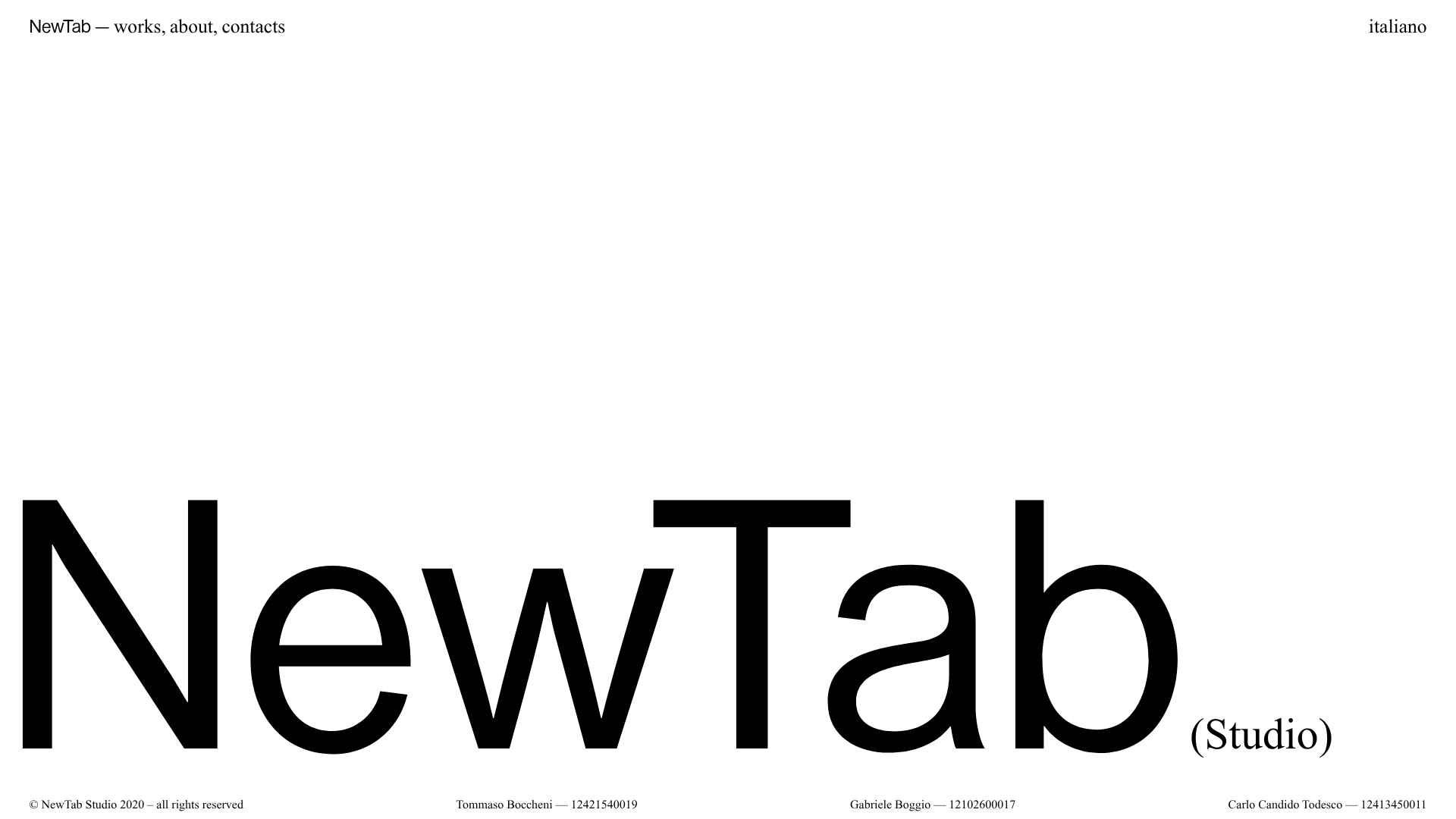
NewTab Studio Minimalist Portfolio Landing Page
A clean, typography-focused landing page featuring an oversized SVG/canvas hero title, a top-aligned navigation bar, and a minimalist footer layout.
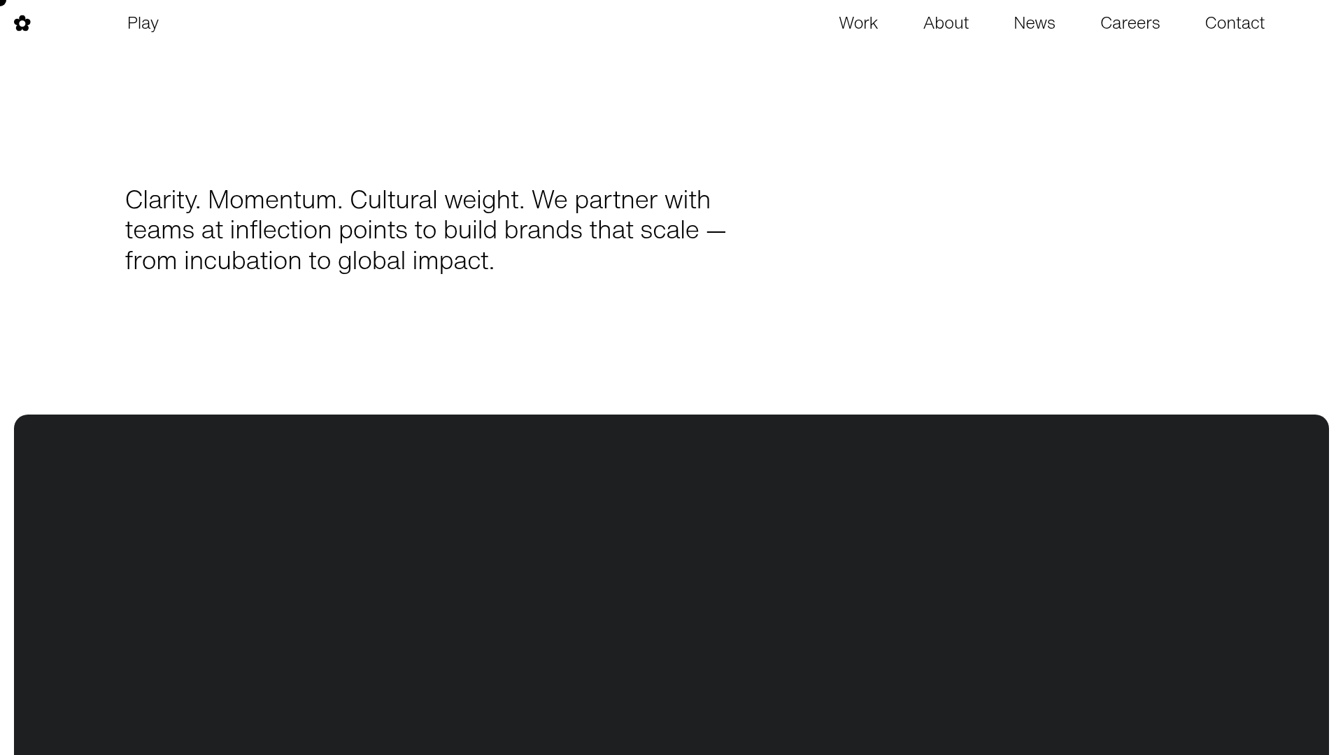
Play Studio Minimalist Portfolio Landing
A high-impact agency layout featuring a oversized typography header, a full-width integrated Vimeo video background, and a unique expandable accordion list for industry showcases.

Baubauwerk Minimal Agency Portfolio Homepage
A clean studio site featuring a centered text hero, scatter-plot filterable project gallery, and full-bleed image sections for case studies.
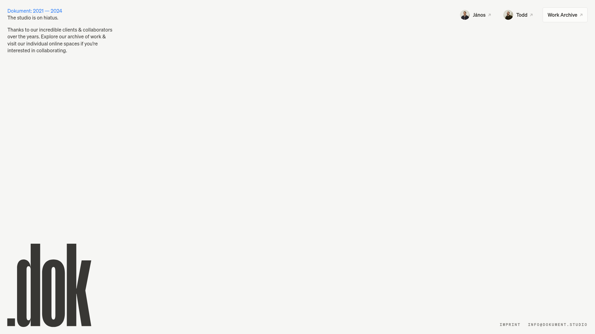
Dokument Studio Minimalist Portfolio Landing
A clean, high-contrast landing page featuring a bottom-aligned oversized logo, top-right profile links, and a minimalist typography-focused layout.
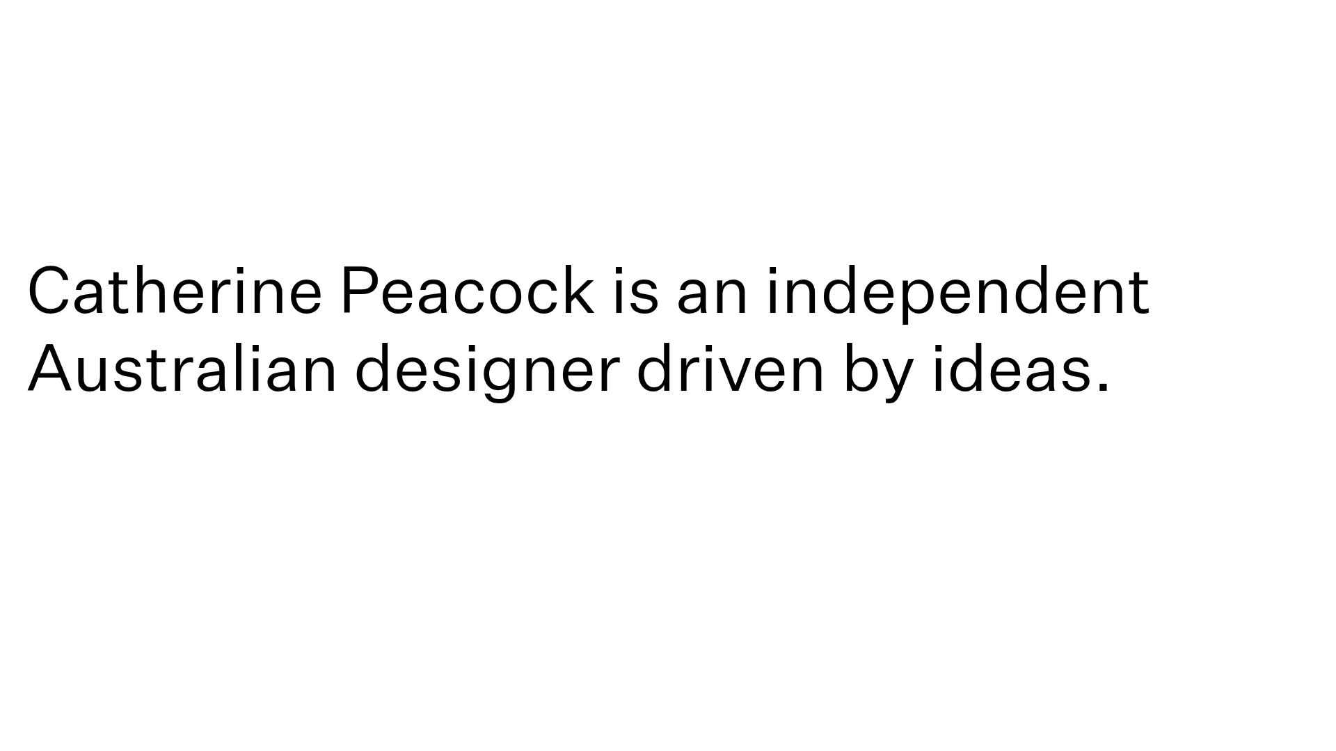
Catherine Peacock Designer Portfolio Home
A minimalist portfolio layout featuring a vertically stacked masonry project grid, sticky navigation with animated icons, and offset typography.
