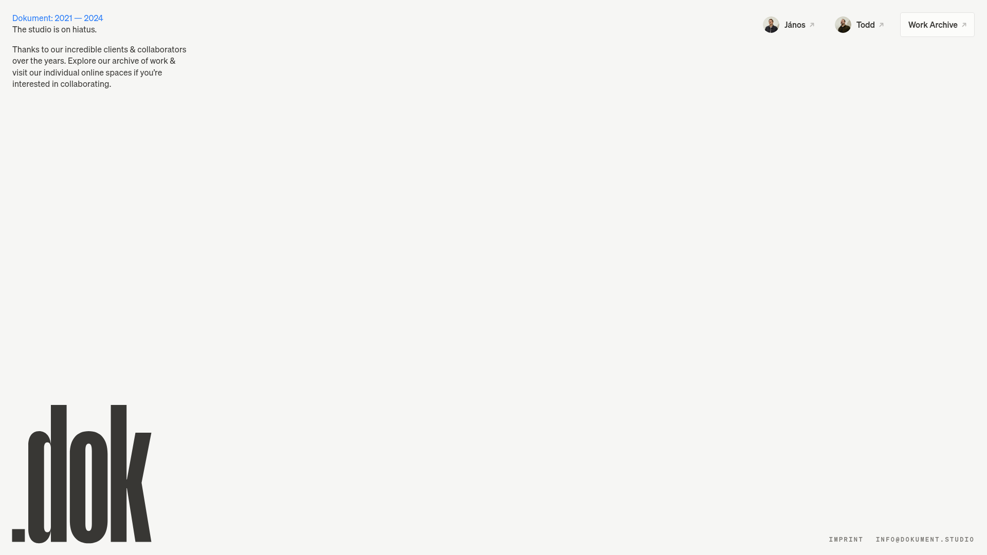
Dokument Studio Minimalist Portfolio Landing
A clean, high-contrast landing page featuring a bottom-aligned oversized logo, top-right profile links, and a minimalist typography-focused layout.
Overview
This minimalist landing page for Dokument Studio serves as a high-impact, low-friction entry point or “hiatus” notice for a creative agency. It is an excellent clone reference for builders looking to master brutalist-adjacent typography, asymmetrical layouts, and the effective use of whitespace to create a premium, editorial feel.
Design System
- Color Palette & Visual Hierarchy: The system uses a restricted high-contrast palette. A warm off-white background (
#f2f2f1suggested by context) paired with deep charcoal (rgb(56, 55, 52)) and a vibrant primary blue (rgb(44, 126, 248)) for the header text. The hierarchy is inverted: small utility text at the top and bottom, with the massive brand mark creating a weighted anchor at the bottom-left. - Typography: The system relies on a clean sans-serif (Inter or similar). Body copy is small and tight for an architectural look. The logo mark (".dok") uses a condensed, ultra-bold, high-x-height typeface that dominates the bottom-left quadrant.
- Layout Structure: The page uses a fixed-viewport approach rather than a scrolling feed. Content is pushed to the four corners:
- Top-Left: Information and status text.
- Top-Right: Navigation links with profile thumbnails and a boxed "Work Archive" button.
- Bottom-Left: Oversized brand logo.
- Bottom-Right: Contact and legal links (Imprint).
- Reusable Components:
- Profile Links: Horizontal stack containing a circular avatar, text label, and an external link arrow icon.
- Action Button: A simple bordered "Work Archive" button with generous padding and a link arrow.
- Logo Container: An SVG-based oversized brand mark that adapts its scale relative to the viewport height.
- Responsive Behavior: The HTML structure indicates specific breakpoints for 1200px, 810px, and mobile. On mobile, the
hidden-6z5n8mclasses suggest that the complex corner layout collapses into a vertically stacked centered column to maintain legibility.
Use Cases
- Who should clone this: Freelance designers, architects, and creative studios who want a "Coming Soon" or "Hiatus" page that feels intentional and high-end rather than broken.
- Effective Remixes: This pattern works perfectly for product launch teasers, digital business cards, or minimalist fashion brand landing pages.
- Remix Directions:
- Typography Swaps: Replace the condensed sans logo with a serif typeface to shift the vibe from "Brutalist" to "Luxury Editorial."
- Background Media: Replace the solid background with a subtle grain texture or a full-bleed low-contrast video loop.
- Functional Pivot: Use the top-right container for a simple newsletter signup instead of profile links.
- Suggested Clone Scope: A full-page clone is recommended to understand the CSS Grid or absolute-positioning required to pin elements to the viewport corners correctly.
Related Inspirations

Christopher Doyle Agency Portfolio Layout
A minimalist, typography-led portfolio featuring a wide-margin grid system, smooth fade-in animations, and simple image-focused project cards.
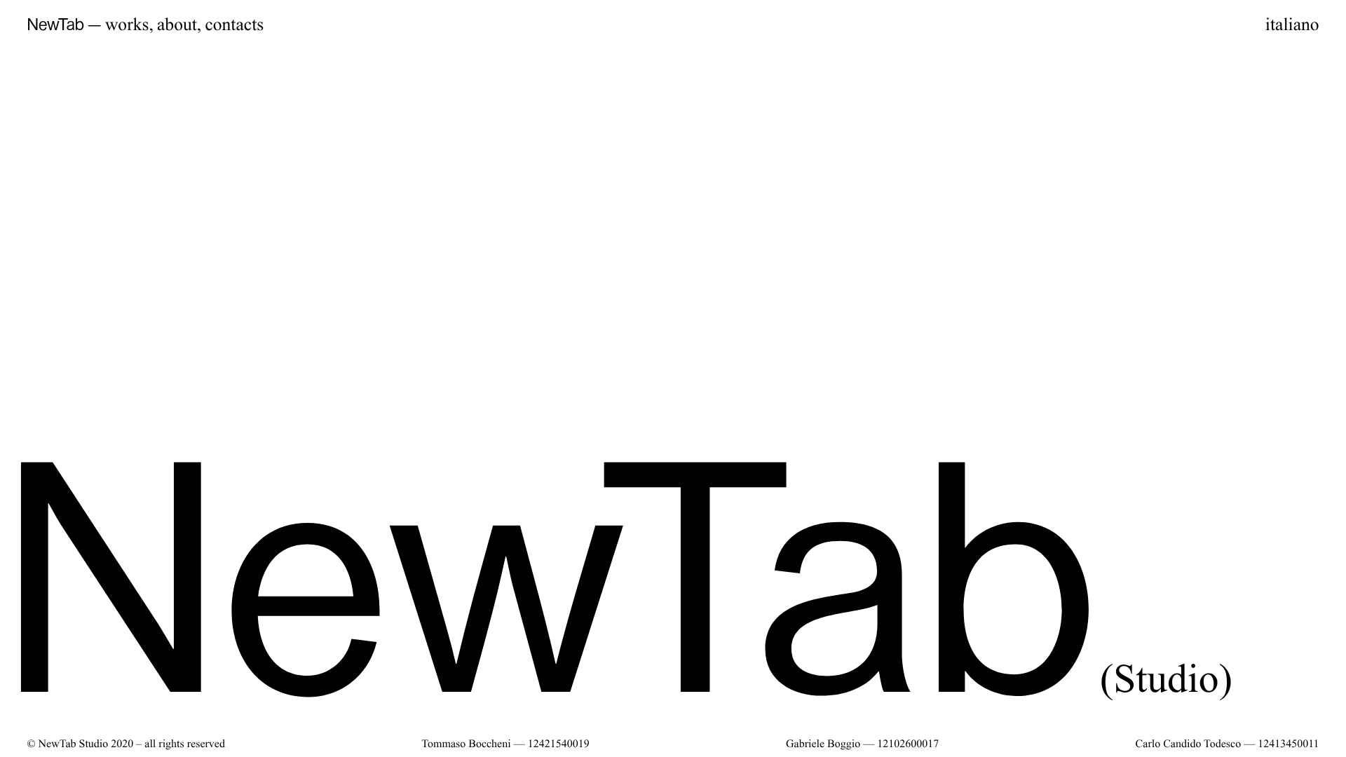
NewTab Studio Minimalist Portfolio Landing Page
A clean, typography-focused landing page featuring an oversized SVG/canvas hero title, a top-aligned navigation bar, and a minimalist footer layout.
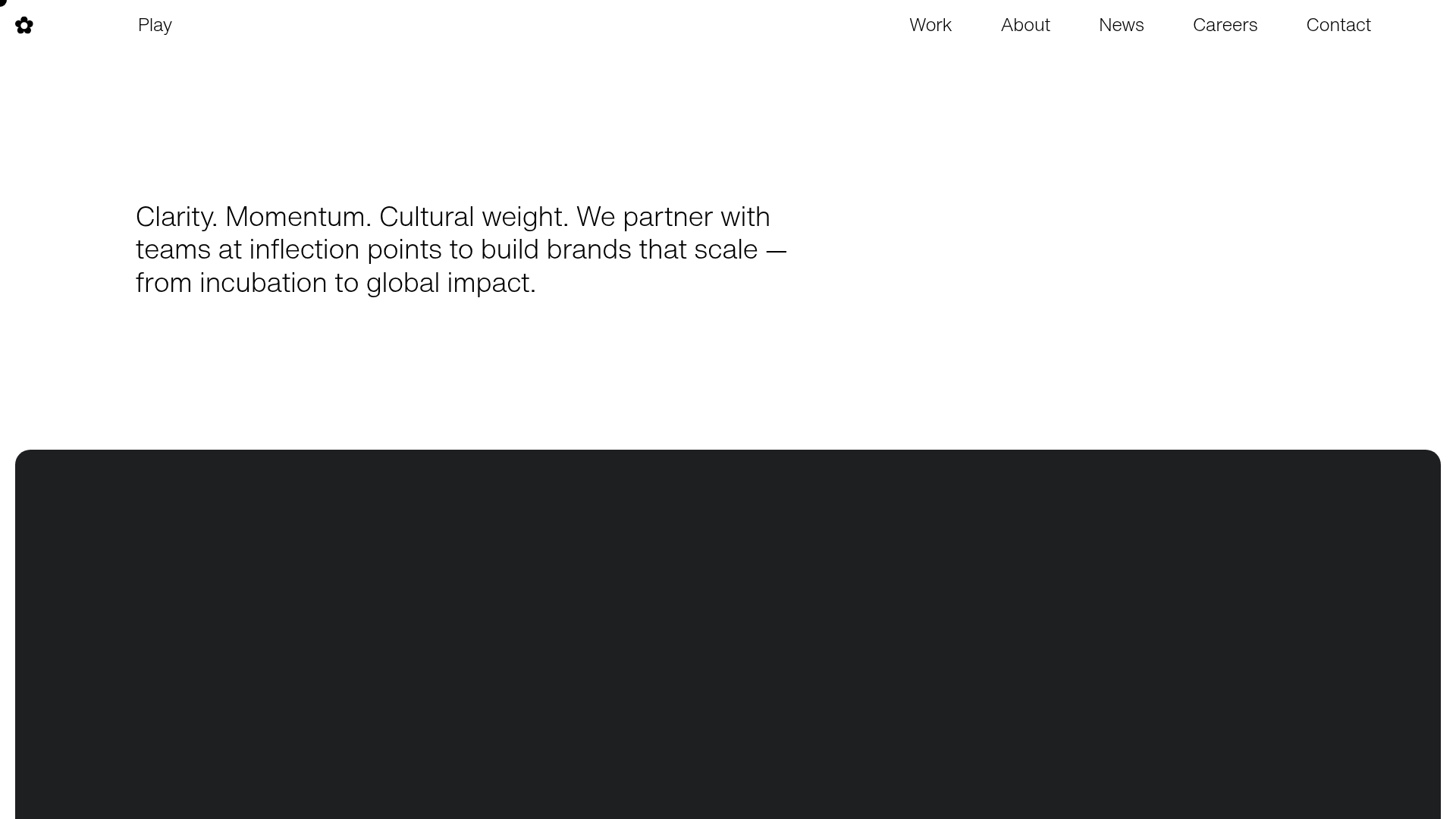
Play Studio Minimalist Portfolio Landing
A high-impact agency layout featuring a oversized typography header, a full-width integrated Vimeo video background, and a unique expandable accordion list for industry showcases.

Baubauwerk Minimal Agency Portfolio Homepage
A clean studio site featuring a centered text hero, scatter-plot filterable project gallery, and full-bleed image sections for case studies.
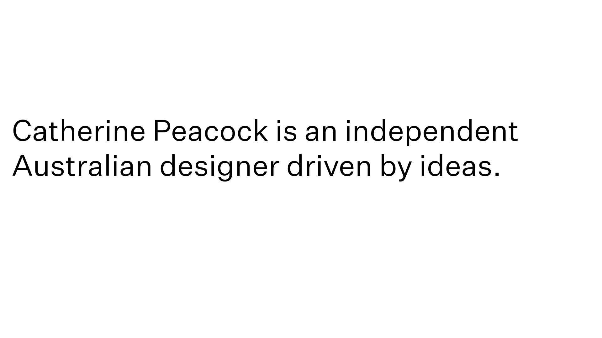
Catherine Peacock Designer Portfolio Home
A minimalist portfolio layout featuring a vertically stacked masonry project grid, sticky navigation with animated icons, and offset typography.
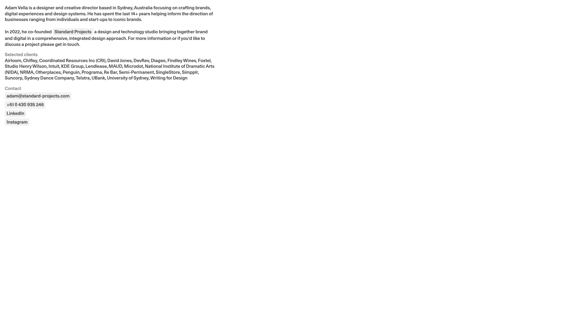
Adam Vella Minimalist Design Portfolio
A clean, text-heavy professional portfolio layout featuring a fixed-width single column, pill-shaped action buttons, and a minimalist typography-led design system for creative bios.
