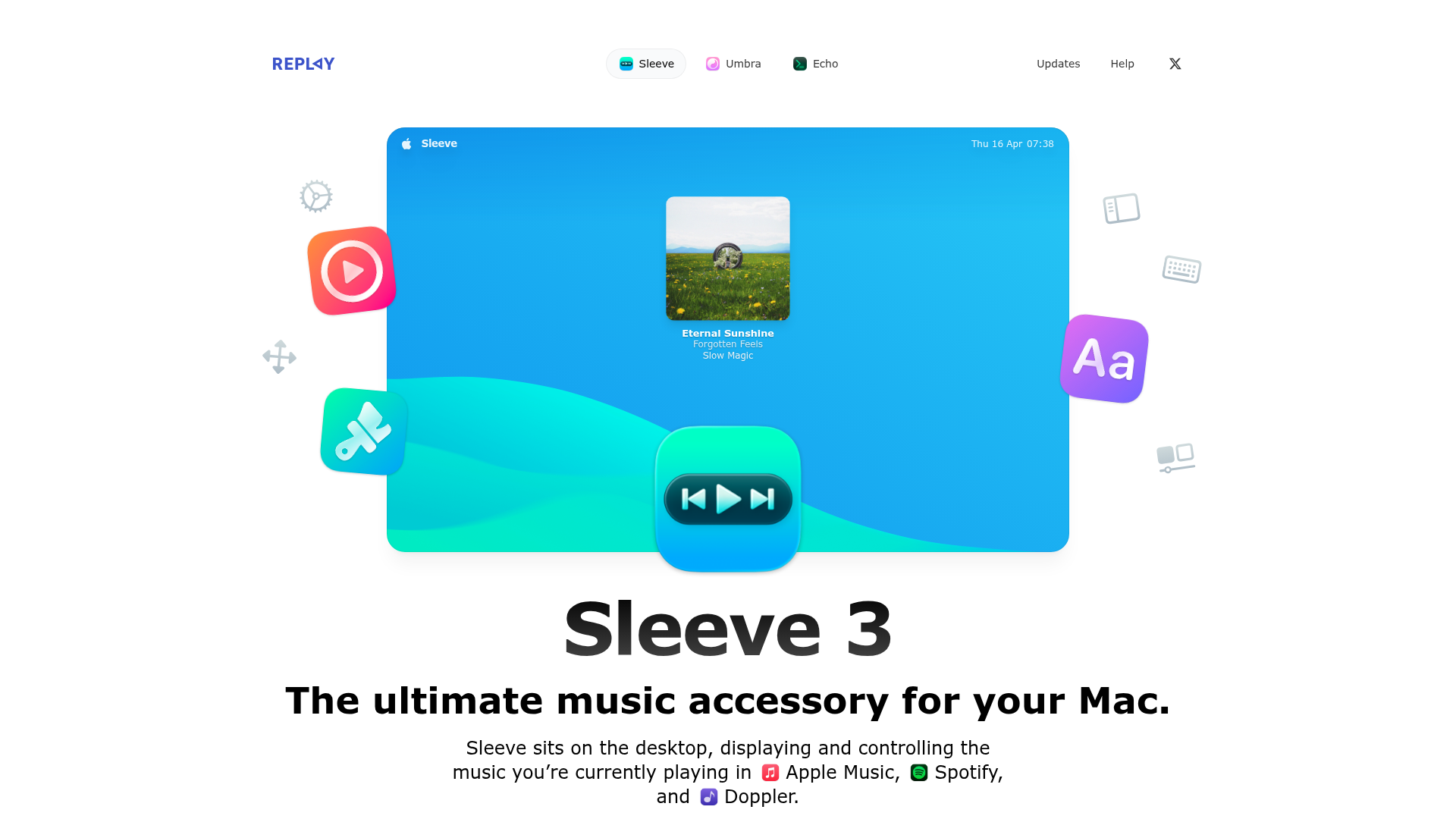
Sleeve 3 Software Landing Page
A clean product landing page featuring a centered hero section with floating decorative icons, soft gradients, and integrated app integration badges.
Overview
Sleeve 3’s landing page is a masterclass in software marketing, using a clean, centered design that balances vibrant gradients with ample white space. It effectively showcases a Mac desktop utility through high-quality contextual renders and floating UI elements, making it an excellent reference for builders aiming to present digital tools with a tactile, premium feel.
Design System
- Color Palette & Visual Hierarchy: The primary palette uses a mix of deep blacks and sharp whites (supporting dark mode) accented by a variety of high-vibrancy gradients (e.g.,
#0E95EEto#27C9F5). Visual hierarchy is established through massive typography for the product name, followed by bold summaries and secondary descriptions in a lighter font weight. - Typography: The system uses a clean sans-serif (likely system fonts or Inter) with a significant scale range. Product titles use
text-6xl md:text-8xlwithfont-semibold, while paragraph text is set totext-lgortext-2xlfor readability and impact. - Page Structure: The flow begins with a large graphical hero section featuring a simulated desktop interface, followed by a feature-driven grid using bento-style layouts. Each section focuses on a specific pillar: Theming, Customization, Integrations, and Shortcuts.
- Reusable Components:
- The "Bento" Grid: The 'Catalogue of hits' section uses a complex grid with
col-span-3androw-span-2variations to highlight key features. - Glassmorphic Cards: Elements like the Keyboard HUD use
backdrop-blur-xlandbg-white/20to mimic macOS interface styles. - Action Buttons: Large dual-action buttons (App Store vs Direct Buy) use distinct styles—one solid background and one with a subtle border and price badge.
- The "Bento" Grid: The 'Catalogue of hits' section uses a complex grid with
- Interaction & Implementation: The HTML reveals extensive use of Tailwind CSS for spacing (
gap-24) and responsive layouts. Advanced CSS techniques includebg-clip-textfor gradient headers andshadow-outlineclasses to create a clean, 1px inset border effect on cards. Motion is hinted at throughtransition duration-500classes on decorative floating icons.
Use Cases
- Who should clone this pattern: Developers of macOS utilities, productivity apps, or high-end SaaS tools that need to communicate "premium quality" through aesthetic precision.
- Remixing effectively: The bento-box grid section can be easily adapted for any feature-heavy product. The integration badges section, which uses glowing app icons (Apple Music, Spotify), is perfect for platforms highlighting a partner ecosystem.
- Practical Directions: Builders can swap out the macOS-specific renders for mobile app mockups or browser windows. The "Keyboard Shortcuts" grid is a highly reusable pattern for any desktop software documentation.
- Clone Scope: A quick section clone of the "Theming" or "Integrations" blocks is ideal for adding character to an existing site, while a full-page clone is best for a dedicated product launch page.
Related Inspirations
Sandland Sleep Product Landing Page
A high-conversion Shopify layout featuring split-video hero sections, logo-based social proof ribbons, and a testimonial slider integrated with biometric sleep tracker results.
Beau Document Automation Landing Page
A modern software landing page featuring a bento-grid layout, split-screen hero assets with animated checkmarks, a step-by-step process guide, and a clean two-tier pricing table.
ClickUp Acquisition Hero Landing Page
Features a modern dark-themed hero section with a search UI graphic, bento-style feature grid, and a high-contrast CTA section with decorative gradients.
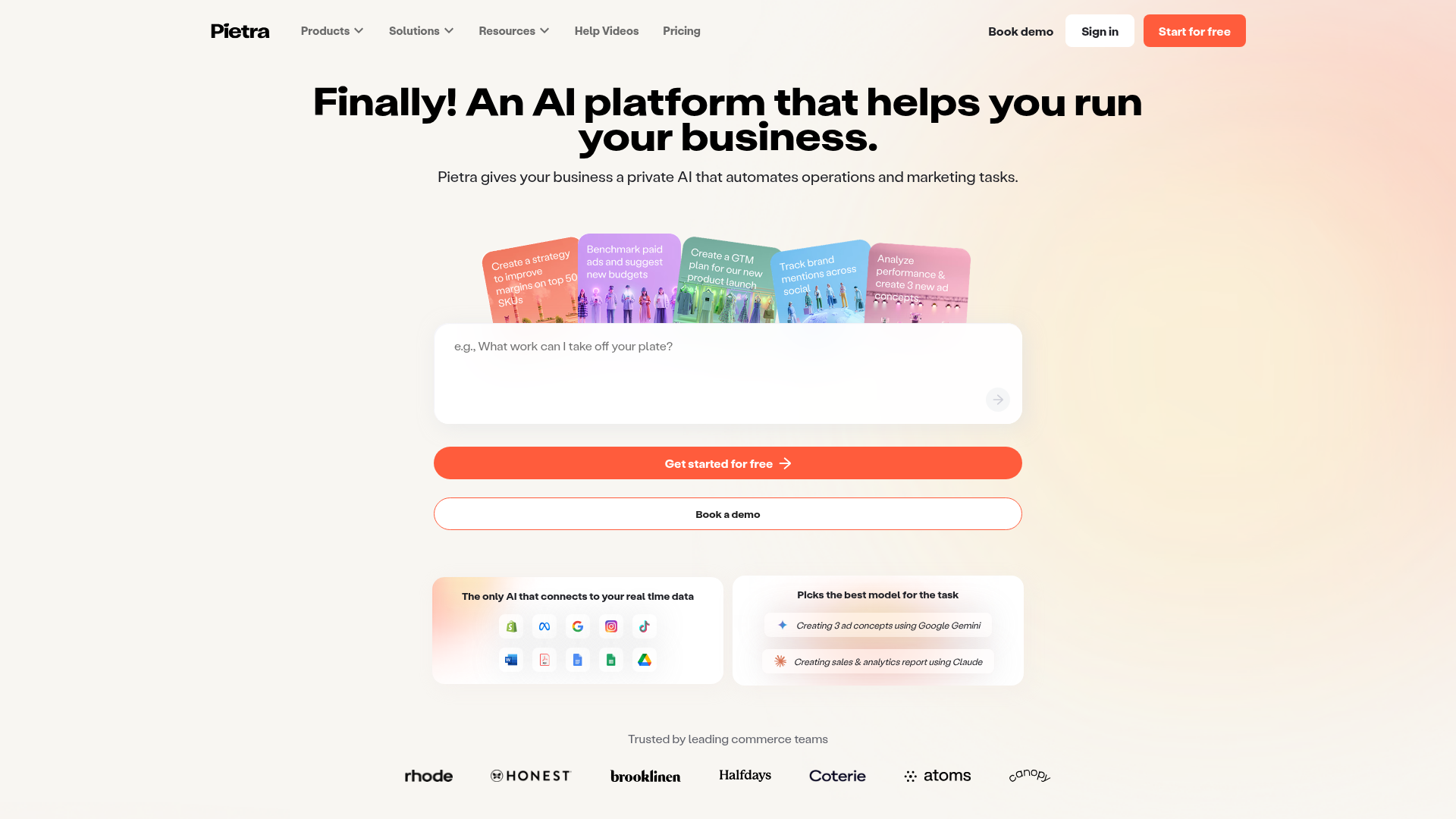
Pietra AI Platform Landing Page
A commerce-focused landing page featuring a centralized AI input hero, colorful floating value-prop cards, a bento-style integration showcase, and tabbed feature sections with side-by-side comparisons.
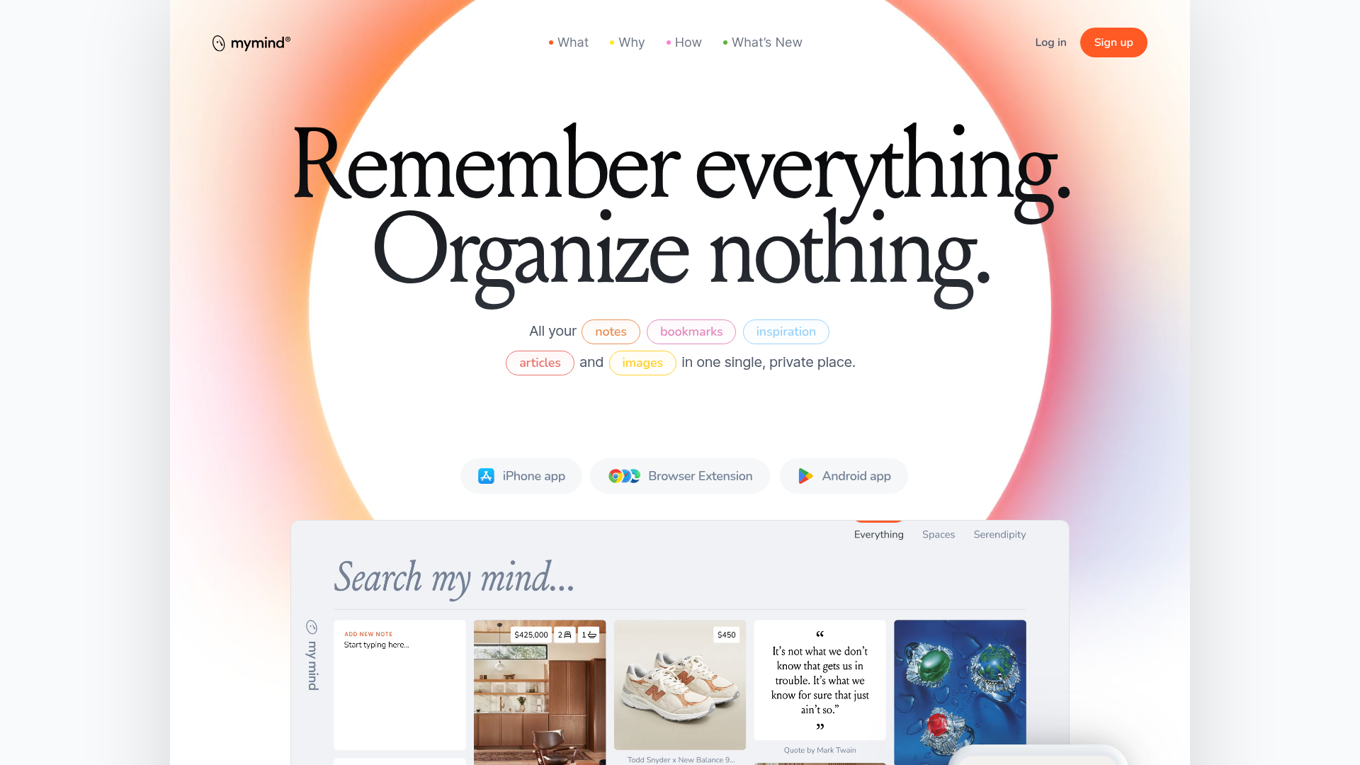
Mymind AI Tool Landing Page
A minimalist SaaS landing page featuring a soft-gradient hero section, custom pill-shaped text badges, and a dynamic bento-style search result preview grid.
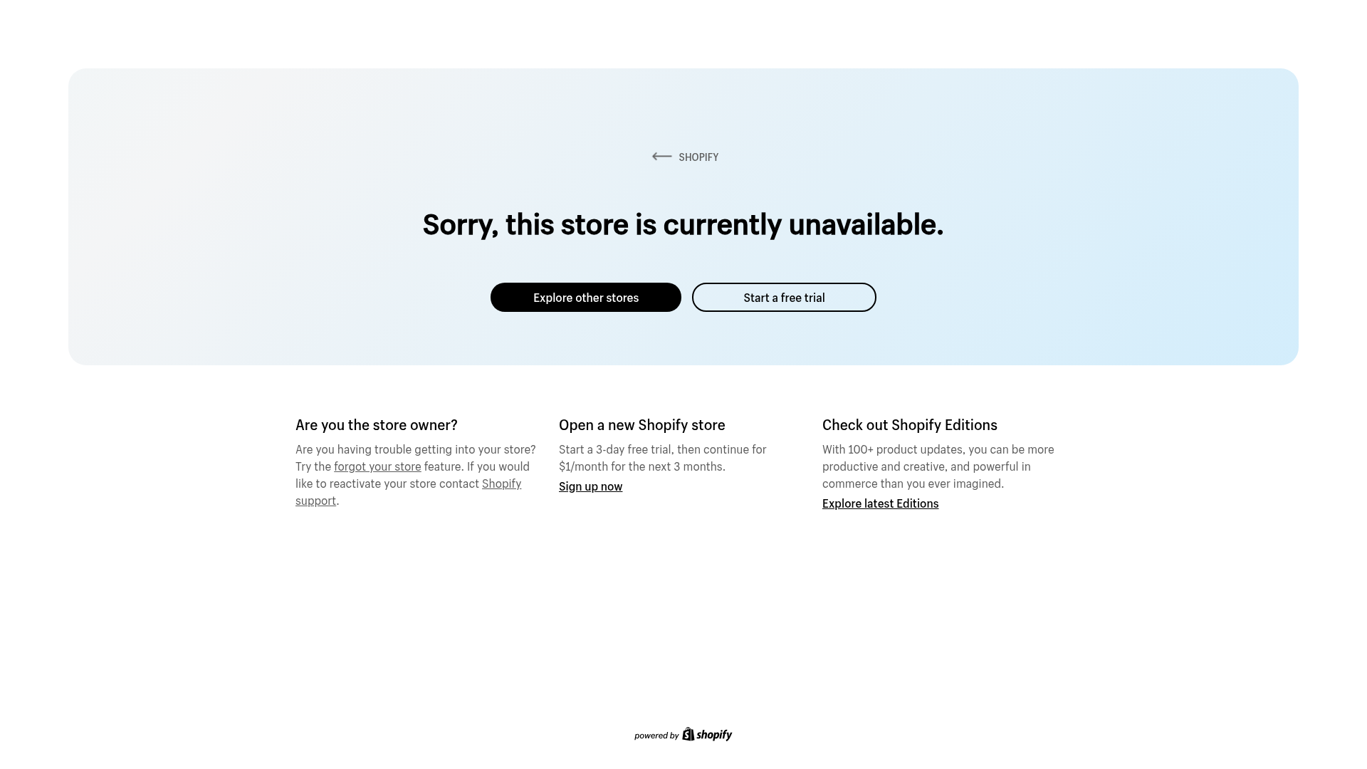
Shopify Unavailable Store Landing Page
A clean, centered error page layout featuring a hero card with rounded corners, primary/secondary action buttons, and a three-column information grid for support and CTAs.
