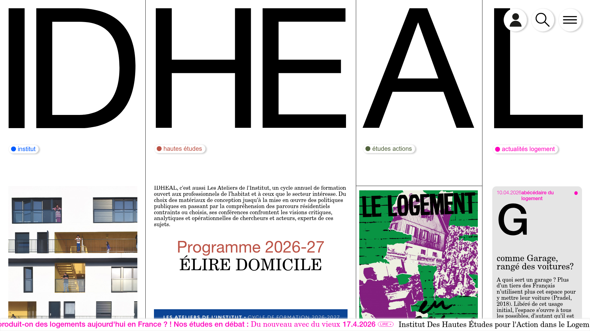
IDHEAL Vertical Pillar Architecture Site
A bold typography-driven layout featuring four full-height vertical sections with scroll-triggered column expansions, integrated image sliders, and a marquee footer.
Overview
This site features a striking four-column vertical pillar architecture where each section acts as a distinct portal for the brand's main divisions. It is a powerful clone reference for organizations needing to balance deep content categories with a high-impact, minimalist aesthetic driven by oversized typography and interactive column expansion.
Design System
- Color Palette & Visual Hierarchy: The design uses a monochrome black-and-white base accented by high-saturation primary colors (Blue, Red, Green, Pink) assigned to specific categories. Each column uses a colored dot indicator and matching border-colors to categorize content without overwhelming the clean space.
- Typography System: Extremely bold, oversized sans-serif letters (ID, HE, AL) serve as both branding and structural anchors at the top of the viewport. Body text uses a mix of serif for headlines (e.g., 'ÉLIRE DOMICILE') and a clean sans-serif for functional descriptions (e.g., 'Institut', 'Hautes études').
- Page Structure: The layout relies on
flex flex-wrapcontainers where each pillar is a.home-cols__col. The header is integrated into these columns via SVG logos, followed by segmented content areas including image sliders, text blocks, and article cards. - Reusable Components:
- Pill Badges: Small rounded status/category indicators with colored dots.
- Slick Sliders: Integrated
slick-sliderwith custom numerical paging (e.g., '1/2'). - Interactive Article Cards: Cards with an image top and a structured text bottom containing metadata (dates) and a '+ lire la suite' call-to-action.
- Footer Marquee: A CSS-animated
auto-scrollercontaining a horizontal ticker of news and links.
- Interaction & Motion: The implementation uses
transitionclasses on column widths. Columns respond to hover/scroll with transformations (translateY) and opacity fades to reveal inner content (home-cols__col-inner). - Implementation Clues: The site uses the
Slickcarousel library and a modular CSS approach with utility classes for spacing (sm-row,xl-row) and flexbox layouts.
Use Cases
- Who should clone this: Research institutes, architecture firms, or design agencies with 3-5 distinct sub-brands or service areas that require equal visual weight on a landing page.
- Effective Remixes: Portfolio sites where each column represents a different medium (e.g., Photography, Video, Design) or non-profits showcasing different mission pillars.
- Remix Directions: Swap the massive 'IDHEAL' background text for high-contrast imagery or different brand initials. The content hierarchy can be adapted by keeping the pillar structure but replacing the image sliders with video backgrounds or data visualization widgets.
- Clone Scope: A full-page clone is ideal to capture the unique scroll behavior; however, the marquee footer or the category-coded article card system can be extracted as standalone components.
Related Inspirations
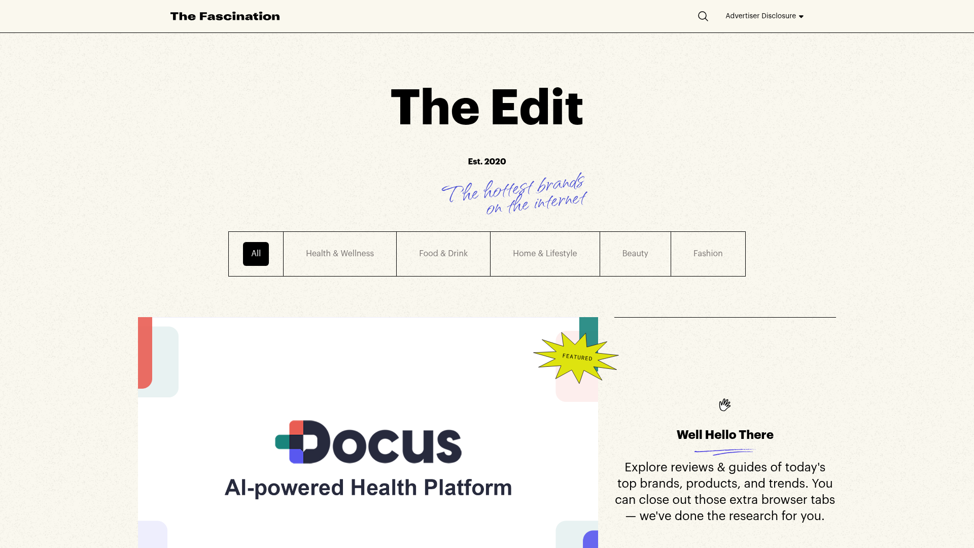
The Fascination Editorial Product Hub
A refined content marketplace layout featuring a minimalist bento-style grid, custom category filters, and modern hovering card interactions for brand reviews.
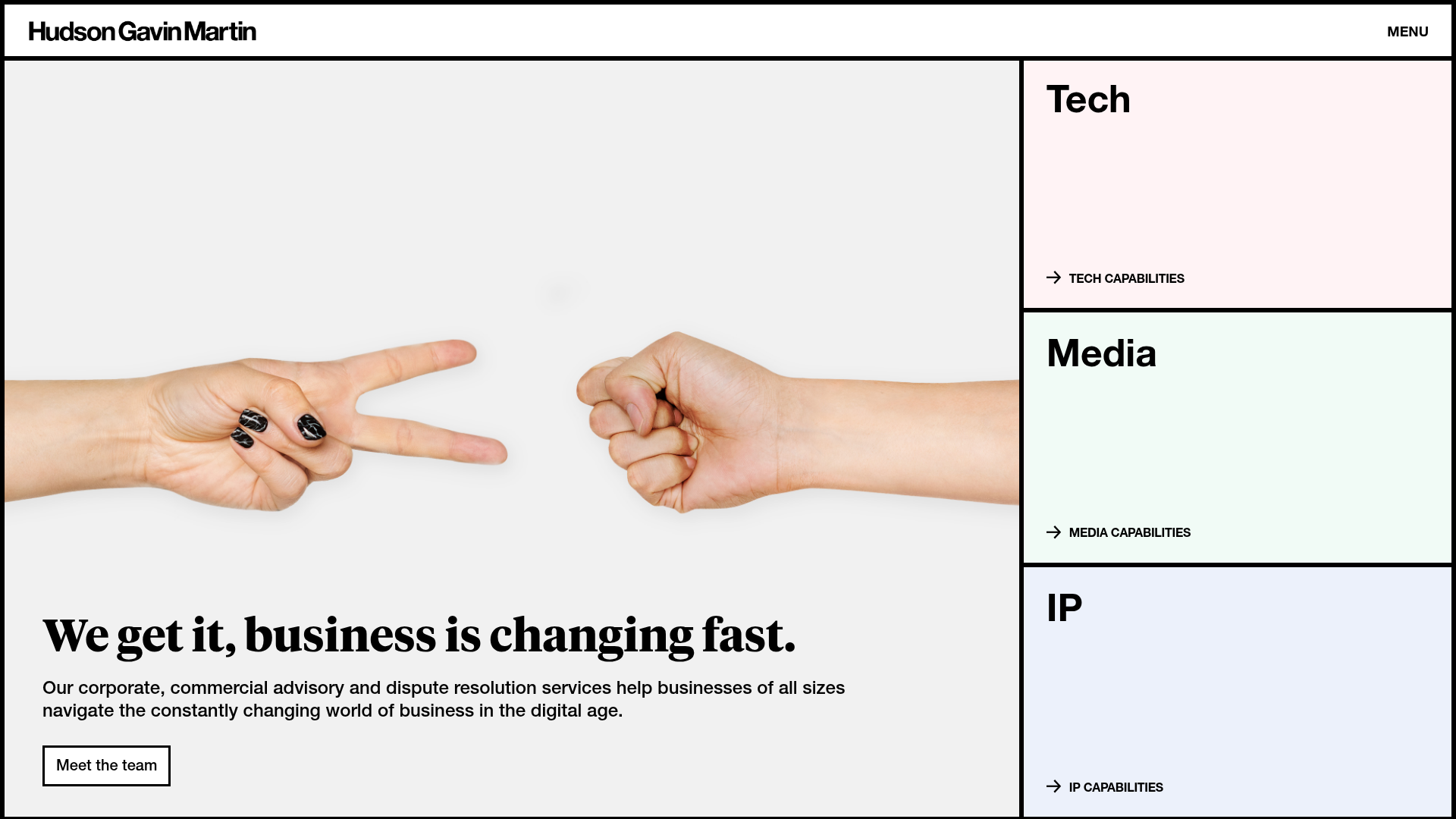
Hudson Gavin Martin Corporate Law Landing
A professional service homepage featuring a minimalist grid-based hero, color-themed navigation blocks, and a bento-style insights feed with subtle hover interactions.
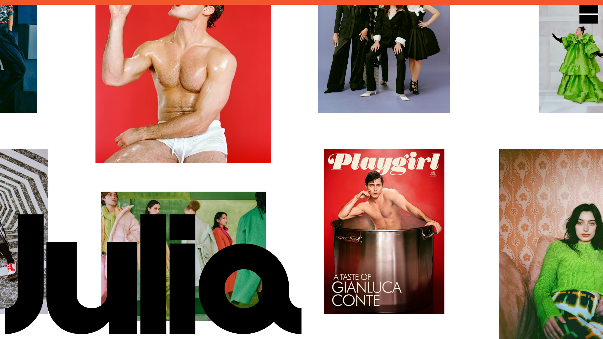
Julia Johnson Photography Portfolio Website
A creative portfolio featuring a masonry-style image grid, overlapping oversized typography, and a minimalist full-screen navigation overlay.
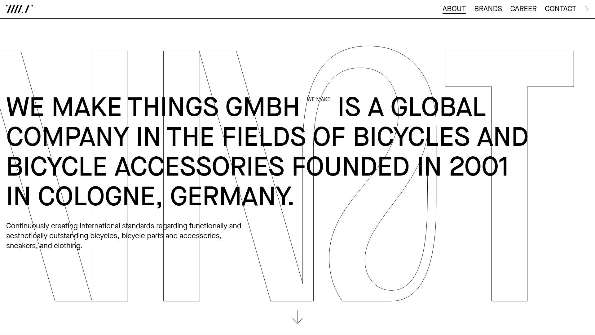
WE MAKE THINGS Corporate Portfolio
A minimalist corporate site featuring a bold typography-heavy hero section and an accordion-style brand list with integrated image galleries and external links.
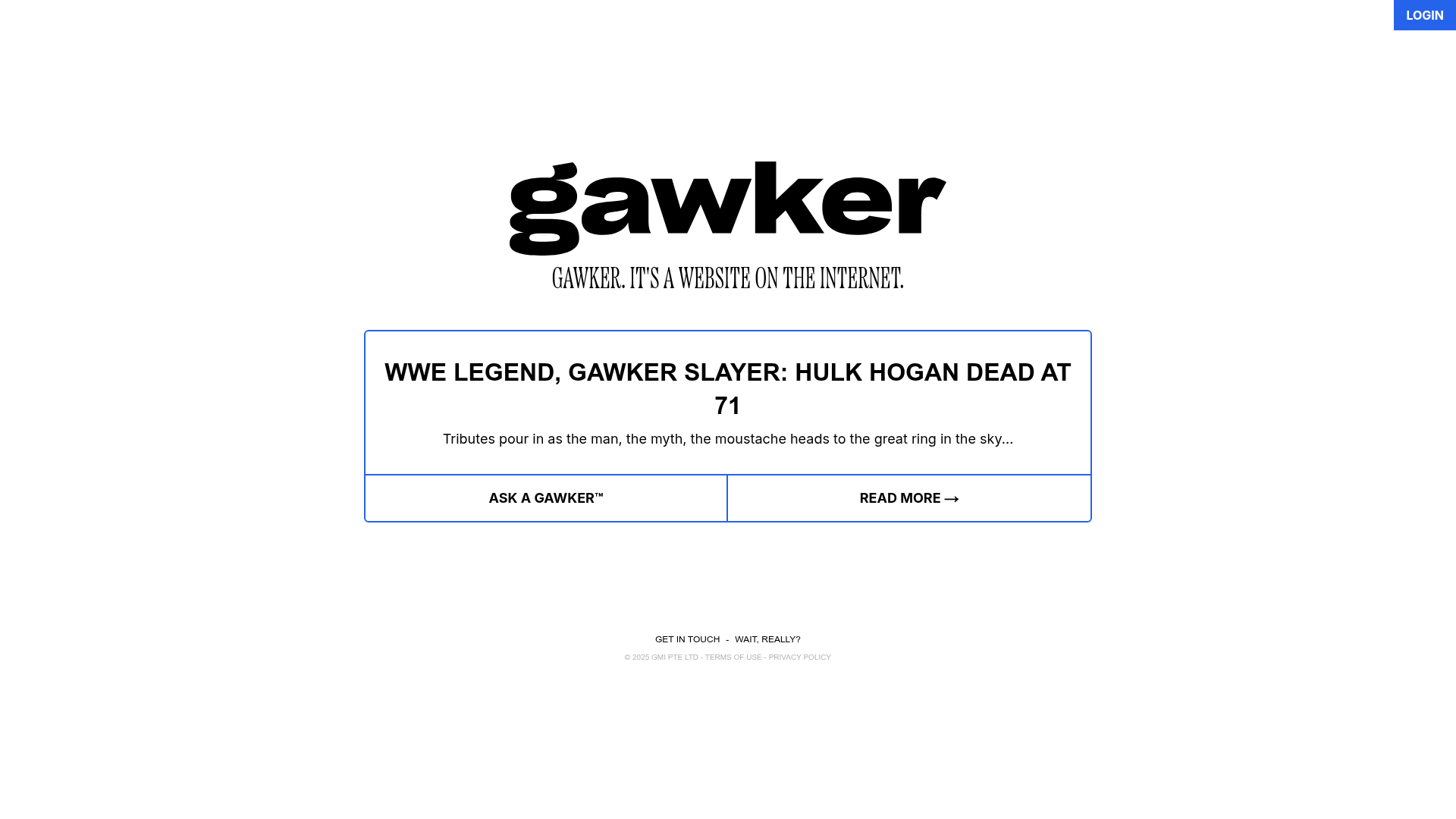
Gawker Minimalist News Landing Page
A clean, centered layout featuring a bold SVG logo, high-contrast typography, and a distinct bordered call-to-action card with a split-grid button design.
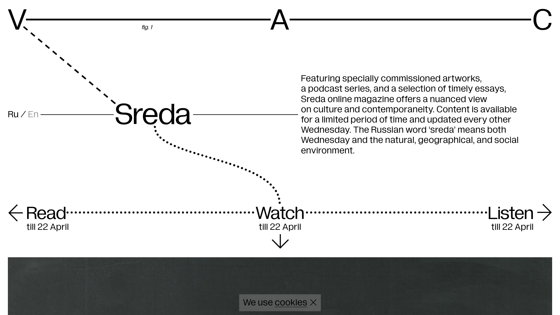
V–A–C Sreda Online Magazine Hub
Minimalist art magazine layout featuring a conceptual typographic header, interactive vertical navigation for mixed media content, and a clean grid for high-resolution archival imagery.
