Studio Thomas Full-Screen Portfolio
A minimalist design portfolio featuring a parallax circle hero, full-screen vertical scroll snapping for case studies, and a dynamic sticky header that changes with section backgrounds.
Overview
This minimalist portfolio design uses high-impact visual layering and vertical scroll-snapping to create a cinematic browsing experience. It is a premier reference for designers wanting to master full-screen layouts that balance bold typography with immersive, parallax-enhanced backgrounds.
Design System
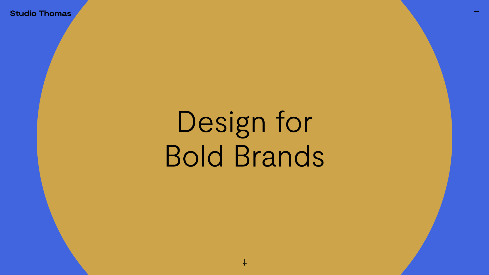
- Color Palette & Visual Hierarchy: The site uses a high-contrast, dual-tone strategy for its hero (Blue background #4A6FEA vs. Gold circle #CEA44A). The hierarchy is flat but impactful, relying on large-scale geometry and centralized, high-contrast black typography to anchor the user's focus.
- Typography System: A clean, modern sans-serif is used throughout. The hero features a large-scale
h1with "snug" line-height to maximize boldness, while case study titles (h2) are smaller but paired with distinctive underlined "View project" links. - Page Structure & Flow: The flow is built on a
fullpage-wrapper. It starts with a parallax hero section (.section.text-center), followed by a series of full-height case study slides (.section.home-project.fullscreen-media), and concludes with a text-heavy approach panel for studio information. - Reusable Components:
- Parallax Shape Container: The
#scenediv withdata-depthattributes creates a multi-layered circle effect that reacts to cursor movement. - Dynamic Header: A sticky
.header-wrapthat alternates between "default" and "dark" states based on the background color of the active section (using themidnight.jslogic seen in the HTML). - Responsive Media Slides:
<picture>elements with multiple sources optimized for both portrait (max-width: 768px) and landscape orientations.
- Parallax Shape Container: The
- Interaction & Motion: The site utilizes vertical scroll-snapping (
fp-sectionclasses indicating fullpage.js usage). Links feature aline-animationhover state, and the hero circle uses a 3D transform effect (translate3d) for depth. - Implementation Clues: The HTML reveals a dependency on
fullPage.jsfor section transitions and likelyParallax.jsfor the hero animation. The header usesmidnightHeaderclasses to handle color switching during scroll transitions.
Use Cases
- Who should clone this: Creative directors, photographers, and branding agencies who want their work to be the primary interface rather than traditional UI components.
- Product Remixes: This pattern effectively suits luxury brand landing pages, architecture portfolios, or digital lookbooks where image quality and "vibe" outweigh dense information density.
- Practical Directions:
- Brand Swap: Change the hero circle to a brand-specific SVG or a video mask while keeping the scroll-snap logic.
- UI Adaptation: Replace the full-screen images with high-resolution video backgrounds for a more dynamic feel.
- Modular Reuse: Clone just the parallax hero section to act as an entry point for a more traditional long-scroll website.
- Suggested Clone Scope: A full-page clone is recommended to maintain the integrity of the scroll-snap transitions and the dynamic header behavior, though the
.home-projectslide is an excellent standalone component for any gallery.
Related Inspirations
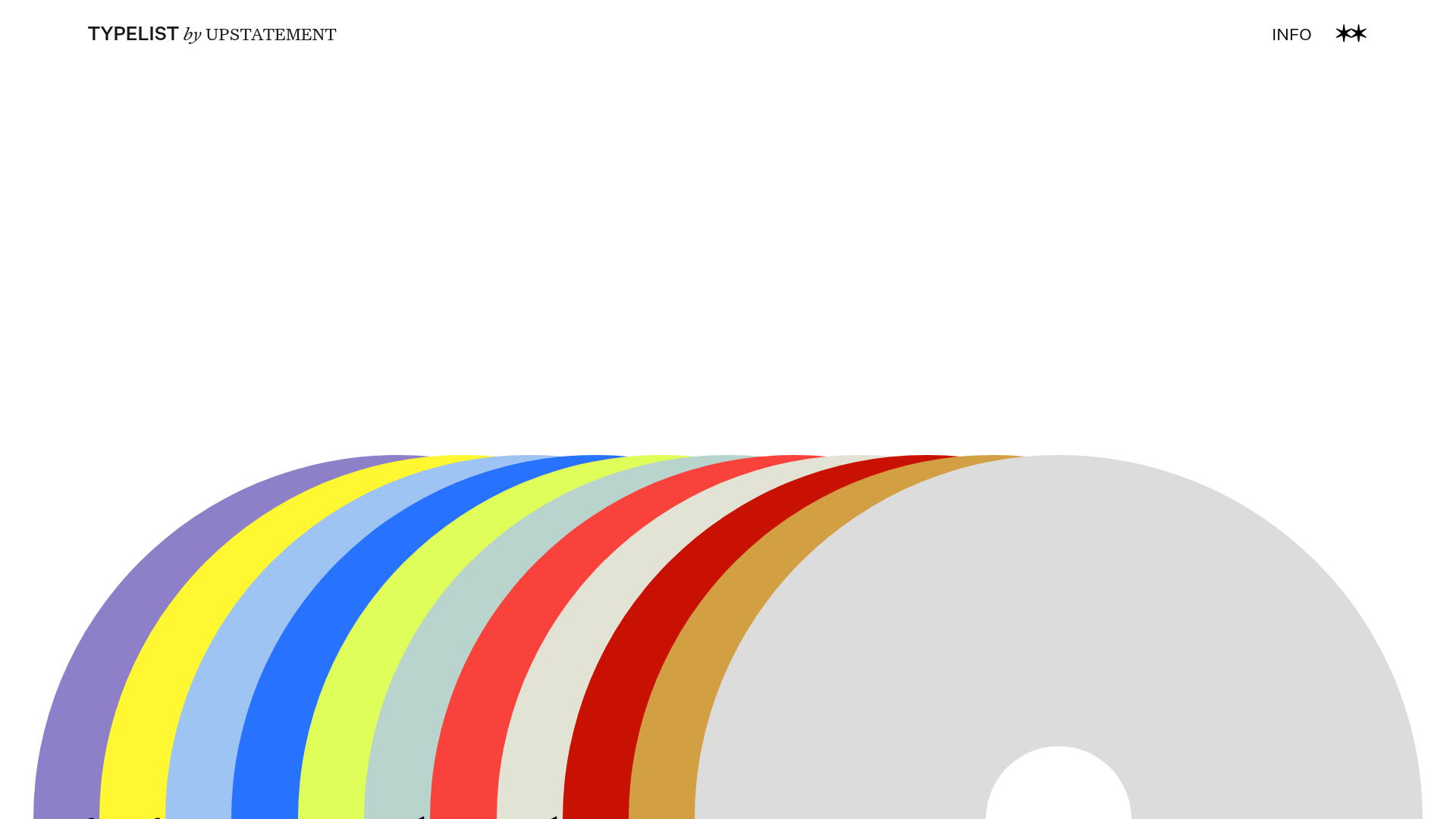
Typelist Typography Playlist Gallery
A creative curated gallery featuring a horizontal overlapping disc navigation pattern, CSS-driven theme color shifting, and smooth page transitions for showcasing design collections.
PostNew Moving Image Portfolio Gallery
A minimalist dark-themed portfolio featuring a full-screen vertical scroll layout, video-based grid sections, and blur-effect navigation components.
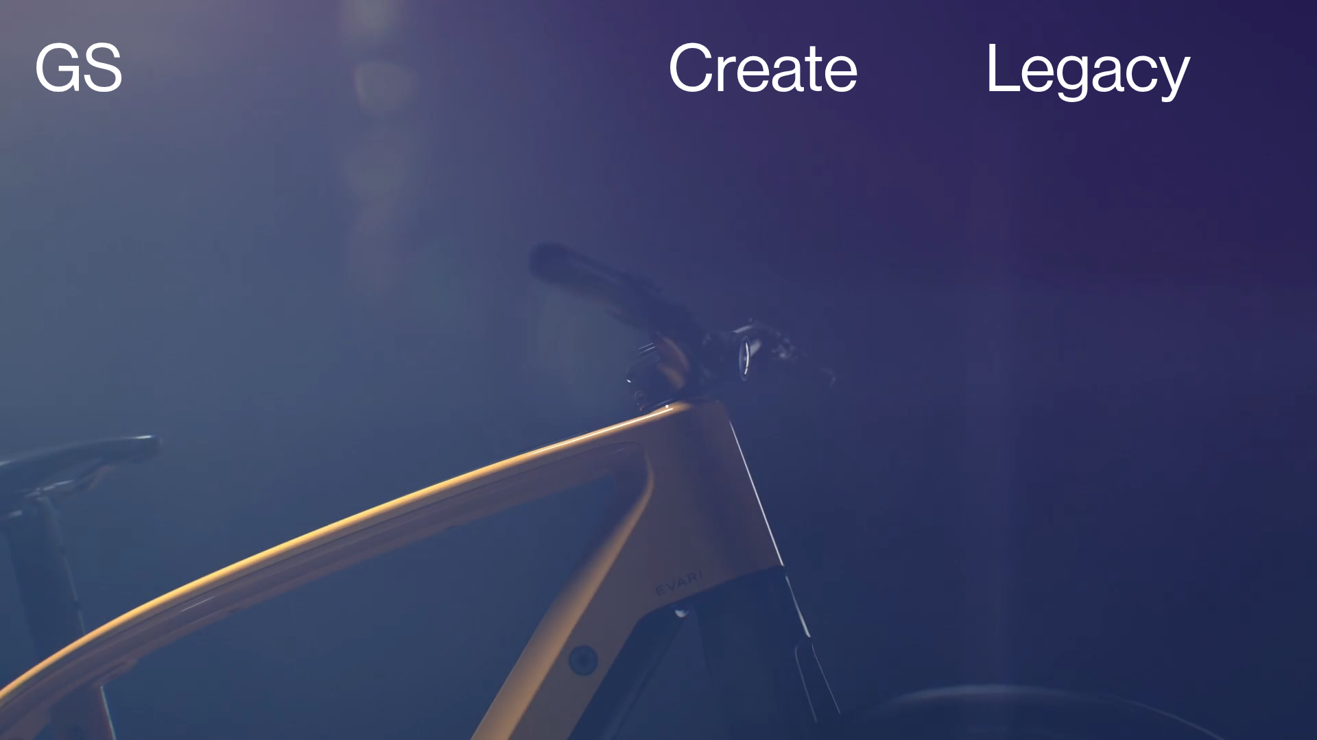
Greenspace Immersive Portfolio Landing Page
A minimalist, video-first site featuring full-screen media backgrounds, a floating navigation menu, and a hover-triggered project list with dynamic image previews.
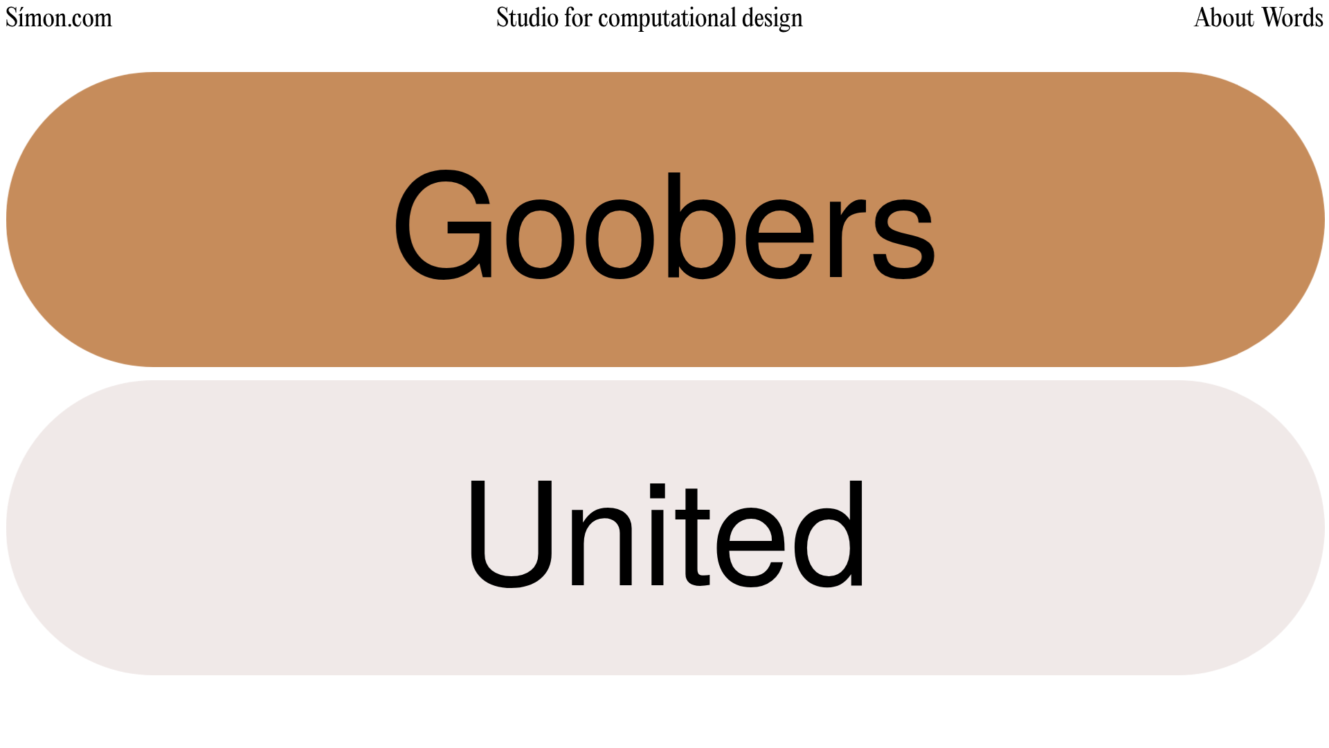
Simon Studio Computational Design Portfolio
A Svelte-based portfolio featuring a vertical project list with large rounded-pill interactive labels and smooth scroll-triggered project transitions.

DNCO Agency Portfolio Case Studies
A high-impact portfolio featuring an animated full-screen hero video, a multi-category filtering menu, and a clean grid of project tiles with hover-state transitions.
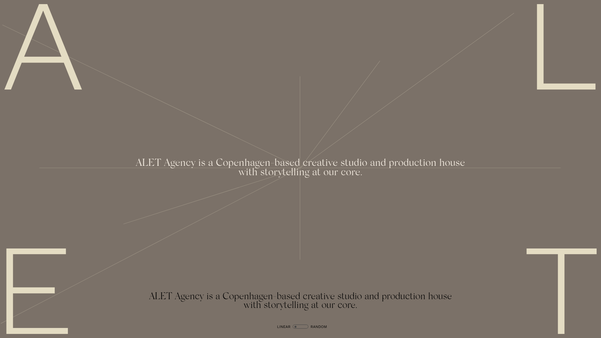
ALET Agency Creative Portfolio Hero
A minimalist immersive landing page featuring a full-viewport mouse-parallax image grid, centered typography, and large-scale decorative characters in the viewport corners.
