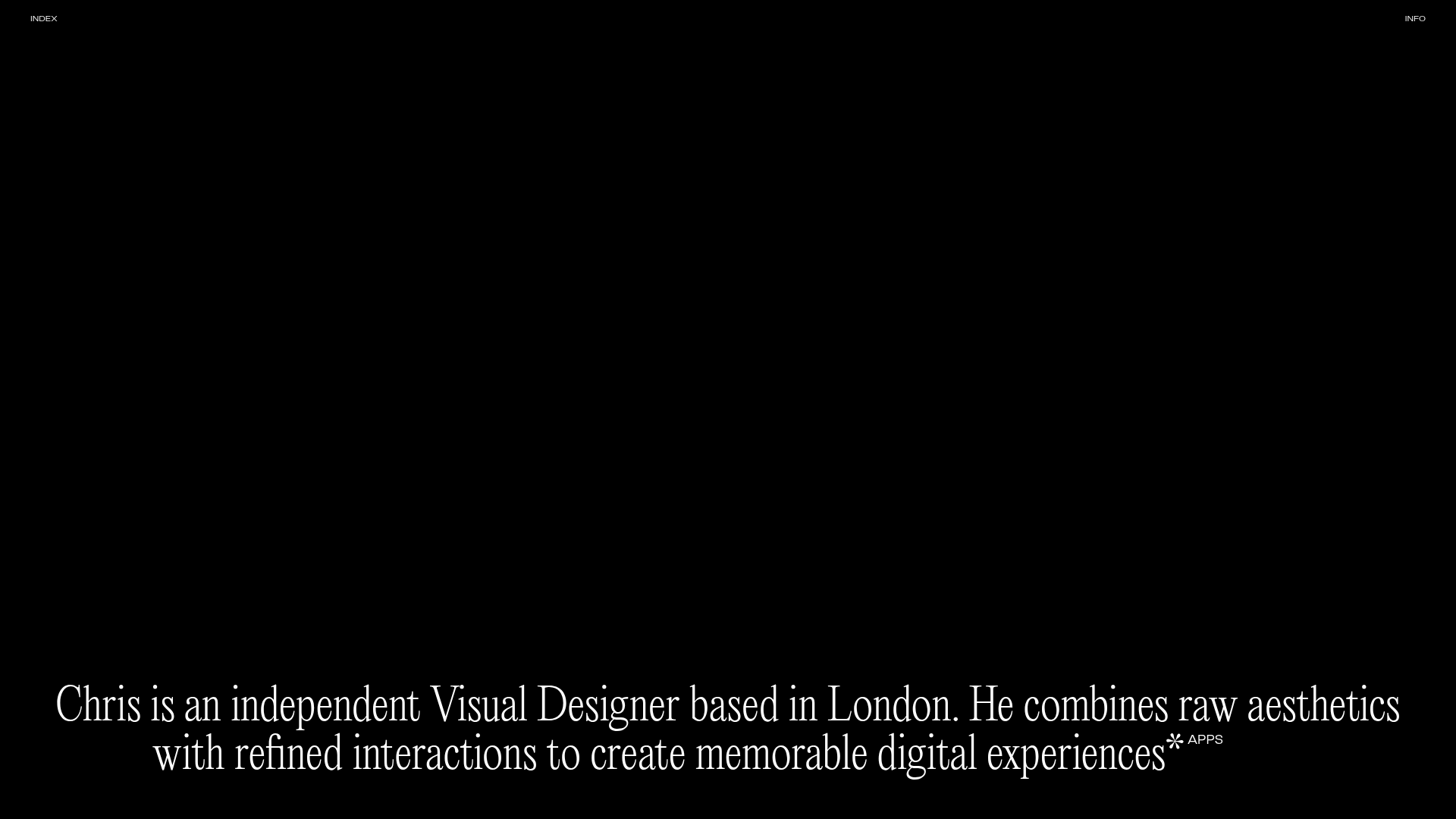
Chris Biron Visual Designer Portfolio
A minimalist dark-themed portfolio featuring a full-screen vertical scroll layout, large-scale serif typography, and a dynamic project image gallery built with Gatsby.
Overview
Chris Biron’s portfolio is a masterclass in minimalist, dark-mode design that prioritizes high-impact typography and seamless smooth-scrolling interactions. It serves as an excellent clone reference for creatives who want to showcase a high-end visual aesthetic with a focus on immersive full-screen project presentations.
Design System
- Color Palette & Visual Hierarchy: A strict monochromatic scheme featuring a deep black (#000000) background with high-contrast white typography. Hierarchy is established through extreme shifts in font size rather than color, creating a "raw" yet "refined" look.
- Typography: The system relies on a large-scale, elegant Serif typeface for the body and headings. The HTML structure uses
h1andh2elements with significant letter spacing and condensed widths. Emphasis is created using inline<span>tags for dynamic tags like "Websites" and "Apps." - Page Structure: The layout follows a full-screen vertical scroll. It transitions from a hero section with a large centered descriptive statement to a dynamic project gallery where images fill large portions of the viewport. Navigation remains minimal, with "INDEX" and "INFO" corners anchoring the top of the frame.
- Reusable Components:
- Project Cards: The
<a>tags wrappinggatsby-image-wrappercreate modular project blocks that can be easily duplicated. - Dynamic Header/Statement: The
h2statement block includes a rotating tag system within a<span>cluster, ideal for summarizing skills or services.
- Project Cards: The
- Interaction & Motion: The HTML indicates a heavy reliance on Gatsby's image processing for lazy loading and smooth transitions. Specifically, the project container uses
transform: translateYwith a long2scubic-bezier transition, suggesting a "parallax-like" reveal as the user interacts with the page. - Responsive Behavior: The use of a
100vwimage sizing strategy viasrcsetandsizesattributes ensures that the visual impact remains consistent across screen sizes, with images scaling proportionally to the device width.
Use Cases
- Who Should Clone This: Visual designers, art directors, and photographers who want a "less is more" approach where the work speaks for itself without UI clutter.
- Effective Remixes: This pattern works perfectly for high-end fashion lookbooks, architecture studio landing pages, or boutique agency portfolios.
- Practical Remix Directions:
- Style Swap: Change the background to a "paper" white and the text to a deep charcoal for a print-inspired editorial look.
- IA Adaptation: Instead of a single vertical scroll, use the large serif typography for a horizontal slider experience.
- Section Reuse: Clone the dynamic tag-rotation logic within the descriptive header to add life to otherwise static "About" sections.
- Suggested Clone Scope: A full-page clone is most effective here, as the design relies on the relationship between the empty space, the large text, and the subsequent project images to create its unique atmosphere.
Related Inspirations

Dries Bos Creative Developer Portfolio
A high-interaction dark-mode portfolio featuring a grain-textured bento grid, marquee headers, theme switching, and a dynamic project list with hover-triggered image previews.
OPX Studio Agency Portfolio
A minimalist dark-themed portfolio featuring a staggered masonry project grid, cinematic video embeds, and a responsive oversized typography hero section.
Hugo Ferradás Portfolio Site
A dark-themed portfolio featuring a creative director bio, sticky sidebar navigation, and a dynamic asymmetric grid of case study cards with animated hover reveals.
Quentin Hocdé Portfolio Hero Page
A creative developer portfolio featuring a WebGL-powered background, complex letter-shuffling typography animations, and a multi-column responsive layout for professional bios and links.
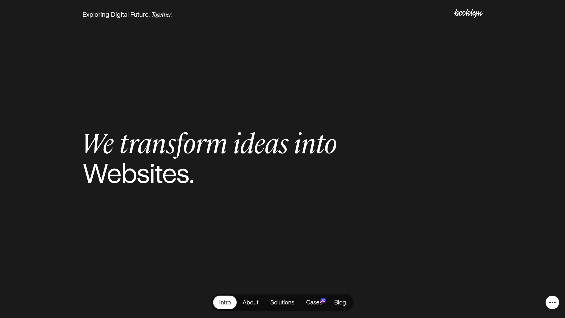
Becklyn Agency Dark Mode Portfolio
A high-end dark-themed agency site with a floating capsule navigation, staggered case study layouts, text-reveal animations, and horizontal team sliders.
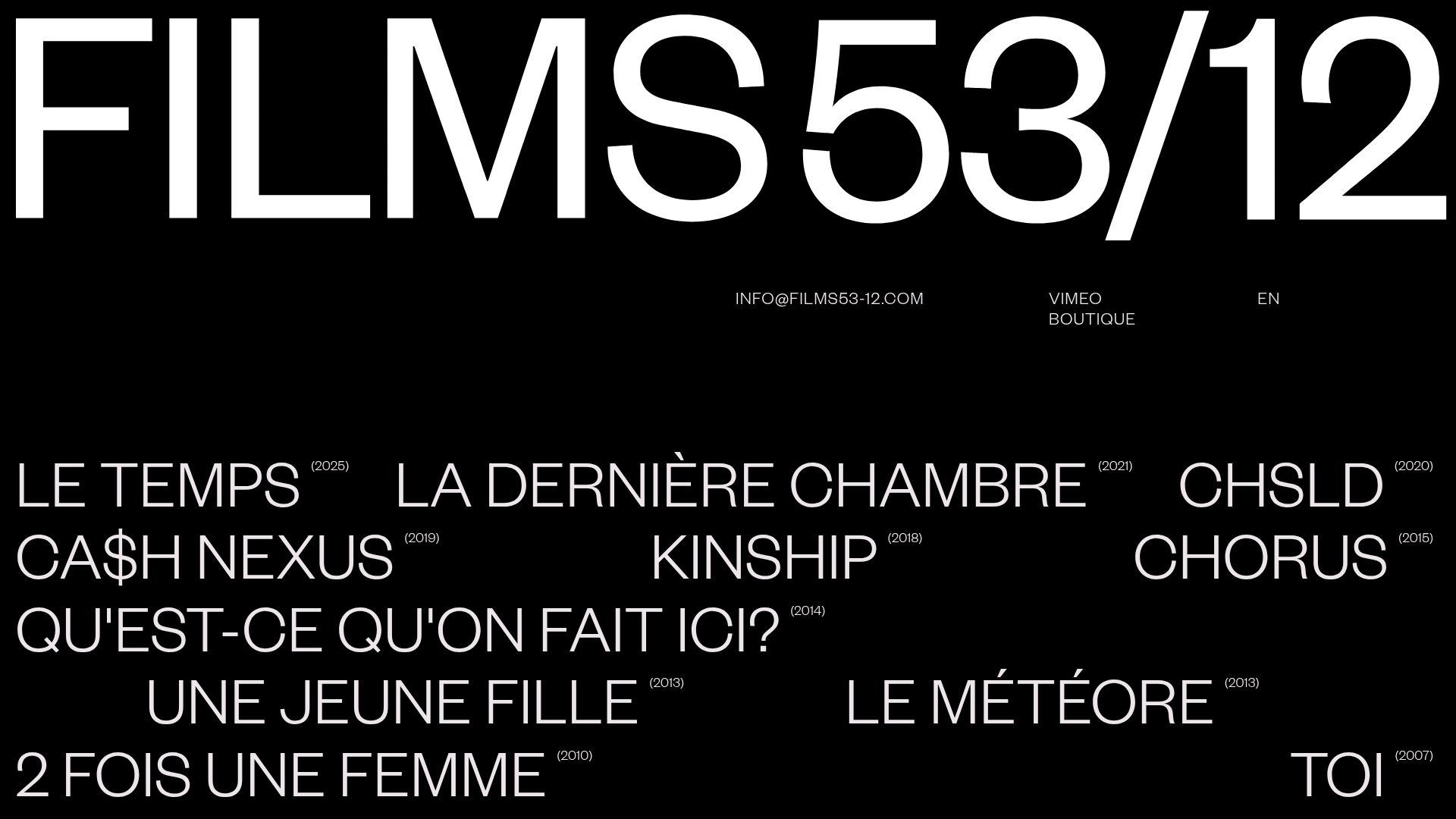
Films 53/12 Cinematographic Portfolio Layout
A minimalist dark-mode production site featuring a scattered typography grid, interactive hover-to-reveal image states, and a clean list-based film catalogue.
