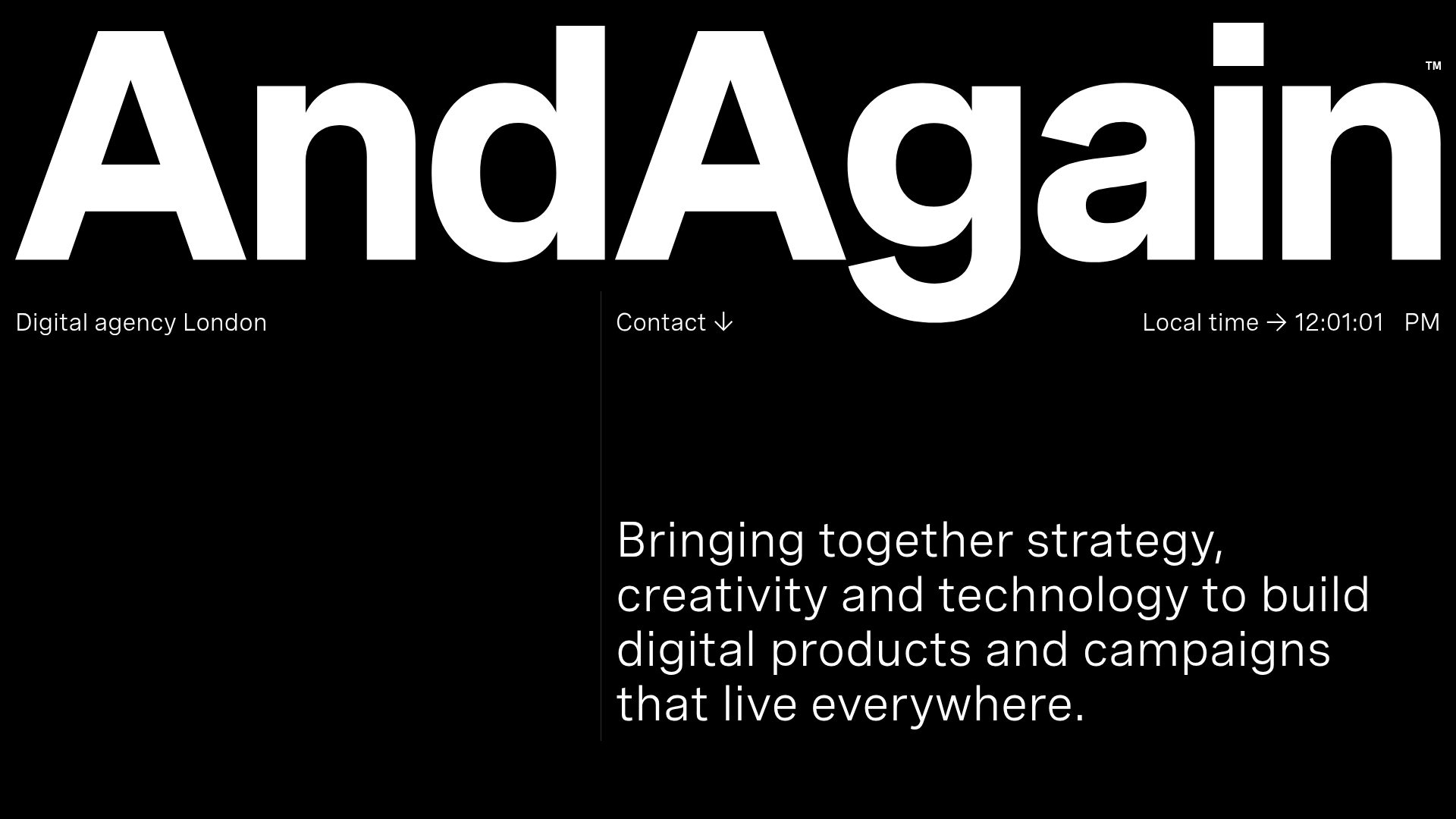
AndAgain Digital Agency Portfolio
A high-contrast dark mode portfolio featuring oversized typography, a scroll-triggered project sequence, skew-in entry animations, and a real-time local clock display.
Overview
This website is a minimalist, high-contrast digital agency portfolio that utilizes bold typography and negative space to create a sophisticated brand presence. It is a premier reference for builders looking to master 'skew-in' scroll animations, real-time dynamic UI elements, and an unconventional project navigation system.
Design System
- Color Palette & Visual Hierarchy: A strict monochromatic dark mode (black background, white text) that relies on extreme font size variations to establish hierarchy. Large-scale headings dominate the viewport, pushing secondary information like location and contact into the periphery.
- Typography: The system uses a clean, geometric sans-serif (resembling Inter or a similar high-quality grotesque). Scale is used dramatically: the brand name 'AndAgain' is massive, nearly touching the edges, while body text and metadata are significantly smaller with generous tracking.
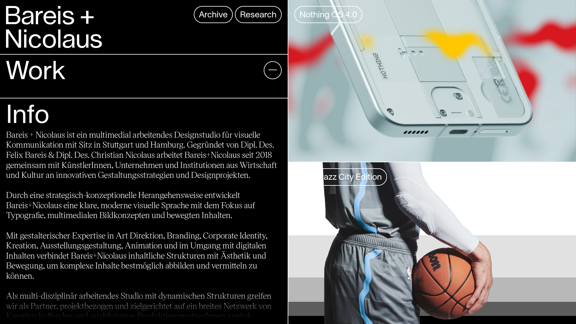
- Page Structure: The layout follows a vertical flow starting with a hero branding block, followed by a secondary informational terrace (Digital Agency London, Contact, Local Time), leading into a vertically-scrolling project sequence. The bottom section concludes with a detailed capabilities list and contact information.
- Reusable Components:
- Dynamic Header Blocks: A three-column sub-header featuring a location label, a 'Contact' button with a downward arrow (↓), and a real-time GMT/Local clock.
- Animated Typography Wrappers: HTML classes like
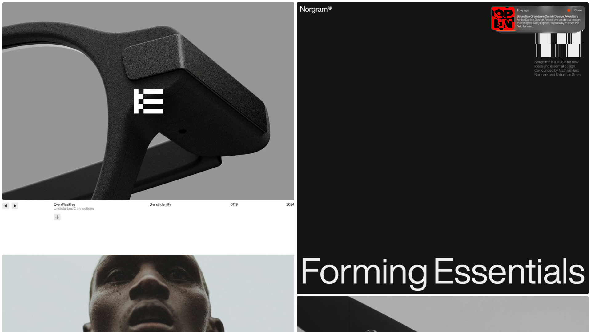
go3374758668contain nested spans that use a customskew-inCSS animation (1.5s duration with a cubic-bezier ease) to slide content into view as the user scrolls. - Project Cards: Full-width project links that combine large title text and category labels with a background image/video preview.
- Interaction & Motion: The standout feature is the scroll-driven animation. Elements don't just fade in; they skew and tilt from the bottom up. Hover states on project links are described as 'hoverless' in the HTML, suggesting the emphasis is on the scroll-triggered video previews rather than cursor interaction.
- Implementation Clues: The site is built with a modern framework (indicated by the
data-hkattributes and Vercel-optimized images). It uses a<canvas>element (classgo2833715941) for high-performance visual transitions and likely a custom scroll-jacking or intersection observer setup to trigger the900vhsection height transitions.
Use Cases
- Who should clone this: Creative studios, independent designers, and high-end architects who want a portfolio that feels 'premium' and editorial.
- Effective Remixes: This pattern works perfectly for product launch pages or lookbooks where visual impact is more important than dense information.
- Practical Directions: Remix the visual style by swapping the black/white contrast for a high-saturation primary color (e.g., Electric Blue/White). Replace the custom video gallery with high-resolution image cards, but keep the
skew-inentry logic for a professional sheen. - Clone Scope: For a fast win, clone the three-column metadata bar (Location, Contact, Clock) to add utility to a generic hero section. For a full project, clone the CSS animation keyframes and the grid-less layout structure to break away from standard boxed templates.
Related Inspirations

Niklas Rosén Designer Portfolio Index
A minimalist, responsive grid-based portfolio index featuring a clean 16-column layout, typographic list components, and a custom dark mode transition.

Break Maiden Agency Portfolio Hero
A high-impact dark mode hero section featuring oversized typography with inline GIF icons and a responsive grid for display-heavy case studies.
Norgram Minimalist Design Portfolio
A high-end, monochrome studio portfolio featuring a brutalist typography-led hero section, a clean asymmetrical masonry grid, and minimalist project navigation.
Marx Design Minimal Portfolio Grid
A high-end design portfolio featuring a synchronized image-hover grid layout, GSAP-powered transitions, and a hidden fullscreen menu with portrait image links.
Kirifuda Inc. Minimal Portfolio Showcase
A clean, dark-mode agency portfolio featuring a typographic hero section, a high-contrast list-based works gallery with metadata, and a segmented multi-column footer for company details.
Bareis + Nicolaus Design Portfolio
A split-screen portfolio featuring a fixed text-based sidebar alongside an edge-to-edge scrollable gallery of video and image project components.
