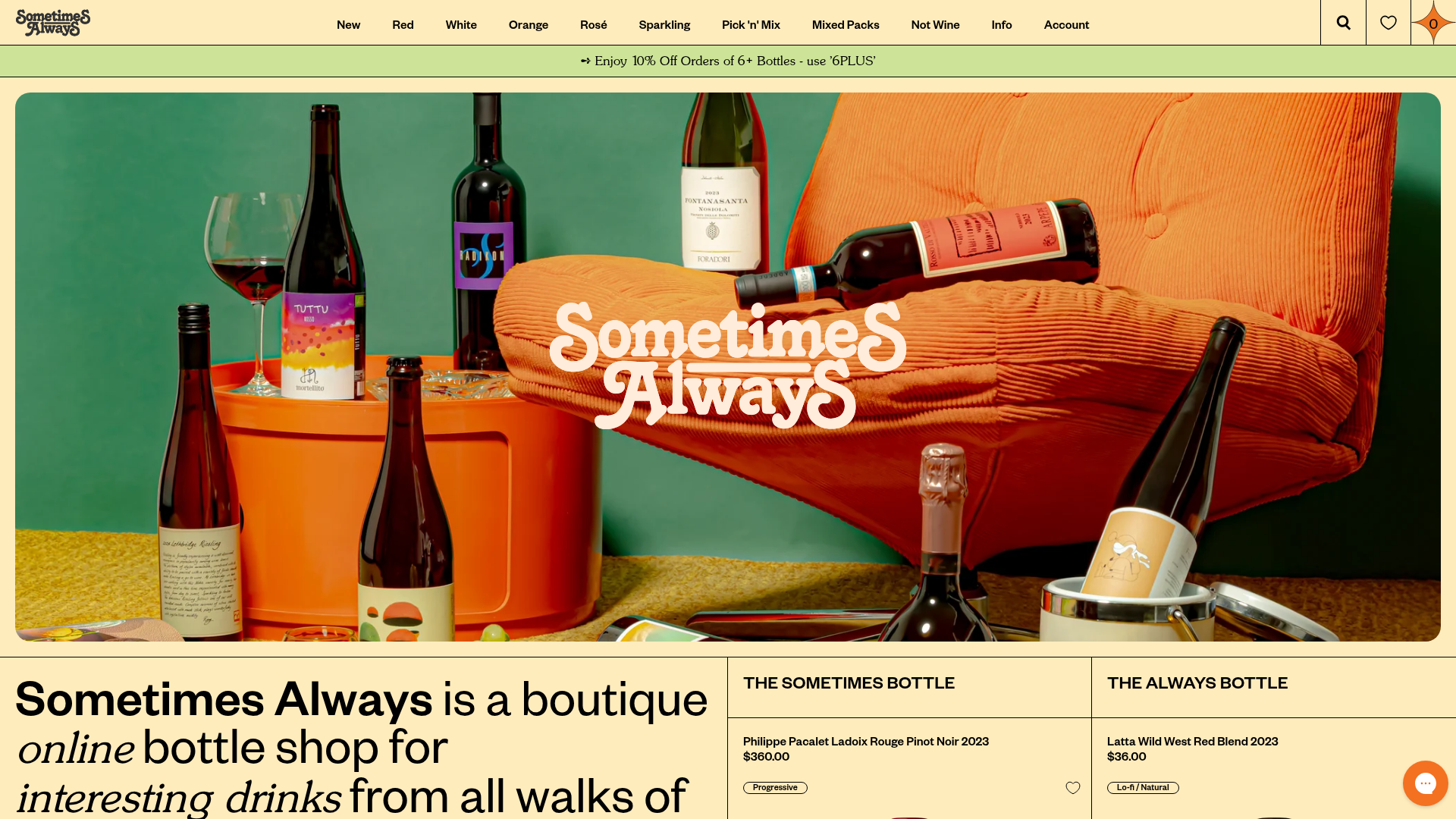
Sometimes Always Boutique Wine Shop
A high-fashion e-commerce layout featuring a serif-heavy typography system, bold overlapping image hero, and a two-column product spotlight grid with wishlist integration.
Overview
This boutique e-commerce layout for Sometimes Always blends high-fashion editorial aesthetics with a functional Shopify-based retail experience. It is a standout reference for clones because of its sophisticated use of serif typography, a unique 'split-grid' product spotlight, and a distinctive muted color palette that elevates standard liquor retail into a lifestyle brand. Builders should look to this for its seamless integration of brand storytelling and conversion-focused product grids.
Design System
- Color Palette & Visual Hierarchy: The site uses a sophisticated, low-contrast palette featuring a pale cream (#ffecdb) background, olive green (#cde498) notification bars, and deep blacks for text. Hierarchy is established through oversized typography and a mix of full-width heroic imagery and structured grid lines that define section boundaries.
- Typography System: A high-impact serif-heavy system using custom fonts (e.g., 'SunsetSerial-Light'). It features large, bold headings for value propositions and a mix of italics for emphasis (e.g., "interesting drinks", "cult producers"). Metadata like prices and badges use a clean, bold sans-serif to ensure legibility within the editorial flow.
- Page Structure & Section Flow: The flow starts with a high-contrast notification bar, followed by a full-bleed hero banner with an overlapping centered logo. This transitions into a theoretical-led introduction block, followed by a two-column 'featured spotlight' grid (The Sometimes vs. The Always), then a standard 4-column product grid, and finally editorial blocks for recipes and news.
- Reusable Components: Notable components include the 'Product Spotlight' cards which feature top-aligned Titles/Prices and bottom-aligned image/CTA clusters. The 'Notification Bar' supports sliding messages. The newsletter signup module ('Hold the phone!') uses a 50/50 split with a square image-to-text ratio.
- Interaction & Motion: The UI utilizes a grid-line system (
gridlines active) that remains visible, giving it a blueprint/design-process feel. Buttons feature simple hover states with spinner integrations for the 'Add to Cart' action. The wishlist icon (heart) is anchored to the top-right of product images via absolute positioning. - Responsive Behavior: The HTML reveals a flexible grid system (
l-gridCol--4) that collapses based on screen size, with specific 'empty cell' handlers (is-empty) to maintain alignment in various viewports.
Use Cases
- Who should clone this: This pattern is ideal for luxury small-batch retailers, artisanal food brands, or independent fashion labels that want to appear 'established yet alternative.'
- Remixing direction: A practical remix involves swapping the cream/olive palette for high-contrast neon/black for a streetwear vibe, or keeping the typography but replacing the grid lines with organic shadows for a softer feel.
- Practical reuse: Builders can specifically clone the 'Dual Spotlight' section (The Sometimes/Always) to highlight contrasting product categories (e.g., 'Essentials' vs. 'Occasions') or reuse the oversized editorial text block for brand positioning.
- Suggested Scope: A full-page clone is recommended to maintain the specific balance between the broad typography and the thin-lined layout, though the newsletter and 'Weeknight Hits' 4-column grid are excellent standalone components.
Related Inspirations
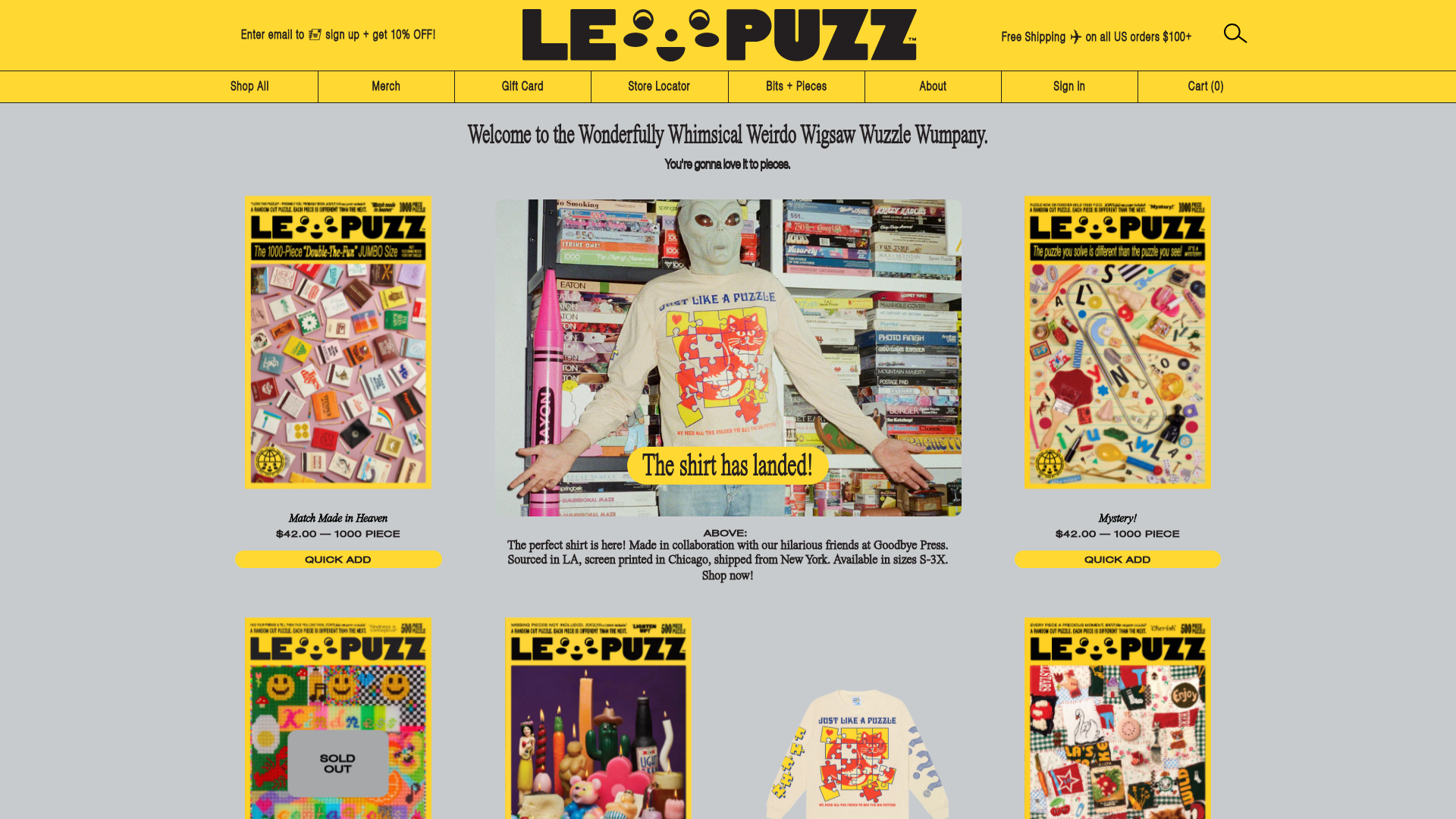
Le Puzz E-commerce Grid Gallery
A playful Shopify-based storefront featuring a responsive product grid with interactive 3D box-flipping hover effects and integrated lifestyle banners.

Context Gallery High-End Furniture Landing Page
A minimal editorial layout featuring a multi-column product carousel, designer biographies with image-text pairings, and a magazine-style content grid for curated design stories.

Glein Minimalistic Bento Grid eCommerce
A clean, modular layout using a bento-style responsive grid of text teasers and large-scale product imagery for lookbooks and collection browsing.

Basic.Space E-commerce Gallery Clone
A minimalist product marketplace featuring a clean sticky navigation bar, nested flyout menus, and a horizontally scrollable product carousel with hover-state image switching.

Ashley & Co Lifestyle E-commerce
An elegant Shopify-based storefront featuring a split-screen animated hero, horizontal ticker-tape collection carousel, and dynamic mega-menus with scent-specific color switching and image previews.
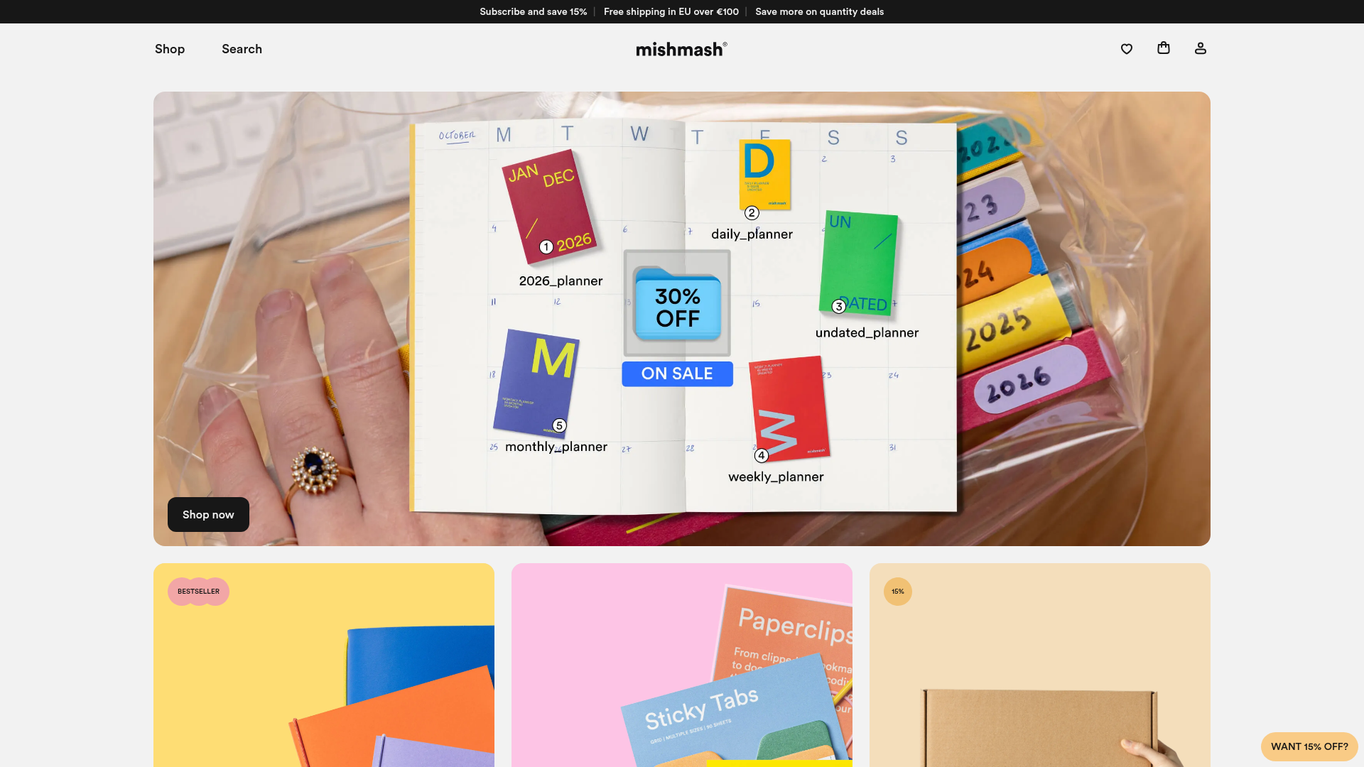
Mishmash Stationery E-commerce Layout
A clean retail template featuring rounded image grids, a multi-column comparison section with custom iconography, and a responsive products carousel.
