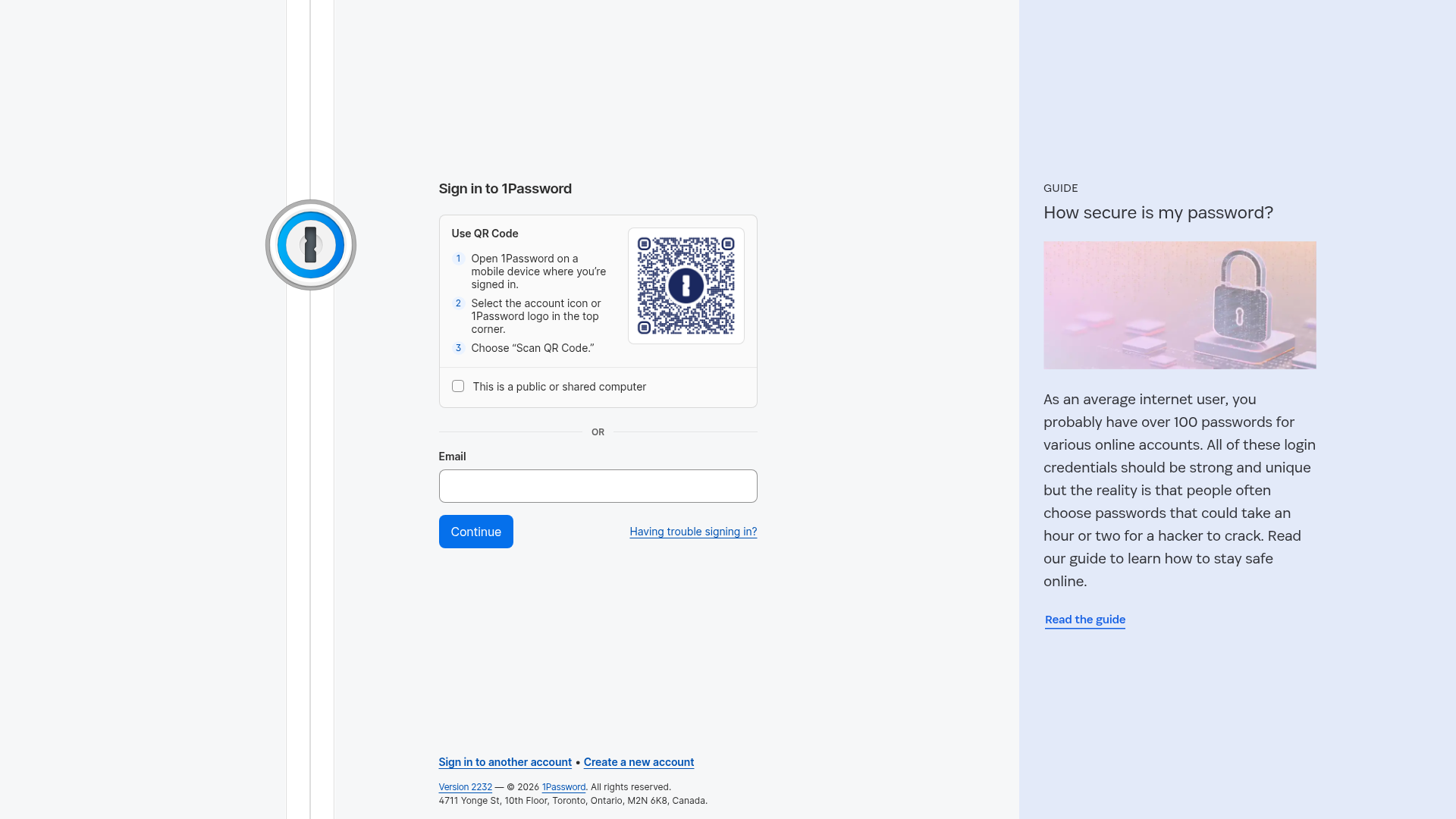
1Password Dual-Panel Sign-In Page
A split-view authentication layout featuring a QR code login flow, a secondary email form, and a vertical promotional sidebar with a guide card.
Overview
This is a layout-focused authentication page from 1Password that reimagines the traditional sign-in flow. It features a dual-panel arrangement that prioritizes seamless device-to-device authentication via QR code while maintaining a secondary, standard email input field for legacy access.
Design System
- Color Palette & Visual Hierarchy: The design uses a high-contrast, clean approach. The primary panel is bright white (
#FFFFFF) with a neutral background, while the promotional sidebar uses a muted sky blue (bg-bits-blue-new-100) to differentiate educational content from functional inputs. Deep blues are used for primary actions and links to denote interactivity. - Typography System: The UI leverages a clean san-serif system (Agile Sans). Hierarchy is established through weight and case: labels use bold text, while the promotional section uses large, light-weight headings (
text-2xl) for a modern, editorial feel. - Page Structure:
- Fixed Vertical Gutter: A thin vertical line on the left anchors a branded lock icon, providing constant brand presence.
- Central Authentication Panel: Divided into a segmented QR code block (topped with numbered steps) and a traditional form field separated by a bold "OR" line.
- Promotional Sidebar: An fixed-width right panel used for user education and guides, featuring a large featured image and clear call-to-action.
- Reusable Components:
- Segmented QR Card: A bordered container with ordered list items and a framed QR image.
- Standardized Form Fields: Large, rounded input fields with clear top-aligned labels.
- Primary CTA Button: Solid blue buttons with rounded corners and centered white text, using accessible large padding.
- Promotional Card: A vertical stack featuring a category label (all-caps), a headline, an image, and a text-link with an arrow-forward icon.
- Implementation Clues: The HTML reveals a utility-first approach (Tailwind-like classes such as
min-h-screen,flex-col,space-y-6) and a focus on accessibility througharia-labelandroleattributes on labels and buttons.
Use Cases
- Who should clone this pattern: B2B or B2C SaaS platforms that offer both mobile and desktop applications. It is ideal for security-focused products where passwordless authentication (QR scanning) is a primary user goal.
- Products for remix: Digital wallets, enterprise HR portals, or multi-platform creative tools.
- Remix Directions:
- Brand Swap: Replace the blue-on-white theme with dark mode while maintaining the distinct side panel for product updates.
- Sidebar adaptation: Use the right panel for social proof (testimonials), feature highlights, or customer support chat instead of a guide.
- Login segmentation: Instead of QR code vs. Email, remix this to show "Single Sign-On (SSO)" in the top segment and "Local Account" in the bottom segment.
- Clone Scope: A high-value clone involves the full dual-panel structure to observe the balance between utility (left) and education (right).
Related Inspirations

Slite SaaS Knowledge Base Landing Page
A clean SaaS hero section with a conversational headline, secondary call-to-action buttons, and a structured software interface preview featuring user testimonials.
Attio AI CRM Landing Page
A clean SaaS landing page featuring a tiered navigation bar, a centered hero section with twin CTAs, and a detailed interactive dashboard preview.
Koa Health Mental Care Landing Page
A clean healthcare landing page featuring a centered hero section, scroll-based fade-in animations, overlapping mobile mockups, and a multi-column feature grid with accent borders.
Balsa Software Documentation Landing Page
A clean document-centric layout featuring a centered hero section, high-contrast callout boxes, and a nested dashboard UI preview for collaborative tool showcases.
Firebase Hosting Site Not Found
A minimal placeholder layout for 404 error states including a centered logo, numbered troubleshooting guide, and linked utility text.
Visual AI Landing Page Templates
A high-end SaaS layout featuring a serif-heavy typography system, bento-style product showcase grids, accordion-style feature blocks, and minimalist wireframe UI components.
