SuperHi Plus Accelerator Split-Scroll Landing Page
A high-contrast creator platform layout featuring a sticky split-screen hero, horizontal-scrolling timelines, 3D icon canvases, and a comparison table for service models.
Overview
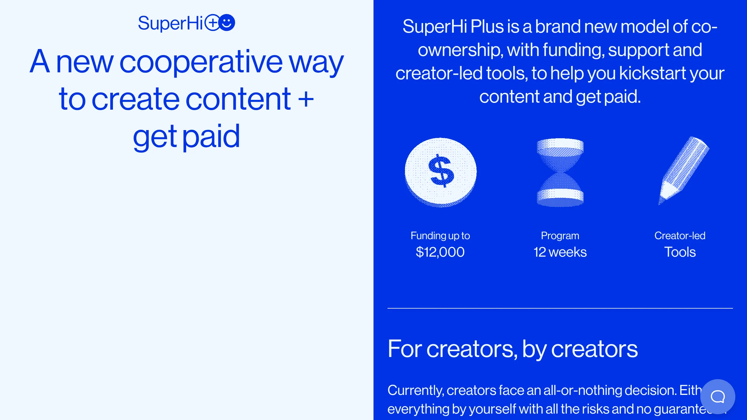
This is a high-impact landing page for the SuperHi Plus accelerator, utilizing a bold split-screen layout that balances minimalist white space with vibrant, electric blue brand colors. It is a prime reference for builders looking to implement asymmetrical scroll behaviors and 3D web graphics to convey modern, technical, or creative services.
Design System
- Color Palette & Visual Hierarchy: The site uses a high-contrast binary system: a light grey/white (#F0F7FF) for readability and a saturation-heavy primary blue (#0047FF) for impact. Text colors invert based on background, ensuring rigorous compliance with accessibility standards.
- Typography: The system utilizes a clean, geometric sans-serif (resembling Inter or similar modern variants). Large, tight-leading h1 and h2 headers define the hierarchy, while smaller body text uses generous line heights for clarity in technical descriptions.
- Page Structure & Section Flow:
- Hero: A
split-scrollsection where the left side anchors the primary value proposition while the right side introduces introductory content. - Feature Grid: A three-column layout featuring Three.js 3D icons (Coin, Hourglass, Pencil).
- The "Beyond" Comparison: A multi-column block using vertical separators to compare DIY, Platform, and SuperHi Plus models.
- Timeline: A segment describing a 12-week program using horizontal scrolling timelines.
- FAQ: Accessible Radix-UI based accordions for dense information.
- Hero: A
- Reusable Components: The tiered service comparison blocks (DIY vs. Platform vs. SuperHi Plus) are highly reusable for SaaS or product comparisons. The sticky header within the
c-dBDfkRclass that transitions during scroll is an excellent navigation pattern to clone. - Interaction & Motion: The UI features heavy use of
canvaselements for 3D visualizations. Scroll-driven animations are built using Stitches (CSS-in-JS library, evidenced by class names likec-lesPJm), where content sections reveal as the user moves vertically. - Implementation Clues: Built with Next.js and Three.js. The HTML reveals a sophisticated CSS-in-JS architecture using tokens for spacing and color, making it easier to remix via a centralized theme file.
Use Cases
- Who should clone this: Creative studios, startup accelerators, or developer tool platforms that need to present complex funding or program models in a digestible way.
- Effective Remixes:
- SaaS Pricing: Adapt the "Beyond current models" section into a comparison table between your software and legacy competitors.
- Course Syllabus: Reuse the horizontally-scrolling 12-week timeline for any project-based educational content.
- Personal Portfolio: The split-screen hero is a classic choice for showcasing a bio on one side and a 3D portfolio piece on the other.
- Scope: A full-page clone is best for those wanting to replicate the complex sticky/split-scroll orchestration. For a quicker win, clone the three-column feature icons (
c-bQzyIt) or the footer link grid.
Related Inspirations
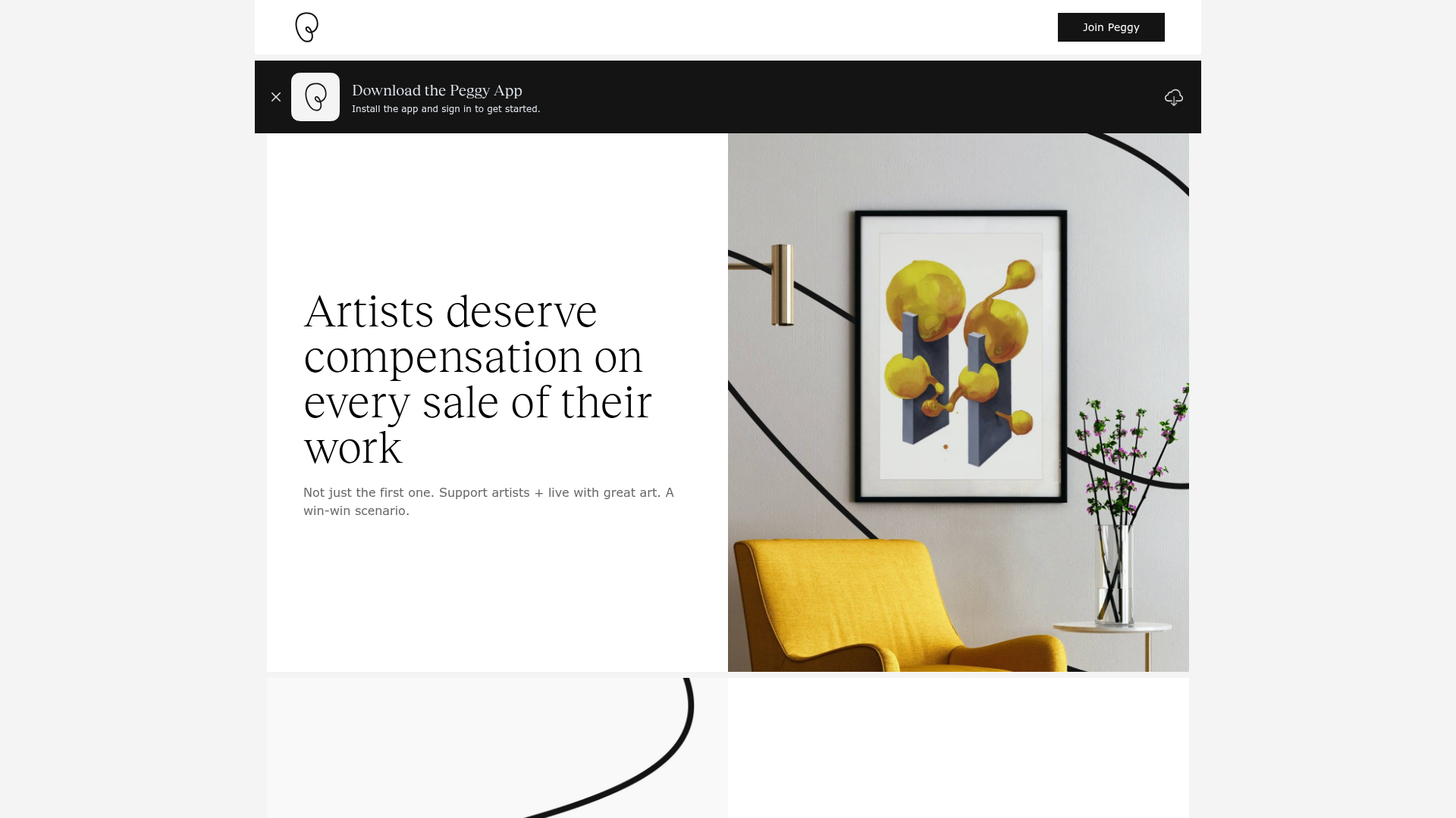
Peggy Art Royalties Pitch Page
A clean storytelling layout featuring alternating image-text sections, a three-column testimonial grid with circular avatars, and a icon-based feature grid for brand values.
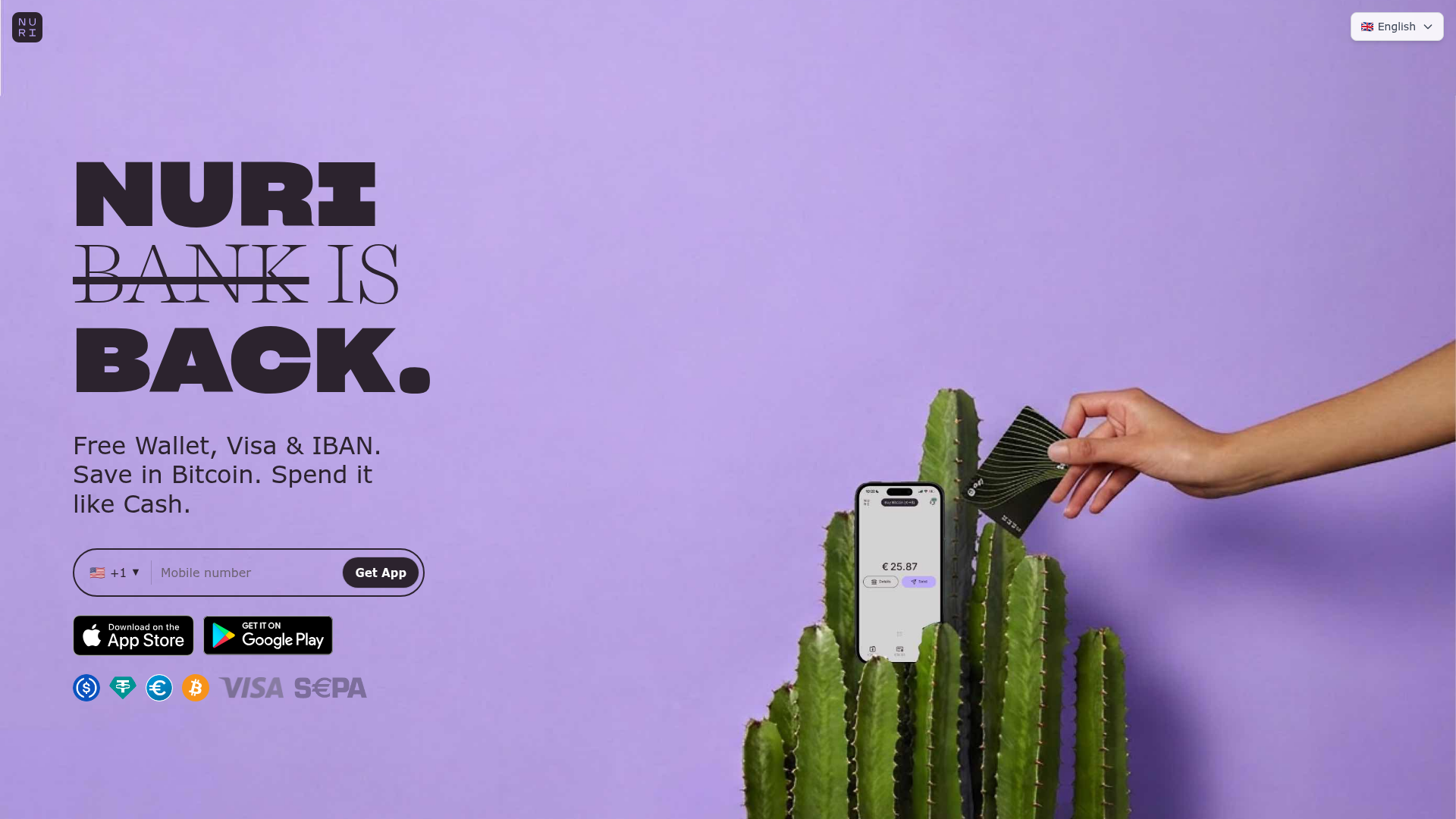
Nuri Cryto Banking Landing Page
A high-impact landing page featuring a bold typography hero, a phone-number signup component, and a sticky scroll-driven feature showcase with centered mobile mockups.
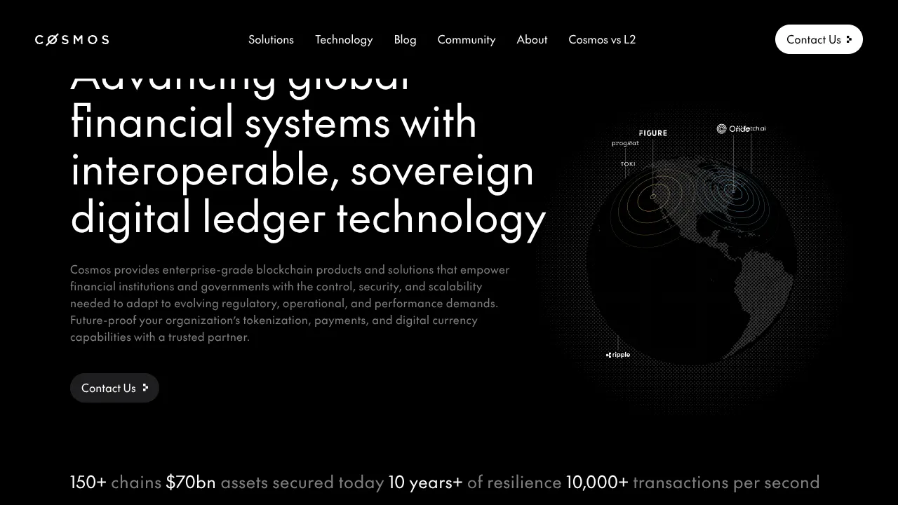
Cosmos Network Enterprise Landing Page
A dark-themed blockchain hero section featuring a minimalist navigation header, high-contrast typography, a stylized digital globe graphic, and a statistics-based footer ribbon.
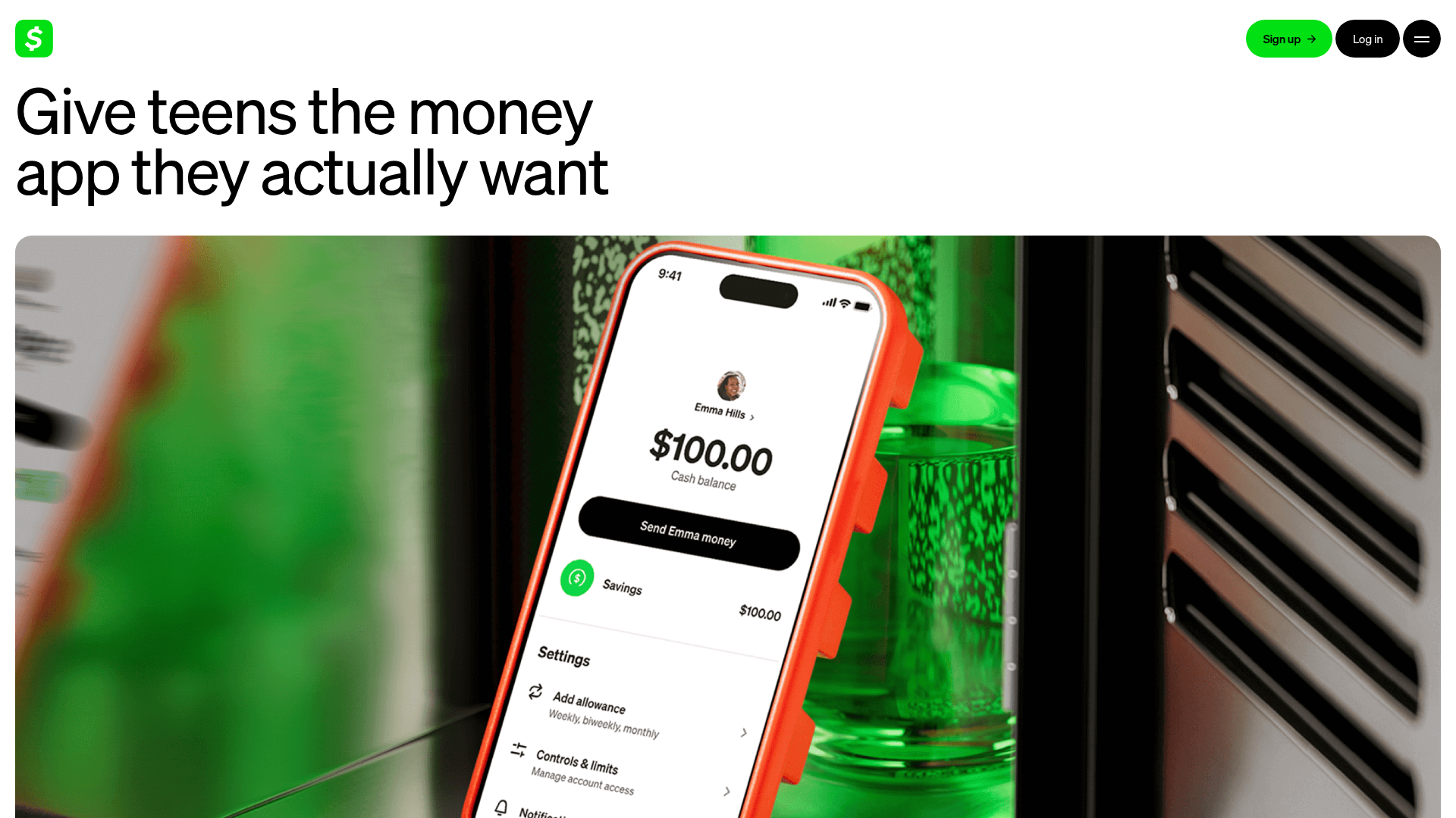
Cash App Families Landing Page
A financial services landing page featuring a minimalist high-contrast hero, flexible bento-style feature grids, an accordion-based FAQ, and a clean three-column card layout.
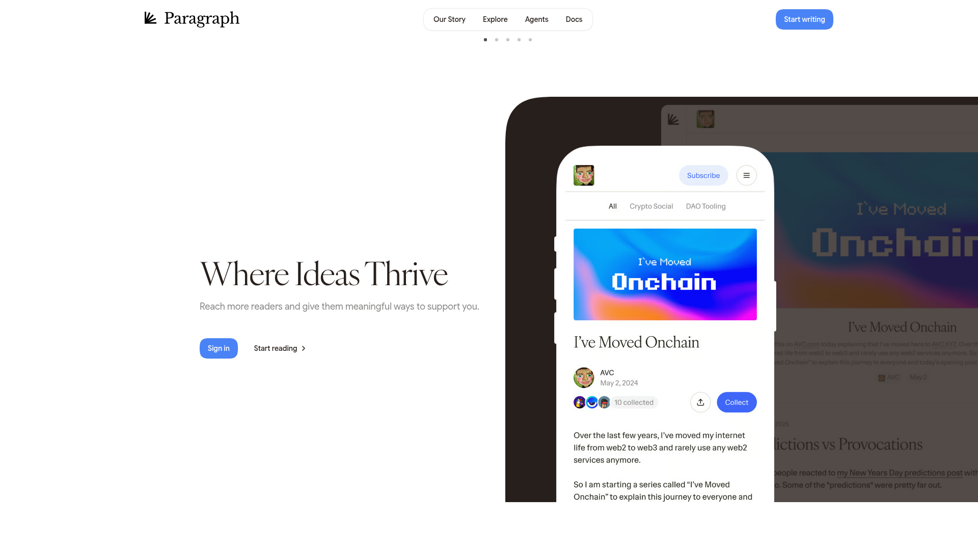
Paragraph Web3 Publishing Landing Page
Minimalist Web3 platform layout featuring a split-hero design with text-based calls to action and a mobile viewport mockup for content preview.
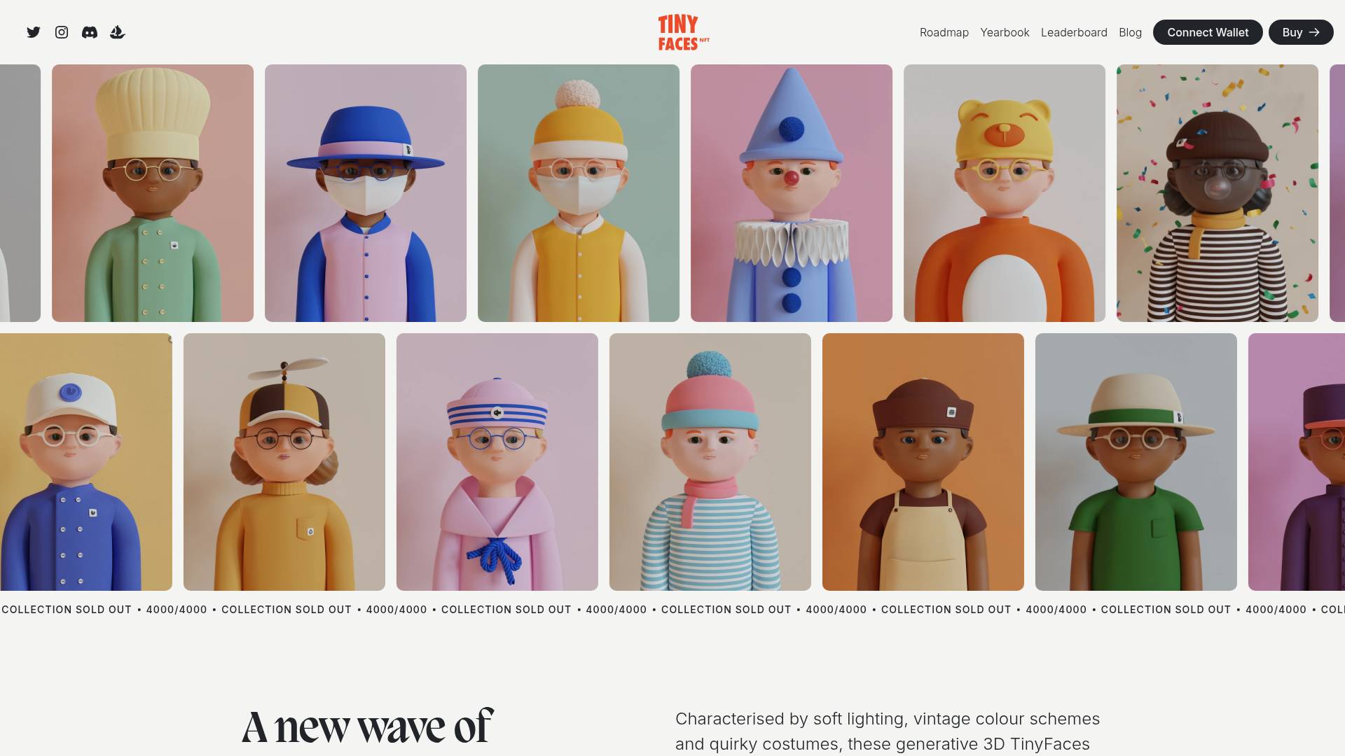
TinyFaces NFT Collection Landing Page
A high-fidelity Web3 landing page featuring an animated infinite image marquee, sticky navigation with wallet connection, a Swiper-based character carousel, and a collapsible FAQ accordion.
