Cubitts Eyewear Minimalist E-commerce Layout
A sophisticated eyewear store featuring a tiered grid system of image-based blocks, autoplaying video containers, and a product carousel with subtle image-hover transitions.
Overview
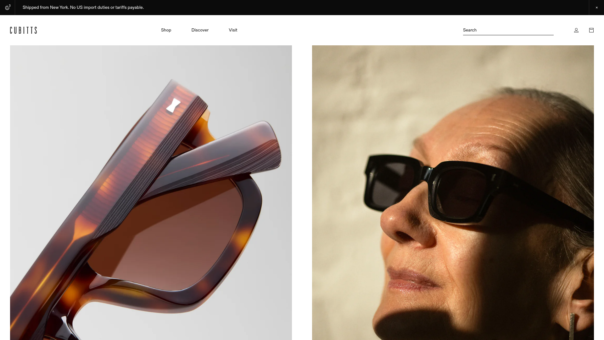
Cubitts is a premium eyewear retailer whose website exemplifies high-end minimalist e-commerce. It utilizes a sophisticated tiered grid system—mixing full-width, half, and quarter-screen media blocks—to balance editorial storytelling with direct product conversion. This is an excellent reference for designers or developers wanting to build a 'luxury boutique' feel through CSS grid layouts and refined micro-interactions.
Design System
- Color Palette & Visual Hierarchy: The site uses a high-contrast monochrome base (Pitch Black
#000000and Stark White#FFFFFF) to act as a gallery backdrop. This allows the high-resolution product photography—rich in ambers, tortoiseshells, and metallics—to provide the primary visual interest. - Typography System: A clean, geometric sans-serif (e.g., in
font-desktop-ui-14) is used for navigation and price points, while traditional serif headers or italicized paragraphs add an editorial weight to brand storytelling. The hierarchy is lean, favoring lowercase or small-caps UI elements to maintain a quiet aesthetic. - Page Structure & Flow: The site follows a vertical 'magazine' flow: starting with a high-impact split-hero, moving into dual-image storytelling sections (
block-media-half), and transitioning into a four-column product carousel (site-carousel). This leads into dense service grids (block-media-quarter) and finally broad full-width experience blocks. - Reusable Components:
- Grid Blocks: Modular containers (
block-media-half,block-media-quarter) that can hold either static images or autoplaying loop videos. - Product Cards: Minimal cards with a dual-image hover system (
product-card__image-hover) that reveals a lifestyle shot over a product flat lay. - Minimal Search Drawer: A slide-out overlay (
site-drawer--search) that utilizes clear typography and pre-selected 'Popular Search' tags for rapid navigation.
- Grid Blocks: Modular containers (
- Interaction Patterns: The primary motion is the subtle image-swap on
product-cardhover. Autoplay video blocks useplaysinlineandmutedattributes to provide atmospheric motion without user interaction. - Implementation Clues: The HTML structure uses heavy Shopify-specific patterns (
shopify-section), indicating a highly modular section-based architecture. CSS is managed via dedicated assets (e.g.,section-media-blocks.css) indicating a component-driven CSS approach.
Use Cases
- Who Should Clone This: Luxury accessories brands (watches, jewelry, handbags) or bespoke service providers who need to communicate craftsmanship alongside a product catalog.
- Remix Directions:
- The Grid: Reuse the tiered media block system to create a 'lookbook' page for a fashion launch.
- Hover States: Extract the
product-card__image-hoverlogic to show 'Front View' and 'Side View' for any physical product. - Info Architecture: Adapt the 'Service' blocks to highlight after-care or repair services for technical gear or electronics.
- Suggested Scope: A full-page clone is ideal for those building a brand-new storefront from scratch. For an existing site, cloning the
site-carouseland theblock-media-halfsections provides a quick way to upgrade a standard homepage to an editorial standard.
Related Inspirations

Context Gallery High-End Furniture Landing Page
A minimal editorial layout featuring a multi-column product carousel, designer biographies with image-text pairings, and a magazine-style content grid for curated design stories.

Glein Minimalistic Bento Grid eCommerce
A clean, modular layout using a bento-style responsive grid of text teasers and large-scale product imagery for lookbooks and collection browsing.

Basic.Space E-commerce Gallery Clone
A minimalist product marketplace featuring a clean sticky navigation bar, nested flyout menus, and a horizontally scrollable product carousel with hover-state image switching.

Ashley & Co Lifestyle E-commerce
An elegant Shopify-based storefront featuring a split-screen animated hero, horizontal ticker-tape collection carousel, and dynamic mega-menus with scent-specific color switching and image previews.
Mishmash Stationery E-commerce Layout
A clean retail template featuring rounded image grids, a multi-column comparison section with custom iconography, and a responsive products carousel.
Volume Crowdfunding Book Gallery
A minimalist editorial storefront featuring full-width high-resolution image cards, status pills for campaign progress, and a clean typography-focused navigation layout.
