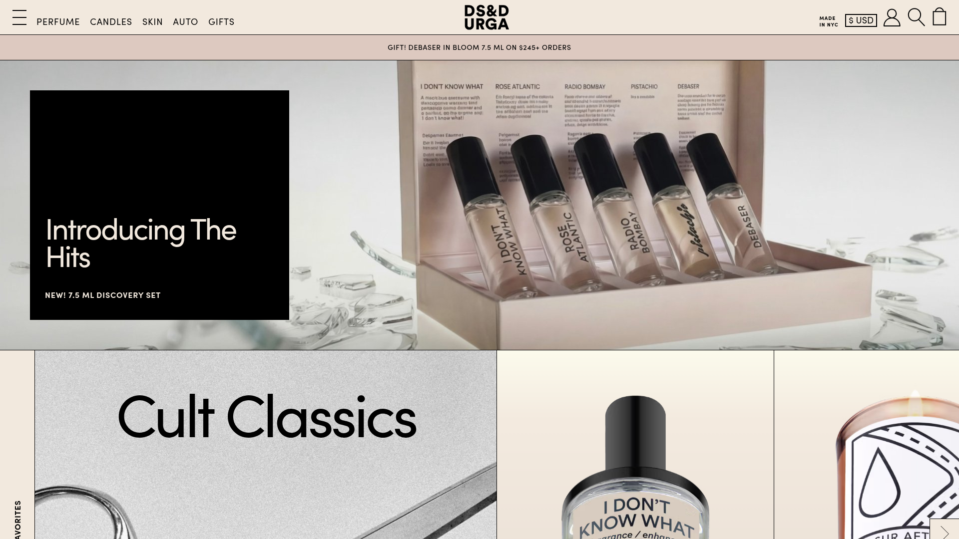
DS & Durga E-commerce Landing Page
A high-concept beauty storefront with a rigid grid layout, horizontal product carousels with vertical text headers, and an industrial-meets-minimalist aesthetic.
Overview
DS & Durga’s e-commerce landing page is a masterclass in modern, industrial minimalism that prioritizes high-fidelity brand storytelling through a distinct layout engine. It uses a rigid 1-pixel grid system to frame products, making it an excellent reference for builders wanting to balance brutalist design with high-luxury product presentation.
Design System
- Color Palette & Visual Hierarchy: The site uses a sophisticated neutral palette consisting of
bg-cream(#ddc9c0) andbg-black, accented by a soft "sludge" gray for borders. Hierarchy is established through stark-contrast blocks (e.g., black text modules over high-resolution imagery) rather than traditional drop shadows or depth. - Typography: A bold, sans-serif typography system (tracked as
text-sans-in the code) uses extreme weight and scale variations. Headlines like "Cult Classics" utilize tight letter spacing (tracking-tighter) at large sizes (up totext-sans-120), while navigation and metadata are rendered in small, all-caps, heavy-weight fonts (font-800). - Page Structure: The layout follows a linear vertical stack of horizontal carousels. Each section is introduced by a signature vertical text header (e.g., "CULT-FAVORITES") rotated 90 degrees within a narrow side gutter, creating a unique structural rhythm.
- Reusable Components:
- Grid-Bordered Carousels: Wide horizontal sliders that include a large "hero" image followed by product cards with sliding price summaries.
- Overlay Modules: Black informational boxes that sit partially over hero media.
- 1px Grid System: A layout wrapper that applies
gap-pxto create thin, architectural lines between all sections.
- Interactions & Motion: The UI features horizontal product carousels (implemented with
keen-slider) that use opacity shifts on hover. Video backgrounds automatically play to add dynamism to hero blocks, and a persistent "cart drawer" slide-out interaction manages the checkout flow. - Mobile Behavior: The layout is highly responsive; vertical headers persist but scale down, while the 12-column desktop grid collapses into single-column stacks with heavy use of
display: flexandaspect-ratioto maintain image integrity. - Implementation Clues: Built using Next.js with Tailwind CSS. The use of specific utility classes like
grid-col-border,tracking-tighter, anduppercaseconfirms a utility-first styling approach designed for high customizability.
Use Cases
- Who should clone this: Niche luxury brands, high-concept fragrance or skincare lines, and fashion labels that rely on distinct SKU stories rather than mass catalog browsing.
- Effective Remixes: This pattern works beautifully for creative portfolios or digital lookbooks. You can effectively remix the "vertical header" sidebars for a site navigation system or convert the rigid grid into a more organic, asymmetrical layout.
- Remix Directions: Swap the industrial cream/black for vibrant neon colors for a Gen-Z apparel brand or replace the 1px border with thicker, rounded borders for a more friendly SaaS landing page.
- Clone Scope: A full-page clone is ideal for those needing a cohesive brand identity, but the "Product Carousel with Vertical Header" is the standout modular section that can be isolated and reused in a standard site to add an edgy, editorial feel.
Related Inspirations

Context Gallery High-End Furniture Landing Page
A minimal editorial layout featuring a multi-column product carousel, designer biographies with image-text pairings, and a magazine-style content grid for curated design stories.

Glein Minimalistic Bento Grid eCommerce
A clean, modular layout using a bento-style responsive grid of text teasers and large-scale product imagery for lookbooks and collection browsing.

Basic.Space E-commerce Gallery Clone
A minimalist product marketplace featuring a clean sticky navigation bar, nested flyout menus, and a horizontally scrollable product carousel with hover-state image switching.

Ashley & Co Lifestyle E-commerce
An elegant Shopify-based storefront featuring a split-screen animated hero, horizontal ticker-tape collection carousel, and dynamic mega-menus with scent-specific color switching and image previews.
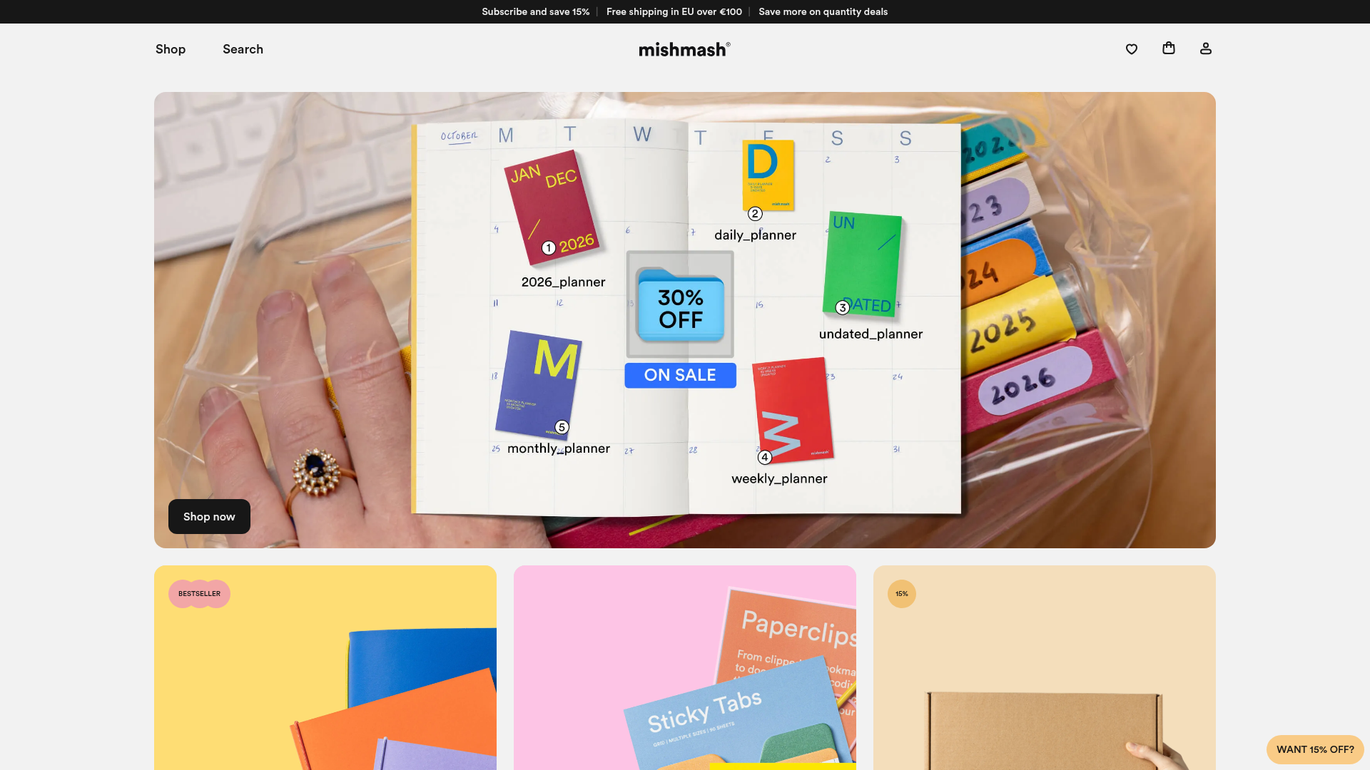
Mishmash Stationery E-commerce Layout
A clean retail template featuring rounded image grids, a multi-column comparison section with custom iconography, and a responsive products carousel.
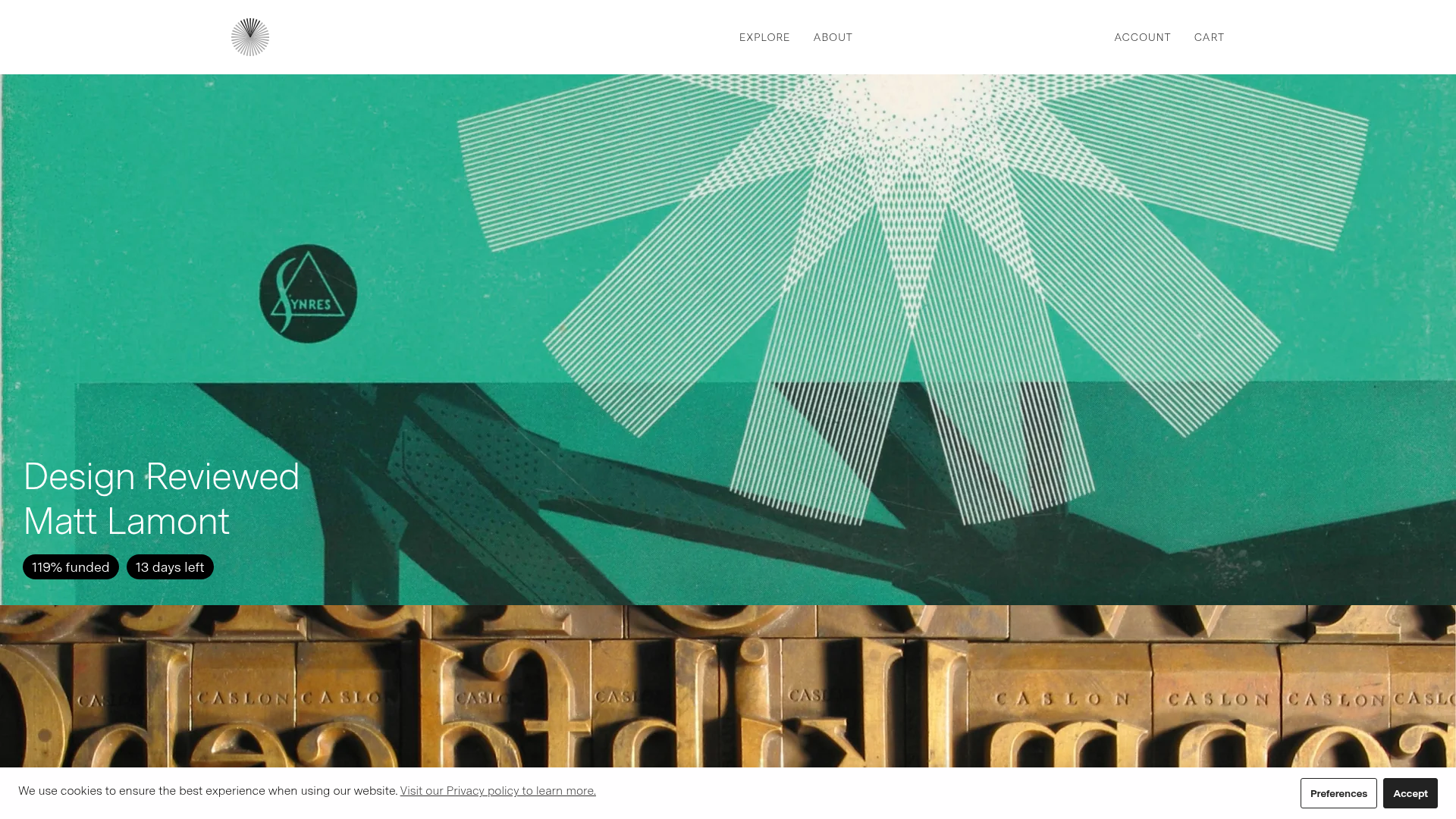
Volume Crowdfunding Book Gallery
A minimalist editorial storefront featuring full-width high-resolution image cards, status pills for campaign progress, and a clean typography-focused navigation layout.
