Cosmos Visual Inspiration Showcase Landing
A minimalist design featuring a sticky search-driven header, scroll-triggered text animations, image reveal transitions, and interactive visual similarity carousels.
Overview
Cosmos is a minimalist visual inspiration platform that uses a highly sophisticated landing page to showcase its search-driven curation. It is an excellent clone reference for building premium, high-end portfolios or asset libraries that require a balance between extreme whitespace and complex, scroll-triggered animations. Developers should look to this site for its masterful use of 'reveal' interactions and sticky positioning to tell a non-linear visual story.
Design System
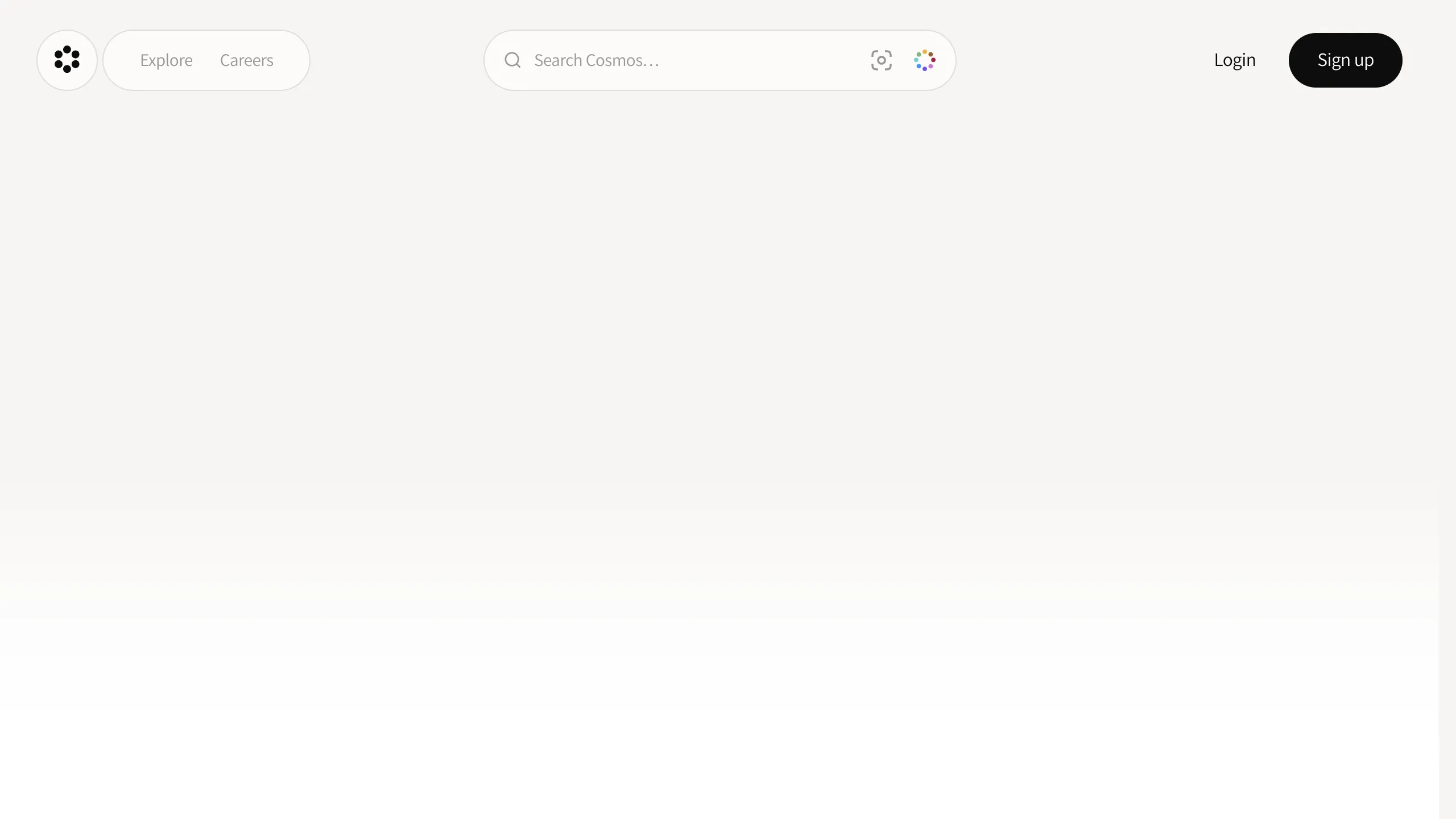
- Color Palette & Visual Hierarchy: The site uses a 'Paper' background (
#F9F7F3) rather than pure white, creating an editorial, tactile feel. The primary text color is high-contrast black/dark-gray, while interactive secondary text uses a lighter 'Tertiary' gray. The hierarchy is defined by massive headlines and generous padding, often exceeding 50-75px between sections (mt-50,mt-75). - Typography: The system features a custom serif (labeled
font-cosmos-oraclein HTML) for expressive headlines and a clean sans-serif for UI elements (text-body-regular). Headlines use negative tracking (up to-3.7px) and tight leading to create a dense, modern aesthetic. - Page Structure:
- Sticky Header: A floating, rounded pill-based nav containing a central search bar.
- Immersive Hero: A center-aligned headline that clears into a scroll-anchored video film section.
- Interactive Feature Cards: Multi-layered sections that use
translateYanimations to 'float' images into view as the user scrolls. - Scrolling Marquees: Infinite logo loops for social proof.
- Large Footer Call-to-Action: A high-impact 'Sign up' section with radial gradients and heavy blur masks.
- Reusable Components:
- Pill Buttons: Fully rounded search bars and buttons with subtle
hover:bg-hover-tertiarystates. - Segmented Control: A custom tab switcher (Show/Blur/Hide) with a sliding background highlight.
- Masked Marquees: Logo carousels that use
mask-image: linear-gradientto fade at the edges.
- Pill Buttons: Fully rounded search bars and buttons with subtle
- Interaction & Motion: The site relies heavily on scroll-triggered blur reveals (
opacity:0; filter:blur(6px)) applied at the word or character level. Image transitions usecubic-bezier(0.215, 0.61, 0.355, 1)for a premium 'snappy' feel. Sticky containers are used to keep videos or specific images centered while text scrolls past. - Implementation Clues: Built using Tailwind CSS utility classes (e.g.,
animate-fade-in,z-sticky,items-center). It utilizes CSS variables for layout heights (--layout-header-height) and custom easing profiles for high-performance transforms.
Use Cases
- Who should clone this pattern: Creative agencies, luxury brand studios, and AI-powered search tools that want to emphasize "curation" and "taste" over raw data density.
- Effective Remixes:
- Portfolio Sites: Reuse the sticky search header and the image reveal carousels to showcase project galleries.
- SaaS Landing Pages: Adapt the 'AI content' toggle component to demonstrate product features like filtering or privacy modes.
- E-commerce: Use the 'visual similarity' layout to show related products in a lifestyle context.
- Practical Remix Directions: Builders can swap the off-white 'Paper' background for a dark mode palette while keeping the blur-reveal typography. The info architecture is simple enough to be condensed into a single-page marketing site.
- Suggested Clone Scope: A quick section clone of the Header and Search Bar is highly valuable for UI kits; a full-page clone is recommended for high-budget branding projects that prioritize motion design.
Related Inspirations

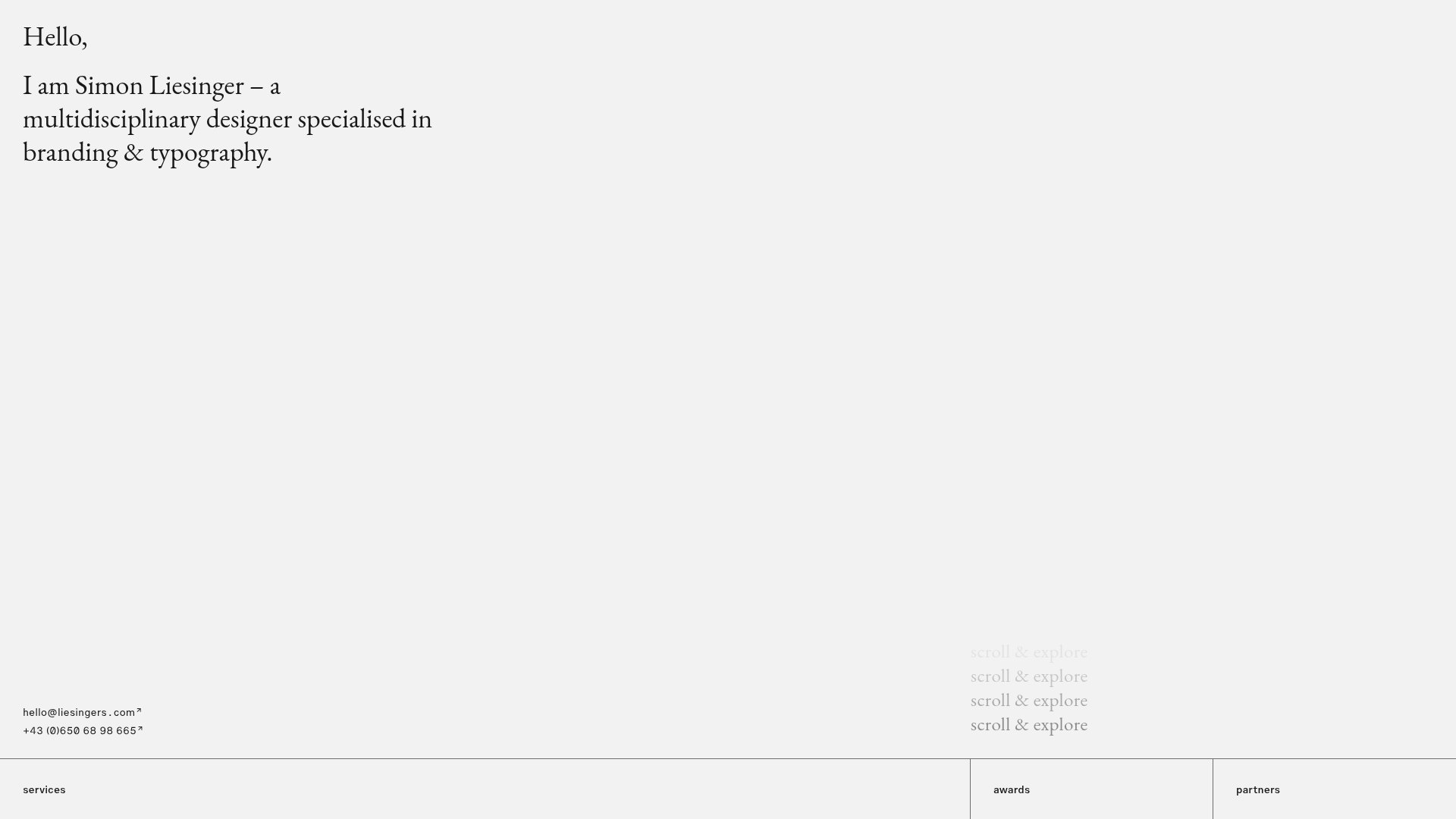
Baubauwerk Minimal Agency Portfolio Homepage
A clean studio site featuring a centered text hero, scatter-plot filterable project gallery, and full-bleed image sections for case studies.
Minimalist Typography Portfolio and Services Grid
A clean, serif-heavy layout featuring an A-Frame 3D hero animation, tiered service lists, and a modular multi-column text structure for design manifestos.
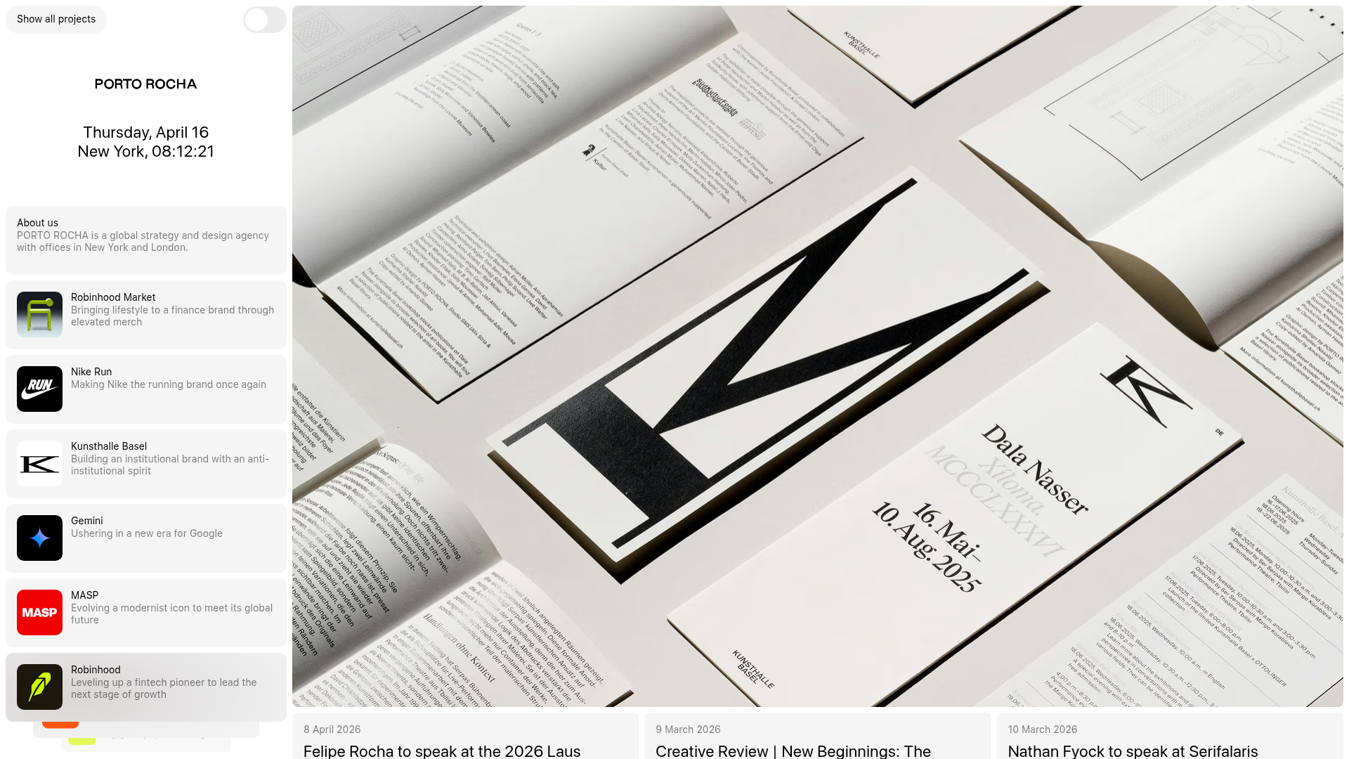
Porto Rocha Design Portfolio Mockup
A minimalist, side-bar navigation portfolio featuring a dual-column layout with a scrollable project feed and high-contrast typography.
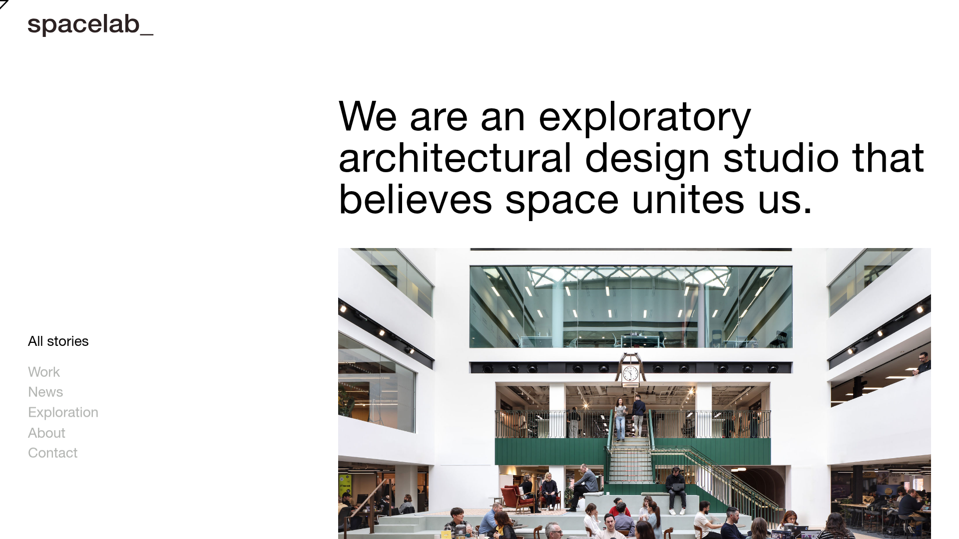
Spacelab Exploratory Architectural Portfolio
A minimalist studio website featuring a clean sidebar navigation and a high-impact asymmetric grid layout designed for visual storytelling.
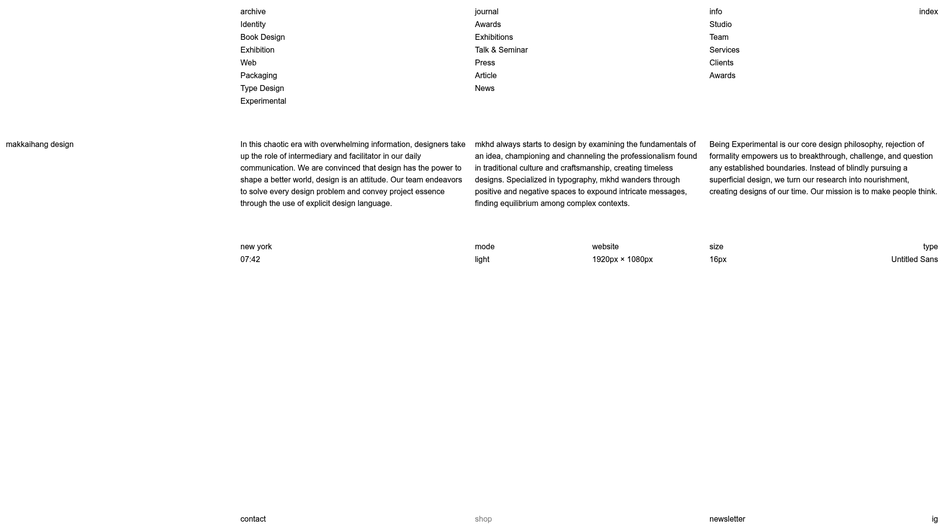
Makkaihang Design Studio Portfolio
A minimalist design agency landing page featuring a full-bleed video hero, a multi-column typographic layout, and a functional footer tracker for real-time local time and font details.
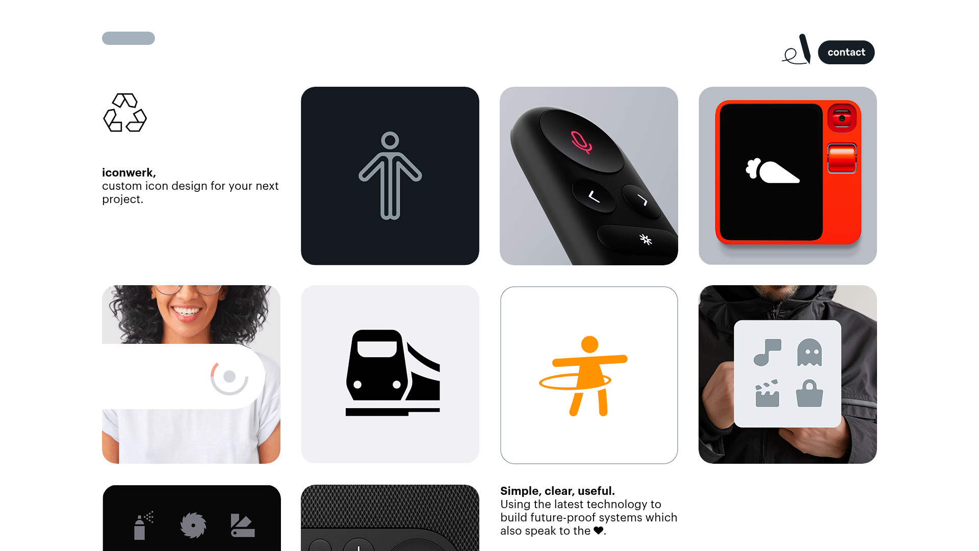
Iconwerk Design Portfolio Bento Layout
A minimalist bento grid portfolio featuring varying square tile sizes, clean iconography showcases, and a simple fixed navigation header for creative work.
