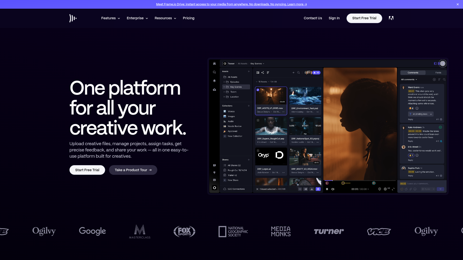
Frame.io Creative Collaboration Landing Page
A dark-themed professional SaaS landing page featuring a high-contrast hero section, interactive software interface mockup, and a scrolling logo marquee for social proof.
Overview
Frame.io is a leading creative collaboration software platform. Its landing page is a masterclass in dark-themed SaaS design, utilizing high-contrast typography and a complex application mockup to demonstrate product value instantly. Developers should clone this to study professional layout hierarchy, "glassmorphism" interface styling, and effective logo marquee integration.
Design System
- Color Palette & Visual Hierarchy: The site uses a deep black background (
#000000) to create a premium feel. Primary actions use a white background with black text for maximum contrast, while secondary actions use a semi-transparent dark grey. Hints of brand purple and blue are used sparingly within the software mockup and notification badges. - Typography: Features a clean, geometric sans-serif (resembling circular or grotesque styles). The hero headline uses a large, tight-tracked weight with high line-height to command attention. Hierarchy is maintained through color scaling (pure white for titles, grey for subtext).
- Page Structure:
- Marketing Banner: Top-fixed promotional bar.
- Navigation: Minimalist header with dropdown menus and dual CTAs.
- Hero Section: Left-aligned copy block paired with a sophisticated right-aligned application interface mockup.
- Trust Bar: A horizontal scrolling marquee of monochrome partner logos (Ogilvy, Google, Fox Sports).
- Reusable Components:
- Pill Buttons: Rounded buttons with high-contrast states.
- Interactive Mockup: A structured dashboard container with internal sidebars, asset grids, and a video player layout.
- Logo Carousel: A template for displaying social proof that maintains brand aesthetic by using uniform opacity and color.
- Implementation Clues: The structure suggests a modern framework implementation (typically React/Next.js) using modular containers. The UI mockup uses absolute positioning and flexbox to simulate a desktop application experience within a browser window.
Use Cases
- Who should clone this: Developers building developer tools, video editing software, or high-end B2B SaaS platforms that need to convey technical sophistication.
- Remixing Directions:
- Architecture: Swap the video editing mockup for a code editor or data visualization dashboard.
- Brand Style: Transition the dark theme to a high-contrast light theme while maintaining the 60/40 hero split layout.
- Info Architecture: Adapt the sidebar-driven mockup to showcase a mobile app interface instead.
- Suggested Scope: Start by cloning the Logo Marquee and the Hero Layout. The hero layout's grid structure (copy on left, complex component on right) is a robust foundation for any product-led landing page.
Related Inspirations

GoCardless Payments Platform Landing Page
A dark-themed fintech landing page featuring a split-screen video hero, bento-style feature cards, a horizontal logo slider, and step-by-step accordion guides.
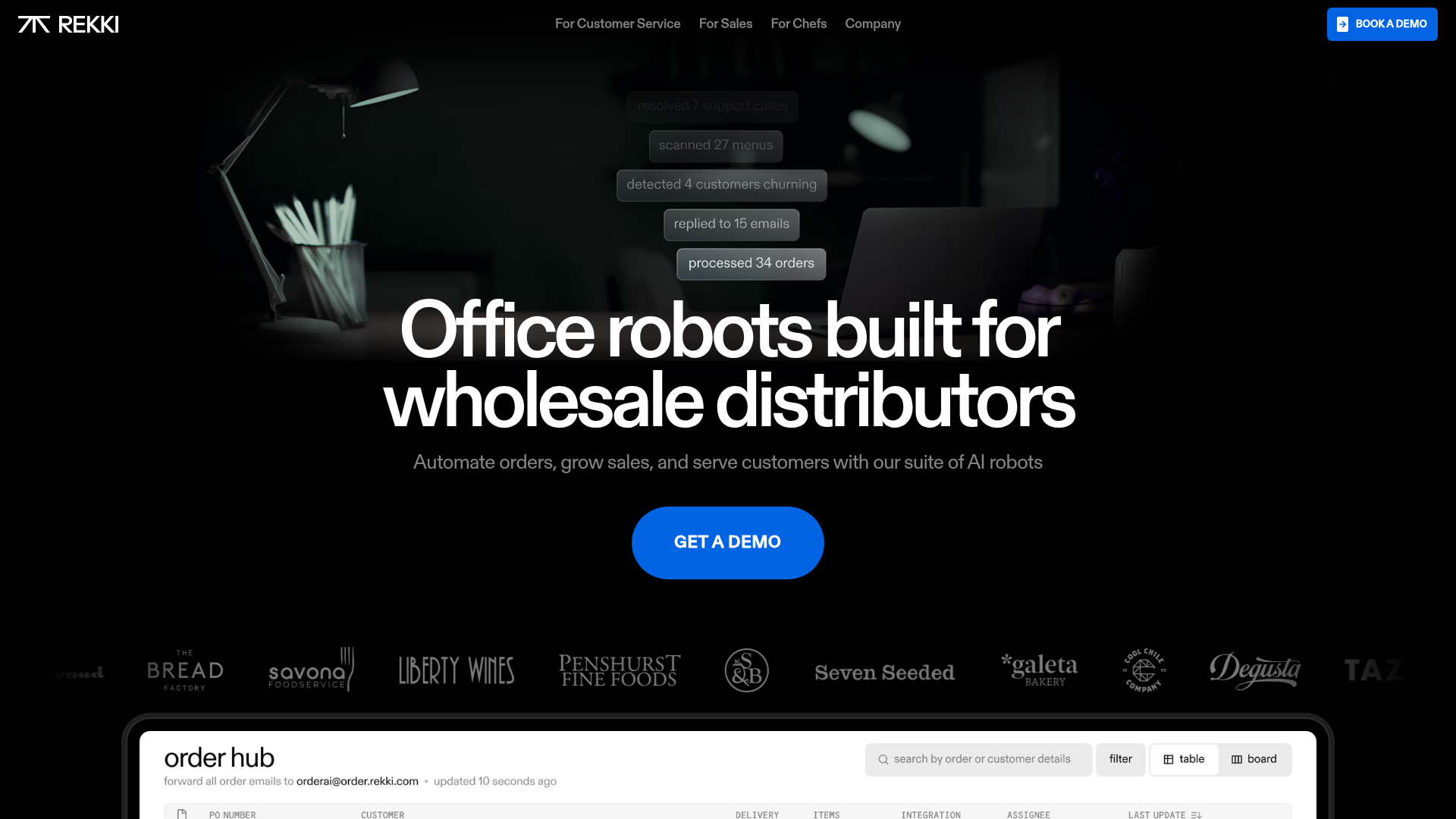
REKKI AI Automation SaaS Landing Page
A high-impact dark-mode landing page featuring a floating label hero section, marquee brand logos, an interactive dashboard UI preview, and card-based testimonial grids.

Vercel AI Cloud Landing Page
A modern landing page featuring a minimalist dark-themed navbar, a grid-overlay hero section with radial color gradients, and high-contrast typography for customer success stories.
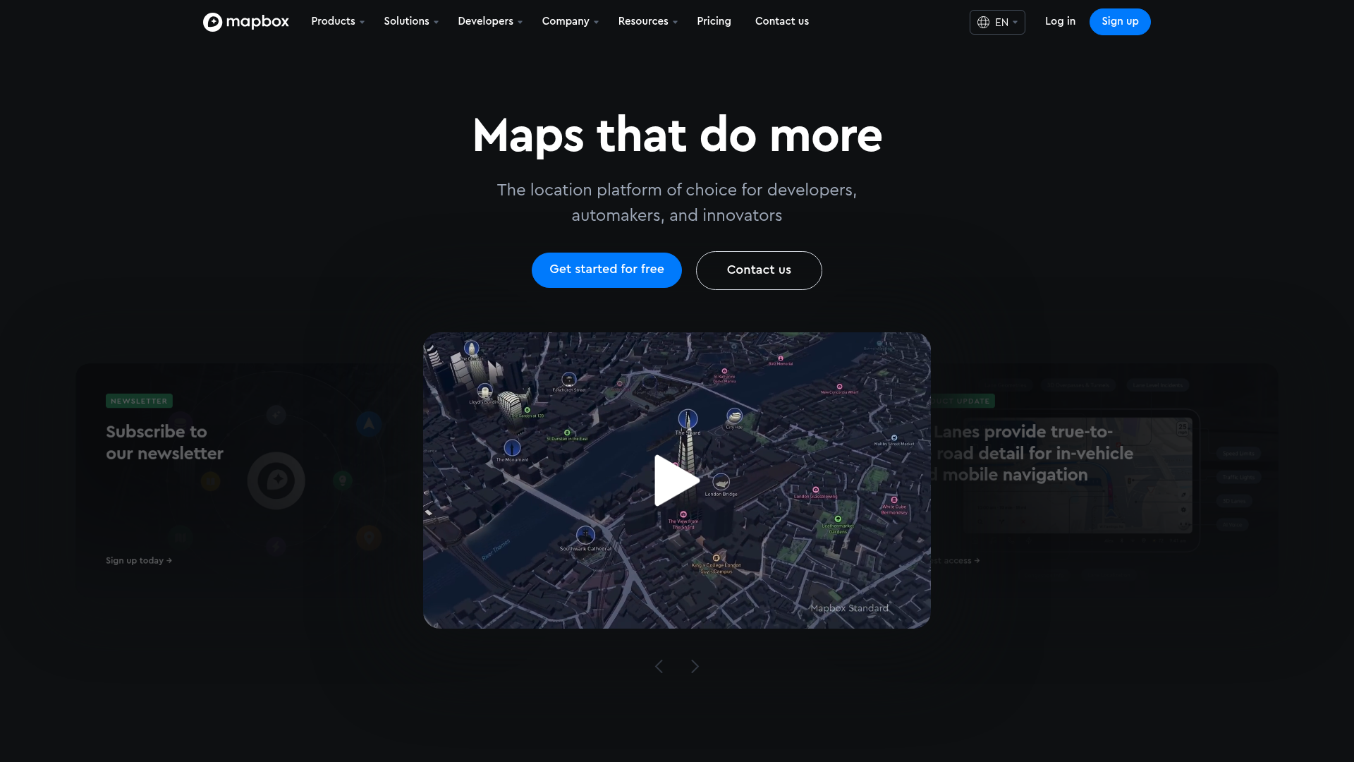
Mapbox SaaS Hero and Showcase Landing
A dark-themed landing page featuring a 3D-effect carousel, layered product highlight cards, tabbed customer stories, and a logo proof grid.
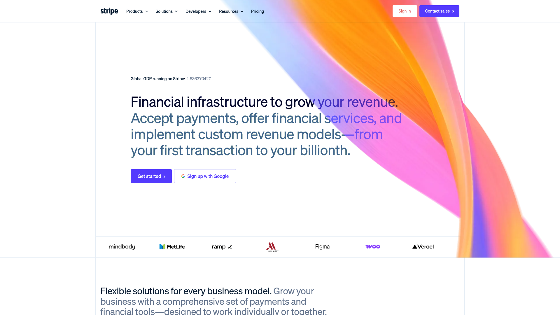
Stripe Modern SaaS Landing Page
A high-conversion landing page featuring a complex mesh-gradient hero, sticky navigation, and a horizontal logo wall for brand social proof.
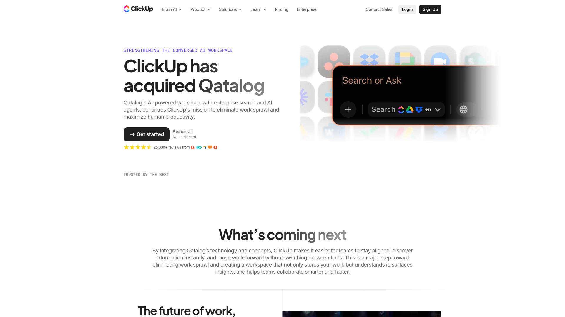
ClickUp Acquisition Hero Landing Page
Features a modern dark-themed hero section with a search UI graphic, bento-style feature grid, and a high-contrast CTA section with decorative gradients.
