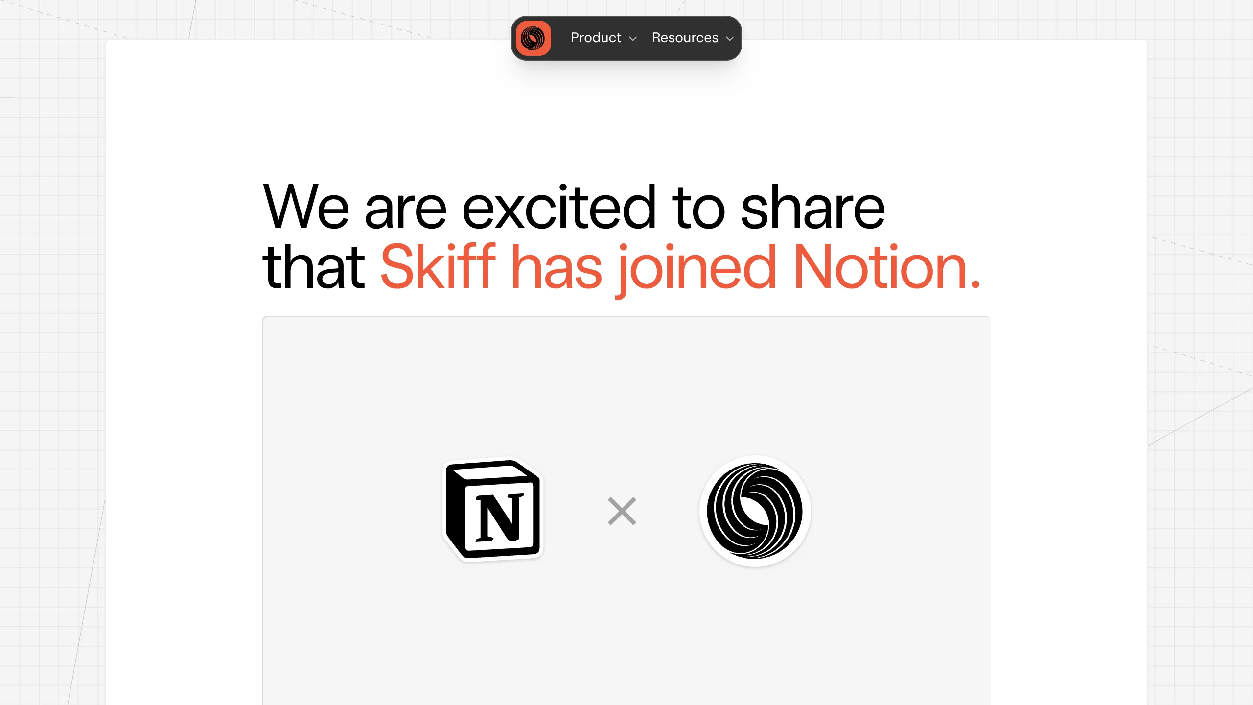
Skiff Acquisition Announcement Landing Page
A clean announcement layout featuring a centered minimalist hero, high-contrast typography, a pill-shaped sticky navigation bar, and a detailed four-column footer.
Overview
This landing page is a masterclass in minimalist corporate communication, specifically designed for a high-impact acquisition announcement. It uses a centered, document-style layout that bridges the gap between a high-end blog post and a professional product page, making it an excellent reference for builders wanting to signal transparency and prestige.
Design System
- Color Palette & Visual Hierarchy: The design relies on a neutral base of off-whites (
#F5F5F4) and pure white cards with soft shadows to create depth. A vibrant orange (bg-orange-500) is used sparingly as an accent color for key brand names and primary links, creating an immediate focal point against the high-contrast black typography. - Typography System: The site features a sans-serif system with a focus on large, bold display headings (
h1) followed by generous line-height for body text (leading-relaxed) to ensure readability. The footer introduces a secondary mono font as labels for category headers to create a tech-forward aesthetic. - Page Structure: The layout follows a linear, single-column flow: a sticky pill-shaped primary nav at the top, followed by a hero section centered on a large visual logo lockup, then deep-text storytelling cards, and finally a comprehensive four-column footer.
- Reusable Components:
- Pill Navigation: A dark-themed, floating sticky bar with rounded-2xl corners and dropdown indicators.
- Inverted Image Placeholders: The
shadow-insetgrey box used for the logo lockup serves as a reusable container for showcasing partnerships or key graphics. - Columnar Footer: A clean, scalable map of links divided by functional categories (Legal, Developer, Resources).
- Responsive Behavior: The HTML reveals a mobile-first approach where the floating navigation shifts from a fixed width to
w-11/12on smaller screens and the logo lockup scales down (scale-50) to maintain composition on mobile viewports. - Implementation Clues: Built with Tailwind CSS, utilizing utility classes for spacing (gap-5, py-16), layout (flex-col, items-center), and specialized visual effects like
skiff-border-raisedandshadow-inset.
Use Cases
- Corporate Announcements: Ideal for companies sharing major milestones, mergers, or service updates that require a serious yet modern tone.
- Single-Page Resumes or Portfolios: The centered white-on-grey card structure can be easily remixed into a personal landing page or a case study showcase.
- Minimalist Newsletters: Builders can repurpose the typography and spacing rules to create a clean archive for long-form content.
- Remix Directions: Swap the orange accent color for a brand-specific primary hue, or replace the central logo box with an embedded video player or a product carousel to turn it into a high-conversion landing page.
- Clone Scope: The full-page layout is worth cloning for those needing an end-to-end professional presence, while the sticky pill nav is a great component-only clone for more complex projects.
Related Inspirations

Slite SaaS Knowledge Base Landing Page
A clean SaaS hero section with a conversational headline, secondary call-to-action buttons, and a structured software interface preview featuring user testimonials.
Attio AI CRM Landing Page
A clean SaaS landing page featuring a tiered navigation bar, a centered hero section with twin CTAs, and a detailed interactive dashboard preview.
Koa Health Mental Care Landing Page
A clean healthcare landing page featuring a centered hero section, scroll-based fade-in animations, overlapping mobile mockups, and a multi-column feature grid with accent borders.
Balsa Software Documentation Landing Page
A clean document-centric layout featuring a centered hero section, high-contrast callout boxes, and a nested dashboard UI preview for collaborative tool showcases.
Firebase Hosting Site Not Found
A minimal placeholder layout for 404 error states including a centered logo, numbered troubleshooting guide, and linked utility text.
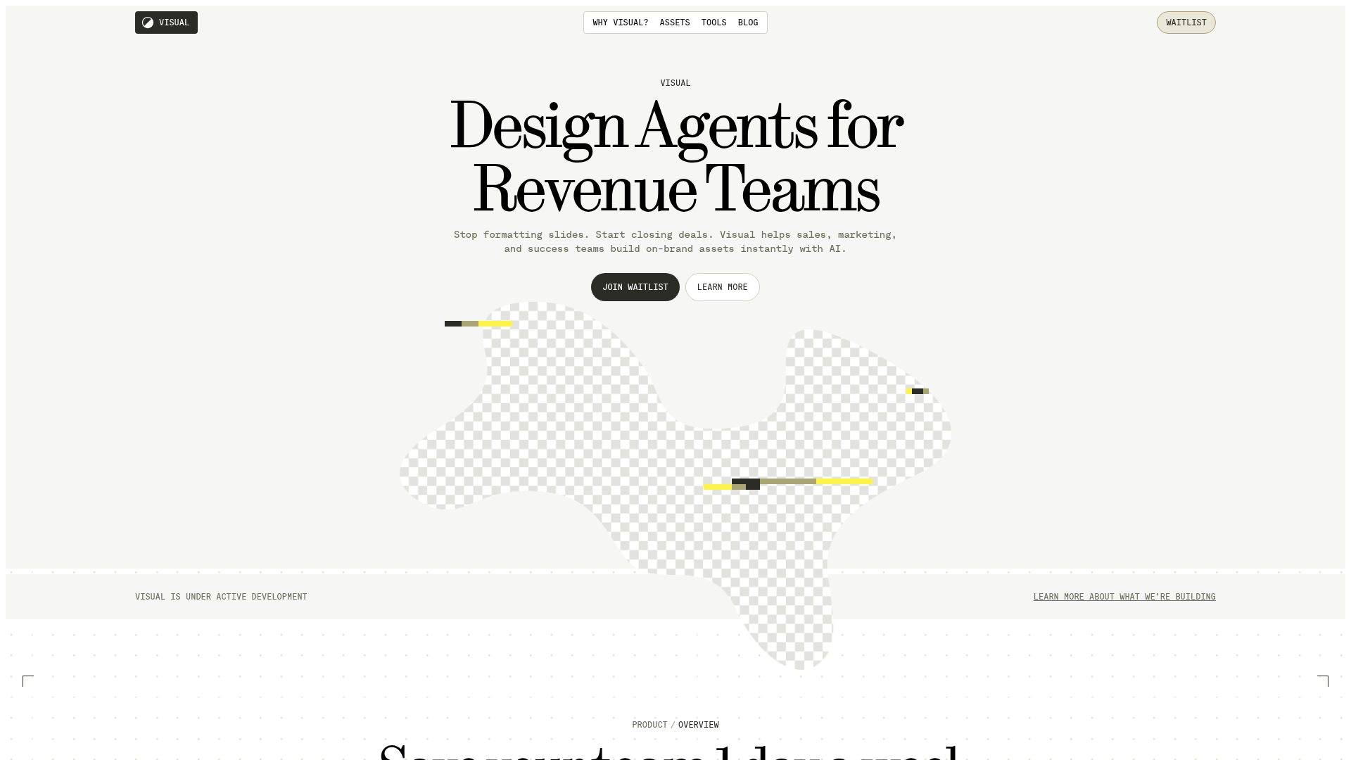
Visual AI Landing Page Templates
A high-end SaaS layout featuring a serif-heavy typography system, bento-style product showcase grids, accordion-style feature blocks, and minimalist wireframe UI components.
