Lunch Concept Fashion E-commerce Showcase
A minimalist fashion store featuring a full-width chrome-effect typography overlay, high-impact hero imagery, and a clean product grid with hover-state image swapping.
Overview
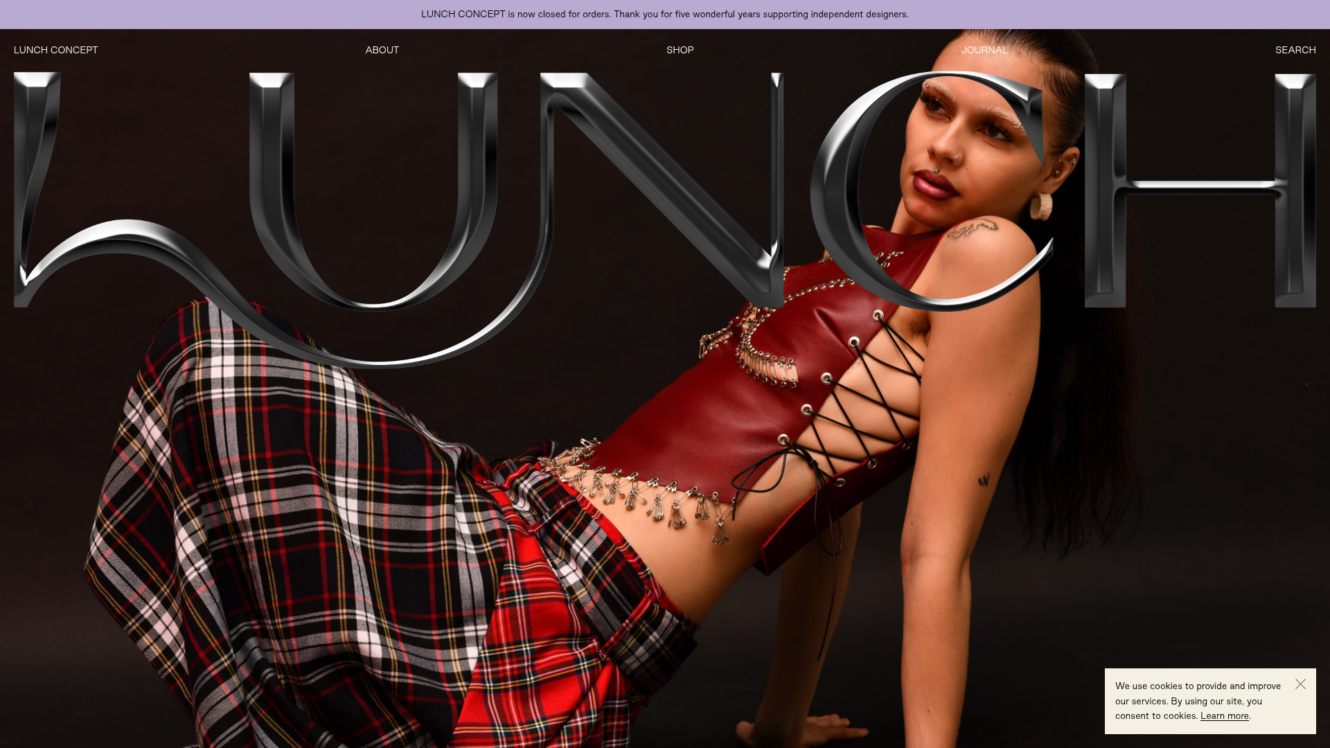
Lunch Concept is a minimalist fashion e-commerce site focused on independent designers and sustainable style. It serves as a strong clone reference for its high-impact visual hierarchy, particularly its unique use of transparent chrome-textured typography overlaid on hero photography to establish immediate brand identity. The layout demonstrates how to balance experimental aesthetic choices with a highly structured, conversion-focused product grid.
Design System
- Color Palette & Visual Hierarchy: The site uses a neutral foundation to allow product photography to dominate. A light lavender notification banner (#D1C4E9) provides a soft contrast at the top. The background is a clean white, with black text providing high-contrast readability. Sophisticated visual weight is achieved by using full-bleed, moody photography contrasted against a 3D chrome logo overlay.
- Typography System: The design relies on clean, sans-serif fonts (likely from the Adobe Fonts/Typekit integration seen in the HTML). Navigation and secondary headings use uppercase for a more architectural, structured feel. Product titles are rendered in a slightly heavier weight to stand out within the grid.
- Page Structure: The flow begins with a persistent notification bar, followed by a minimal main navigation. The hero section is the centerpiece, featuring a large image with a transparent SVG/PNG chrome branding overlay. Below the fold, the site transitions into multiple categorized product sections ("New Products," "Shop by Designer," "Exclusives") formatted in a repeating grid pattern.
- Reusable Components:
- Hero Overlay: A specific technique of layering a textured, transparent brand mark over full-screen imagery.
- Product Cards: A standard vertical layout featuring a portrait image, designer tag, product name, price, and availability labels (e.g., "Made To Order" or "Sold Out").
- The Cookie/Notice Banner: A floating bottom-right module with a simple close icon and underlined links.
- Interaction & Motion: The implementation features an
onhoverimage swap mechanism within the product grid (visible in the HTML<img>classes), allowing users to see alternative angles or detail shots without clicking. Buttons and links utilize subtle text-decoration transitions. - Responsive Design: The HTML structure includes specific
mobile-heroclasses, indicating a transition from full-bleed desktop landscapes to vertically-oriented mobile imagery. The navigation remains condensed and text-based to maintain clarity on smaller screens.
Use Cases
- Target Builders: Designers and developers building portfolios, niche fashion boutiques, or luxury brand landing pages that need to feel artistic yet functional.
- Effective Remixes: This pattern works exceptionally well for high-end retail in beauty, jewelry, or avant-garde furniture where brand "vibe" is as important as the items themselves.
- Practical Directions: Builders should clone the layout and reuse the product grid logic while remixing the "Chrome" overlay with their own brand marks. The "Sold Out" and "Made to Order" tags are excellent small UI patterns for artisanal shops to reuse.
- Clone Scope: A full-page clone is recommended to capture the transition from the experimental hero section to the clean, utilitarian shop interface. Alternatively, the product grid with its hover-state image swapping is an excellent standalone section clone for improving existing e-commerce sites.
Related Inspirations

Context Gallery High-End Furniture Landing Page
A minimal editorial layout featuring a multi-column product carousel, designer biographies with image-text pairings, and a magazine-style content grid for curated design stories.

Glein Minimalistic Bento Grid eCommerce
A clean, modular layout using a bento-style responsive grid of text teasers and large-scale product imagery for lookbooks and collection browsing.

Basic.Space E-commerce Gallery Clone
A minimalist product marketplace featuring a clean sticky navigation bar, nested flyout menus, and a horizontally scrollable product carousel with hover-state image switching.

Ashley & Co Lifestyle E-commerce
An elegant Shopify-based storefront featuring a split-screen animated hero, horizontal ticker-tape collection carousel, and dynamic mega-menus with scent-specific color switching and image previews.
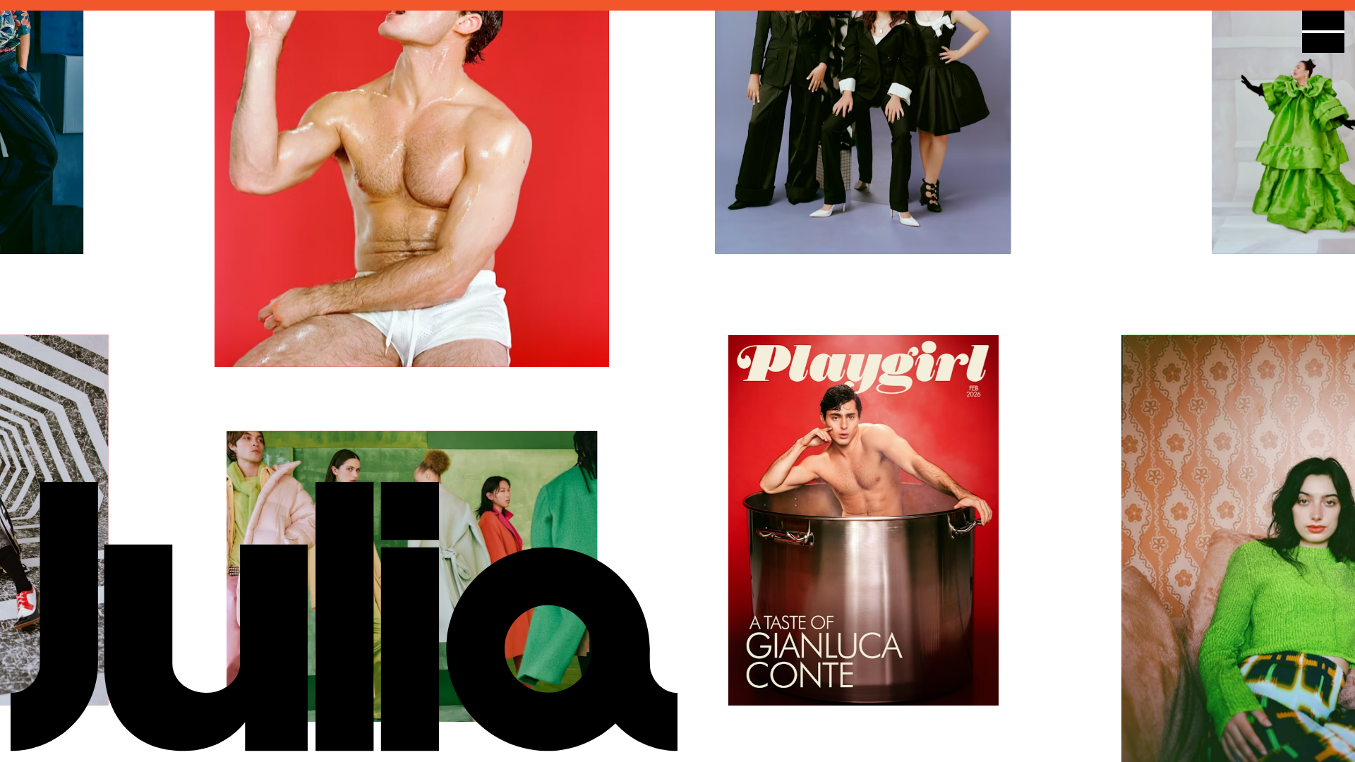
Julia Johnson Photography Portfolio Website
A creative portfolio featuring a masonry-style image grid, overlapping oversized typography, and a minimalist full-screen navigation overlay.
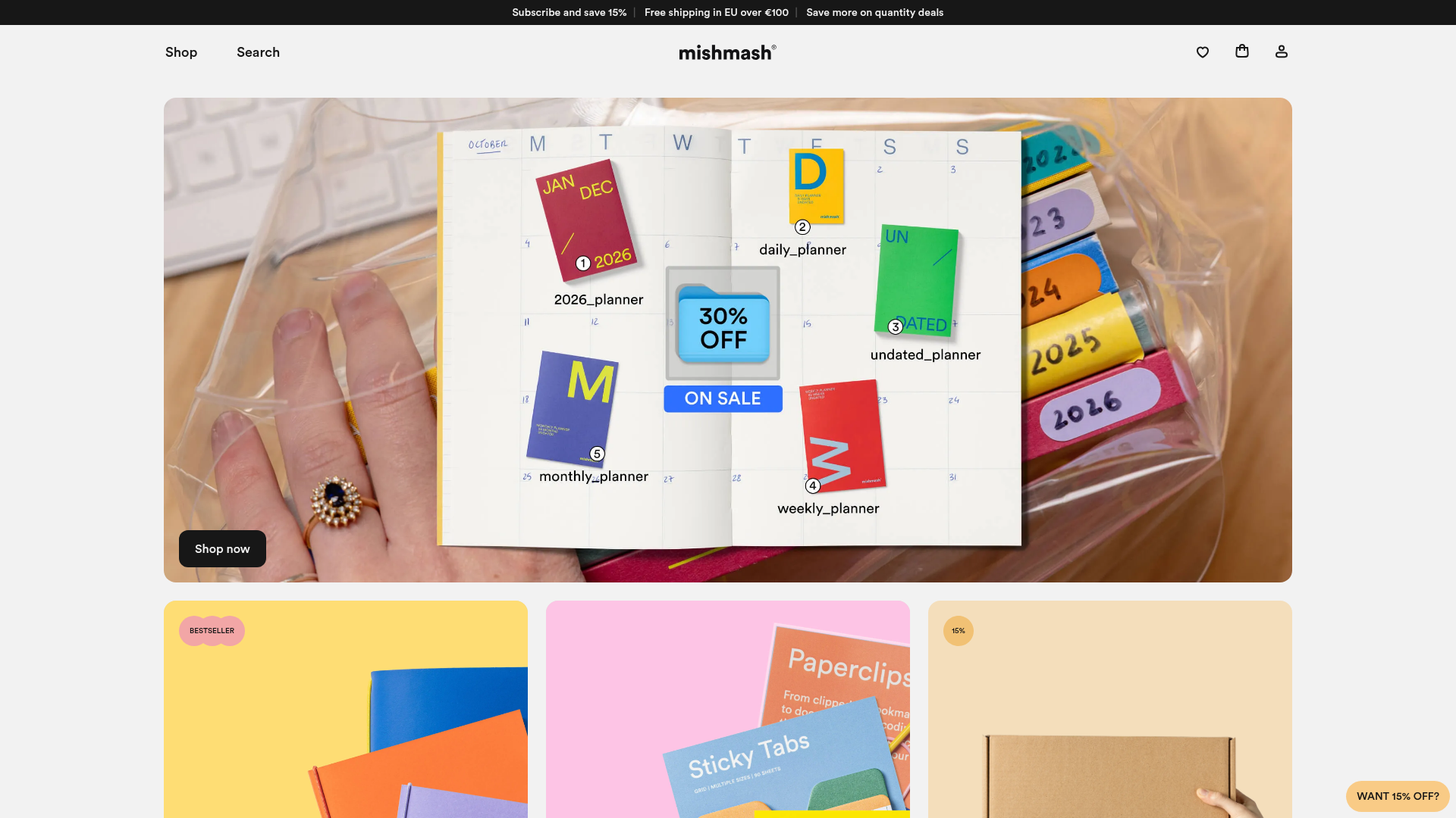
Mishmash Stationery E-commerce Layout
A clean retail template featuring rounded image grids, a multi-column comparison section with custom iconography, and a responsive products carousel.
