Exhibition Magazine Editorial Grid Gallery
A high-fashion magazine layout featuring a giant typographic header, full-width banner hero, and a responsive multi-column article grid with subtle hover transitions and a newsletter popup.
Overview
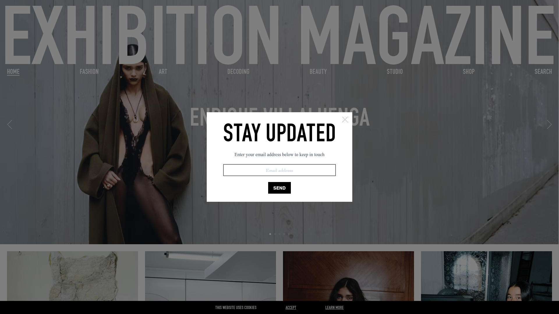
This website is a sophisticated digital editorial for Exhibition Magazine, a high-fashion and art publication. It excels as a clone reference due to its bold use of oversized typography, immersive full-width media banners, and a clean, responsive layout that treats digital content with a print-like aesthetic.
Design System
- Color Palette & Visual Hierarchy: The design uses a minimal monochrome base (black, white, and varying shades of gray) to allow high-contrast photography to lead the visual experience. Hierarchy is established through extreme scale—giant headers for branding and medium-weight serif titles for article cards.
- Typography: The system relies on a high-impact, condensed sans-serif for the primary brand header ("EXHIBITION MAGAZINE") which spans the full width of the viewport. Sub-navigation and article titles use a more legible, clean sans-serif for functional clarity.
- Page Structure & Flow: The layout begins with a massive typographic header integrated into a hero slider. This is followed by a multi-column article grid (
article-list) using vertical list items, punctuated by a full-width immersive banner (article-banner) that breaks the rhythm. The page ends with a high-contrast footer containing newsletter links and social media. - Reusable Components:
- Article Cards: A vertical image-first block with a placeholder layout (
padding-top: 133.33%) to maintain a 3:4 aspect ratio. - Newsletter Popup: A clean, centered modal with a high-contrast "SEND" button.
- Fat Buttons: Large, wide buttons used for "LOAD MORE CONTENT" and main CTAs.
- Article Cards: A vertical image-first block with a placeholder layout (
- Interactions: The HTML suggests state-based transitions on article cards (
opacity: 1; transform: translateY(0px)) indicating entry animations. The top navigation is minimal and sits directly over the hero image to remove visual clutter. - Implementation Clues: The site is built using Nuxt.js (based on the
#___nuxtand#___layoutIDs). It utilizes a utility-first approach for layout (e.g., classes likeflex,mx-auto,w-full, andmy-6) and Prismic CMS for dynamic image delivery.
Use Cases
- Who should clone this: Designers and developers building digital magazines, fashion portfolios, or luxury brand lookbooks that need to balance extreme branding with content-heavy grids.
- Product Remixing: This pattern works effectively for high-end architecture firms, art galleries, or boutique e-commerce shops where visual storytelling is prioritized over dense feature lists.
- Remix Directions: One could swap the stark black-and-white theme for a high-saturation color palette while keeping the oversized header for a more streetwear/pop-art look. The
article-bannersection can be repurposed as a promotional section for specific collections. - Clone Scope: For a quick win, clone the Typographic Header and Hero Slider combination. For a full-scale project, the Responsive Article Grid with the aspect-ratio-locked image containers provides a robust foundation for a professional-grade blog or news feed.
Related Inspirations
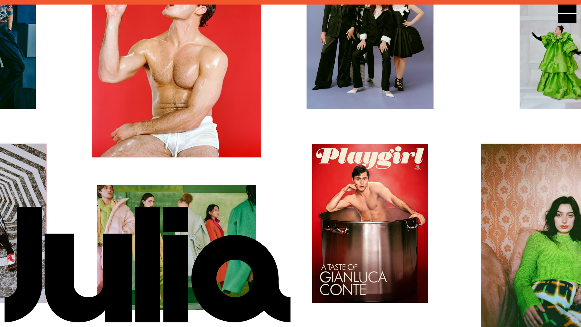
Julia Johnson Photography Portfolio Website
A creative portfolio featuring a masonry-style image grid, overlapping oversized typography, and a minimalist full-screen navigation overlay.
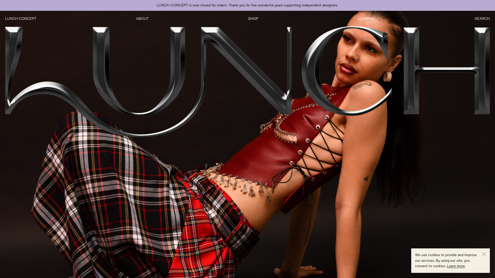
Lunch Concept Fashion E-commerce Showcase
A minimalist fashion store featuring a full-width chrome-effect typography overlay, high-impact hero imagery, and a clean product grid with hover-state image swapping.
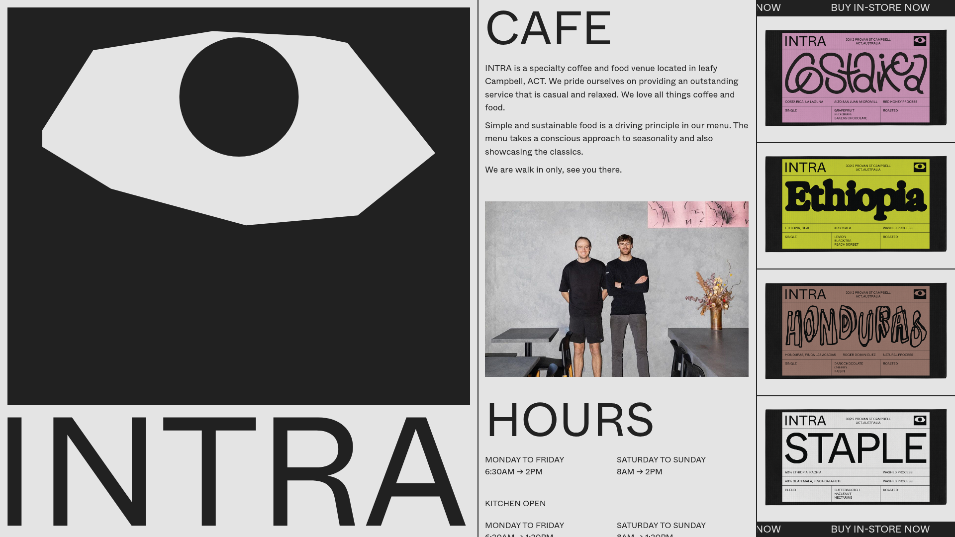
INTRA Specialty Cafe Landing Page
A brutalist-inspired single-page layout featuring a bold oversized hero graphic, a multi-column scrolling grid for store info, and an animated product ticker for retail items.

Context Gallery High-End Furniture Landing Page
A minimal editorial layout featuring a multi-column product carousel, designer biographies with image-text pairings, and a magazine-style content grid for curated design stories.

Glein Minimalistic Bento Grid eCommerce
A clean, modular layout using a bento-style responsive grid of text teasers and large-scale product imagery for lookbooks and collection browsing.

Basic.Space E-commerce Gallery Clone
A minimalist product marketplace featuring a clean sticky navigation bar, nested flyout menus, and a horizontally scrollable product carousel with hover-state image switching.
