Hartzler Dairy Product Landing Page
A bold, image-centric layout featuring a large typographic hero background, product-focused sticker badges, and a full-screen vertical navigation menu.
Overview
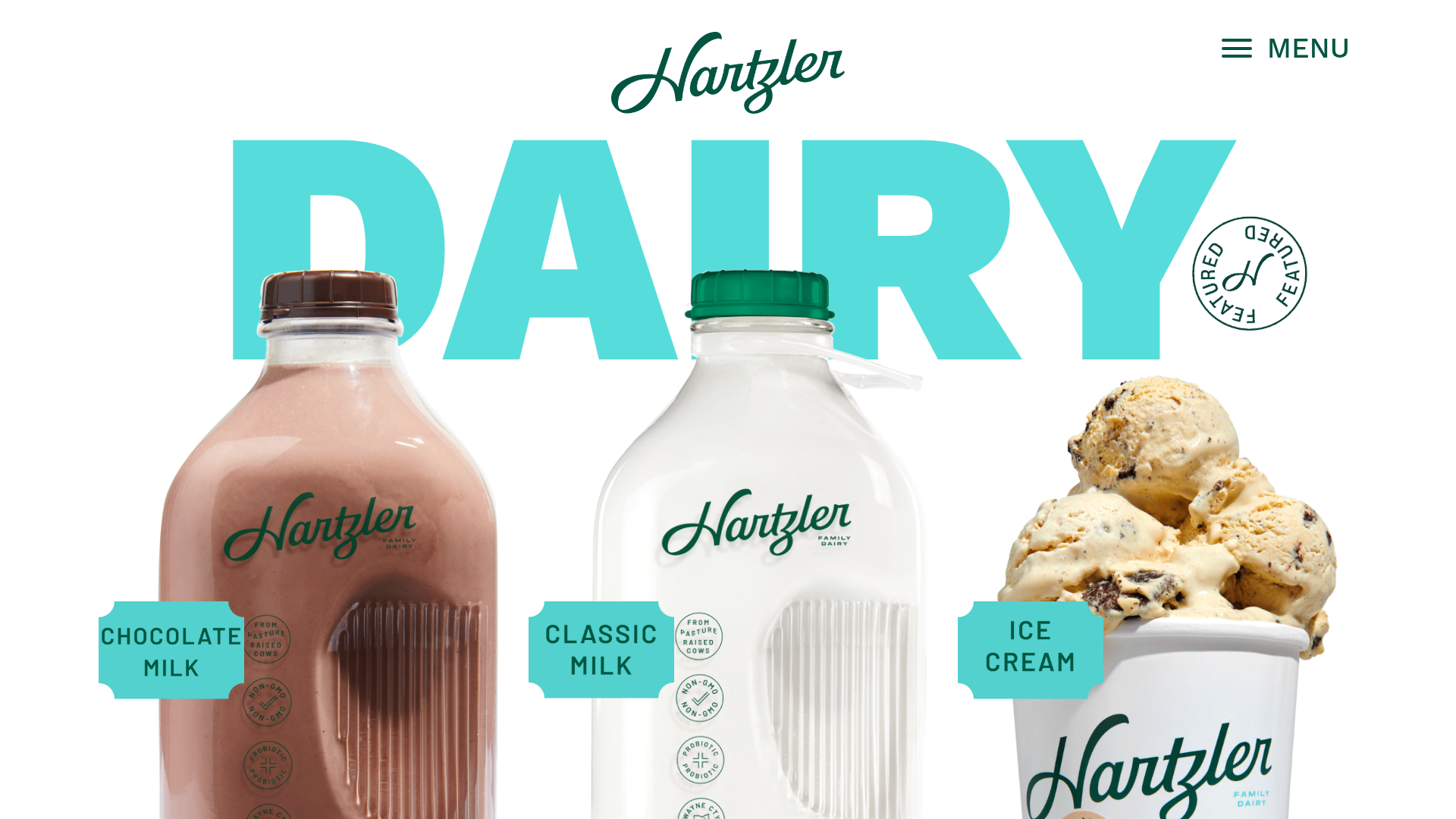
Hartzler Dairy's landing page is a high-impact, visual-first e-commerce experience that emphasizes brand personality through bold typography and forced-perspective product imagery. It is an excellent recruitment/clone reference for physical product brands looking to create a premium, tactile feel using high-quality photography and "sticker" style graphical overlays.
Design System
- Color Palette & Visual Hierarchy: The site uses a vibrant teal (#40E0D0 / turquoise) as its primary accent color for giant background lettering and badges, creating a strong contrast against the minimalist white background. The hierarchy is dominated by oversized text elements trailing behind realistic 3D product renders.
- Typography System: The system uses a mix of a script font for the brand logo ("Hartzler") and a heavy, geometric sans-serif (Work Sans, weight 900) for the high-impact backgrounds. Sticker-style labels utilize a monospaced or narrow sans-serif for a technical, yet retro, dairy-label aesthetic.
- Page Structure: The layout relies on a Z-index stacked approach where giant typographic headings (e.g., "DAIRY", "FRESH") sit in the background, product shots occupy the mid-ground, and descriptive "sticker" badges float on top. The navigation is tucked into a clean, top-right hamburger menu.
- Reusable Components:
- Floating Badges: Die-cut style labels (e.g., "CHOCOLATE MILK") with jagged edges that can be reused for any product feature.
- Vertical Off-Canvas Menu: A sophisticated full-screen overlay that uses image-rich cards ("nav-cards") for primary categories like Milk, Minis, and Ice Cream.
- Rotating Stamp: A circular "Featured" GIF/Graphic that acts as a visual anchor.
- Interaction Patterns: The HTML reveals the use of an off-canvas slide-up navigation (
pp-offcanvas-slide) that transitions the entire screen. Product images are wrapped in simple anchor tags for direct navigation to category pages. - Implementation Clues: The site is built using the Beaver Builder framework (classes like
fl-builder-contentandfl-node), utilizing a column-based grid system to align off-center product imagery.
Use Cases
- Who Should Clone: D2C (Direct to Consumer) brands in the food, beverage, or beauty industries that rely on strong visual appeal and unique packaging.
- Product Remixing: Perfectly suited for products with distinct shapes or high-quality product photography (e.g., perfumes, craft beer, bottled sauces).
- Remix Directions:
- Brand Swap: Replace the teal with a neon orange or deep plum for a high-fashion or tech-hardware look.
- Info Architecture: Adapt the giant background text to function as a scrolling marquee or dynamic section labels.
- Information Density: Reuse the floating sticker component to highlight technical specs (e.g., "Non-GMO", "Organic", "15ml") on simpler product pages.
- Clone Scope: A quick section clone of the "Ultra Header" (giant background text + product + badge) provides the most immediate value for high-density landing pages.
Related Inspirations
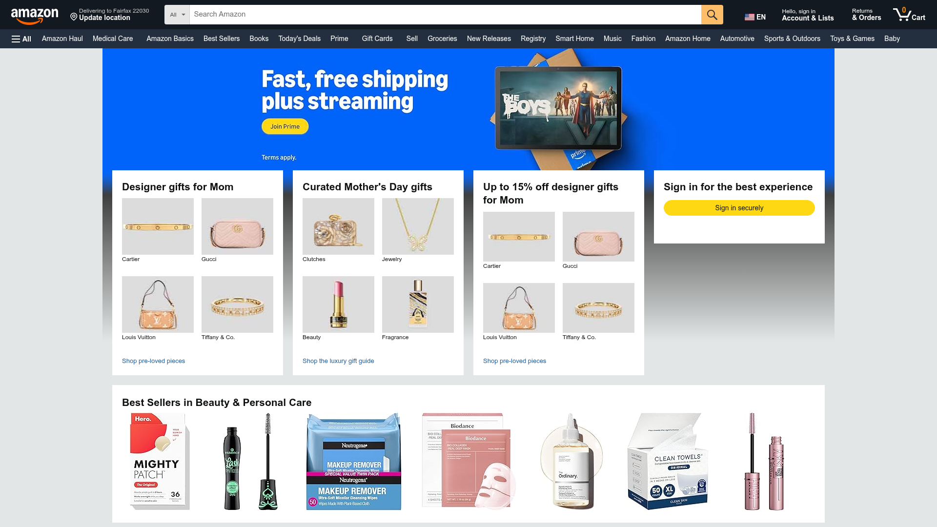
Amazon Marketplace E-commerce Homepage
A complex dashboard layout featuring a carousel hero banner, multi-column bento grids for categorized promotions, and a horizontal product recommendation slider.
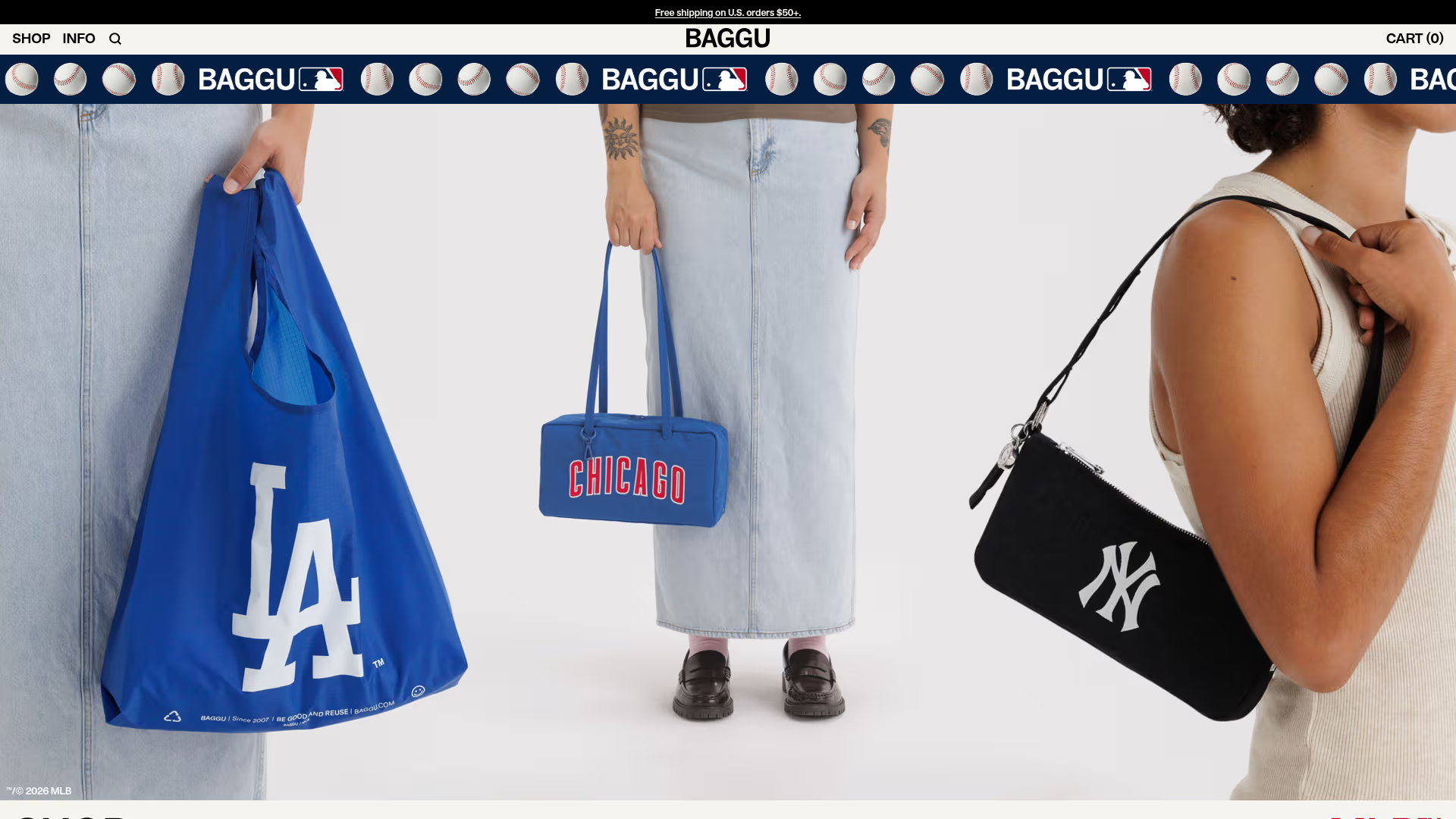
BAGGU Minimalist E-commerce Hero Template
A clean retail landing page layout featuring a full-width high-impact hero section, a sticky integrated banner, and a minimalist navigation header optimized for product launches.
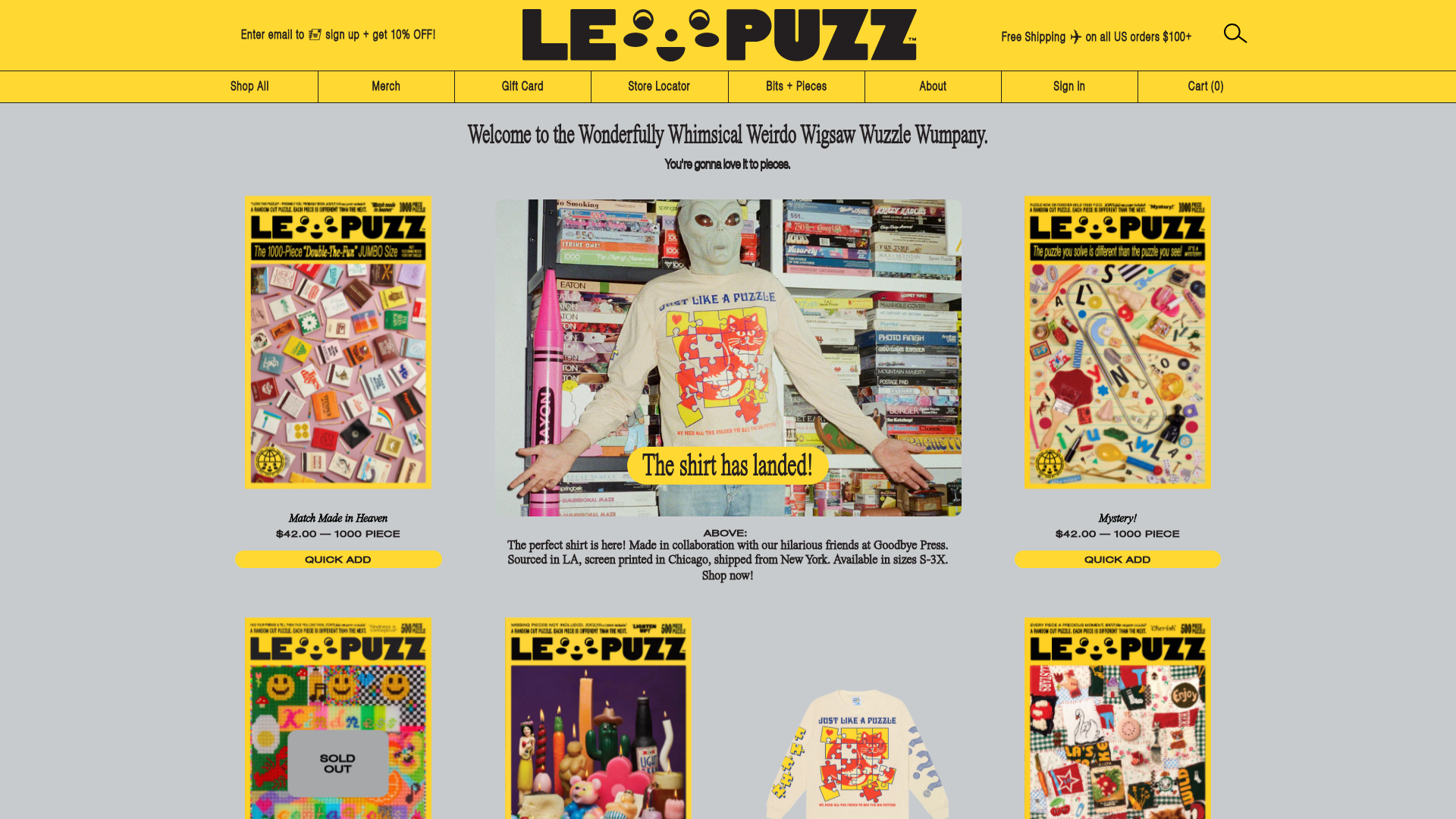
Le Puzz E-commerce Grid Gallery
A playful Shopify-based storefront featuring a responsive product grid with interactive 3D box-flipping hover effects and integrated lifestyle banners.

Transform Festival Event Landing Page
Features a full-width hero section, quote carousel for reviews, and a grid-based news listing using responsive card components and image-driven layout.
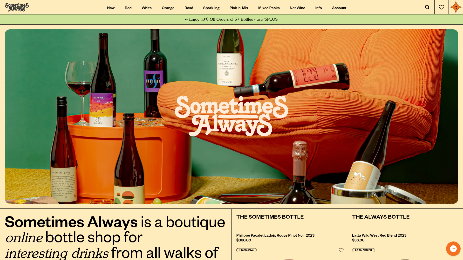
Sometimes Always Boutique Wine Shop
A high-fashion e-commerce layout featuring a serif-heavy typography system, bold overlapping image hero, and a two-column product spotlight grid with wishlist integration.
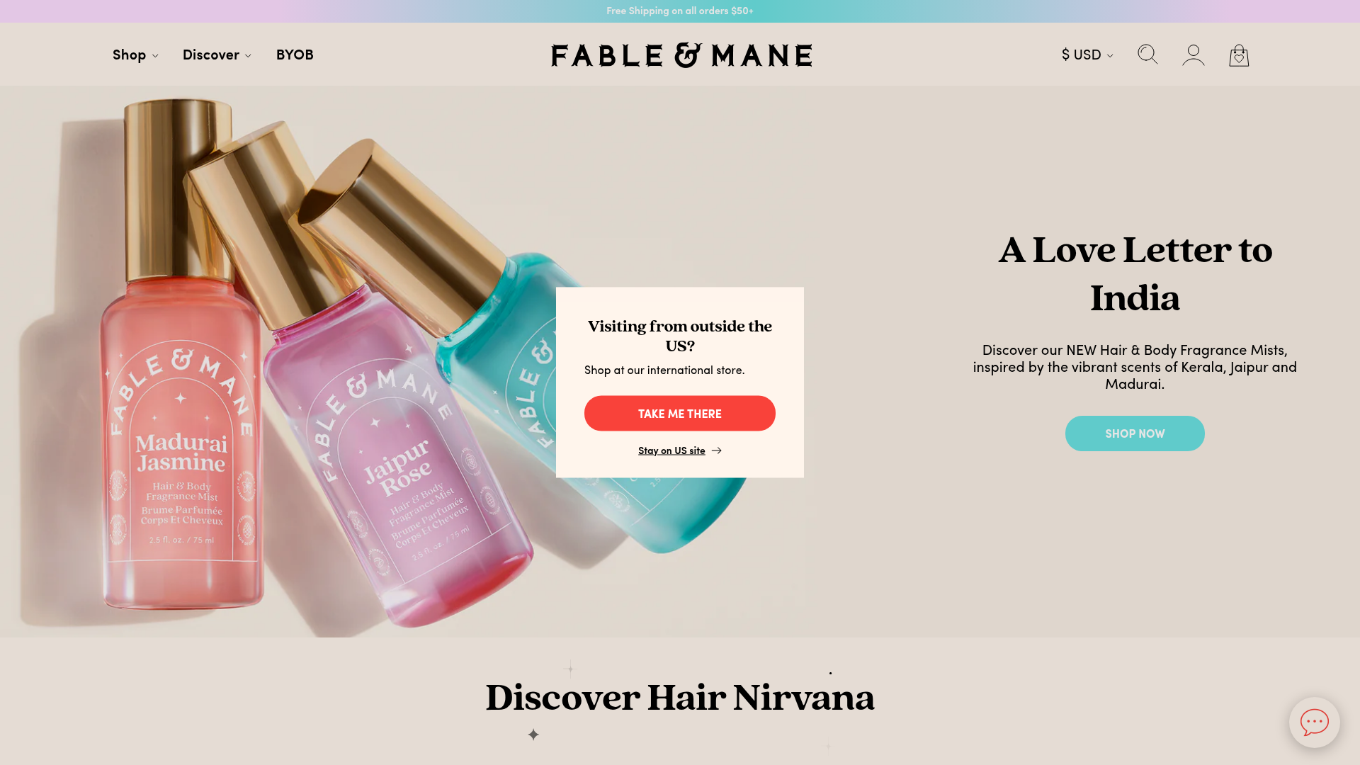
Fable & Mane Beauty Storefront
A clean e-commerce layout featuring a high-impact hero slider with localized entry popups and a product carousel with hover-triggered secondary images.
