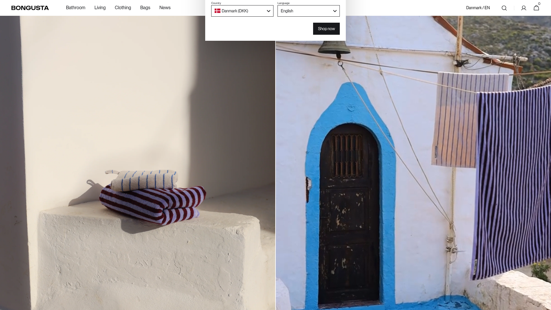
Bongusta Home & Fashion Storefront
A vibrant e-commerce layout featuring a split-screen hero video/image section, a horizontal product carousel with hover-image swaps, and a multi-column footer with sticky-scrolling effects.
Overview
Bongusta is a high-end Danish home and fashion storefront that utilizes a playful, minimalist aesthetic to showcase colorful textiles. This layout is an excellent reference for builders wanting to combine a luxury editorial feel with high-performance e-commerce utility, specifically featuring a unique split-screen hero and a content-reveal footer.
Design System
- Color Palette & Visual Hierarchy: The site uses a clean monochromatic base (#FFFFFF) to allow high-saturation product photography to provide the color. The visual hierarchy is extremely flat, emphasizing large-scale imagery over heavy text blocks.
- Typography System: A bold, sans-serif Grotesk typeface is used for the brand logo and navigation, providing a modern architectural feel. Secondary text uses a clean, utilitarian sans-serif with ample letter spacing for readability.
- Page Structure & Flow: The flow begins with a 50/50 split-screen hero (static image left, video right), followed by a dense product carousel. The page concludes with an innovative "content reveal" footer where the main content scrolls over a fixed background image, revealing a multi-column link directory.
- Reusable Components:
- Split-Screen Hero: Two
bg-item-wrappercontainers for side-by-side media. - Hover-Swap Product Cards: Cards using
featured-first-imageandfeatured-second-imageto toggle between studio and lifestyle shots on hover. - Sticky Header: A minimal top nav with category links (Bathroom, Living, etc.) that remains accessible during long scrolls.
- Localization Modal: A structured
md-modal__gridfor multi-market currency and language selection.
- Split-Screen Hero: Two
- Interactions & Motion: The storefront utilizes the Swiper.js library for high-performance horizontal carousels. Interaction patterns include subtle opacity changes on button hovers and a distinct "reveal" effect in the footer where imagery surfaces from behind the layout.
- Implementation Clues: HTML classes indicate a Shopify-based architecture with custom section-based CSS (e.g.,
shopify-section-header). It relies on standard browser utilities and lightweight JS libraries like Swiper for mobile-responsive touch interactions.
Use Cases
- Who should clone this: Brands in the interior design, boutique fashion, or high-end lifestyle space that rely on visual storytelling rather than heavy copywriting.
- What products remix well: Boldly colored items like ceramics, designer accessories, or furniture collections where large-scale media can do the selling.
- Practical remix directions:
- Information Architecture: Swap the flat navigation for a mega-menu if the catalog is larger.
- Brand Style: Replace the high-saturation product videos with muted, earthy tones for a more organic, sustainable brand vibe.
- Scope: A quick clone of the split-screen hero section is ideal for landing pages, while the full-page clone is best for comprehensive e-commerce builds.
- Suggested clone scope: Full-page clone is recommended to capture the sophisticated interplay between the split-screen hero and the fixed-image footer reveal.
Related Inspirations

Context Gallery High-End Furniture Landing Page
A minimal editorial layout featuring a multi-column product carousel, designer biographies with image-text pairings, and a magazine-style content grid for curated design stories.

Glein Minimalistic Bento Grid eCommerce
A clean, modular layout using a bento-style responsive grid of text teasers and large-scale product imagery for lookbooks and collection browsing.

Basic.Space E-commerce Gallery Clone
A minimalist product marketplace featuring a clean sticky navigation bar, nested flyout menus, and a horizontally scrollable product carousel with hover-state image switching.

Ashley & Co Lifestyle E-commerce
An elegant Shopify-based storefront featuring a split-screen animated hero, horizontal ticker-tape collection carousel, and dynamic mega-menus with scent-specific color switching and image previews.
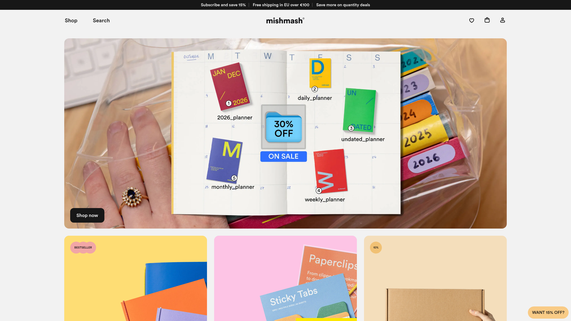
Mishmash Stationery E-commerce Layout
A clean retail template featuring rounded image grids, a multi-column comparison section with custom iconography, and a responsive products carousel.
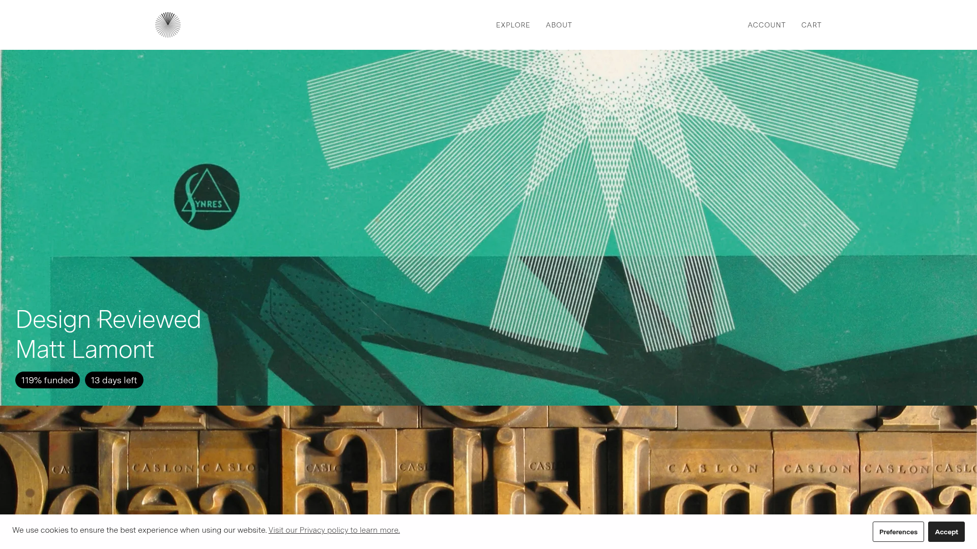
Volume Crowdfunding Book Gallery
A minimalist editorial storefront featuring full-width high-resolution image cards, status pills for campaign progress, and a clean typography-focused navigation layout.
